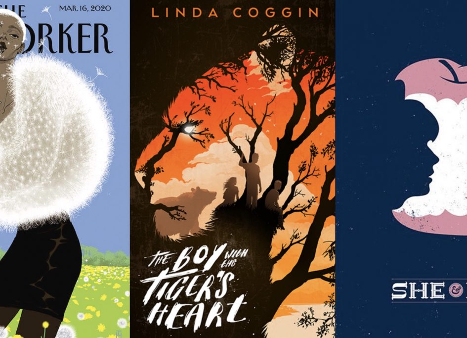
1. This cover for The New Yorker created by Tomer Hanuka incorporates the element of texture as the character in this piece is seen to be modelling a top made of dandelion fluff. Hanuka’s ability to create a texture so similar to dandelions ends up creating a sense of lightness that flows throughout the piece.

2. Levente Szabo’s use of the element of shape in the cover of ‘The Boy with the Tiger’s Heart’ creates a sense of depth as the branches of the trees and the vibrant orange sunset work together and create the shape of tiger.

Leave a Reply
You must be logged in to post a comment.