Category: IDES 142

Canadian Design Today

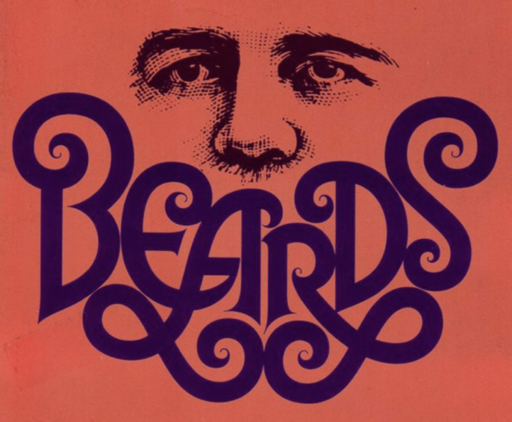
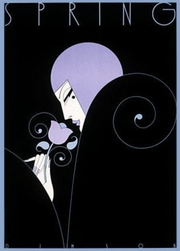
Theo Dimson captured my heart with his minimal figures and lovely usage of colour.

Born in London, Ontario and grown up around comics books and magazines, DImson became enamoured with design at a very early age.  Dimson was given a scholarship to attend the Ontario College of Art and Design, which he later graduated from in 1950.

After working as president and director of Reeson Dimson & Smith LTD for over a decade, Dimson made the decision to make his own company Dimson Designs Inc. in 1985, where he was president and creative director of the company.  

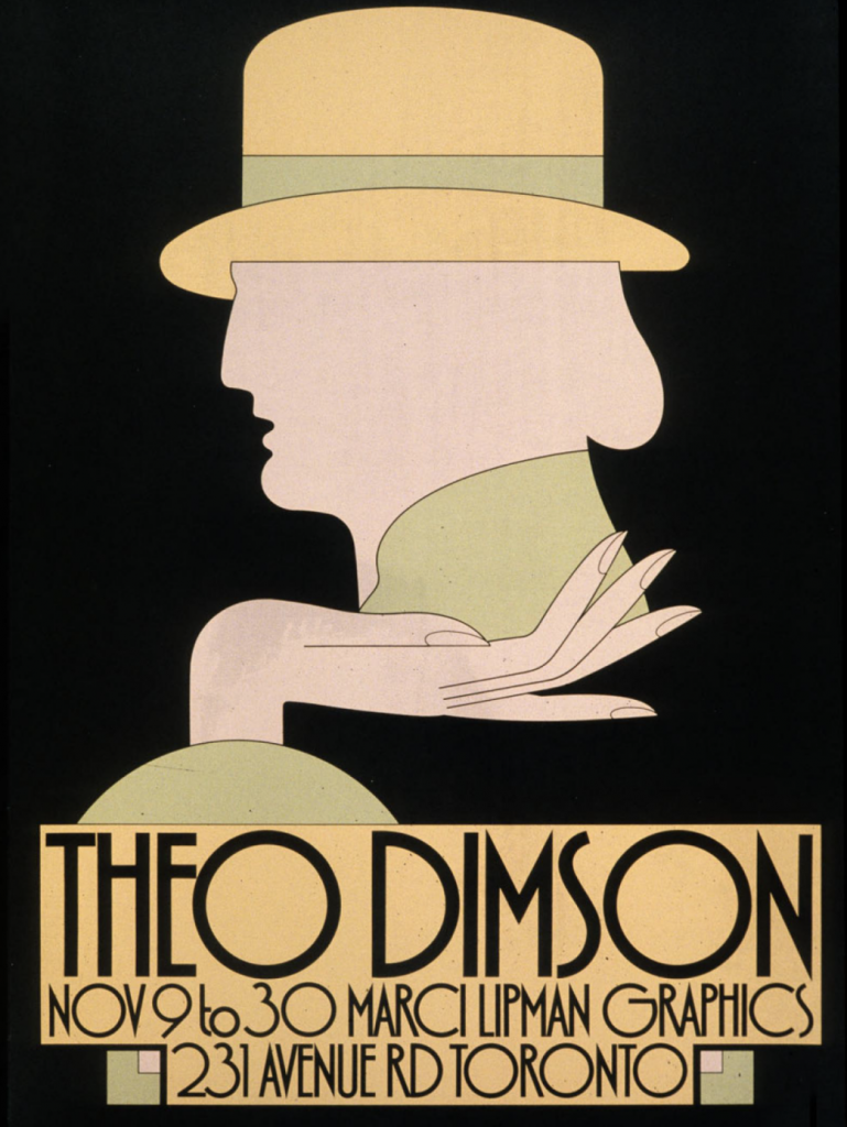
Now I’d like to move on to Dimson’s illustration style.  It required very little detail but has the perfect ability for the viewer to understand the point of the image right away.  Personally something that I wish I would be able to have the ability to execute. 

Postmodernism in Europe

Jamie Reid was born in the United Kingdom in 1947 and is most well known for his ransom note-esque decollage pieces.  

His most famous works would have to be covers that Reid made for the Sex Pistols albums ‘Never Mind the Bollocks’ and ‘Here’s the Sex Pistols’ alongisde covers for their singles, ‘God Save the Queen’ and ‘Anarchy in the U.K.’

Reid’s cover art helped define the aesthetic of the British punk movement of the 1970’s with its faux ransom note letters and iconic defecements of pop culture and natinalistic images.

Today, Reid’s work can be found at the Museum of Modern Art in New York, the Albert Museum in London and the Tate Gallery in London, among others.

Supergraphics Innovators: Venturi and Scott Brown

Robert Venturi & Denise Scott Brown have been regarded as some of the most influential architects of the twentieth century.

The Vanna Venturi House – 1964

The couple met each other while teaching at University of Pennsylvania in 1960 and got married in 1967, Scott Brown joined Venturi’s firm in 1969, at the time named Venturi and Raunch as partner in charge of planning.

Children’s Museum of Houston -1992

Robert Venturi and Denise Venturi and Scott Brown both critical of the modernist doctrine that was being displayed in architecture at the time. The two wanted more electric architecture that integrated historic references into their work, a “gentle manifesto” which formed the basis for postmodernism.

Sainsbury Wing – 1991

As someone who considered becoming an architect when they were younger, these two alongside Frank Gehry were huge inspirations for me.  They held the ability to incorporate their art and talent into their works.

Fire Station #4 – 1968

As a young teen surrounded by grey block buildings with the prettiest buildings in town being skyscrapers with super reflective windows, Venturi and Scott Brown’s architecture made me realize that good architecture isn’t just a tall building with shiny windows, it’s so much more than that.

Seattle Art Museum – 1991
Fun Fact! A security guard yelled at me when I was ten for petting the ram sculptures lol

References:

https://www.britannica.com/biography/Robert-Venturi-and-Denise-Scott-Brown

https://www.archdaily.com/769194/spotlight-robert-venturi-and-denise-scott-brown

Wes Wilson; Psychedelic Design Hero

Wes Wilson is regarded as one of the psychedelic pioneers of the ‘60s .

Wilson attended San Francisco State University and while attending the university, Wilson worked at a small printing press.  At that small press was where Wilson’s career as a psychedelic poster artist would take off.

Wilson mainly designed layouts for pamphlets and flyers which eventually led him to become an established poster designer.  When the Fillmore Auditorium began to hold weekly concerts, Wilson was asked to design posters for them.  Wilson designs for the auditorium were fresh and vibrant and so addictive that other artists decided to replicate his style in their own work.

Wilson was able to create such hypnotic imagery by intertwining his experiences with LSD and his experience as a printer together, Wilson also drew many of his inspirations from the Art Nouveau masters.  I find it quite fascinating, today drugs are looked down upon as it is more common for them to be laced with something fatal but decades ago it seems that wasn’t as large as a problem.

As Wilson’s career continued to peak, he began to grow disillusioned by all the financial opportunities and his career as a poster artist.  The disillusionment grew to be so overwhelming that he decided to move out of the city to live on a farm in Missouri Ozarks.  This does not mean he lost his love for poster art though, just that Wilson lost interest in the competitive, ever growing field of business.

Sadly Wilson passed away last year on January 24, 2020.  Wes Wilson and his art will forever be looked back on as someone who was able to define his generation.

Herb Lubalin

When Herb Lubalin comes to mind there’s only one word that I can think of, and that word is ‘classic’.

Herb Lubalin was a well known American graphic designer most well known for his gorgeous typographic style.  Lubalin was able to bring a unique beauty and creative vibe to his typography.  He was the creator of many lovely typefaces such as ITC Avant Garde, Pistilli Roman, Receding Hairline NF and many others.

Lubalin studied at the Cooper Union for the Advancement of Science and Art and graduated in 1939.  After graduating, Lubalin worked at Sudler & Hennessey for 19 years.  In 1964, he left Sudler  & Hennessey to create his own company, Herb Lubalin Inc.

Lubalin collaborated with Ralph Ginzburg on three of Ginzberg’s magazines: Eros, Fact and Avant Garde.

All in all, I think that Herb Lubalin’s classic style is gorgeous and the general public should definitely appreciate it more.

http://www.designishistory.com/1960/herb-lubalin/

Visual Research II: Figure Ground

The usage of figure ground is presented perfectly in Gert Van Duinen’s ‘Whalehouse Series’. White the house matching the background colour it presents that the house is indeed closer to the viewer than the tail itself.

Visual Research II: Proximity

Dana Tanamachi’s work ‘Marie Condo x Wall Street Journal’ falls into the element of proximity. The subtly muted white illustrations against the grey background creating the sphere like shape. The illustrations of the nature-like materials make the entire image feel whole and well rounded.

Visual Research I – Sept 15, 2020.


1. This cover for The New Yorker created by Tomer Hanuka incorporates the element of texture as the character in this piece is seen to be modelling a top made of dandelion fluff. Hanuka’s ability to create a texture so similar to dandelions ends up creating a sense of lightness that flows throughout the piece.

2. Levente Szabo’s use of the element of shape in the cover of ‘The Boy with the Tiger’s Heart’ creates a sense of depth as the branches of the trees and the vibrant orange sunset work together and create the shape of tiger.
3. Christopher Delorenzo presents an interesting example of using negative space in his illustration ‘She & Him’. The use of the uneven edges of the apple’s core creating a silhouette of two faces staring at each other is such a creative way of using space.