Category: 141

Survey 9: Women, Persons and The Famous Five

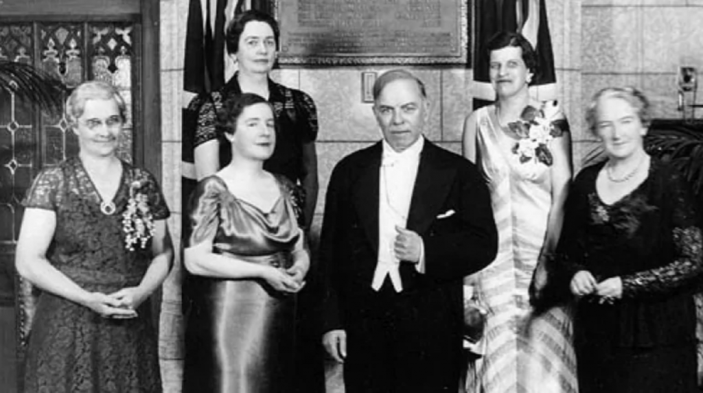
On October eighteenth of 1929, women in Canada were finally declared to fit under the legal definition of “persons”.

This led to the women of Canada being given the opportunity to be appointed by the Senate which then led to women becoming more immersed into Canada’s social and political life.

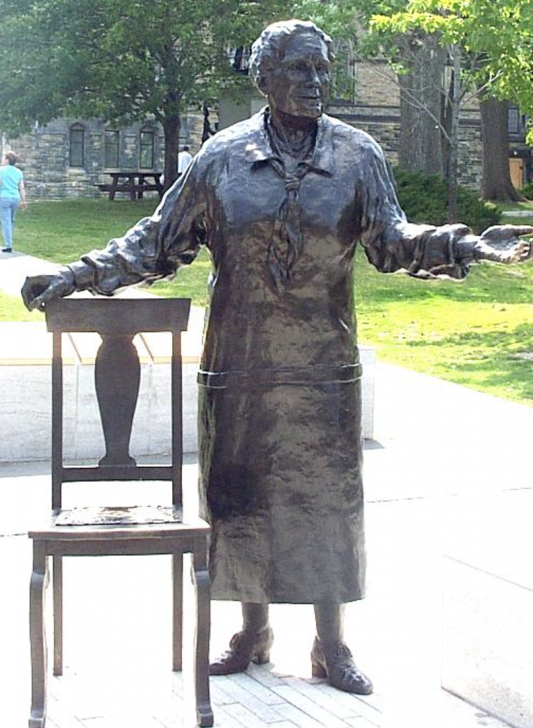
The main reason as to why women today are viewed as human beings rather than objects are mainly thanks to the Persons Case and the “Famous Five”.  

Surprisingly while doing research for this blog post, I learned that prior to the Persons Case, all of Canada besides Quebec allowed any white women over the age of twenty one the ability to vote by 1927.

Now to be considered a ‘qualified person’ back in the twentieth century, one had to be at least thirty years old, had to own a property of at least $4,000 and reside in the province of their appoint.  The ‘rules’ stated in the previous sentence were written as law in the British North America Act of 1867 which is now known as the Constitution Act, 1867.  The Act never specified whether or not women were counted as ‘persons’ so the Canadian government deemed men as the only “persons”.  This group of women were then given the title, the “Famous Five”.

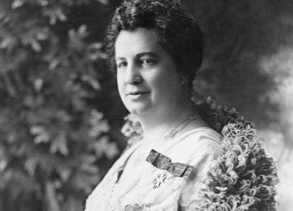
In August of 1927, Canadian women’s rights activist Emily Murphy invited four other women activists, Nellie McClung, Irene Parlby, Louise McKinney and Henrietta Muir Edwards to create a petition to send to the Canadian government.  Their goal was to reinterpret the word “person” shifting the focus from just blatantly men to men and women.  This letter was sent out on August 27, 1927. 

Emily Murphy

This request was denied by the Supreme Court on April 24, 1928.

Although the Famous Five felt defeated but were unwilling to give up, they took their petition up to the Judicial Committee of the Privy Council an even higher authority.  After much deliberation and going back and forth, the Privy Council reversed the Supreme Court’s decision on October 18, 1929.

Prime Minister King poses with Nellie McClung, 2 senators and “Famous Five” family members in front of the tablet unveiled commemorating the “Women as Persons” ruling. 
-Eugene M. Finn

The meant that the word and meaning of “persons” would finally include women in its definition.

Statue of Emily Murphy in the monument to Famous Five, Parliament Hill, Ottawa

https://cfc-swc.gc.ca/commemoration/whm-mhf/persons-personne-en.html

https://www.thecanadianencyclopedia.ca/en/article/persons-case

https://sencanada.ca/en/sencaplus/how-why/why-the-persons-case-matters/

Typography Infographic

I was really excited for this project.

When this project was first announced that I needed to make an infographic poster about the history of typography, I needed to take a step back and thoroughly consider what I wanted to do.

I knew right away I was displeased with the idea of having to go through the entirety of typography history and fit it into one poster so I thought,

‘Why not go over the history of advertisements?’

With that idea in mind, nothing could go wrong.

Until, the burnout hit.  I was pushed into a slump of not wanting to touch this project at all.  It was quite painful, everytime I tried working on iy I would distinctively try to find something to distract me, which of course led to one form or another of procrastination.

I am quite disappointed in myself with this project as I actually was intrigued with what I chose to research but unfortunately I decided to just scratch that idea and make a poster regarding the classifications.  I’d have to say that the final product is fine but it is a big downgrade from what I had in mind.

If I were to evaluate myself I would have to give myself a six out of ten.

If my burnout didn’t hit me at this point I definitely would have done a much better job.

Exhibit Artifact Rationale

Type seen in photo above:

‘The arts and crafts movement founded by william morris was born out of the pure desire for furniture and the entirety of interior design to be viewed at a higher quality.  The luxurious, artistic expression implemented onto the forms of furniture rather than it be a sculpture and/or a painting, it truly shifted the view of art.  ARt did not have to be hung up on a wall, art could be sat on as well.  The idea of creating comfortable and beautiful interiors inspired two young men, Arthur H. Mackmurdo and Selwyn Image.  This inspiration led the two of them to create The Century Guild.’  

There is a saying that goes ‘In every artist’s life, they will always end up working with a chair’.  With that quote in mind, that is exactly what I did.  

The moment this project was announced the first thing I could think of was creating a small model of a piece of furniture-a chair in particular from the Arts and Crafts movement.  The piece that I had in mind as my main form of reference and inspiration for the project was  Arthur H. Mackmurdo’s chair that was created in 1882.

Sadly, I dove head first into this project without thinking and was so immersed in the creation of the chair that I completely forgot to write out the rationale, and so I sit here on the eve of this project being due typing away. If I were to give myself a mark out of ten, visually based off of the sculpture I created I would have to give myself a solid eight since my efforts in creating it were definitely pulled off. On the other hand my research and writing on this project would have to be seven, I believe my process was much quicker and fast paced compared to my peers which has led to my writing coming off as a tad sloppy but still retains the information asked to be featured.

All in all, I thoroughly enjoyed this project.  I felt much less restraint and was happy to work with another art medium that wasn’t paint.

Thank you professor Judy Snaydon for assigning a project that made feel good about my about my art again.

Survey Six; Sigmund’s Dreams

Sigmund Freud – Max Halberstadt
1921

With the release of ‘The Interpretation of Dreams’ in 1899, Sigmund Freud introduced a whole new unexplored portion of the mind that the average person was not aware of.  Freud truly shifted everyone’s perspective of how the mind worked.

One of the most impactful results that came out of the release of Freud’s book was the general public finally gaining a better understanding of mental health and how dreams can be connected to forms of mental illness.  Prior to the release of Freud’s book, the general public were under the belief that mental illness was nothing more than a disease or some sort of tumour that ate away at the brain and could be dealt with by just cutting it out of the body.  ‘The Interpretation of Dreams’ was an introduction to how the dreams that many of us experience have underlying meaning to our unspoken desires and unspoken truths in our life. 

Federica Bordoni – Nautilus Magazine Issue 27

With that, I can’t help but disagree with Freud’s statement.  Freud analyzed himself and only himself for a whole two years and didn’t begin to analyze other people until after he was finally finished with the dissection of his own brain that he studied.  This means that many of the desires that he has described that are reflected in dreams are mainly his own desires that he implemented and assumed that every other person desires as well, which of course is not the case.

Alex Ernst – The Barbarians
1937

‘The Interpretation of Dreams’ was also a catalyst for the surrealist art movement.  The book nor Freud are credited when discussing the art movement today, but he definitely aided in the movement’s birth.  The theories that came out of dreams sparked interest in artists who were determined to break the barriers that surround fine art.  Artists such as Max Ernst, Salvador Dali and Dorothea Tanning took these visions from their subconscious and displayed them onto their canvases for the world to see.

Dorothea Tanning – Birthday
1942

Thanks to the surrealist movement and the painting and visual dissection of many artists’ dreams, this directed me into the dream realm of visual arts.  Many of my paintings from when I was in high school were inspired by dreams that had impacted me.  In some strange way, I can’t help but be glad that Freud impacted the art world so greatly because I thoroughly enjoy discussing dreams with other people and have a love for drawing my dreams out.

Although some of Freud’s beliefs and theories of the mind did not age well, such as his belief that only men can have homoerotic behaviour and if two women display behaviour of such kind, it is deemed as a form of mental illness.  Along with that theory, there were many others that really don’t make sense at all. 

Salvador Dali – Persistence of Time

Freud made a huge impact and improvement in the field of psychology.  His interpretations of dreams, although not accurate for every person, delved into the forms of mental illness and trauma and made it easier for the public to understand rather than be disgusted by.  Psychoanalysis also thoroughly impacted the world of art and aided artists in displaying and exploring the unknown portions of the mind.  All in all, Freud’s ideas still impact us today, for better or for worse.

Citations:
https://www.frontiersin.org/articles/10.3389/fpsyg.2018.01553/full

https://learningenglish.voanews.com/a/a-23-2008-11-17-voa1-83136897/128621.html

https://gdc.net/education/scholarships/jim-rimmer

https://www.verywellmind.com/the-interpretation-of-dreams-by-sigmund-freud-2795855

https://www.invaluable.com/blog/sigmund-freud-influence/

Typography Zine Experience Overview; Bank Gothic

This project had a rocky start to begin with.

My original typeface that I was eager to do my research on was Eckmann but after a good week of trial and error there just wasn’t enough information to fill up six pages of information.

Luckily, I was able to find another typeface that piqued my interest and that was Bank Gothic.  Bank Gothic has this strange futuristic feel that I truly can remember being used around me growing up.

I decided to only use green for the colour as I always associate green with sci-fi or futuristic things as to me green represents laser or the lights used intergalactic spaceships.

If I were to give myself a mark out of ten I would have to give myself a solid seven out of ten.  There are definitely a few visual errors that needed to be covered up in white out which tainted the picture a bit but aside from that I am at peace with this project and glad that I got the opportunity to learn more about an individual typeface on my own.

Citations;

https://www.creativebloq.com/computer-arts/greatest-fonts-countdown-74-bank-gothic-91412896

https://books.google.ca/books?id=woFnDwAAQBAJ&pg=PA46&redir_esc=y#v=onepage&q&f=false

https://www.linotype.com/5323/the-original-squared-sans-redrawn-bank-gothic-and-morris-sans.html

http://typedia.com/explore/typeface/bank-gothic/

https://www.writework.com/essay/significance-bank-gothic

Survey 4: Daguerreotype

The phenomenon of the Daguerreotype truly came as an intimidating surprise.  It slowly made its way up towards the mainstream crowd and once it finally received the well deserved attention it created quite an uproar.

Sixth-plate Daguerreotype of a Man Holding an Infant – Artist and Date Unknown

The burst of popularity the Daguerreotype shocked many due to the fact that instead of needing to pose for hours on end, people and objects could have their photo taken in a mere fifteen minutes.  The phenomenon unfortunately also drove out many popular and up-and-coming portrait artists leading to many of their careers to sadly go down the drain.   Although the topic that is being discussed does not directly correlate to the fashion of clothing it did end up shifting the idea of who held the ability to receive a photograph.  Daguerreotypes became an equalizer among all of the social classes.  Any average person could walk into a portrait studio, sit for an image, and have the same product as the millionaire down the street.  There was no longer any form of likenesses only created for the rich and higher classes.  

Cornelius Conway Felton with his Hat and Coat – John Adams Whipple (early 1850’s)

Daguerreotype came to be in 1839 when Louis-Jacques-Mandé Daguerre collaborated with Nicéphore Niéce.  When Niépce passed away in 1833, this gave Daguerre the opportunity to take full control of the project and gain a better understanding for himself.  Daguerre found that once a copper plate covered with silver iodide was exposed to light in a camera, which was then fumed with mercury vapour and fixed by a solution of common salt, a permanent image would be formed.  With this discovery Daguerre was able to change the world of art and portraiture tremendously.

Fredrick Douglass – Unknown (1855)

Survey 3: Baroque and All of its Nitty Gritty

Prague Window Ornaments

The translation for the word Baroque is to describe something as elaborate or highly detailed.  Baroque embodied this description through the beautiful and breathtaking visuals seen in the design and architecture of the time.  Baroque came to be in Italy as a response of the Catholic Church to the many criticisms that arose during the Protestant Reform in the 16th-century.  This period lasted just over a century and a half and it left a huge mark in the realm of design and world of architecture.

ATTENTION TO DETAIL:

Design and architecture go hand in hand when discussing the Baroque period some of the key characteristics from it that are still used in architecture, media and design today.  Some of the key factors in Baroque design was the exaggeration of clarity and movement; an extended hand would be transformed into an outstretched arm with every single joint in the hand curled in on an emphazed hand.  Nothing looked as if it were out of place and everything was placed meticulously in order.

Prague Window Ornaments up close

THE BODY OF A BUILDING:

One of the most noticeable characteristics when looking upon any of the architectural masterpieces built during the Baroque period is that they all include this sense of drama and grandeur.  The buildings always have a high peak and wide frame.  An almost perfect example of these characteristics would be St Nicholas Church designed by Kilian Ignaz Dientzenhofer and Christoph Dientzenhofer.

Exterior of St. Nicholas Church
Interior of St. Nicholas Church

BAROQUE’S INFLUENCE TODAY:

Today for graphic designers and illustrators in particular they have a leverage when taking inspiration from famous artistic periods; with them quite simply only needing to go through a generous amount of research and then creating their ‘Baroque’ themed/inspired piece.  Many designers will take inspiration from natural details of leaves or small rosettes and florals around the border or incorporated into the typography.  Steve Goodin takes the curving leaves from the period and decorates it around this gloomy coloured poster and gives it a form of liveliness with these curling leaves looking as if they’re on the move.  Dana Tanamachi also exhibits the Baroque style as well but a tad bit more subdued, there are no curving leaves but I believe that she displays a feeling of Baroquesque detailing.

by Steve Goodin
by Dana Tanamachi

The Baroque period last a long one hundred and fifty years and it left nothing but immaculate detailing and inspired artists (designers and architects alike) to go in full detail and this has shown future generations that every little detail matters.

The Mood Board – 141

At some point in one’s life, a person shall be in the position holding the title ‘Guinea Pig’.  My classmates and I were given this position for a new assignment. Although there is nothing wrong with being the first to work on or experience a new project, there comes a problem where there are examples present to help gain a better grasp of the assignment itself.  The lack of examples was understandable but I spent quite a bit of time re-reading the brief but was met with nothing but confusion.  The project due date was rescheduled (which I shall be forever thankful for) but the revisions that occurred during the week brought on only more stress.  I was so full of stress and confusion that by the end of it I had just given up and threw it all together. InVision also had some problems especially if you place something in the wrong place, there was no undo button so I had to move everything around all over again.

 This project deserves a four out of ten because I truthfully am unhappy with what I’ve created.  The mood board feels so plain and lacks any form of distinguishable flavour and my voice is buried underneath facts.  I was under the belief that all the topics I had chosen were what I was thoroughly interested in but alas-as I write these words in the early hours in the morning, I am wrong about what I am intrigued by once again. I enjoyed the research aspect of this project but my procrastination got the best of me and sadly I was unable to finish this project fully.

Here is the link to my InVision Moodboard: https://michellelussier592965.invisionapp.com/board/141—Survey-4-ckg8szzau0pqj16v9x9v49378

References:

https://www.diplomatie.gouv.fr/en/coming-to-france/france-facts/symbols-of-the-republic/article/the-french-flag

https://ir.una.edu/cgi/viewcontent.cgi?article=1047&context=nahr

https://www.history.com/topics/france/french-revolution

https://www.britannica.com/topic/flag-of-France

https://unframed.lacma.org/2016/08/03/french-revolutionary-fashion

https://www.history.com/this-day-in-history/napoleon-crowned-emperor

https://www.britannica.com/technology/daguerreotype

https://photofocus.com/photography/lasting-impacts-of-the-daguerreotype/#:~:text=Daguerreotypes%20became%20an%20equalizer%20among,gave%20rise%20to%20picture%20factories.

Art Nouveau; The Beauty That Came Out of It

As the Industrial Revolution came to an end, a new period emerged; a period that many consider to have been the very first ‘modern style’.  Art Nouveau began in 1890 and ended in 1915, yet in the short thirty-five years of the period’s prime it was able to create such a large impact on those involved and still impacts those in the present day. 

The period of Art Nouveau mainly influenced those whose careers led down the artistic route, specifically those in architecture and design.

Casa Batllo – 1877
Antoni Gaudi

Architects were able to play with the idea of these sculpturesque buildings just as the style of expressing oneself and their own creative fantasies had become extremely popular. Architects in particular took their expressions to another level of intricacy.  Antoni Gaudi’s name sticks out like a sore thumb out of the architects from that period, as his work on the ‘Casa Batllo’ is one of the most well-known pieces of architecture to the general public.  The architecture of this period was almost creature-like; the rounded windows and smooth exterior having an almost skin like texture.  The colours and carvings that were used so beautifully and so intricately that it truthfully saddens me that it’s so rare to find a designer and/or architect willing to take on the challenge of creating another beautiful structure welcoming its guests in with wide open doors.

Secession Building – 1897-98
Joseph Maria Olbrich

When the Art Nouveau period emerged in the late 1800s, many designers took this as an opportunity to finally experiment with their own styles. Designers saw this opportunity as a clean slate, to break from traditional media and erase it all and enter an entirely new and unique style. Multiple names from this period could be listed off if you asked an art history lover; Gustav Klimt, Egon Schiele, Aubrey Beardsley and so many more. 

The Kiss – 1907-08
Gustav Klimt
The Rose – 1898
Alphonse Mucha

Alphonse Mucha in particular is one of the few artists from the period whose work has truthfully moved me.  Mucha’s style of thick lining around the centre figure and barely textured skin in particular, mesmerizes the viewer and truly draws them in. 

The response to what the industrial revolution that occurred years before may not have been a perfect response, but it was a beautiful one.

References:

https://www.metmuseum.org/toah/hd/artn/hd_artn.htm

http://www.visual-arts-cork.com/history-of-art/art-nouveau.htm

https://design.tutsplus.com/articles/what-is-art-nouveau–cms-31579

The Yearbook Spread

Trying to explain oneself and leave a positive lasting first impression on one’s peers is quite an intimidating project to start off with.  Even the idea of making a project only revolving around me, I can’t help but shudder in disgust. Talking about myself is one of my least favourite things to do when introducing myself to new people.  Unsurprisingly, due to the fact that I dread discussing myself, I procrastinated this project up until the very last few days. 

I brainstormed what I enjoy, the particular colours that revolve around a strawberry-my favourite fruit and built up my piece from there.  When thinking of a strawberry and the feelings it brings to me personally, I always feel soft and my mind sometimes feels like it melts in content when consuming them.  The fat teardrop shapes are a recurring shape that I have been drawing since I was young. No matter what, the action of drawing these loose shapes always calms me down. 

The set up and placement of the featured categories seem all over the place but not in a good way.  Although I enjoy the colour palette, the multiple warm tones used to create this piece make it a bit rough on the eyes.  This piece feels almost too cluttered even though the teardrops work well together. The portrait of my face almost seems out of place and should definitely be much closer to my name to help the viewer move through the spread rather than have to jump from one section to the next.  This project deserved time, love and care all of which I did not provide.   This project definitely stands at a strong six out of ten.  The colour palette I chose is very pleasing but the set up and placement of everything is just too messy.

Although my view on the final product of this project is more negative than positive, I am glad that I got to create something that didn’t end up going my way. This project has reminded me that I still don’t enjoy talking about myself but it also let me experience the sensation of frustration and stress that I have not felt in a long time, it was nice.

Thank you.

-Michelle Lussier