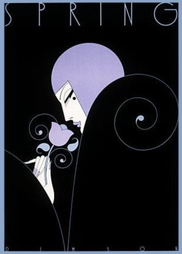
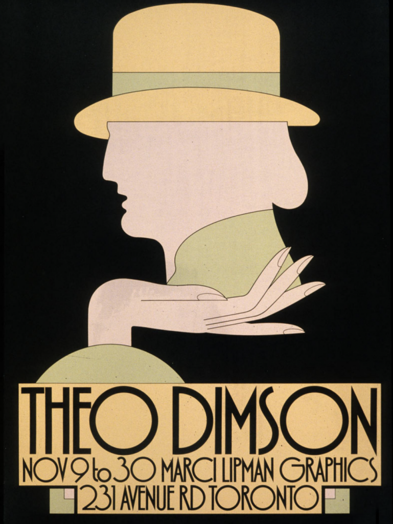
Theo Dimson captured my heart with his minimal figures and lovely usage of colour.
Born in London, Ontario and grown up around comics books and magazines, DImson became enamoured with design at a very early age. Dimson was given a scholarship to attend the Ontario College of Art and Design, which he later graduated from in 1950.
After working as president and director of Reeson Dimson & Smith LTD for over a decade, Dimson made the decision to make his own company Dimson Designs Inc. in 1985, where he was president and creative director of the company.
Now I’d like to move on to Dimson’s illustration style. It required very little detail but has the perfect ability for the viewer to understand the point of the image right away. Personally something that I wish I would be able to have the ability to execute.
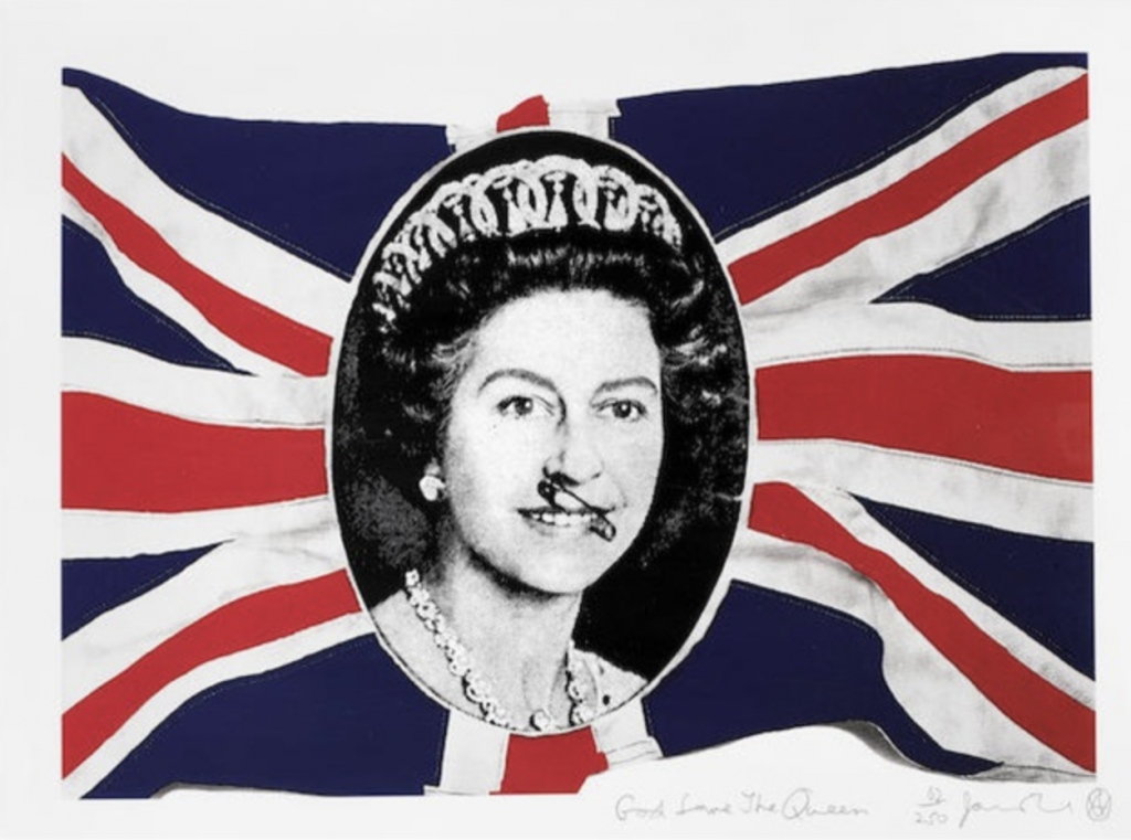
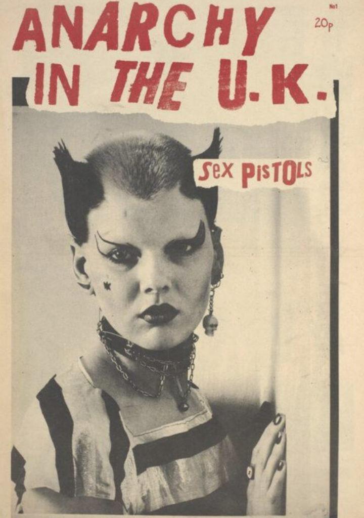
Jamie Reid was born in the United Kingdom in 1947 and is most well known for his ransom note-esque decollage pieces.
His most famous works would have to be covers that Reid made for the Sex Pistols albums ‘Never Mind the Bollocks’ and ‘Here’s the Sex Pistols’ alongisde covers for their singles, ‘God Save the Queen’ and ‘Anarchy in the U.K.’
Reid’s cover art helped define the aesthetic of the British punk movement of the 1970’s with its faux ransom note letters and iconic defecements of pop culture and natinalistic images.
Today, Reid’s work can be found at the Museum of Modern Art in New York, the Albert Museum in London and the Tate Gallery in London, among others.
Robert Venturi & Denise Scott Brown have been regarded as some of the most influential architects of the twentieth century.
The Vanna Venturi House – 1964
The couple met each other while teaching at University of Pennsylvania in 1960 and got married in 1967, Scott Brown joined Venturi’s firm in 1969, at the time named Venturi and Raunch as partner in charge of planning.
Children’s Museum of Houston -1992
Robert Venturi and Denise Venturi and Scott Brown both critical of the modernist doctrine that was being displayed in architecture at the time. The two wanted more electric architecture that integrated historic references into their work, a “gentle manifesto” which formed the basis for postmodernism.
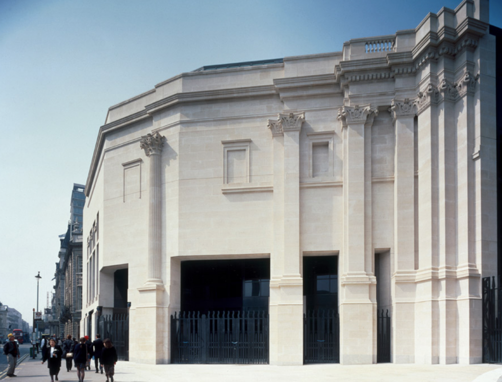
Sainsbury Wing – 1991
As someone who considered becoming an architect when they were younger, these two alongside Frank Gehry were huge inspirations for me. They held the ability to incorporate their art and talent into their works.
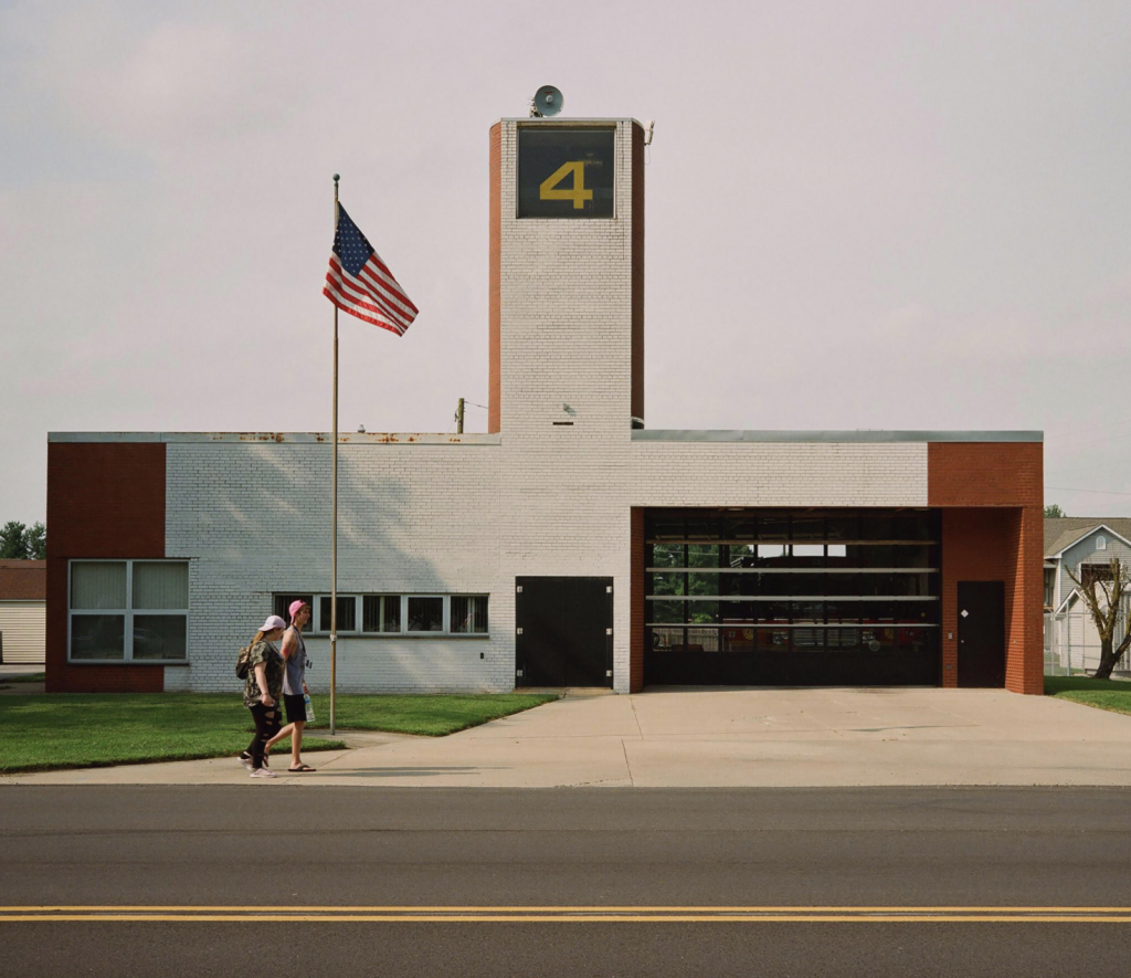
Fire Station #4 – 1968
As a young teen surrounded by grey block buildings with the prettiest buildings in town being skyscrapers with super reflective windows, Venturi and Scott Brown’s architecture made me realize that good architecture isn’t just a tall building with shiny windows, it’s so much more than that.
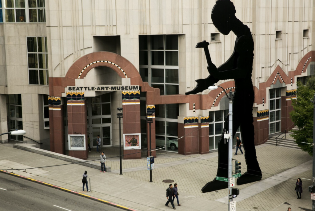
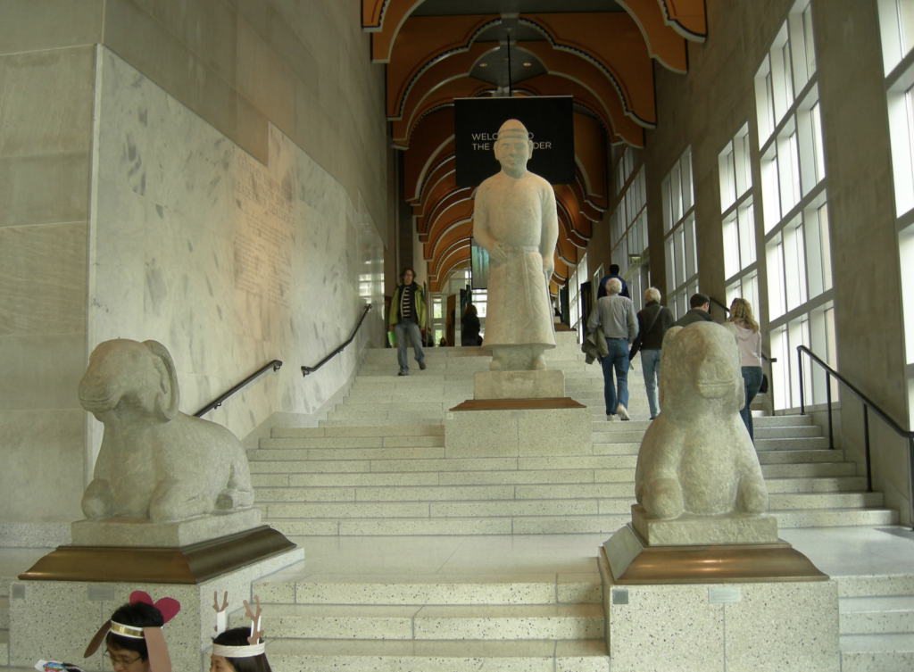
Seattle Art Museum – 1991
Fun Fact! A security guard yelled at me when I was ten for petting the ram sculptures lol
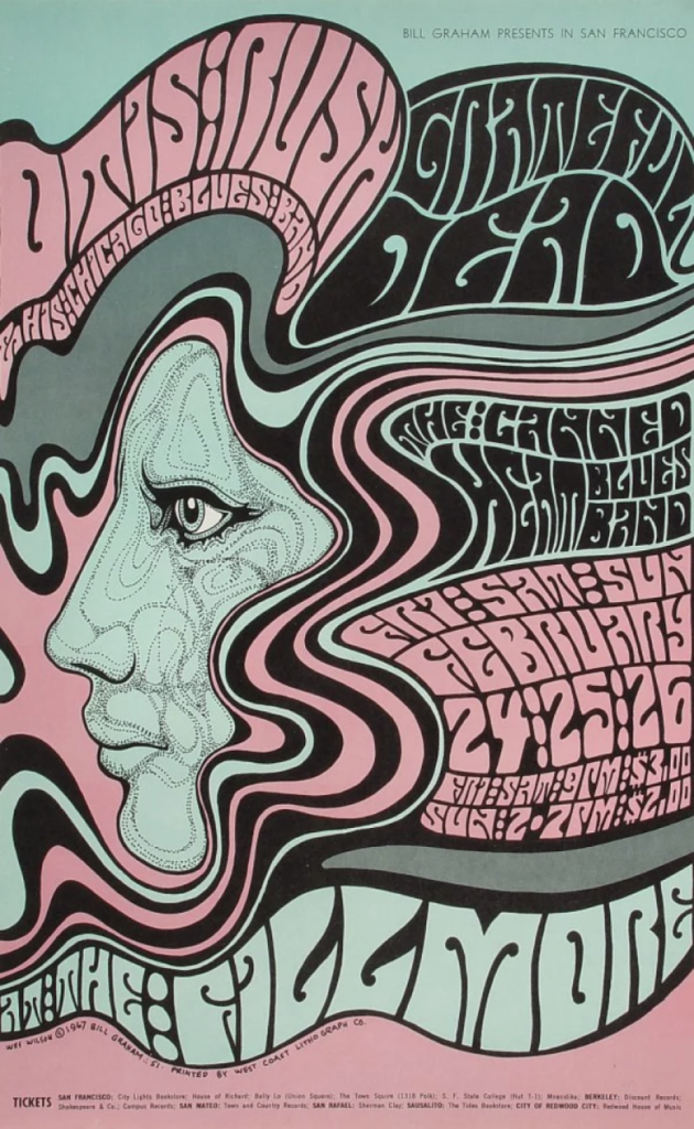
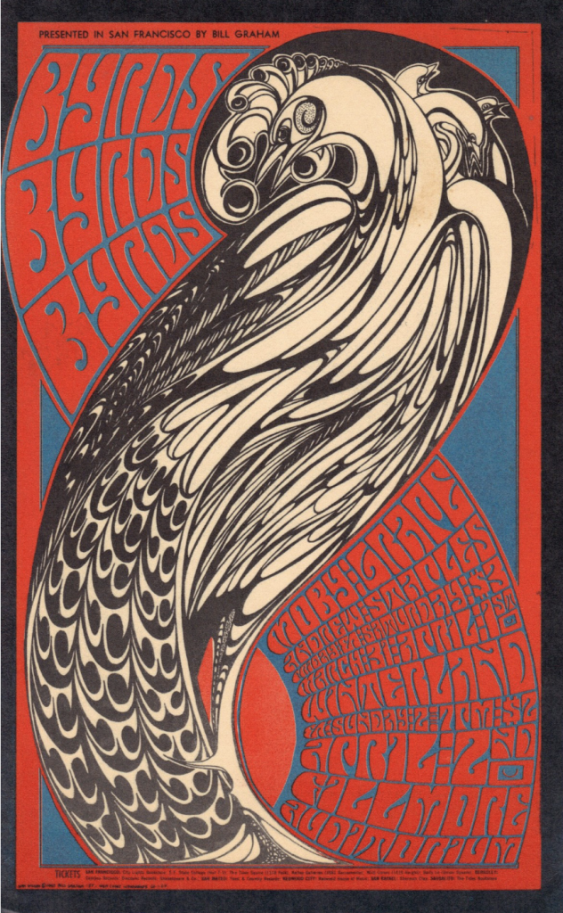
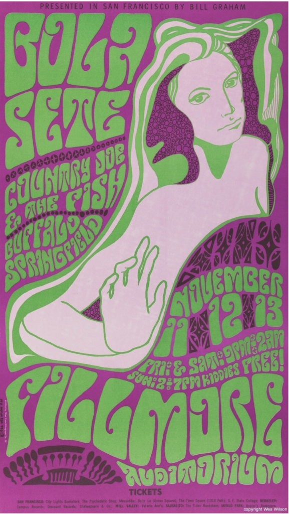
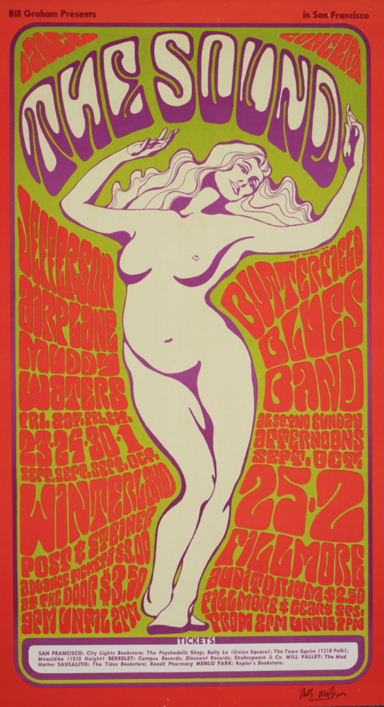
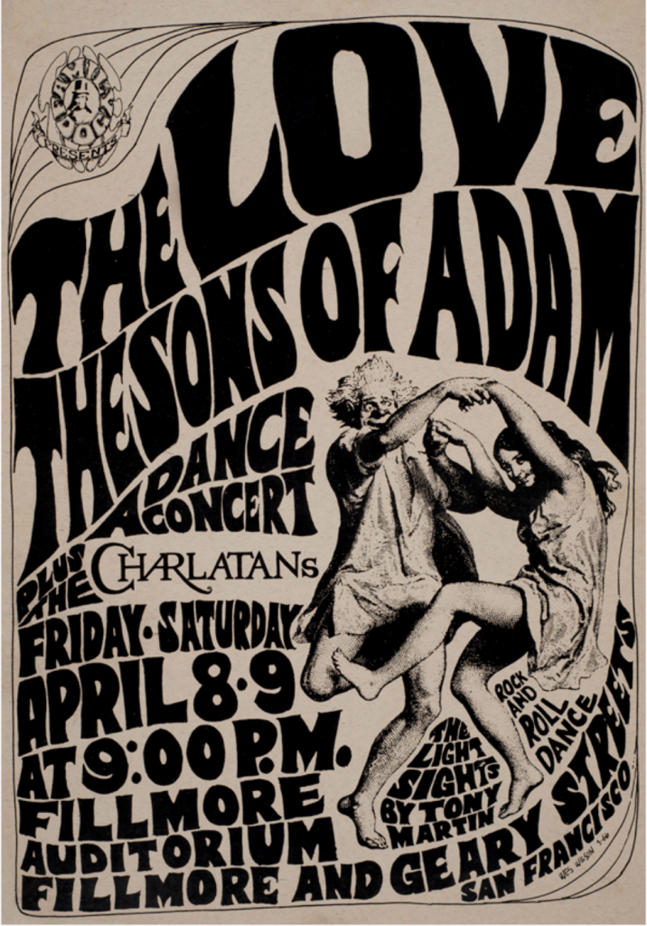
Wes Wilson is regarded as one of the psychedelic pioneers of the ‘60s .
Wilson attended San Francisco State University and while attending the university, Wilson worked at a small printing press. At that small press was where Wilson’s career as a psychedelic poster artist would take off.
Wilson mainly designed layouts for pamphlets and flyers which eventually led him to become an established poster designer. When the Fillmore Auditorium began to hold weekly concerts, Wilson was asked to design posters for them. Wilson designs for the auditorium were fresh and vibrant and so addictive that other artists decided to replicate his style in their own work.
Wilson was able to create such hypnotic imagery by intertwining his experiences with LSD and his experience as a printer together, Wilson also drew many of his inspirations from the Art Nouveau masters. I find it quite fascinating, today drugs are looked down upon as it is more common for them to be laced with something fatal but decades ago it seems that wasn’t as large as a problem.
As Wilson’s career continued to peak, he began to grow disillusioned by all the financial opportunities and his career as a poster artist. The disillusionment grew to be so overwhelming that he decided to move out of the city to live on a farm in Missouri Ozarks. This does not mean he lost his love for poster art though, just that Wilson lost interest in the competitive, ever growing field of business.
Sadly Wilson passed away last year on January 24, 2020. Wes Wilson and his art will forever be looked back on as someone who was able to define his generation.
When Herb Lubalin comes to mind there’s only one word that I can think of, and that word is ‘classic’.
Herb Lubalin was a well known American graphic designer most well known for his gorgeous typographic style. Lubalin was able to bring a unique beauty and creative vibe to his typography. He was the creator of many lovely typefaces such as ITC Avant Garde, Pistilli Roman, Receding Hairline NF and many others.
Lubalin studied at the Cooper Union for the Advancement of Science and Art and graduated in 1939. After graduating, Lubalin worked at Sudler & Hennessey for 19 years. In 1964, he left Sudler & Hennessey to create his own company, Herb Lubalin Inc.
Lubalin collaborated with Ralph Ginzburg on three of Ginzberg’s magazines: Eros, Fact and Avant Garde.
All in all, I think that Herb Lubalin’s classic style is gorgeous and the general public should definitely appreciate it more.
On October eighteenth of 1929, women in Canada were finally declared to fit under the legal definition of “persons”.
This led to the women of Canada being given the opportunity to be appointed by the Senate which then led to women becoming more immersed into Canada’s social and political life.
The main reason as to why women today are viewed as human beings rather than objects are mainly thanks to the Persons Case and the “Famous Five”.
Surprisingly while doing research for this blog post, I learned that prior to the Persons Case, all of Canada besides Quebec allowed any white women over the age of twenty one the ability to vote by 1927.
Now to be considered a ‘qualified person’ back in the twentieth century, one had to be at least thirty years old, had to own a property of at least $4,000 and reside in the province of their appoint. The ‘rules’ stated in the previous sentence were written as law in the British North America Act of 1867 which is now known as the Constitution Act, 1867. The Act never specified whether or not women were counted as ‘persons’ so the Canadian government deemed men as the only “persons”. This group of women were then given the title, the “Famous Five”.
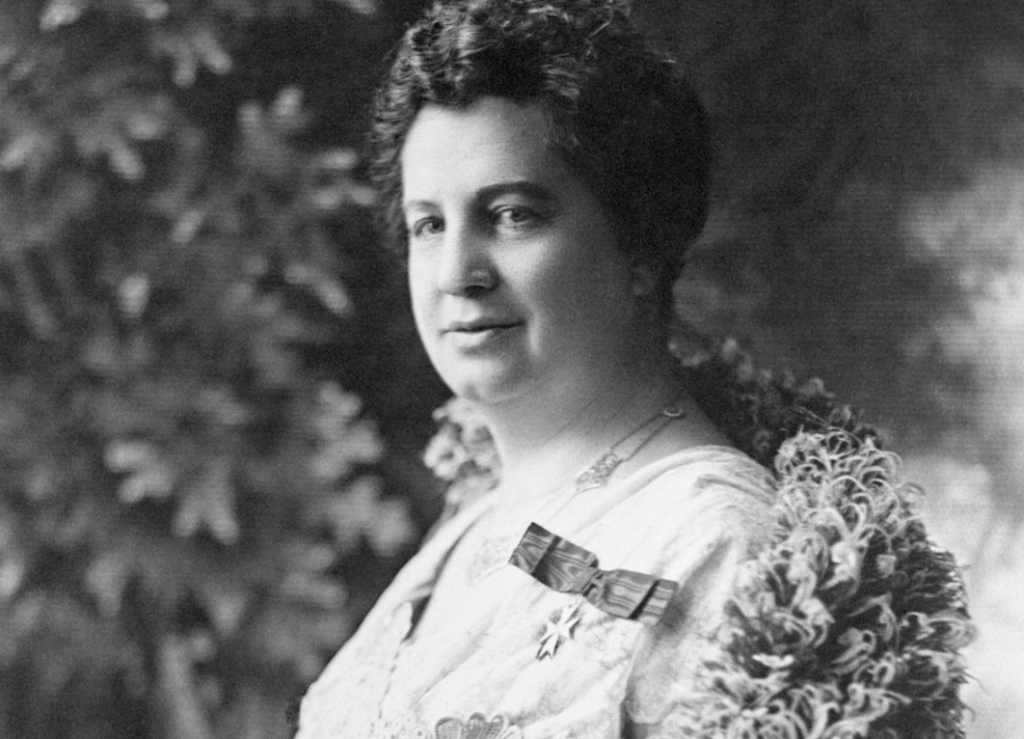
In August of 1927, Canadian women’s rights activist Emily Murphy invited four other women activists, Nellie McClung, Irene Parlby, Louise McKinney and Henrietta Muir Edwards to create a petition to send to the Canadian government. Their goal was to reinterpret the word “person” shifting the focus from just blatantly men to men and women. This letter was sent out on August 27, 1927.
Emily Murphy
This request was denied by the Supreme Court on April 24, 1928.
Although the Famous Five felt defeated but were unwilling to give up, they took their petition up to the Judicial Committee of the Privy Council an even higher authority. After much deliberation and going back and forth, the Privy Council reversed the Supreme Court’s decision on October 18, 1929.
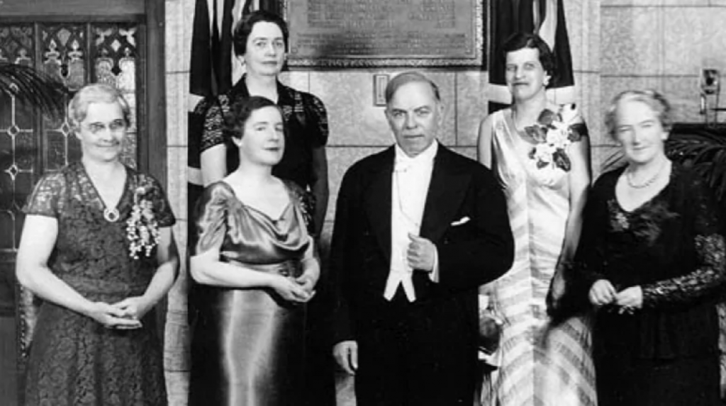
Prime Minister King poses with Nellie McClung, 2 senators and “Famous Five” family members in front of the tablet unveiled commemorating the “Women as Persons” ruling. -Eugene M. Finn
The meant that the word and meaning of “persons” would finally include women in its definition.
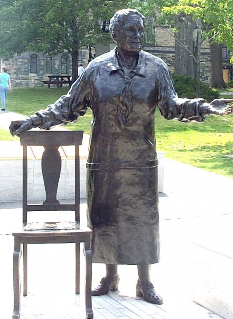
Statue of Emily Murphy in the monument to Famous Five, Parliament Hill, Ottawa
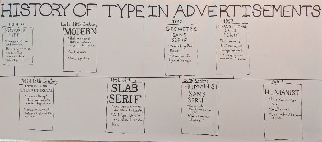
When this project was first announced that I needed to make an infographic poster about the history of typography, I needed to take a step back and thoroughly consider what I wanted to do.
I knew right away I was displeased with the idea of having to go through the entirety of typography history and fit it into one poster so I thought,
‘Why not go over the history of advertisements?’
With that idea in mind, nothing could go wrong.
Until, the burnout hit. I was pushed into a slump of not wanting to touch this project at all. It was quite painful, everytime I tried working on iy I would distinctively try to find something to distract me, which of course led to one form or another of procrastination.
I am quite disappointed in myself with this project as I actually was intrigued with what I chose to research but unfortunately I decided to just scratch that idea and make a poster regarding the classifications. I’d have to say that the final product is fine but it is a big downgrade from what I had in mind.
If I were to evaluate myself I would have to give myself a six out of ten.
If my burnout didn’t hit me at this point I definitely would have done a much better job.
She is the epitome of a woman who is happy with what she is accomplishing in life and is thriving.
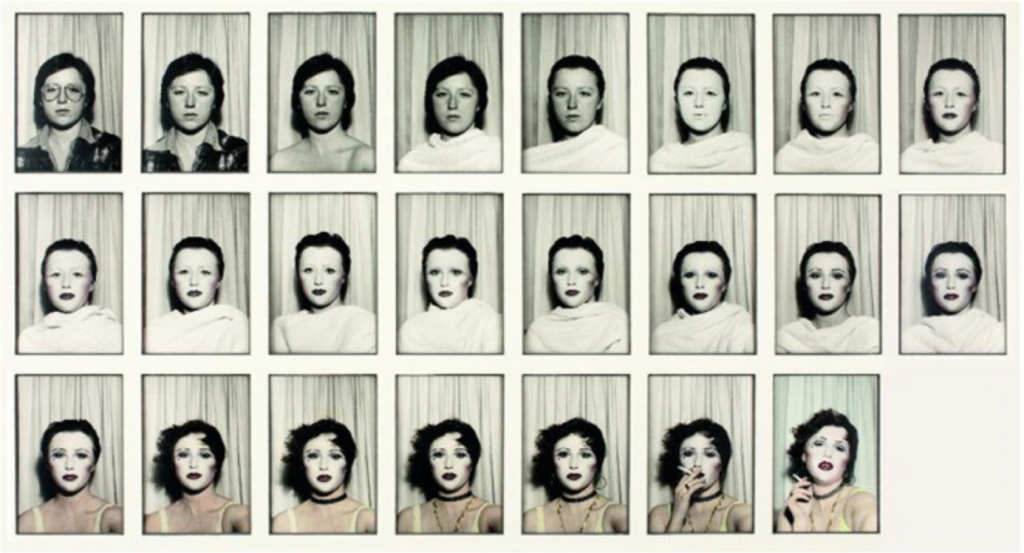
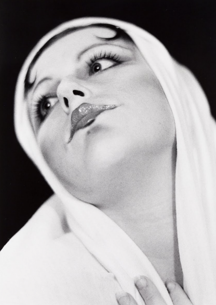
Cindy Sherman is one the most important photographers alive today. Almost the entirety of Sherman’s collection of photography are self portraits, but what differentiates Sherman’s work from others is her fantastic use of costume and make-up.
Untitled (#479) – 1975
Untitled (#354) – 2000
Her passion for costumes stems from her childhood when playing dress up. She didn’t dress up to become a ballerina or a princess, in fact her perspective of dress up was to entirely change the way she was viewed and really wanted to change the angles of her face to become something different.
Sherman has stated that during her shooting process she rarely has an intent on how her audience shall react. The only time this statement was not true was during the late 1980’s and early 1990’s, when the resurgence of painting became mainstream again. Sherman was struggling to make her big break as male artists were given all the attention and praise. With all of the praise being given to the men, Sherman grew frustrated with the fact that her work was being overlooked and so she chose to retaliate in her own way; photos.
Untitled (#175) – 1987
Untitled (#308) – 1994
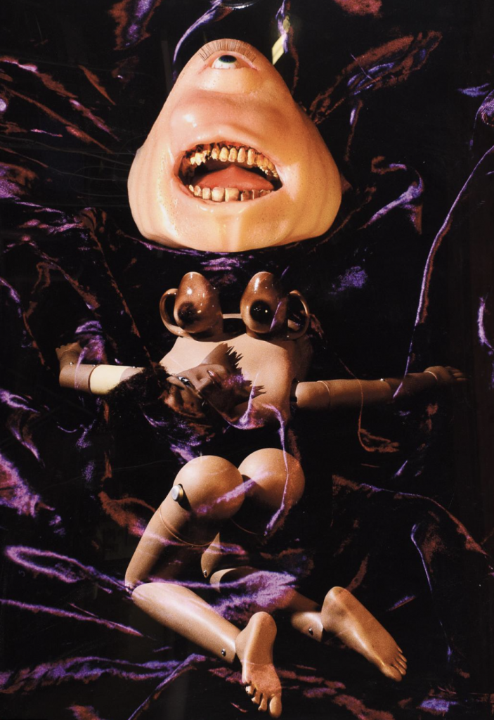
I was extremely lucky to go see her work earlier this year at the Vancouver Art Gallery, her larger than life photographs truly left in awe. Surprisingly the photos that truly made me feel the most emotion were her photos using prosthetics and dolls. The way that she placed the dolls in suggestive or almost victim like positions thoroughly made me freeze in shock-I was unable to move or even look away.
Untitled (#424) – 2004
Cindy Sherman is such a genuine artist, she makes art that challenges the audience alongside creating pieces just for her own personal thrill, a good balance between the two.
Duchamp Plays John Cages in Toronto – 1968 Unknown
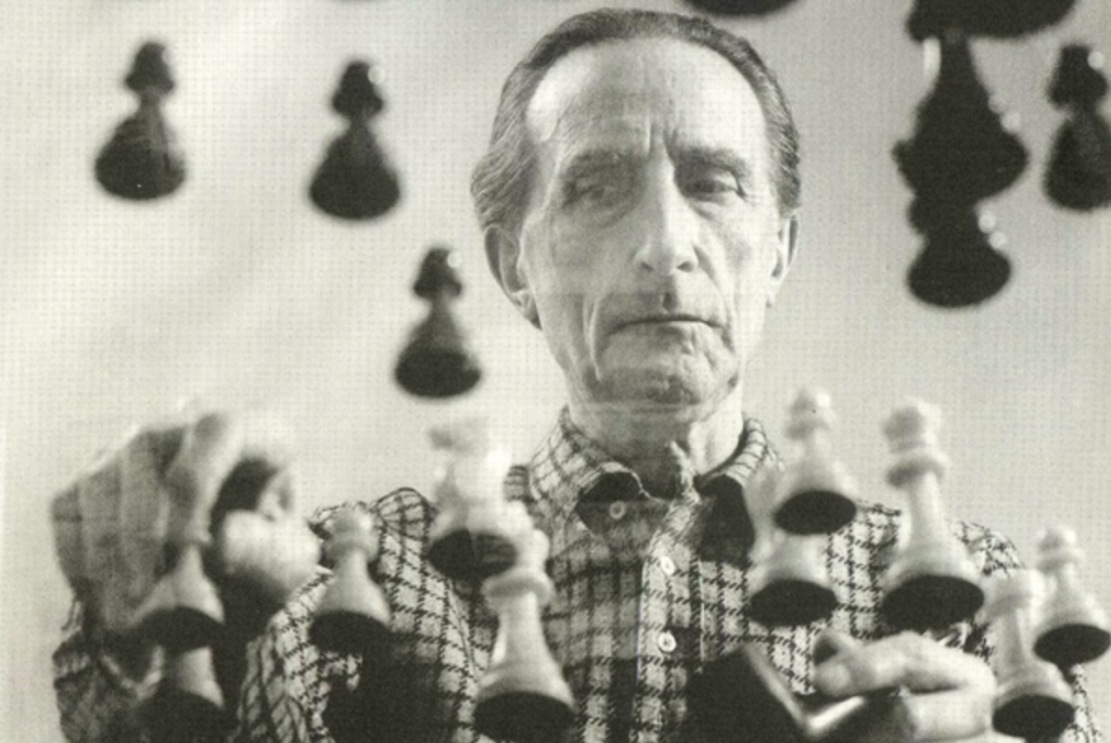
Marcel Duchamp who was originally a painter-his first piece that gained a large amount of fame being the painting “Nude Descending a Staircase, No.2” (1912). After 1912 though, Duchamp’s work in paintings decreased greatly and found his true passion; readymades.
Nude Descending a Staircase, No.2 – 1912
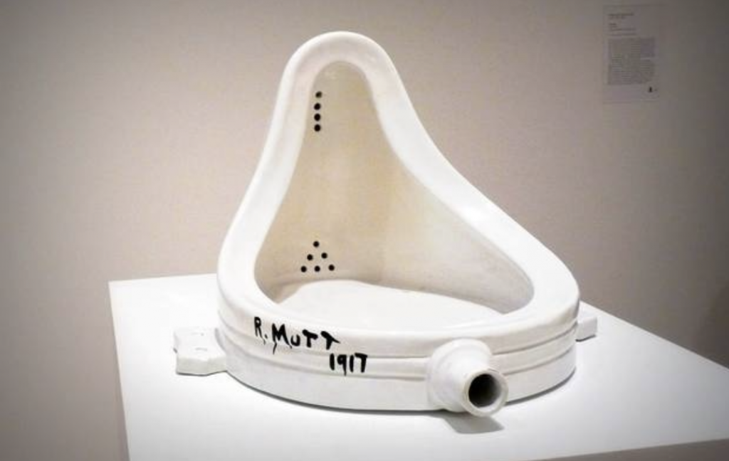
Fountain – 1917
His well known piece from his collection of readymades would have to be “Fountain”, a urinal flipped upside down which Duchamp had submitted to an exhibition of the Society of Independent Artists in New York.
Unsurprisingly a huge controversy arose out of this, many criticizing Duchamp’s work as an assault to the conventional understanding of the nature and status of art.
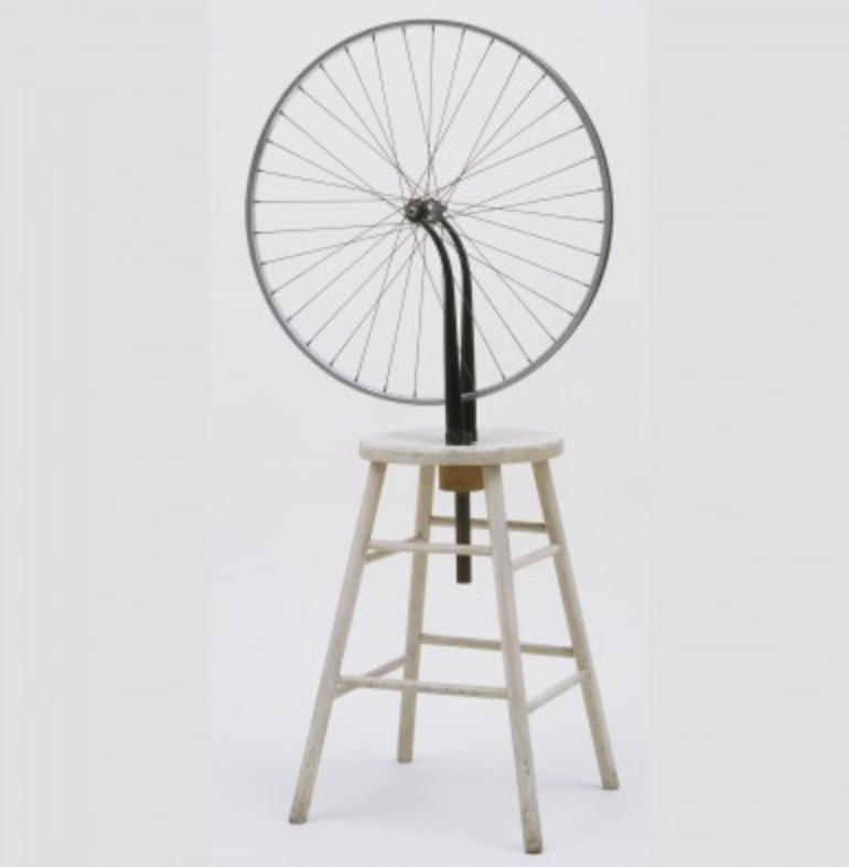
Bicycle Wheel -1913
Duchamp’s work will always have divided views, considering the majority of his work being ignored by the public until the avant-garde movement of the 1960’s where groups such as the Surrealists deemed his work as important. Although in the Surrealists’ eyes he was important, critics and “official” art circles still say nothing but a failure of an artist.
In Advance of the Broken Arm – 1915
Although Duchamp viewed himself as an artist and anti-artist at the same time and with that, he is considered to be one of the leading artists of the twentieth century.
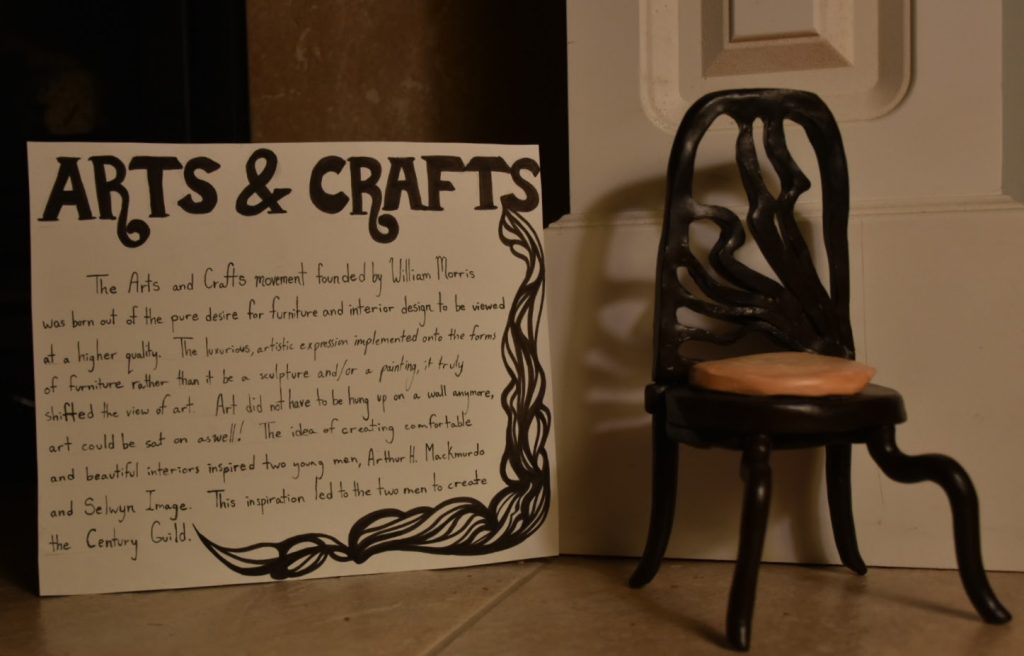
‘The arts and crafts movement founded by william morris was born out of the pure desire for furniture and the entirety of interior design to be viewed at a higher quality. The luxurious, artistic expression implemented onto the forms of furniture rather than it be a sculpture and/or a painting, it truly shifted the view of art. ARt did not have to be hung up on a wall, art could be sat on as well. The idea of creating comfortable and beautiful interiors inspired two young men, Arthur H. Mackmurdo and Selwyn Image. This inspiration led the two of them to create The Century Guild.’
There is a saying that goes ‘In every artist’s life, they will always end up working with a chair’. With that quote in mind, that is exactly what I did.
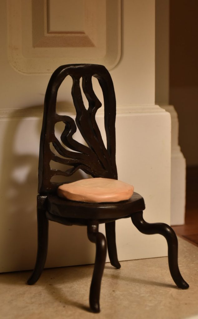
The moment this project was announced the first thing I could think of was creating a small model of a piece of furniture-a chair in particular from the Arts and Crafts movement. The piece that I had in mind as my main form of reference and inspiration for the project was Arthur H. Mackmurdo’s chair that was created in 1882.
Sadly, I dove head first into this project without thinking and was so immersed in the creation of the chair that I completely forgot to write out the rationale, and so I sit here on the eve of this project being due typing away. If I were to give myself a mark out of ten, visually based off of the sculpture I created I would have to give myself a solid eight since my efforts in creating it were definitely pulled off. On the other hand my research and writing on this project would have to be seven, I believe my process was much quicker and fast paced compared to my peers which has led to my writing coming off as a tad sloppy but still retains the information asked to be featured.
All in all, I thoroughly enjoyed this project. I felt much less restraint and was happy to work with another art medium that wasn’t paint.
Thank you professor Judy Snaydon for assigning a project that made feel good about my about my art again.