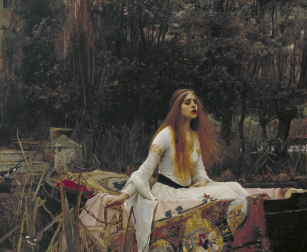
Pale skin, bright hair and in depth detailed faces that illustrate such emotion on a piece of canvas. John William Waterhouse’s depictions of women being portrayed in such romantic and melancholic scenes are so touching to my heart.
The Lady of Shallot – 1888
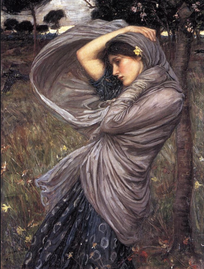
Waterhouse was an English painter during the Victorian era, his specialty most well known are his large-scale paintings of classical mythological subjects. There is some sort of underlying emotion that lays beneath his paintings, be it the slightly pale glow that illuminates his figures or the distinct longing look in each of his subjects eyes.
In the beginning of Waterhouse’s artistic career he pursued sculpture while studying at the Royal Academy in London. In 1874 he shifted his major to painting, ‘Sleep and His Half-Brother Death’ being one of the earliest pieces that made Waterhouse realize his potential in the field of painting.
Boreas – 1903
Waterhouse’s pieces knew how to pull at the strings of the mind and knew how to make melancholy so beautiful.
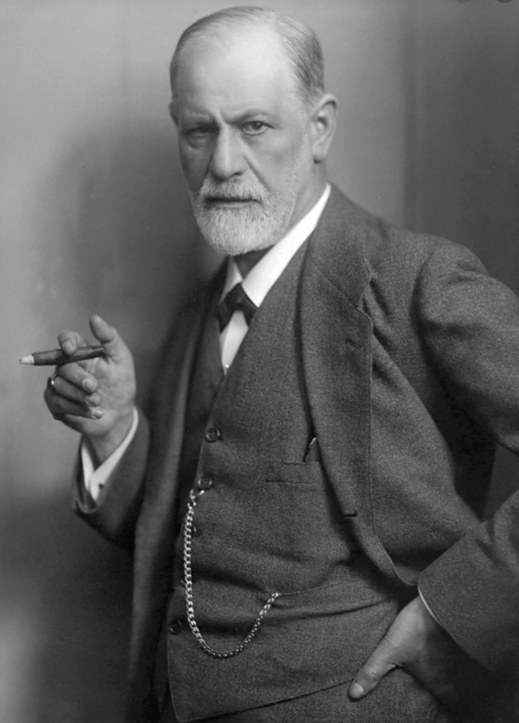
With the release of ‘The Interpretation of Dreams’ in 1899, Sigmund Freud introduced a whole new unexplored portion of the mind that the average person was not aware of. Freud truly shifted everyone’s perspective of how the mind worked.
One of the most impactful results that came out of the release of Freud’s book was the general public finally gaining a better understanding of mental health and how dreams can be connected to forms of mental illness. Prior to the release of Freud’s book, the general public were under the belief that mental illness was nothing more than a disease or some sort of tumour that ate away at the brain and could be dealt with by just cutting it out of the body. ‘The Interpretation of Dreams’ was an introduction to how the dreams that many of us experience have underlying meaning to our unspoken desires and unspoken truths in our life.
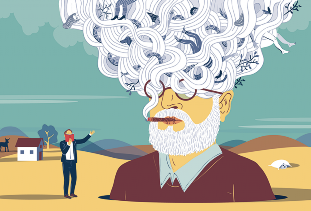
Federica Bordoni – Nautilus Magazine Issue 27
With that, I can’t help but disagree with Freud’s statement. Freud analyzed himself and only himself for a whole two years and didn’t begin to analyze other people until after he was finally finished with the dissection of his own brain that he studied. This means that many of the desires that he has described that are reflected in dreams are mainly his own desires that he implemented and assumed that every other person desires as well, which of course is not the case.
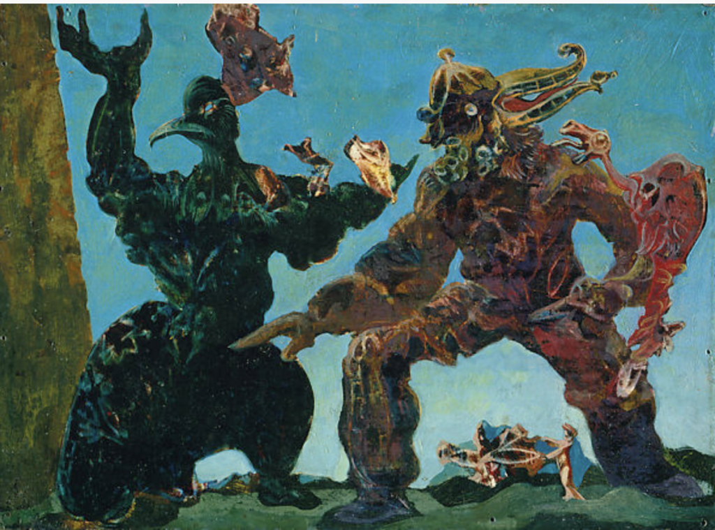
Alex Ernst – The Barbarians 1937
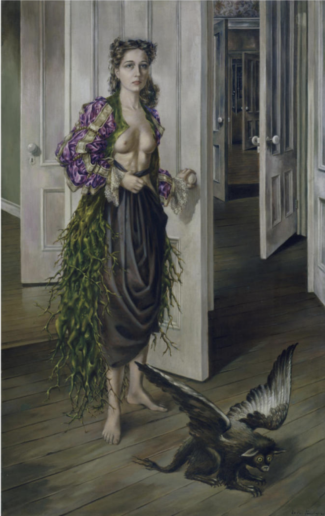
‘The Interpretation of Dreams’ was also a catalyst for the surrealist art movement. The book nor Freud are credited when discussing the art movement today, but he definitely aided in the movement’s birth. The theories that came out of dreams sparked interest in artists who were determined to break the barriers that surround fine art. Artists such as Max Ernst, Salvador Dali and Dorothea Tanning took these visions from their subconscious and displayed them onto their canvases for the world to see.
Dorothea Tanning – Birthday 1942
Thanks to the surrealist movement and the painting and visual dissection of many artists’ dreams, this directed me into the dream realm of visual arts. Many of my paintings from when I was in high school were inspired by dreams that had impacted me. In some strange way, I can’t help but be glad that Freud impacted the art world so greatly because I thoroughly enjoy discussing dreams with other people and have a love for drawing my dreams out.
Although some of Freud’s beliefs and theories of the mind did not age well, such as his belief that only men can have homoerotic behaviour and if two women display behaviour of such kind, it is deemed as a form of mental illness. Along with that theory, there were many others that really don’t make sense at all.
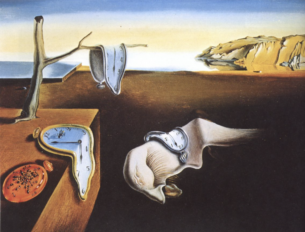
Salvador Dali – Persistence of Time
Freud made a huge impact and improvement in the field of psychology. His interpretations of dreams, although not accurate for every person, delved into the forms of mental illness and trauma and made it easier for the public to understand rather than be disgusted by. Psychoanalysis also thoroughly impacted the world of art and aided artists in displaying and exploring the unknown portions of the mind. All in all, Freud’s ideas still impact us today, for better or for worse.
My original typeface that I was eager to do my research on was Eckmann but after a good week of trial and error there just wasn’t enough information to fill up six pages of information.
Luckily, I was able to find another typeface that piqued my interest and that was Bank Gothic. Bank Gothic has this strange futuristic feel that I truly can remember being used around me growing up.
I decided to only use green for the colour as I always associate green with sci-fi or futuristic things as to me green represents laser or the lights used intergalactic spaceships.
If I were to give myself a mark out of ten I would have to give myself a solid seven out of ten. There are definitely a few visual errors that needed to be covered up in white out which tainted the picture a bit but aside from that I am at peace with this project and glad that I got the opportunity to learn more about an individual typeface on my own.
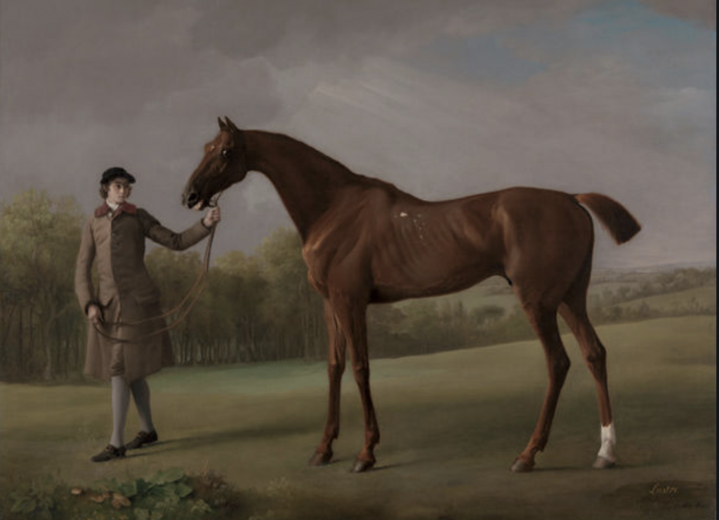
If I were to ask you to describe George Stubbs in one word, almost every single person would say; Horse.
Lustre, Held By a Groom (1762)
George Stubbs’ most famous pieces of art revolved around horses, these magnificent beasts that humanity had somehow gained the ability to tame. Stubbs was mainly self taught although he was apprenticed for a short time by an unknown artist but all in all, Stubbs educated himself on the art of painting. Stubbs’ work fell in between the Neoclassicism and Romanticism eras.
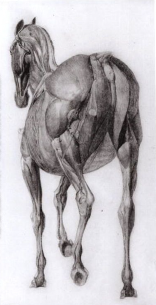
Study No.7 – The Anatomy of a Horse (1766)
Study No.8 – The Anatomy of a Horse’s Body (1766)
In the 1750’s Stubbs dived into and dedicated himself to studying the analysis of the horse’s anatomy. After eighteen grueling months in a farmhouse in a remote town in Lincolnshire, Stubbs finally came out victorious having perfected the form of the horse.
Horse Frightened By a Lion (1770)
After moving to London, Stubbs gained popularity and established a name for himself in the portraiture aspect of horses.
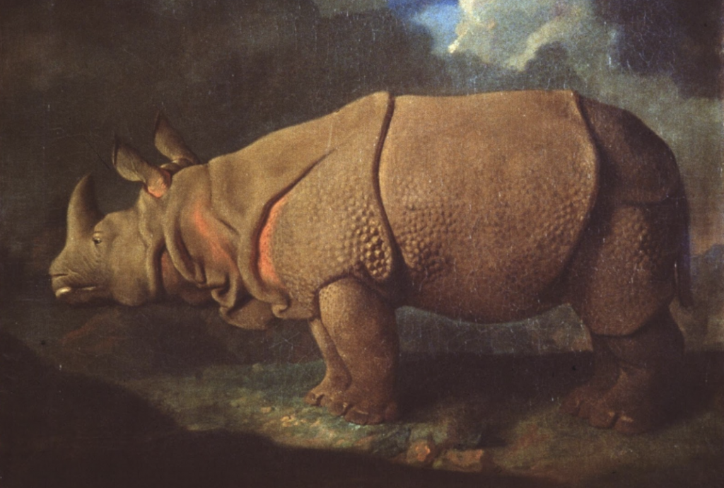
Stubbs did not just paint horses, he painted a variety of animals ranging from monkeys to rhinos and so many more.
Rhinoceros – 1790-92 First anatomically correct painting of an adult rhinoceros
Stubbs’ impact on the perspective of horses and other animals was truly monumental and carries a beauty that is indescribable.
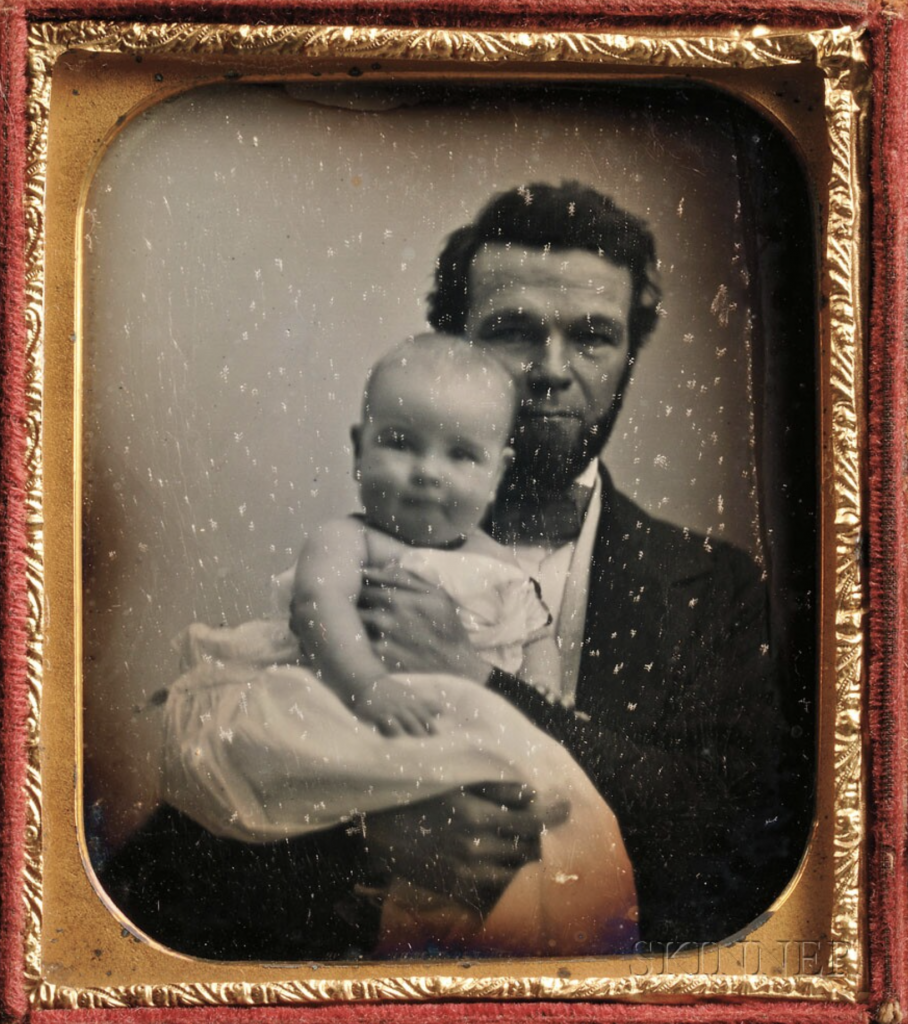
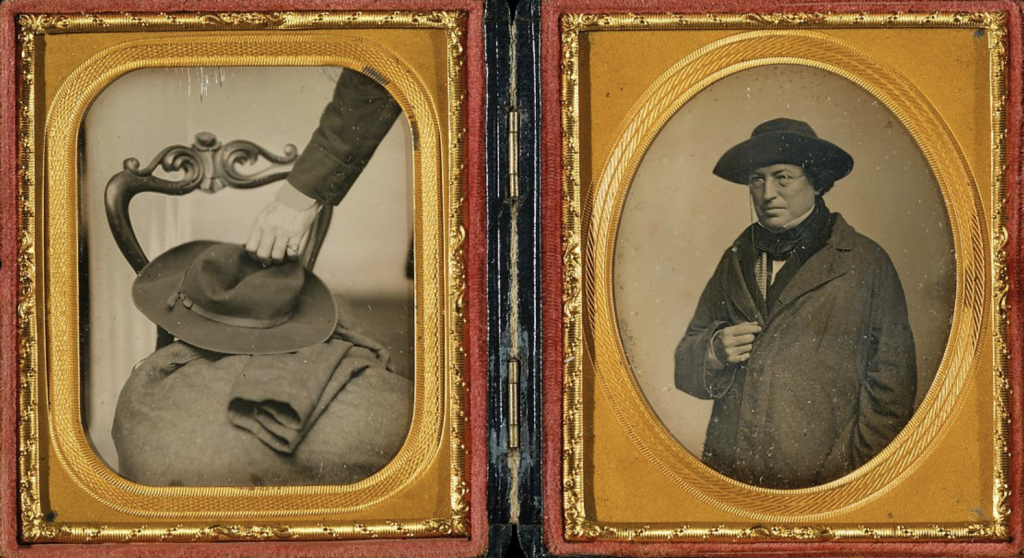
The phenomenon of the Daguerreotype truly came as an intimidating surprise. It slowly made its way up towards the mainstream crowd and once it finally received the well deserved attention it created quite an uproar.
Sixth-plate Daguerreotype of a Man Holding an Infant – Artist and Date Unknown
The burst of popularity the Daguerreotype shocked many due to the fact that instead of needing to pose for hours on end, people and objects could have their photo taken in a mere fifteen minutes. The phenomenon unfortunately also drove out many popular and up-and-coming portrait artists leading to many of their careers to sadly go down the drain. Although the topic that is being discussed does not directly correlate to the fashion of clothing it did end up shifting the idea of who held the ability to receive a photograph. Daguerreotypes became an equalizer among all of the social classes. Any average person could walk into a portrait studio, sit for an image, and have the same product as the millionaire down the street. There was no longer any form of likenesses only created for the rich and higher classes.
Cornelius Conway Felton with his Hat and Coat – John Adams Whipple (early 1850’s)
Daguerreotype came to be in 1839 when Louis-Jacques-Mandé Daguerre collaborated withNicéphore Niéce. When Niépce passed away in 1833, this gave Daguerre the opportunity to take full control of the project and gain a better understanding for himself. Daguerre found that once a copper plate covered with silver iodide was exposed to light in acamera, which was then fumed withmercury vapour and fixed by a solution ofcommon salt, a permanent image would be formed. With this discovery Daguerre was able to change the world of art and portraiture tremendously.
The translation for the word Baroque is to describe something as elaborate or highly detailed. Baroque embodied this description through the beautiful and breathtaking visuals seen in the design and architecture of the time. Baroque came to be in Italy as a response of the Catholic Church to the many criticisms that arose during the Protestant Reform in the 16th-century. This period lasted just over a century and a half and it left a huge mark in the realm of design and world of architecture.
ATTENTION TO DETAIL:
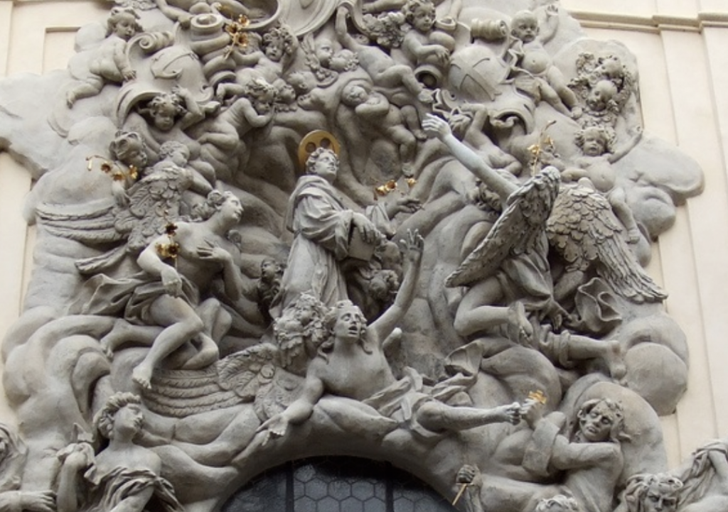
Design and architecture go hand in hand when discussing the Baroque period some of the key characteristics from it that are still used in architecture, media and design today. Some of the key factors in Baroque design was the exaggeration of clarity and movement; an extended hand would be transformed into an outstretched arm with every single joint in the hand curled in on an emphazed hand. Nothing looked as if it were out of place and everything was placed meticulously in order.
Prague Window Ornaments up close
THE BODY OF A BUILDING:
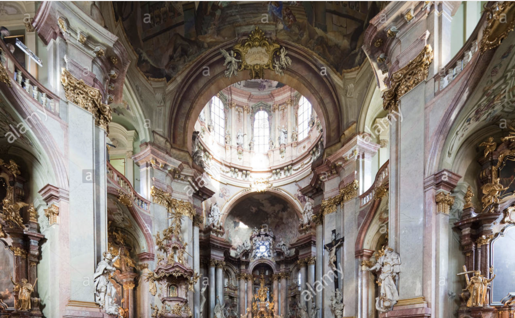
One of the most noticeable characteristics when looking upon any of the architectural masterpieces built during the Baroque period is that they all include this sense of drama and grandeur. The buildings always have a high peak and wide frame. An almost perfect example of these characteristics would be St Nicholas Church designed by Kilian Ignaz Dientzenhofer and Christoph Dientzenhofer.
Exterior of St. Nicholas ChurchInterior of St. Nicholas Church
BAROQUE’S INFLUENCE TODAY:
Today for graphic designers and illustrators in particular they have a leverage when taking inspiration from famous artistic periods; with them quite simply only needing to go through a generous amount of research and then creating their ‘Baroque’ themed/inspired piece. Many designers will take inspiration from natural details of leaves or small rosettes and florals around the border or incorporated into the typography. Steve Goodin takes the curving leaves from the period and decorates it around this gloomy coloured poster and gives it a form of liveliness with these curling leaves looking as if they’re on the move. Dana Tanamachi also exhibits the Baroque style as well but a tad bit more subdued, there are no curving leaves but I believe that she displays a feeling of Baroquesque detailing.
by Steve Goodinby Dana Tanamachi
The Baroque period last a long one hundred and fifty years and it left nothing but immaculate detailing and inspired artists (designers and architects alike) to go in full detail and this has shown future generations that every little detail matters.
At some point in one’s life, a person shall be in the position holding the title ‘Guinea Pig’. My classmates and I were given this position for a new assignment. Although there is nothing wrong with being the first to work on or experience a new project, there comes a problem where there are examples present to help gain a better grasp of the assignment itself. The lack of examples was understandable but I spent quite a bit of time re-reading the brief but was met with nothing but confusion. The project due date was rescheduled (which I shall be forever thankful for) but the revisions that occurred during the week brought on only more stress. I was so full of stress and confusion that by the end of it I had just given up and threw it all together. InVision also had some problems especially if you place something in the wrong place, there was no undo button so I had to move everything around all over again.
This project deserves a four out of ten because I truthfully am unhappy with what I’ve created. The mood board feels so plain and lacks any form of distinguishable flavour and my voice is buried underneath facts. I was under the belief that all the topics I had chosen were what I was thoroughly interested in but alas-as I write these words in the early hours in the morning, I am wrong about what I am intrigued by once again. I enjoyed the research aspect of this project but my procrastination got the best of me and sadly I was unable to finish this project fully.
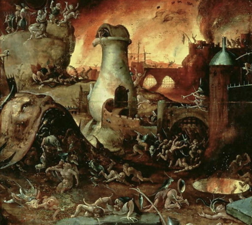
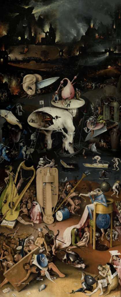
His pieces consisted of visuals and images that if given only a few moments to gaze upon, the human eye could barely comprehend. Bosch chose to take the elements of painting he had learned to convey reality, reverse those principles and create horrors that shook the human body to the core. These elements of horror specifically incorporated in Bosch’s pieces representing hell were the main reason he achieved such fame.
‘Hell 2’
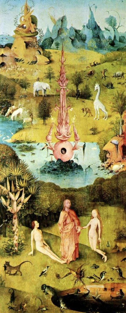
Bosch was well known for his nightmarish pieces but he was also able to create light and airy scenes as well. An example of the contrast between the horrendous and pleasing scenes is shown in his most famous piece ‘Garden of Earthly Delights’ 1515.
‘Garden of Earthly Delights; Panel 1’ 1515
‘Garden of Earthly Delights; Panel 3’ 1515
Although Bosch’s paintings are well known and have been dissected in tiny detail, very little is known about him personally. Bosch’s life was quite mysterious, even in 1516-the year he passed no one ever knew his true age. One thing many can agree on is the fact that Bosch’s pieces of horror were far ahead of their time and still drive fear into any who look upon it.
As the Industrial Revolution came to an end, a new period emerged; a period that many consider to have been the very first ‘modern style’. Art Nouveau began in 1890 and ended in 1915, yet in the short thirty-five years of the period’s prime it was able to create such a large impact on those involved and still impacts those in the present day.
The period of Art Nouveau mainly influenced those whose careers led down the artistic route, specifically those in architecture and design.
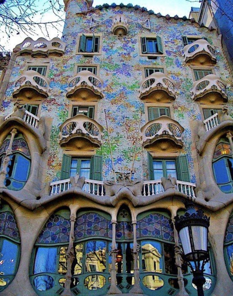
Casa Batllo – 1877 Antoni Gaudi
Architects were able to play with the idea of these sculpturesque buildings just as the style of expressing oneself and their own creative fantasies had become extremely popular. Architects in particular took their expressions to another level of intricacy. Antoni Gaudi’s name sticks out like a sore thumb out of the architects from that period, as his work on the ‘Casa Batllo’ is one of the most well-known pieces of architecture to the general public. The architecture of this period was almost creature-like; the rounded windows and smooth exterior having an almost skin like texture. The colours and carvings that were used so beautifully and so intricately that it truthfully saddens me that it’s so rare to find a designer and/or architect willing to take on the challenge of creating another beautiful structure welcoming its guests in with wide open doors.
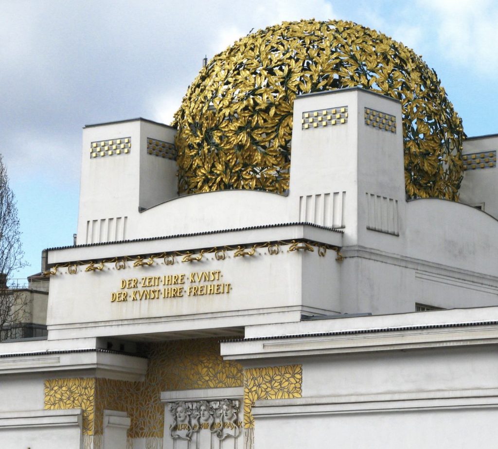
Secession Building – 1897-98 Joseph Maria Olbrich
When the Art Nouveau period emerged in the late 1800s, many designers took this as an opportunity to finally experiment with their own styles. Designers saw this opportunity as a clean slate, to break from traditional media and erase it all and enter an entirely new and unique style. Multiple names from this period could be listed off if you asked an art history lover; Gustav Klimt, Egon Schiele, Aubrey Beardsley and so many more.
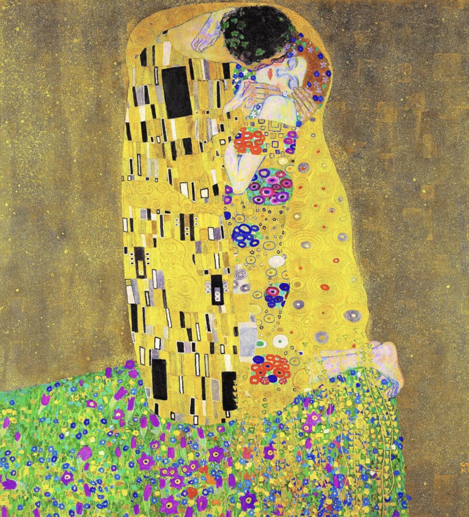
The Kiss – 1907-08 Gustav Klimt
The Rose – 1898 Alphonse Mucha
Alphonse Mucha in particular is one of the few artists from the period whose work has truthfully moved me. Mucha’s style of thick lining around the centre figure and barely textured skin in particular, mesmerizes the viewer and truly draws them in.
The response to what the industrial revolution that occurred years before may not have been a perfect response, but it was a beautiful one.
The usage of figure ground is presented perfectly in Gert Van Duinen’s ‘Whalehouse Series’. White the house matching the background colour it presents that the house is indeed closer to the viewer than the tail itself.