
The translation for the word Baroque is to describe something as elaborate or highly detailed. Baroque embodied this description through the beautiful and breathtaking visuals seen in the design and architecture of the time. Baroque came to be in Italy as a response of the Catholic Church to the many criticisms that arose during the Protestant Reform in the 16th-century. This period lasted just over a century and a half and it left a huge mark in the realm of design and world of architecture.
ATTENTION TO DETAIL:
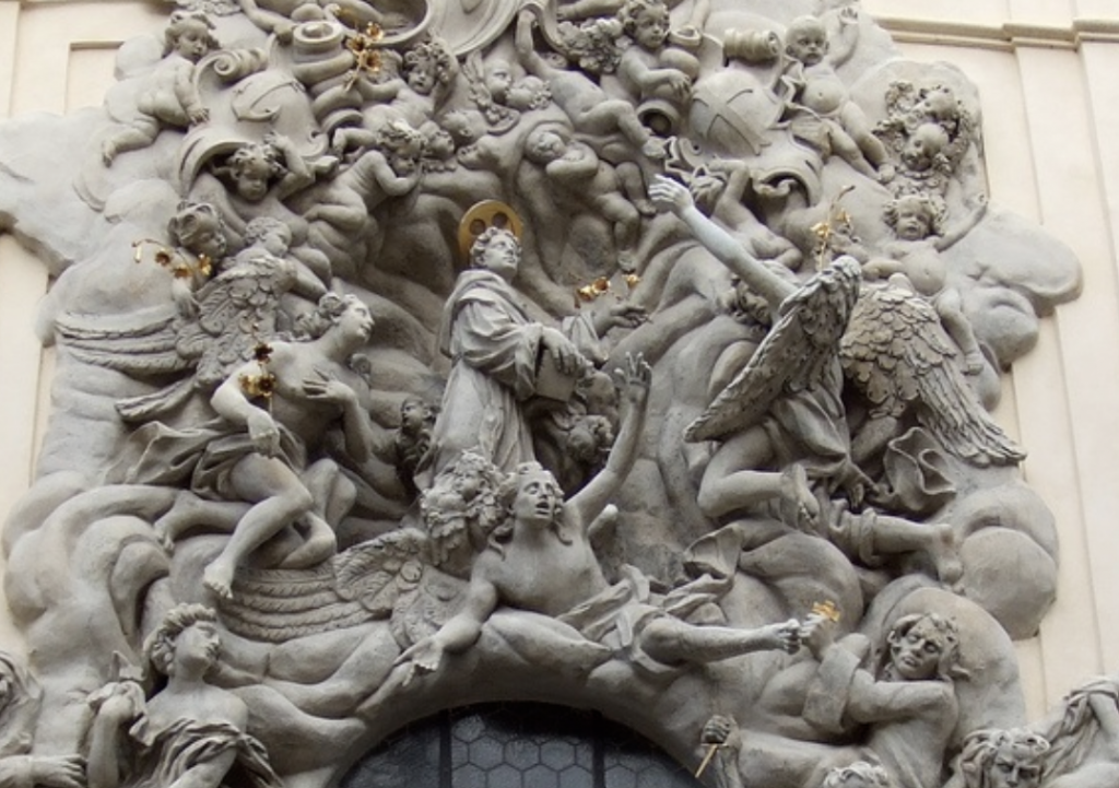
Design and architecture go hand in hand when discussing the Baroque period some of the key characteristics from it that are still used in architecture, media and design today. Some of the key factors in Baroque design was the exaggeration of clarity and movement; an extended hand would be transformed into an outstretched arm with every single joint in the hand curled in on an emphazed hand. Nothing looked as if it were out of place and everything was placed meticulously in order.
THE BODY OF A BUILDING:
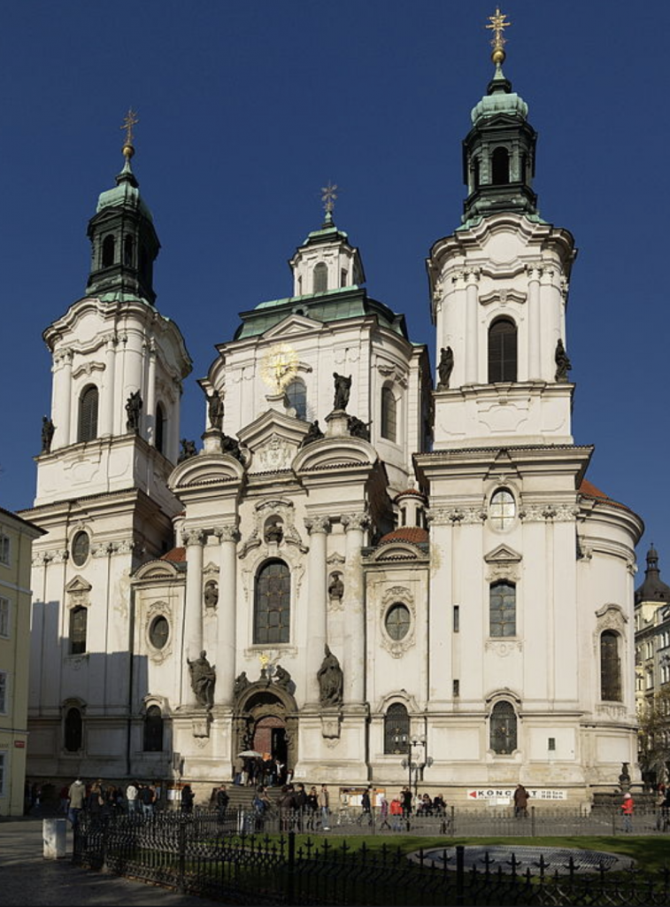
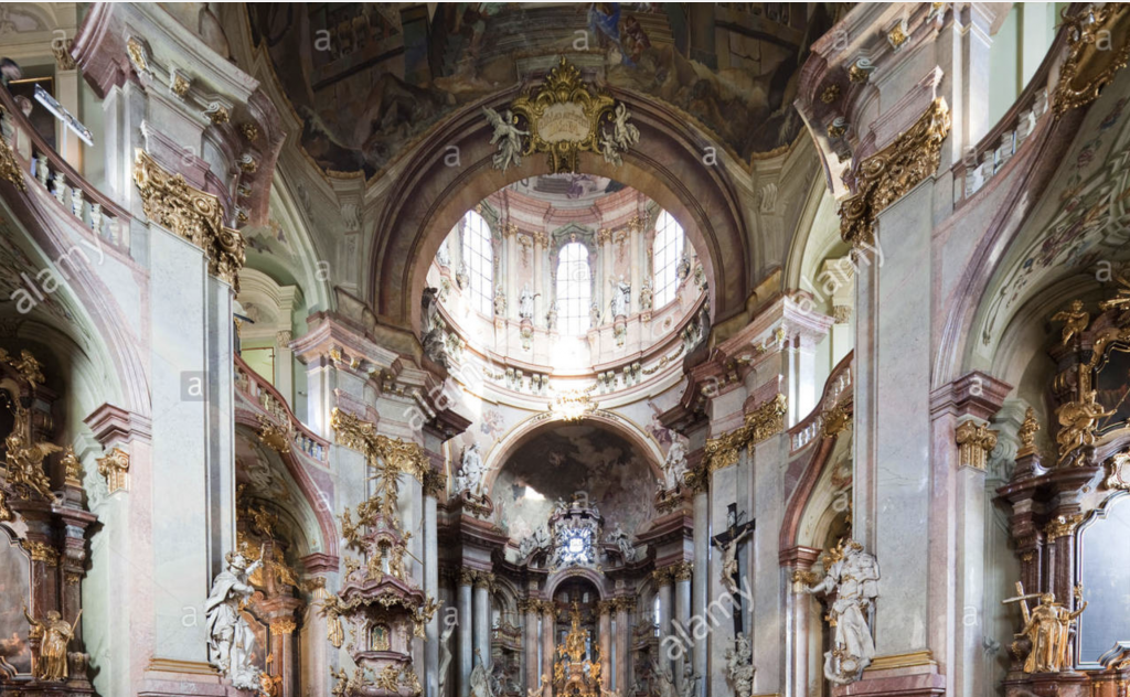
One of the most noticeable characteristics when looking upon any of the architectural masterpieces built during the Baroque period is that they all include this sense of drama and grandeur. The buildings always have a high peak and wide frame. An almost perfect example of these characteristics would be St Nicholas Church designed by Kilian Ignaz Dientzenhofer and Christoph Dientzenhofer.
BAROQUE’S INFLUENCE TODAY:
Today for graphic designers and illustrators in particular they have a leverage when taking inspiration from famous artistic periods; with them quite simply only needing to go through a generous amount of research and then creating their ‘Baroque’ themed/inspired piece. Many designers will take inspiration from natural details of leaves or small rosettes and florals around the border or incorporated into the typography. Steve Goodin takes the curving leaves from the period and decorates it around this gloomy coloured poster and gives it a form of liveliness with these curling leaves looking as if they’re on the move. Dana Tanamachi also exhibits the Baroque style as well but a tad bit more subdued, there are no curving leaves but I believe that she displays a feeling of Baroquesque detailing.

The Baroque period last a long one hundred and fifty years and it left nothing but immaculate detailing and inspired artists (designers and architects alike) to go in full detail and this has shown future generations that every little detail matters.
Leave a Reply
You must be logged in to post a comment.