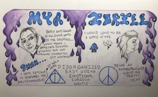
For my yearbook spread I chose to make it feel fun and have a very casual approach to it. I wanted the writing to feel fun and not too serious as that’s how I view myself. I chose to use purple and blue to give it a spiritual kind of calming feel to it. I’ve always love to illustrate flowing shapes, which is why I incorporated the dripping on the sides, as it also signifies “going with the flow,” which I tend to live my life by. At the bottom of the page I illustrated a deathly hallows sign as I have always been a huge Harry Potter fan and even have the sign tattooed on my wrist. I also illustrated a peace sign as I wanted to depict my free spirited “hippie” side as well.
Leave a Reply