Rebelling Through Typography
During the 1920’s people were still fresh from the suffering and loss from the war, this lead to a new art movement starting to emerge called the Dada Movement. This movement was all about anti-establishment, a sort of rebellion pinpointing how the old views of society were no longer making sense for the new world emerging. Through their art they mocked modern society by portraying them as insane; just as their ideologies were.
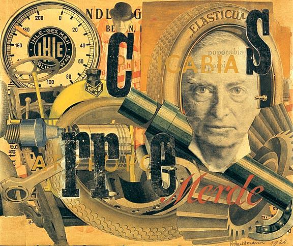
Image taken from tristisbooktours.blogspot.com
Typography was an important part of the Dada movement, as the movement was all about going against the stream and breaking all the rules, this persisted through with their use of type, creating whole new uses for type. Dadaist used type very chaotically as they wanted their posters to appear to be yelling at you.
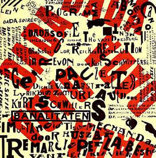
Image taken from designseminar-1.blogspot.com
They would use several different types on one poster, some diagonal some vertical. Random letters and symbols were often scattered through the page. They used boldness and size to portray a heavy form of hierarchy. Many Dadaist believed the fonts message was narrated through how it was displayed rather than what it actually read, leaving some type on posters hardly even legible.
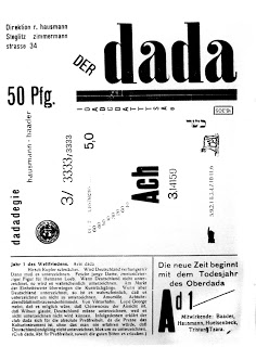
Image taken from designseminar-1.blogspot.com
The Dada movement was a time for typography to forget about the rules and everything that had been constructed in the past. It explored the meaning of chaos through the absence of anything being specific and everything being acceptable aslong as it made you feel the message by means other than reading it.
Works Cited
“Figure 2f from: Irimia R, Gottschling M (2016) Taxonomic Revision of Rochefortia Sw. (Ehretiaceae, Boraginales). Biodiversity Data Journal 4: e7720. Https://Doi.org/10.3897/BDJ.4.e7720.” doi:10.3897/bdj.4.e7720.figure2f.
Leave a Reply