Women’s fashion

Survey 8 – Fashion infographic

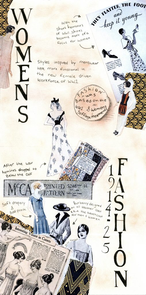
For my infographic I wanted to implanted the style of a collage/ fashion mood board. I decided to focus on women’s fashion because it was rapidly evolving during this period and many new trends were made. I used advertisements and imagery from sewing patterns of the time to make sure things were as authentic as possible. I chose to use vertical text because it creates interest and keeps a balance between the top and bottom halves of the page. I had difficulties finding information and statistics for this time period which made the research portion of this assignment more difficult. I am really happy with how the headings turned out because I hand drew them and I feel it turned out fairly well. Over all I think this is my favourite of all the spreads I’ve made and would give myself a 8/10 because I feel I executed my vision and what I wanted almost perfectly.

Optics During the 1880’s

Survey 5 – artifact

For my artifact I originally chose to make a set of contact lenses inspired by the original glass ones made by Eugen Fick. Although I was able to make the lenses they proved hard to photograph and I had to instead illustrate them as an advertisement. I tried to choose similar typefaces seen on a poster made by jobbing printers and I am overall pleased with how the advertisement turned out. Because I wanted to make the title very bold and in a thick font it made it difficult to fit both the era and the title without taking away from the aspect of the larger text. Overall I would give myself a 7/10 because I only like half of the spread. I spent most of my time focusing on the artifact rather then the text and that was my downfall.

Illuminated Manuscripts​

Type Spread – Survey 2

For this assignment I chose to do my spread in the style of an Illuminated manuscript as it was an important way to pass on knowledge, stories and religious texts. I followed traditional painting and gilding techniques to make the illuminations and artwork on the adjacent side of each page. A monk would sketch their ideas onto the spread before laying down the gold or silver leaf, which was followed by the hand painted details and decorative elements. I experimented a lot with the gold leaf, trying to figure out the best way to place it and ended up using a technique that was still very finicky and time consuming but, it turned out really beautiful and is my favourite part of it all.  I chose rich jewel tones for my palette as it not only reflects the style of the time but the rich merchants and royalty that would have bought these scripts. Then lastly I wrote out the words by hand in ink. Overall I am pleased with the end result and if I ever attempt this again I would take more time in planning and placing the text and it feels a bit messy. I would give myself an 8/10 on this project because I feel that I had a strong idea and took some risks in the process but I could have executed it slightly differently.

Yearbook Spread

When I was assigned the yearbook spread project I immediately thought of all the 80’s and 90’s teen movies and all the bad yearbook photos with them. Not many people know the origins of the 80’s design movement which was inspired by the Italian architect Ettore Scottsass and the Memphis design movement. I used key elements from the movement including distinct shapes, bright colours and a sense of movement between the shapes to create the base for my spread. I then used a font with a handwritten feel to compliment the feel of the 80’s and black borders to be sure nothing felt lost in the piece. For this project I would give myself a 7/10 because if I were to do this again I would make the piece larger in scale so I could illustrate some titles and add more images.