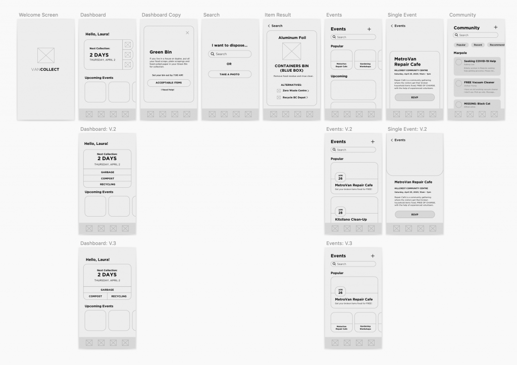
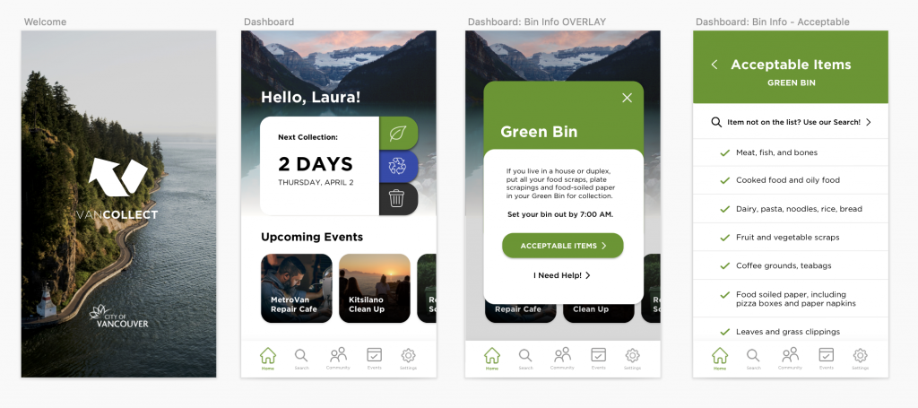
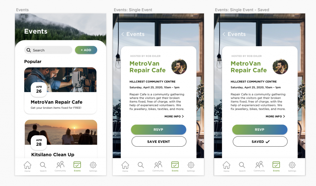
Phase 3 has been a very hectic but also exciting part of this project because I get to apply visuals to all my designs. From last week’s work, I took all my sketches and made digital mid-fidelity wireframes. Then, I started my tiresome hunt for good, royalty-free photography for my app. This phase was over the course of 2 weeks. My mentor, Grace, was quite happy with the outcome of the app and encouraged me to experiment with more layouts to see how they would work. My app took a few different directions, and I’ve constantly changed the photography as this was the hardest part to source. I wanted the app to be very easy to use and understand so that people who have questions regarding recycling properly aren’t struggling with the app as well. I also performed user testing during this phase with 4 people over Zoom. Each session started with an initial interview about the person’s background and opinions on Vancouver recycling, followed by four tasks that I assigned for them to perform over screen sharing of my prototype in Invision. I concluded the session with questions about their experience with their app. The feedback that I received from user testing was surprisingly very positive. The users all really liked the app and there weren’t substantial issues that they encountered. I then spent the last few days learning how to add motion to my prototype to elevate it. I would give myself 9/10 on this phase because it was again, another extremely stressful week filled with lots of work that had to be done and I feel like I delivered a lot successfully.


