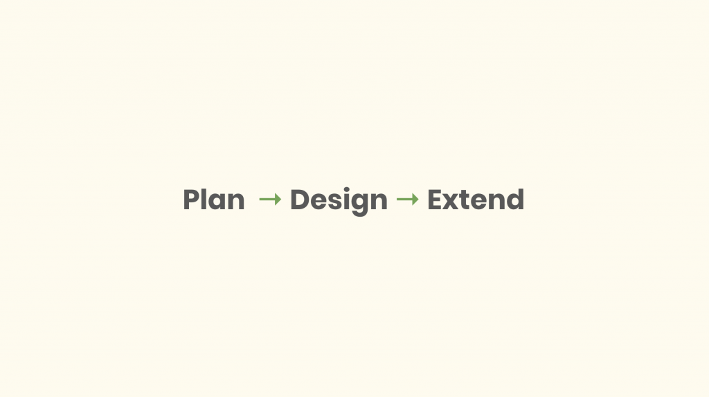
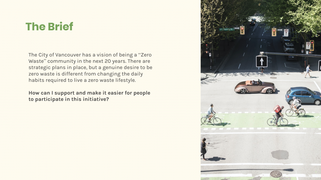
I presented my final project to a small group of designers at Engine Digital over a Google Hangouts call last week! I was a little nervous building up to it, but on the days before the presentation, I made sure my deck was super polished. I wrote any necessary presenter notes, made sure my prototype was fully functioning, rehearsed it a multitude of times, and even video called my friend on Google Hangouts and practiced my presentation several times with them to make sure it would all go smoothly. At first, when I started building my presentation deck, a major thing I initially struggled with was thinking about what to include. I had to choose which parts of my process to show and how to tell everything in a succinct and engaging manner without glossing over important details. I used the format “Plan, Design, and Extend”, which is a presentation style that Engine Digital likes to often use. This really helped organize my presentation in an order that made sense. Another part that I struggled with was deciding what copy to leave in the presentation, and what to put in my presenter notes that I would add onto as I spoke so that it didn’t seem like I was just reading off the slides. I think after a lot of practice and adjustments along the way, I achieved a good balance. On presentation day, Grace (my mentor) introduced me and the project to the other 4 people sitting in for my presentation. Matthew was there was well, which was awesome! My presentation took about 20 minutes and the feedback I received after surprisingly very positive! The audience members said it was a very good presentation, and that I was a good, calming presenter who was able to keep the audience very engaged. They thought that the presentation had good flow and storytelling to it. As for the actual app, they were all impressed by the solution and said that the app looked really good and functioned well – an overall solid solution. They also thought I had great rationale at the end to justify why the solution would work. Matthew was very happy with the work and thought it was nice seeing where I ended up taking the project since the last time I saw him. Some of the things I could work on was including different age ranges in my user testing, potentially adding a screen to the app that includes showing what content was not recyclable, and also including recycling reminders that would pop up on your phone screen – which I added to the presentation deck afterwards. Overall, I would give myself 9.5/10 on this portion because the whole presentation went so well and everyone who gave me feedback was very impressed and happy! Below are a few slides from my final presentation. I couldn’t take a photo of the video call presentation because of privacy concerns.


