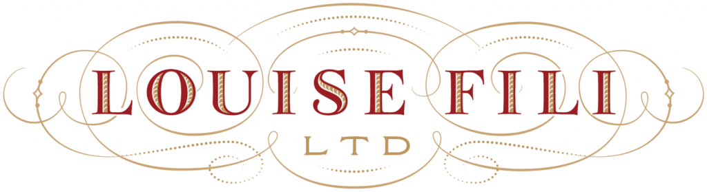
Although the Italian-American designer was born in America and never lived in Italy, Louise Fili lives out her Italian roots extensively through her work. Fili is known for her elegant use of typography. A leader in the post modern return to historical styles, her love for historical Italian type is evident. Heavily influenced by Italy, Modernism, and European Art Deco, Fili combines historical typography with modern colour and compositions to create beautiful book jackets, identities and packagings.
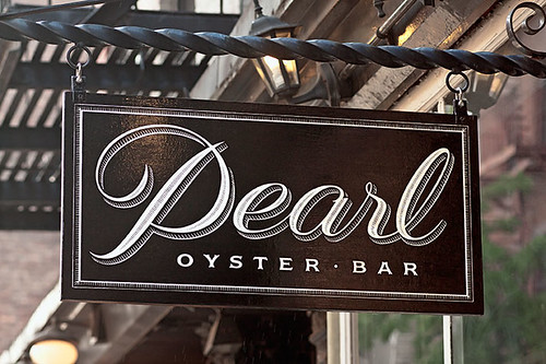
Restaurant identity for Pearl Oyster Bar
Louise Fili worked for Herb Lubalin for a couple of years, before becoming director at Pantheon Books where she designed close to 2000 book jackets. She opened Louise Fili Ltd. in 1989. Her studio specializes in restaurant identity, food logos and packaging, everything she is passionate about.
Tate’s Bake Shop packaging
Louise Fili is without a doubt one of my favourite graphic designers. I love typography, and her work is BEAUTIFUL. Seriously, I’m obsessed.
It’s hard to do Paula Scher justice within the parameters of a short 200 word blog post. One of the most influencial and successful graphic designers in the world, Paula Scher is commonly said to be “master conjurer of the instantly familiar.” Born in 1948, Paula Scher didn’t even know what graphic design was until her junior year at the Tyler School of Art & Architecture, where she originally went into illustration.
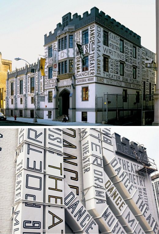
The New Jersey Performing Arts Center supergraphics
Scher is commonly known for major brand identity projects as well as her work on environmental Supergraphics. One of her most notable projects is posters she made for The Public Theater. Her supergraphics are massive installations that completely transform interiors and even exterior spaces. Scher’s extensive list of clients includes: Bloomberg, Microsoft, Bausch + Lomb, Coca-Cola, Shake Shack, The MOMA, and many many more.
I absolutely love Paula Scher and her work. Seeing successful and incredibly influencial women in design like Paula Scher is very inspiring and encouraging. I definitely look up to her. Not only is she a talented designer, I love her as a person as well.
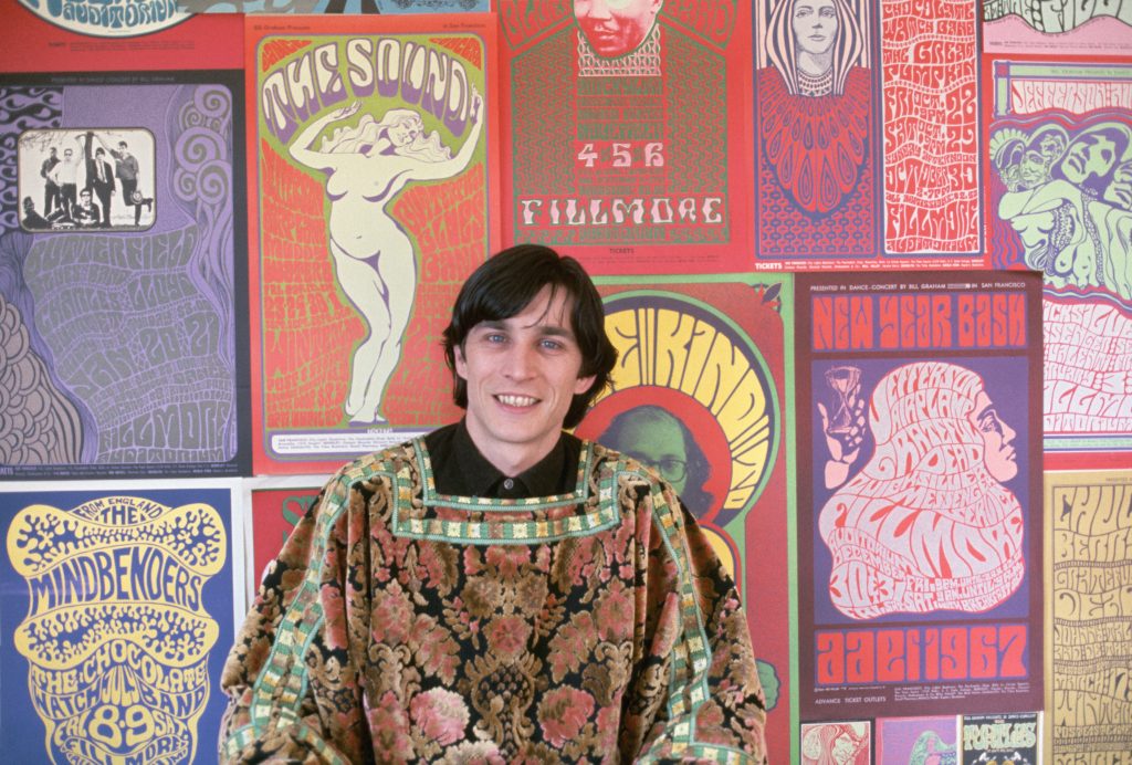
Wes Wilson with some of the posters he designed, many of which showcase his signature style of typography.
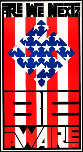
“Are We Next?” Vietnam War protest poster.
Wes Wilson was born in Sacramento, California in 1937. An American artist most notably known as one of the leading designers of psychedelic posters, he invented a style that is now associated with the peace movement, the psychedelic era and the 1960s. Alongside Alton Kelley, Stanley Mouse, Victor Moscoso, and Rick Griffin, Wilson was one of the “The Big Five” San Francisco poster artists of the time. His style was heavily and obviously influenced by Art Nouveau.
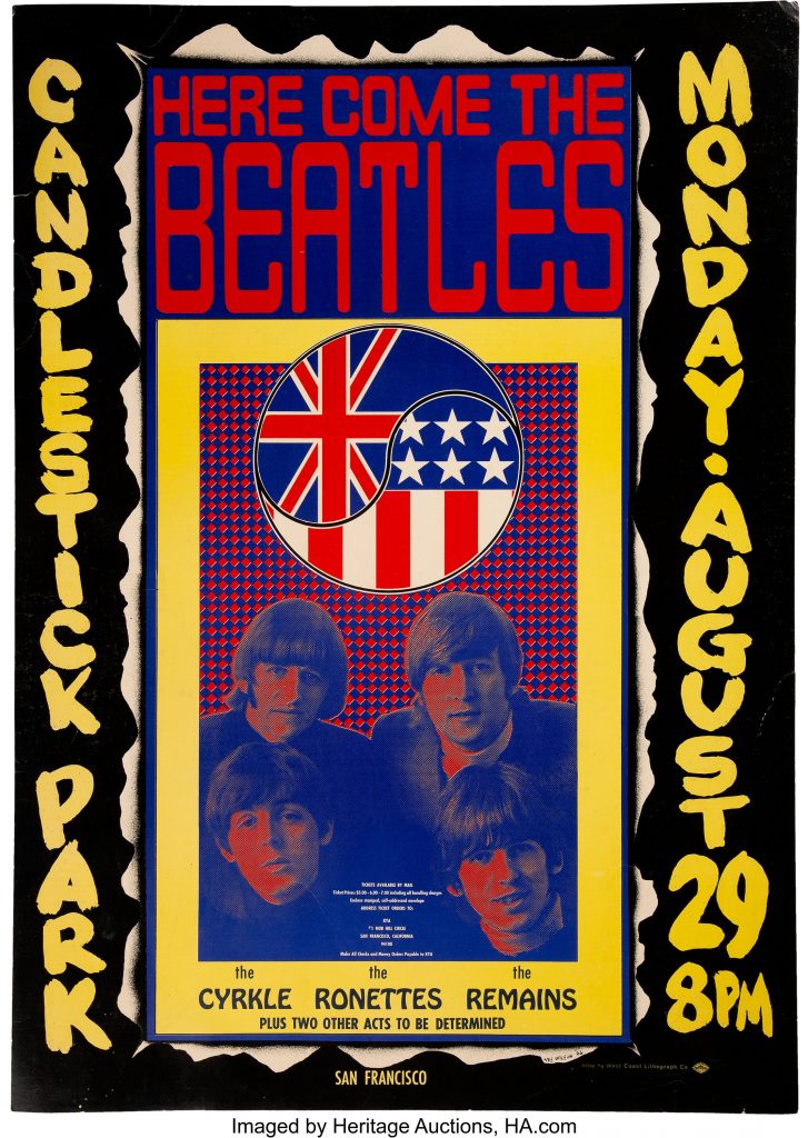
His first posters was a Vietnam War protest poster titled “Are We Next?” caught the attention of Chet Helms, an important music promoter during the Hippie era of the 1960s. Working for Chet Helms and Bill Graham, Wilson made many posters for many well known psychedelic bands and concerts, including posters for The Beatles final concert at Candlestick Park in 1966.
Although the psychedelic style isn’t my favourite, I really enjoy the colours and colour combinations he uses in most of his posters. His use of typography is very unique and interesting, which I also appreciate.
Poster for The Beatles final concert at Candlestick Park in 1966.
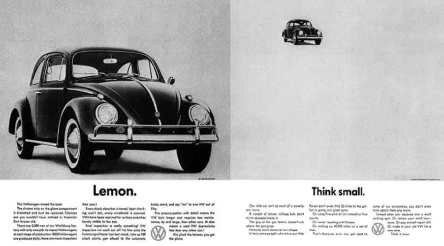
Helmut Krone, the genius behind the well known 1960s Volkswagen Beetle ad campaign, was born in a german sector of Manhattan in 1925. He is considered a pioneer of modern advertising, which is especially evident when looking at his unique and effective ad strategy that is commonly used today.
Two of The Most Well Known VW Beetle Ads Created by Helmut Krone.
Krone worked for Doyle Dane Bernbach for over 30 years, where he worked on many other very effective ad campaigns, including the “When you’re No. 2 you try harder” campaign for Avis and the personification of Colombian Coffee, Juan Valdez.
The “Think Small” ad for VW, pictured above, was voted #1 campaign for all time in Advertising Age’s 1999 The Century of Advertising issue.
Helmut Krone’s wit and great ideas without a doubt made him an incredible advertising art director, which is admirable. I don’t personally find advertising particularly exciting, but I do feel that his ads are clever, effective and he is a great person to look to for inspiration.
OKAY so I worked REALLY hard on this spread so I may be a bit biased but I think it’s really good.
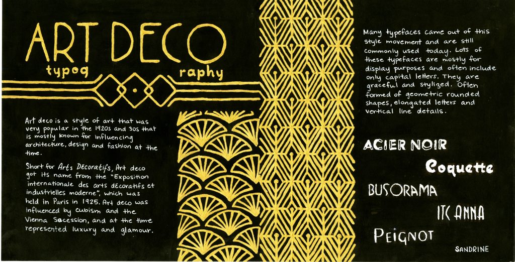
I initially got assigned a front and back cover spread and was coming up with no good ideas, so I ended up trading spreads for a typography spread. I chose to do a spread on art deco style typography. A lot of what comes up in google images when searching art deco is gold patterns on a black background, so that is the direction I decided to go.
Since art deco wasn’t particularly known for its influence on typography, it was rather difficult to find much information and I felt some context on the art deco style would be helpful, so that’s what I put on the left side of the spread as an intro of sorts. On the left side, I gave a little bit of general info and characteristics of art deco typefaces and showed some examples of some common typefaces that are art deco style.
I got really ambitious and spent a LOT of time on this spread which was very tedious (and I spilled masking fluid all over the place in the process so that was fun), but I’m really happy with how it turned out.
Grade
I give myself a 9/10 on this spread. I’m really happy with the final product and think it fits together really well. I think there are a few things that could have been executed and thought out better. For example, I’m not sure that splitting up the word typography in the title works that well. It was a bit of an afterthought that I didn’t plan for an had to work with the space I had at that point.
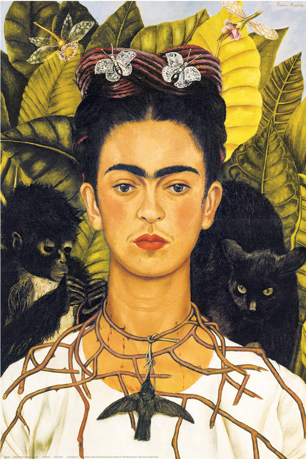
Self Portrait With Thorn Necklace and Hummingbird (1940)
Frida Kahlo was born in 1907 in Coyoacán, Mexico, at the Casa Azul, which was her home for most of her life, although she spent the majority of her life claiming she was born in 1910: in part because she was younger than her peers in school due to having been infected with Polio as a child, but mostly because she wanted to be known as a child of the Mexican revolution, which began in 1910. Frida enjoyed art as a child, but was quite academically inclined and was well on her way to medical school until she was in a tragic bus accident at the age of 18.
On her way home from school, the wooden bus Frida was riding collided with a streetcar. She was very badly injured: she fractured multiple ribs, her collarbone, both her legs, and she was impaled through her pelvis by an iron handrail. This left her bedridden and unable to walk for 3 months, she turned to art. Her parents set up an easel and mirror that allowed her to paint while in bed.
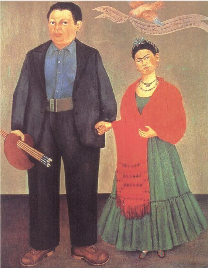
Frida and Diego Rivera (1931)
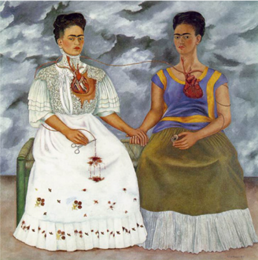
In 1928, she married the well known Mexican muralist Diego Rivera, who was 20 years older than her. Only a couple of years into their marriage they moved to the US for Diego’s work. Frida did not like it there, so they eventually returned to Mexico, much to Diego’s dismay. This caused some tension in their marriage, and they divorced in 1939. This proved to be a productive time for Frida’s career where she painted many of her important pieces. She remarried Diego one year later. Their marriage was marked with infidelity and affairs.
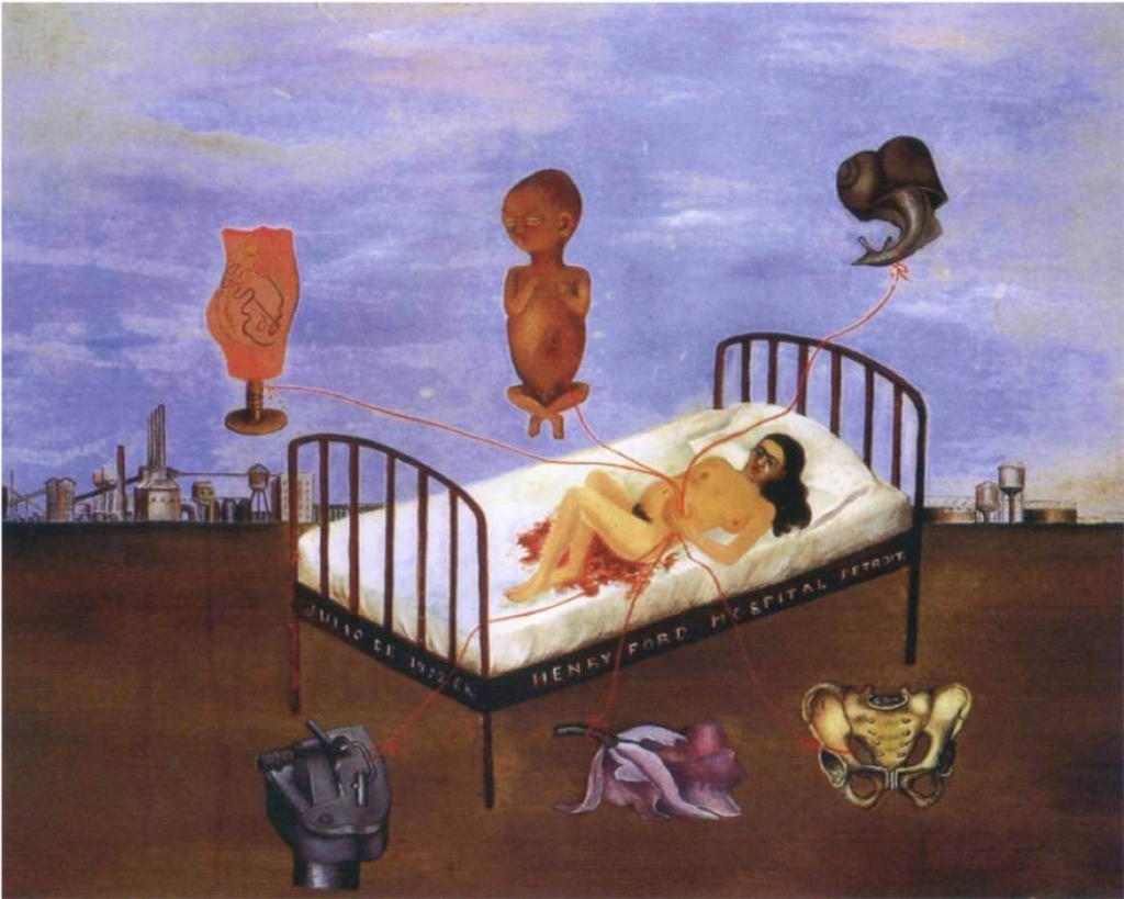
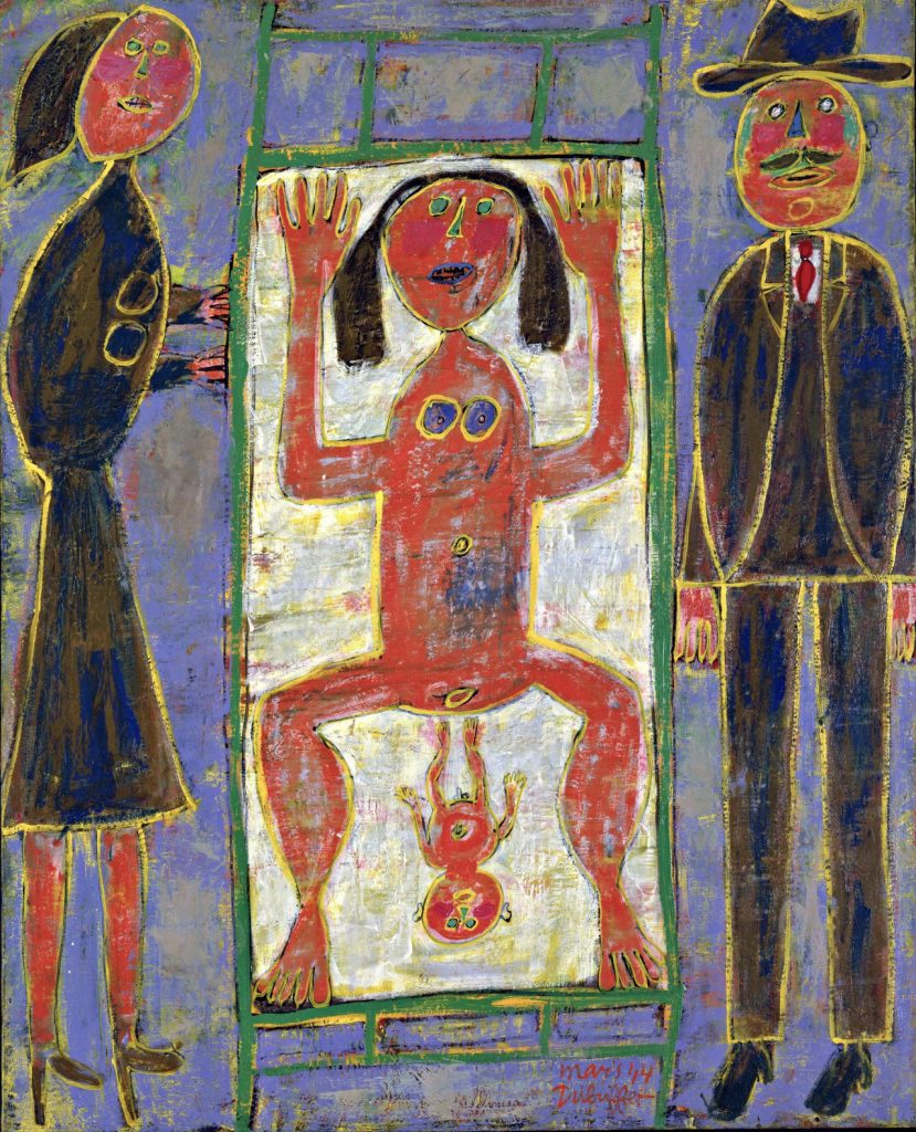
Henry Ford Hospital (1932)
Frida never had it easy in terms of health and suffered quite a bit. As her health began to decline she got increasingly confined to the Casa Azul. She had her first solo show in Mexico in 1953 but had been put on bed rest by her doctors. Determined she had to be there, she had her bed moved to the gallery and arrived at the show in an ambulance.
Throughout her life, Frida was an active member of the Mexican Communist Party, was very passionate about her Mexican culture and heritage, and expressed her feminist and anti-colonialist ideals through traditional indigenous Mexican peasant clothing.
The Two Fridas (1939)
Frida’s main subject was herself, painting a total of 55 portraits in her lifetime. In a style that combined realism and fantasy, she also commonly painted themes of identity, post-colonialism, gender, class and race in Mexican society. Although she is sometimes classified as a surrealist, she strongly disagreed with this, once saying: ” this bunch of coocoo lunatics and very stupid surrealists”.
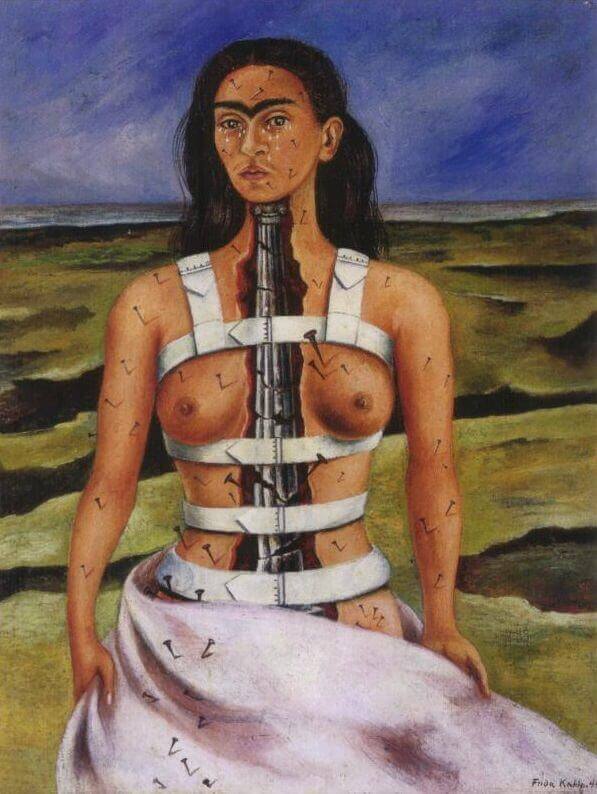
The Broken Column (1944)
As she neared the end of her life, her paintings got darker in subject matter, often containing themes of terror, suffering, wounds and pain. After losing the bottom half of her right leg to gangrene and set off by another affair of Rivera’s, she attempted an overdose. The last words she wrote in her diary were “I joyfully await the exit — and I hope never to return”. Her cause of death was officially ruled to be a pulmonary embolism, but it was found that she had taken an overdose the same night she died. No autopsy was ever performed.
The home where she was born, lived and died is now known as the Frida Kahlo Museum. Although she remained relatively unknown until the late 1970s, by the 90s she had become an icon to Chicanos, feminism and the LGBTQ+ movements. Today Frida is “one of the most instantly recognizable artists.”
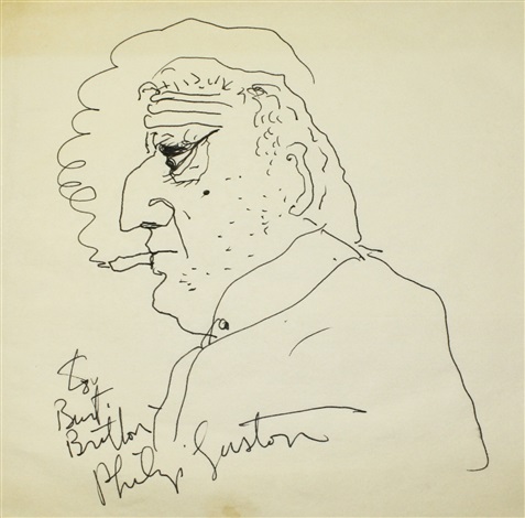
Philip Guston was born in Montreal in 1913 and moved to Los Angeles with his family when he was young. When he was 10 years old, his father hung himself. Philip found his body in their shed. This obviously had a profound impact on his life. As a kid, his preferred setting to draw in was inside a small closet lit by a hanging lightbulb.
When Guston was 14, he began painting when he started attending the LA Manual Arts High School. While he was there, he published a paper alongside Jackson Pollock that got them both expelled. After that, aside from a one-year scholarship at Otis Art Institute, he was mostly a self-taught artist. In his early career, Guston painted many murals.
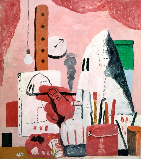
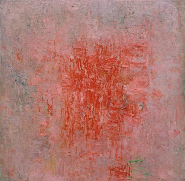
The Studio
Zone
He moved to New York in 1935 and began to teach and lecture in universities in 1941 at the School of Art and Art History at the University of Iowa. He taught there until 1945. Other schools he taught at are Washington University in St. Louis, New York University, the Pratt Institute, and Boston University where he ran a monthly graduate seminar from 1973 until 1978.
In the 1950s, Guston moved away from mural painting and became a first-generation abstract expressionist (although he preferred the term New York School for the movement). In the late 60s, he began to get frustrated with abstraction and helped lead the transition from abstract expressionism to neo-expressionism. This transition led Guston’s style to become representational and cartoonish, which was widely misunderstood by critics and led him to isolate himself in his little art world. After 1968 his palette became limited and his pieces were very existential and sad.
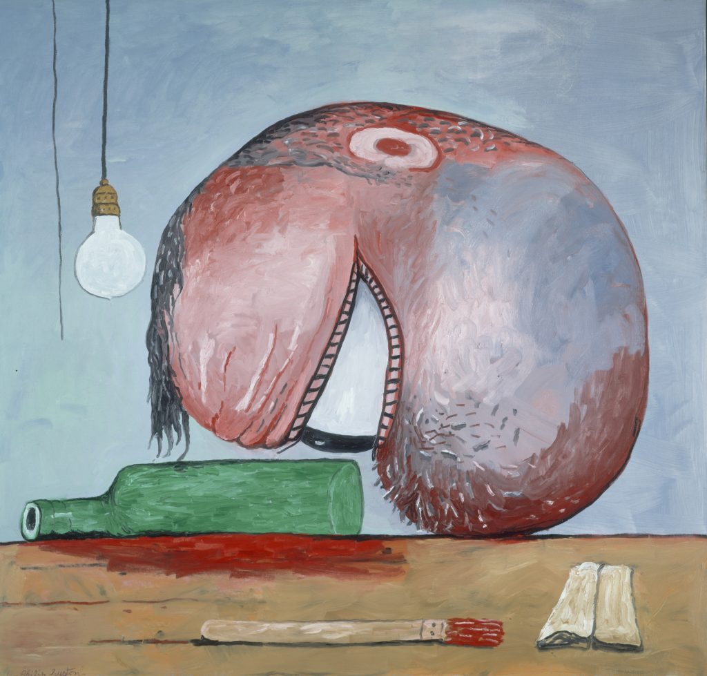
Head and Bottle
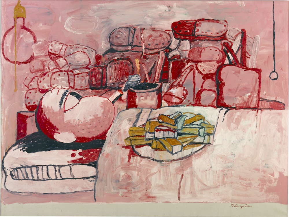
Painter in Bed
I really really like his work, especially his later stuff. It’s so funky and I just really love it!!
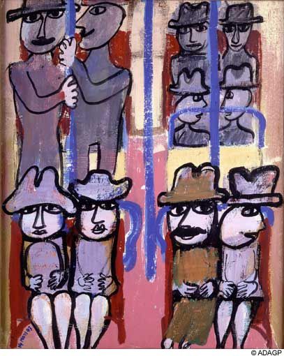
Jean Dubuffet was a French painter and sculptor. He was born in 1901 in Le Havre to successful wine merchants. Exposed to art during his childhood through art classes, he moved to Paris to study painting at the Academie Julian in 1918, where he met and formed friendships with many other well-known artists including Fernand Leger. Unsatisfied with academic art training, Dubuffet only stayed at the school for 6 months, after which he chose to go study independently. He ended up abandoning art for a while, turning instead to the family business of winemaking. He opened his own wine business which was quite successful.
Subway
In 1942, Dubuffet decided to devote himself back to art. he was most interested in painting subjects of everyday life: people sitting in the Paris Metro or people walking. He often painted individuals in cramped spaces, which had a psychological impact on the viewer.
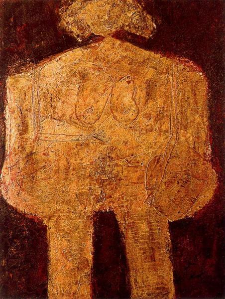
In 1944, he had his first solo show at the Galerie Rene Drouin in Paris. This was his 3rd attempt to become an established artist (so be persistent!). In 1945, Dubuffet was impressed by a show of Jean Fautrier paintings: he viewed is as meaningful art that expressed the depth of a person. Shortly after this, he began to use thick oil paints mixed with various stuff for his pieces — mud, sand, coal, dust, straw, gravel. This led to some backlash from critics, who accused him of ‘anarchy,’ and ‘scraping the dust bin’.
The Beautiful Heavy Breasts
Despite this, he quickly became successful when he moved to America. He was included in a Pierre Matisse exhibition in 1946. Matisse was an influential dealer of contemporary European art in America. Dubuffet’s work was placed alongside Picasso, Braque and Rouault. By the following year, Dubuffet had his first solo show in New York.
One of the most important things Dubuffet started was the Art Brut movement. ‘Art Brut’ means ‘raw art’ in french. He became very interested in art produced by non-professionals such as psychiatric patients, prisoners, and children. He collected this type of art and had exhibitions for the pieces. Inspired by the art he was collecting, he wanted to create art himself that was free from intellectual concerns. Many of his ‘art brut’ style pieces have been called primitive and childlike and compared to wall scratchings and children’s art.
The Cosmorama IV
Childbirth
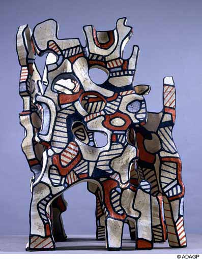
From 1962 onwards, he limited his palette to red, white, black and blue, which makes his paintings from this time very cohesive. Near the end of the 1960s, he turned himself mostly towards sculpture.
I find some of Dubuffet’s work very childlike looking, but some of even those pieces contain really interesting and humorous subject matter, which I really appreciate. A lot of his later work with the limited colour palette I really enjoy.
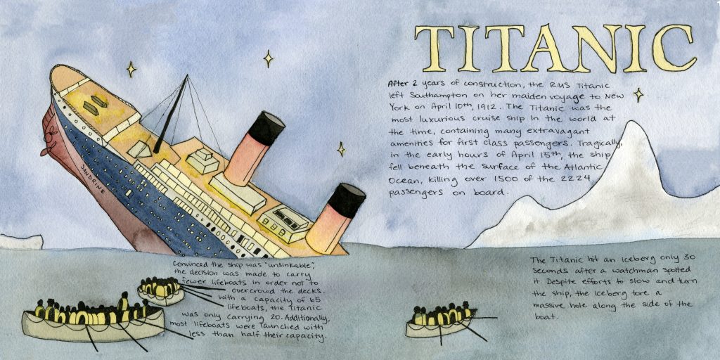
When I read on the timeline handout that the Titanic sank during the time period I had been assigned geopolitics for, I immediately wanted to make a spread on the topic. I’ve always loved the Titanic!
My initial idea was to do a closeup cross section of the Titanic with explanations and illustrations of the various parts of the ship. Although that would have been cool, I think what I ended up doing fits into the geopolitical category much better.
The most important part of the Titanic is that the “unsinkable” ship sank, so I chose to portray a dramatic scene of the sinking. I struggled a bit with having enough space for the text while taking margins into consideration. I needed a fair amount of text because the story of the Titanic is generally known, so I wanted to add information that may not be common knowledge while still having the basic information.
The typeface I used for the title was the most popular font in 1912, the year the Titanic sank – I figured that would be relevant to the time period.
Grade
Overall I am quite happy with how the spread turned out. I would give myself an 8/10. I think the illustrations and design fit well together and the overall spread is nice. There are a few minor hiccups I don’t particularly love, like the word ‘tragically’ cutting into the side of the iceberg a little bit and the general lining up of text in some places could have been planned out better.
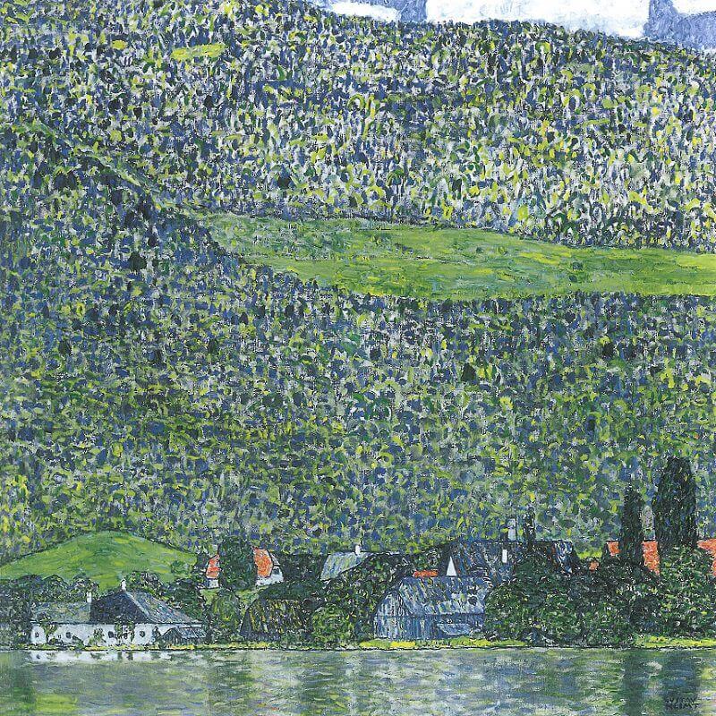
Gustav Klimt was an Austrian symbolist painter in the last 19th and early 20th centuries. He was most interested in painting the female body and human figure in expressive and erotic ways that showed the domination of woman over man. He also painted many murals and landscapes of Attersee.
Unterach On Attersee
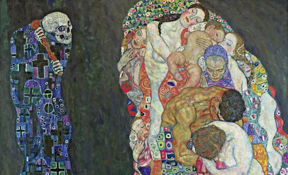
Klimt attended the University of Applied Arts in Vienna where he studied Architectural Painting from 1876-1883. He was poor during his time as a student but later gained popularity and wealth. He later became an honorary member of the University of Munich and the University of Vienna. Klimt received the Golden Order from Emperor Franz Josef I of Austria in 1888 and his painting Death and Life won him a prize in the World Exhibition in Rome in 1911.
Death and Life
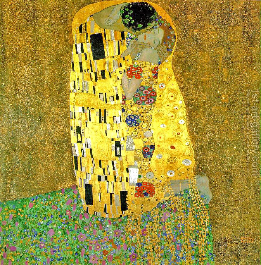
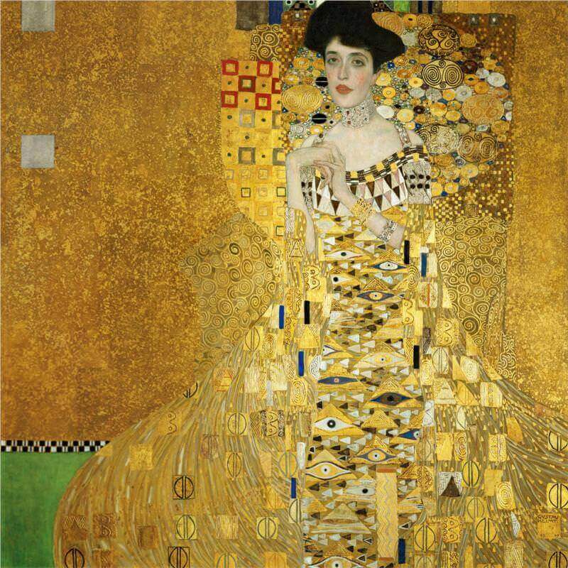
Klimt’s “Golden Phase” was a period in his painting style that brought him very much positive critical reaction and financial success. He used gold leaf in his pieces throughout this time. His most well-known piece, The Kiss, came out of this period.
The Kiss
One of the most important things Klimt was a part of was leading the Vienna Secession Movement. The Vienna Secession was a movement of artists that revolted against academic art and provided exhibitions for unconventional and unknown young artists. He was a part of the movement from 1897 until 1908.
Portrait of Adele Bloch-Bauer I
Although Gustav Klimt could be considered ‘unimportant’ in art history because he did not directly make any drastic changes, he was a very popular and influential artist. His most important influences include Egon Schiele and the expressionist movement. His mural work pioneered a union of art and architecture that went on to influence the Bauhaus and Russian Constructivism.
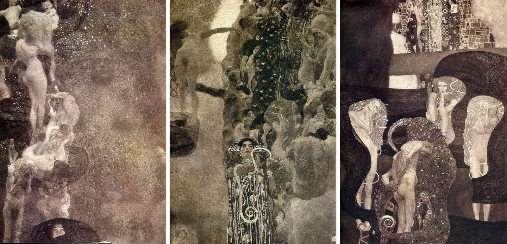
Philosophy, Medicine, & Jurisprudence
Klimt didn’t care for censorship or criticism, in fact he fought against it, aiming to ‘shake up the establishment’. There was major controversy around a ceiling he was commissioned to paint in the Great Hall of the University of Vienna (Philosophy, Medicine, & Jurisprudence). The piece was criticized as ‘pornographic’. This was the last time Klimt took a public commission; his fame brought him many patrons, but he could afford to be selective.