
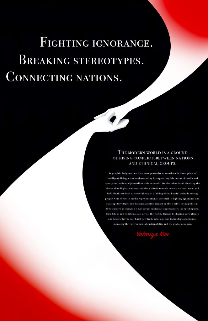
My poster’s theme focuses on breaking stereotypes and building new connections between different nations through supporting fair media channels with design. As it is a topic that takes global relations into account I wanted to keep my aesthetics clean defined with a touch of political official feel to it. I was mainly inspired by propaganda poster designs from 40s – 60s and artists such as Cassandre. The clean fluid form is intended to guide your eyes through poster information as well as representing the positive effect of friendship between countries. Shifting from aggressive red towards peaceful white represented by the touching hands. The script font that I used was intended for making my name look like a signature on an official document proving my relation to the manifesto and it’s principles.
Although I do believe that I produced a good design with a strong concept, execution-wise, however, a better solution could be achieved in order to make the design easier to read and more related to globalism and cosmopolitanism.
I give myself 7/10.