Mentorship Project | DSGN 320 | Initial Character Design – Stage 1

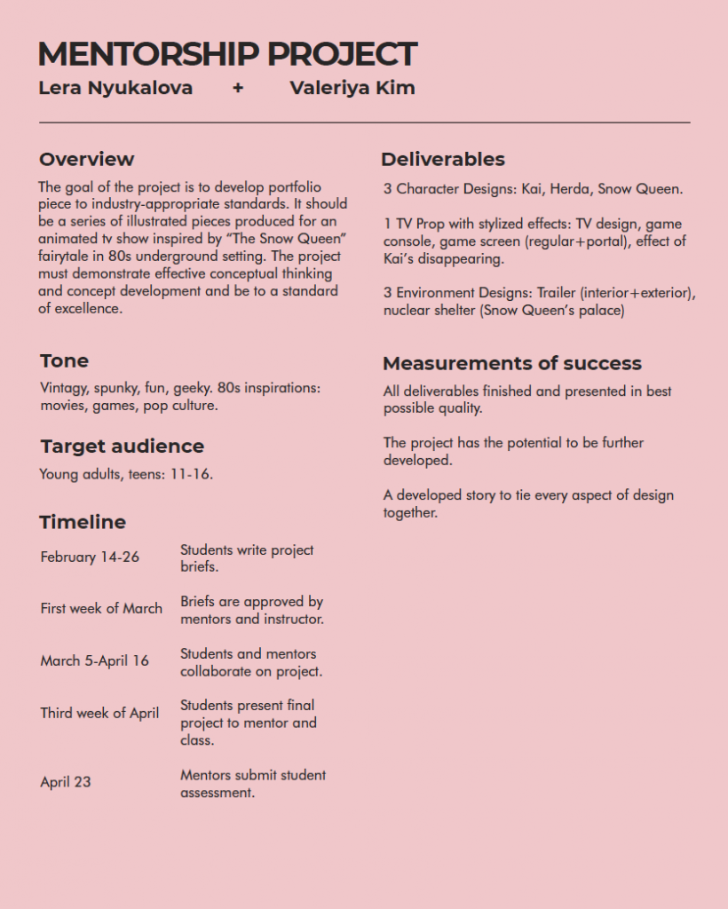
Creating a character for any type of target audience begins with developing a back story. A backstory includes all of the background information you need to know. To create one, dive into the research of different places, cultures, professions, and more. It’s best to know absolutely everything about them so that you’re able to translate the backstory into their design. Where do they live? Who are their parents? What is their hobby? Who is their best friend ? What do they usually eat? What are their interests?

In our case, I am creating the two siblings from the Snow Queen fairy tale, Kai and Herda. I am reimagining the two of them in the 80s setting, therefore it doesn’t make sense for them to live on the balcony of an old Dutch house like in the original story by Hans Christian Andersen.

In this story, Kai and Herda ran away from a foster family and settled down in an old camping van left on an abandoned parking lot. The two of them look after each other without much adult supervision, thus the clothes they wear are clumsy and not in the best shape. Still, both of them are smart and have vigour and wit to them, features that both of them acquired from living alone.

The beginning stages of the character design is using silhouettes. Silhouette thumbnails are a helpful and productive method of design when it’s necessary to produce a large number of variations of concepts within a short period of time. The purpose of finding a strong and interesting silhouette is so that it becomes easily recognizable from a distance to the person playing a video game or watching a movie.

My Silhouettes for Kai and Herda

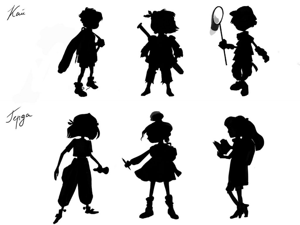
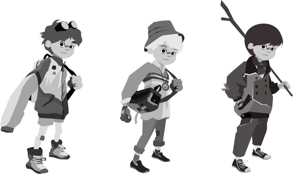
Me and Lera, my mentor, have agreed on the two strongest concepts: 1st Kai and second Herda. Later on, my task was to create tonal sketches, to give the shape, tone and personality to each character. I used a lot of reference from the 80s kids targeted ads in order to better understand the aesthetic of that time.

Kai. Initial concepts.

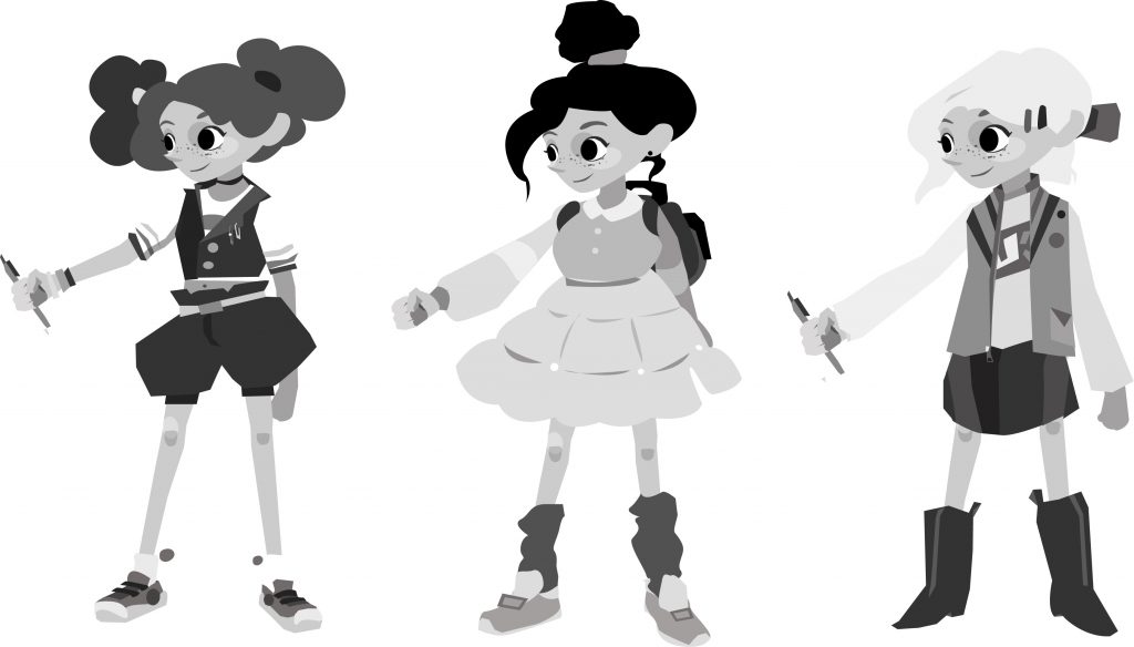
Herda. Initial concepts.

Mentorship Project | DSGN 320 | Meeting the Mentor

Discussing Industry secrets is always easier to digest when you are digesting something inside.

My first meeting with my mentor, Lera Nyukalova, took place in a casual setting of a cafe in Gastown. We began our discussion with a Q&A and she was very open about telling me all the details of her career path. Lera Nyukalova works as a lead designer in Atomic Cartoons. She created stunning environment designs for an upcoming Netflix show “Last Kids on Earth”. Talking to her was incredibly insightful since her journey towards her dream job began in a very similar setting to mine. Both of us come from the same city, Almaty, and both attended the IDEA program. Lera also showed me her portfolio of stunning digital paintings which got me even more inspired to learn from her.

Throughout our talk, I found out a lot of useful information about networking in the animation industry, self – discipline and the work ethic needed for reaching success. I was pleasantly surprised to find out there are quite a few industry professionals in Vancouver who came from Kazakhstan, just as I did. One of the most important tips that I noted down was that attending art and design events is one of the best ways of discovering new connections. I was also shown a few tips & tricks for improving the quality of my drawings.

When we moved onto deciding what type of project to work on, Lera gave me a suggestion to take an existing fairytale as a base, adding a certain twist to it. This is needed for a base narrative that we would later use as guidance for the characters and environment designs. Later on, we have settled on the idea of readapting the classic “Snow Queen” set in the vibrant era of the 80s. This is very exciting as the 80s inspirations, such as aliens, cold war, video arcades and pop culture can lead your imagination to incredible results. I am now all set with a written brief a tone of inspiration to begin ideating on the character design, our 1st stage of the project.

Design Brief

DESGN 320 | Final Logo Concept

In the end, I decided to further develop my “L for Lera” concept. During one of the group critiques, the majority voted for this concept to represent me, as it fits the most into the traits that I wish to describe myself with. It also subtly translates things that I stand out for – sophistication and elegance. The logo describes my skillful artistic eye and my meticulousness. Overall, believe that I was able to translate my professional interests and my personality into a single visual element quiet well. I am satisfied with my representation and feel confident about putting it out in the industry. I hope to continue doing design in the future, however, this project helped me to reflect on my strengths and preferences and now I can say that I feel more confident about strongly pursuing my passion for illustration. I feel like the logo that I created and its application to my brand collateral shows that.

DSGN 320 | Personal AD Poster.

When designing my personal ad, I tried to recall my most frequent inspirations that form my style. High contrast, detailed elements, texture and overall mystery in the atmosphere. It was helpful to look back at my past projects and see all the significant features that are reminiscent of my personality. Thus, I created my poster to show my artistic abilities, meticulousness and imagination. Obviously, some of it slipped into my defining adjectives.

I struggled a bit when it came to writing a short paragraph about myself and making it unique and concise. In a way, I really had to push myself to be as confident as possible in order to own these attributes that I’m naming in my bio. Confidence, strength, readiness are traits that one will struggle to accept without losing modesty. However, I thought that for my story It was something that was necessary. Because ultimately it is these features that make me unique.

DSGN 320 | 3 Logo Concepts

I have now narrowed down and polished my 3 final logo concepts. It is good to see more defined work and witnessing my brand slowly come to life. This process was a lot about filtering and redrawing the rough initial sketches that we picked out during our last group critique. You really have to see as many versions of the logo as you can before you pick the One.

I am excited to see which one of the three will end up as the final pick and how it will tie in together with my work. Hopefully, It’ll turn out stunning.

DSGN 320 | 200 Logo Ideas for myself.

For the milestone of creating my own logo, I had to come up with at least 200 ideas. It was a good challenge for my creativity and a reminder that your first ideas are not always necessarily your best ones. The process had an on and off dynamic for me. Sometimes I would feel a rush of energy and be able to do 50 sketches in one sitting and sometimes I would barely have any inspiration for a single idea. An obvious take away from these past two weeks is the importance of timing yourself. I am glad that
I was able able to break the task down into smaller portions (which were totally unproportionate in relation to each other) and didn’t procrastinate as much as I usually do.

So here I am with 200 ideas. It’s now time to filter them down to 3 brilliant concepts.

Wish me luck!

DSGN 320 | Writing a Brief for myself.

Assessing myself

Our second assignment for a professional development class was to write a creative brief that would summarize this term’s big project. The gist of my brief turned out to be about digging deep into myself in order to discover my visual authenticity. From this small task, I’ve learned to assess myself and my goals with clarity and honesty, in order to bring the best results into the world. Going through the brief over and helped me to settle the tasks down in my mind for the upcoming weeks.

Finding inspiration

The second part of this week’s assignment was to create 9 mood boards that would reflect my tastes and aesthetic preferences. It was really fun to dissect my own personality down to 5 scenes and break down my subconscious choices of what to see, hear, taste and where to be. It helped me to get a clearer understanding of where I am standing in terms of visual language. All these findings will help me build a unique brand for myself!

This is a good start! I give myself 9.5/10.

GDC Student Engagement increase project.

My team’s strategy was to increase student engagement through different platforms. Our first idea, the packaged envelope of gdc goods full of fun and student appealing apparel was aimed towards making the new members feel welcomed and realize that they are a part of a big legitimate organization. This would be achieved through aesthetic trendy design of apparel. The increased use of ambassadors, our second concept, was intended for bringing more members into gdc and bridging the communication gap between the students and the organization. To achieve that we introduced a better recruiting process as well as a few desirable benefits for the ambassador position. Finally, our volunteers engagement strategies included the heavy use of social media which would help the volunteer from all over the world to connect and work together while also increasing gdc’s online presence.

244 PROJECT. DECOLONISING IDEA Educational Website.

https://invis.io/KTQVET34NF5#/350169833_Desktop_HD

My project is based on the concept of creating empathy for a social issue through sharing real life stories.  My main goal was to establish a strong appealing source of legitimate information for the newcomers that would introduce Aboriginal people to Canada’s newcomers. I believe I was successful in creating something that would  Spark interest in the Truth about the Indigenous culture in an immersing and engaging way. The website that I prototyped is capable in speaking truth about the issues of the colonization, revealing reconciliation topic and providing a truthful unbiased insight into historical data.

After critiquing the project with the Indigenous representative I managed to make my product appropriate and not offensive in any kind of way. The website could become a bridge between the newcomers and other Canadian sources providing unbiased information about the local Aboriginal culture, which was the very core of the projects brief.

I do, however, think that I could improve some details. One of them would be making the typography more integrated with the overall design as well as improving the general layouts of the screens to make it more engaging and functional for easier user experience.

I give myself 8.5/10