Monthly Archives: December 2020

Contemporary Art

Francesco Clemente (1952-present)

Francesco Clemente is a contemporary Italian artist known for his dreamlike paintings based on esoteric themes of sexuality and spirituality. Working across oil painting, installation, and watercolour, Clemente’s works are characterized by their formal experimentation with symbols, portraiture, and the human figure.

After an early academic background in classical languages and literature, he briefly enrolled as an architecture student at the University of Rome, in 1970. Throughout the 1970s, he exhibited drawings, altered photographs and conceptual works across Europe. Since 1973 he has frequently resided and worked in India. In 1981 Clemente moved to New York City, where he currently lives with his wife and children. 

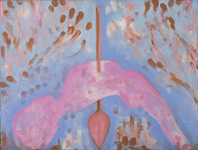
Fascinated with Indian art and mysticism, his gouache paintings and pastel drawings are especially noted for their intense and arcane quasi-religious content that has grown increasingly surreal in his later works. Though large in scale, I think Clemente’s work often conveys an uncanny and unabashed intimacy and he helped reinvigorate painting by using recognizable human figures as his primary subject. I especially love the pastel color palette and blended brush strokes!
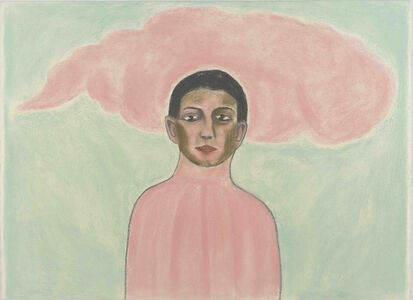
Francesco Clemente - 173 Artworks, Bio & Shows on Artsy
Alba, 2017
Francesco Clemente | Canosa extatic (2016) | Available for Sale | Artsy
Canosa extatic, 2016
Francesco Clemente (b. 1952) | Self-Portrait Without the Mask | 20th  Century, Drawings & Watercolors | Christie's
Self portrait without the mask, 2011

Images:

https://d7hftxdivxxvm.cloudfront.net/?resize_to=fit&width=413&height=300&quality=80&src=https%3A%2F%2Fd32dm0rphc51dk.cloudfront.net%2FZogcUtRNg0cJsSLmoOm1jg%2Flarge.jpg

https://d7hftxdivxxvm.cloudfront.net/?resize_to=fit&width=640&height=485&quality=80&src=https%3A%2F%2Fd32dm0rphc51dk.cloudfront.net%2FYsDvQ-pWrja3Kac1bPPX6w%2Flarge.jpg

Survey 9: Bauhaus Furniture

Image result for bauhaus furniture
well known examples of Bauhaus furniture

The Bauhaus (1913-1933) was a school of art and design that existed in pre-war Germany before being shut down by the Nazi party in the face of World War II.  Founded by Walter Gropius, the primary objective of the Bauhaus was to redefine the relationship between function and design. In other words, as stated by metmuseum.com, the objective was to “reimagine the material world to reflect the unity of all the arts.”

Image result for bauhaus furniture
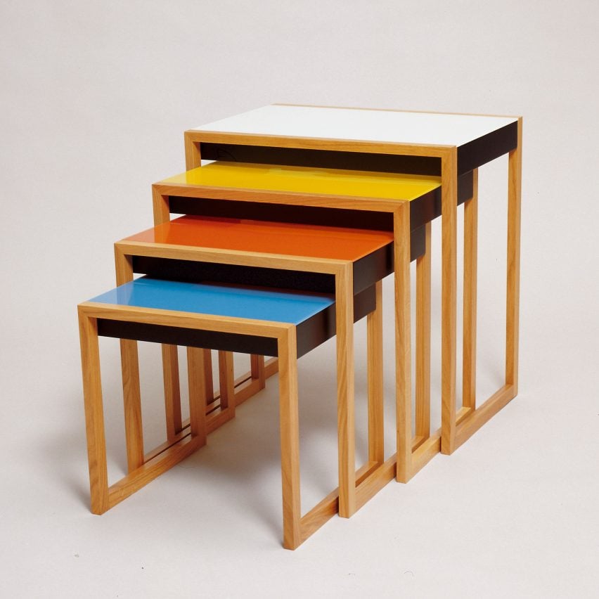
Nesting tables designed by Josef Albers

The Bauhaus housed a multidisciplinary focus. Students learned painting, architecture, sculpture, and design, as well as specialized workshops like cabinet making, among others. Their coursework was intensive and diverse, allowing students to make creations that drew on a large vocabulary of historical and artistic references. Students themselves were diverse as well, bringing their own cultural influences and social-economic lenses to each discipline.

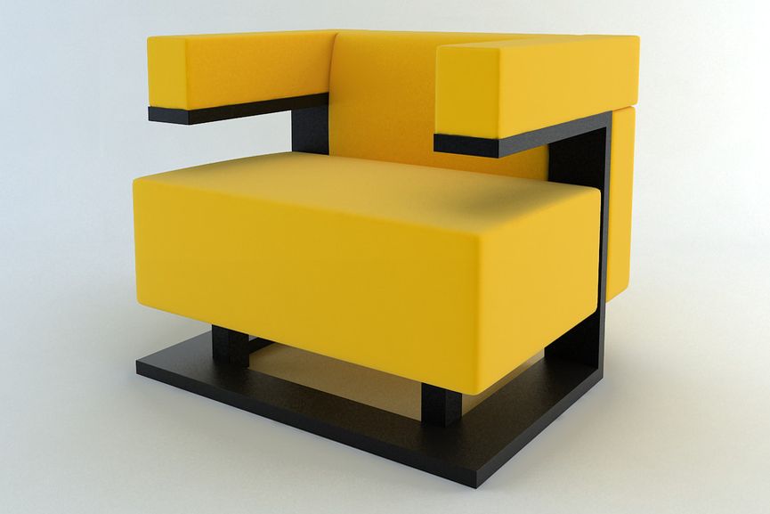
An excellent example is this chair shown below. The extremely basic design is complemented by the unique use of material, contrast, colour and essence of extremist minimalism. In contrast to the arts and crafts/art nouveau movement of the previous decades, the modern qualities of the Bauhaus designs were refreshing to say the least. This had an especially profound effect in its homeland of Germany, notorious for its heavy gothic design style during the early 20th century.

Image result for bauhaus furniture
chair designed by Walter Gropius

Sources:

https://www.metmuseum.org/toah/hd/bauh/hd_bauh.htm

https://i.pinimg.com/originals/9a/ff/fc/9afffc258132091576588ad0ec82d94a.jpg

https://dengarden.com/interior-design/Bauhaus-Furniture

https://www.widewalls.ch/bauhaus-design/

Typographic Infographic Rationale

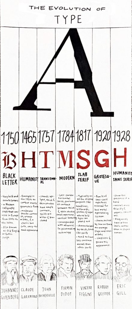
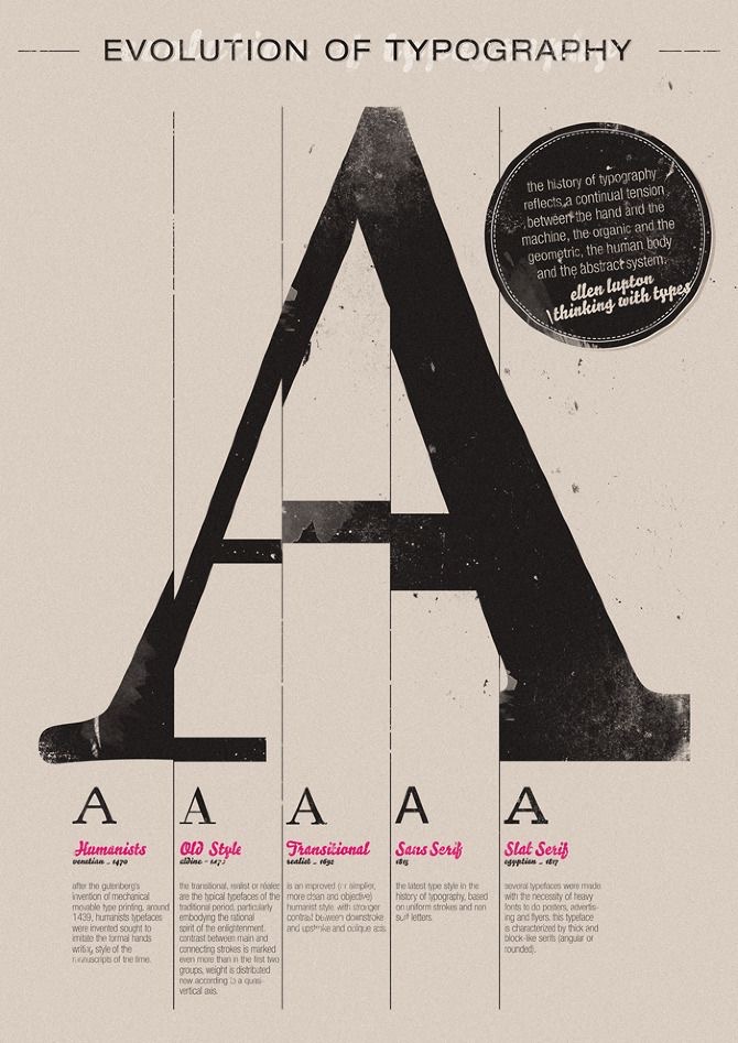
For this assignment, I first started with researching the events I wanted to include in my timeline and then I sketched out all my ideas ahead of time to plan out the text composition and graphics. Unfortunately, I threw out all my sketches so I won’t be able to include them in this blog post. After sketching out all my ideas, I refined them and picked one that would fit the information I had previously researched. I took inspiration from the poster down below and added my own ideas.

I knew I wanted to keep my poster mostly black and white because with the information I have written on it, vibrant colours would not be pleasing to the eyes and the audience would not know where to look. I chose to add red because I think it’s a colour that stands out on its own but also matches well with black and white. With my decision to include the “A” graphic at the top, I made several columns to separate my information and I think it works quite well. Towards the end, I realized that I still had space at the bottom of the poster so I decided to include the well-known typographers under each typeface. It was last-minute research but I’m satisfied with my choice. I would give myself an 8.5/10 on this project because I actually like how my poster turned out and I think I’ve met all the criteria in the project brief but I could have used my time better. Overall, it was a fun assignment and a good review for things we learned in class.