
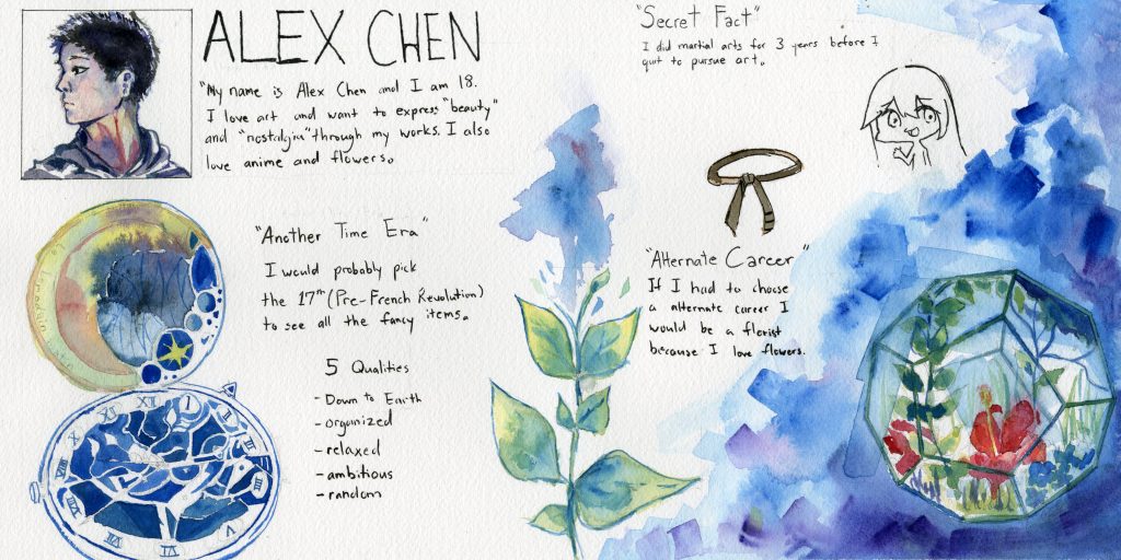
For my yearbook spread I wanted to give off a calming and relaxing tone while maintaining a organized yet complex look. I used cool colours like blue and blue-greens in the background to further emphasize this. By having a simplistic layout I could make detailed illustrations on each page while maintaining a organized look and not flooding the page with text/images. The way I laid out information was a bit too boring so I made up for it by adding watercolour paintings that correspond to the content of the text. By having a simplistic layout, detailed illustrations that contrast the simplicity, and deep blues in my spread I believe this hints at the “ambition” aspect of my 5 word choices.
I would give myself a 8/10 for this assignment. The spread’s layout is simplistic which is not a bad, however I believe that I could have organized the spread in a more detailed manner. There is quite a gap between negative and positive space, and I feel that I could have managed to make more effective use of negative and positive space on the left side of my spread. Furthermore, I should have taken more care to writing out my text as it seems sloppy and unorganized.
Overall I enjoyed this project quite a bit, and I had fun organizing and planning out my composition.
Leave a Reply