Yearbook Spread
Ancient Egypt Yearbook
Reflection
Oh boy was this project some fun.
Overall I enjoyed the process of designing the layout of the spreads and planning out my compositions. I’m a illustrator at heart and I’ve implemented typography before in my works, however they were very minimal at times; at most 3-4 words to emphasize a symbol/expression.
I definitely struggled with the text and planning out how it would go, however I think I did okay given the trouble that I faced.
Rationale
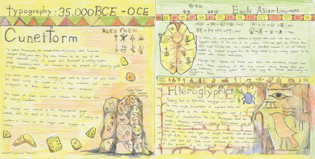
I designed the spread in a way that was filled with complicated illustrations and text. Some points that were addressed in the group critiques was the spacing of text and size of the text. I agree with this as when I look at the text now, it definitely feels to small and unevenly spaced out, especially on the Cuneiform page.
Moving to the right side of the page, I think the design done here is better compared to the left side, although there are still some things that can be fixed. For example, the design layout for the Hieroglyphics page is very condensed, almost to the point where you can’t read what’s written.
For the Chinese Bone-Script part, the illustration of the turtle shell could be moved closer so there is no risk of cropping the illustration. Another point made in the group critique was the use of spacing between text and how images wrap around text.
Notes for Next Spread/Self-Mark
Overall I think I would give myself a 8/10 on this assignment. Although the text, illustration placement, and spacing between lines can be worked on I managed to create a visually appealing spread that isn’t too cluttered.
I think I’ll try and spread out the text more next time, and make sure that my illustrations on the page are well placed and don’t clutter the spread.
The hand-writing itself could also be improved on too. I would like to experiment with printing out text and placing it on my spread, however I feel that this approach in making text feels inorganic/non-cohesive.
Leave a Reply