Survey 9: Typography Spread

For my third spread, I was assigned a typography spread. I was really excited about this one because it was the same time period where design was shifting away from serif typeface and into san serif typeface. Automatically I knew I had to do a spread on the Futura typeface because it is one of my favourite fonts. 

Futura originated from Germany, created by a German type designer named Paul Renner. At this time, Adolf Hitler declared Fraktur font as the official German font, causing all modern typefaces to be looked down upon, especially The typeface Futura. Although it was not loved by Hitler, it was loved internationally for its readability. Futura was the first font to be made into a plaque to stamp during the landing of the moon. This stamp was to let aliens know that humans came in peace.

I am really happy with my third spread. I had a lot of fun creating this spread because I got to make a collage which happens to be one of my favourite types of art styles. It was a bonus that it was also very suitable during this time period. Third time around, I think I did a really good job planning my spread. I took extra caution when placing my type. In the past I put my text either too close to the gutter or not integrate my text well enough where people would be interested in reading what I had to say. Not only did I make the text look like the steam coming out of the landing Apollo 11 but I also made to imitate the popular diagonal text design that was going on around at the time.

I would rate this spread 9/10 because I feel like it is very organized and easy to read. Personally I think my spread would captivate the readers’ attention based on the contrast in red and black used in the background. If I could change one thing about the spread, it would be the image of the Bauhaus school on the bottom right corner. Although the Bauhaus did influence the design of the Futura font, it may not have been super important where I felt the need to incorporate into my spread.

Contemporary & Post Modernism

LISA YUSKAVAGE (1962-PRESENT)

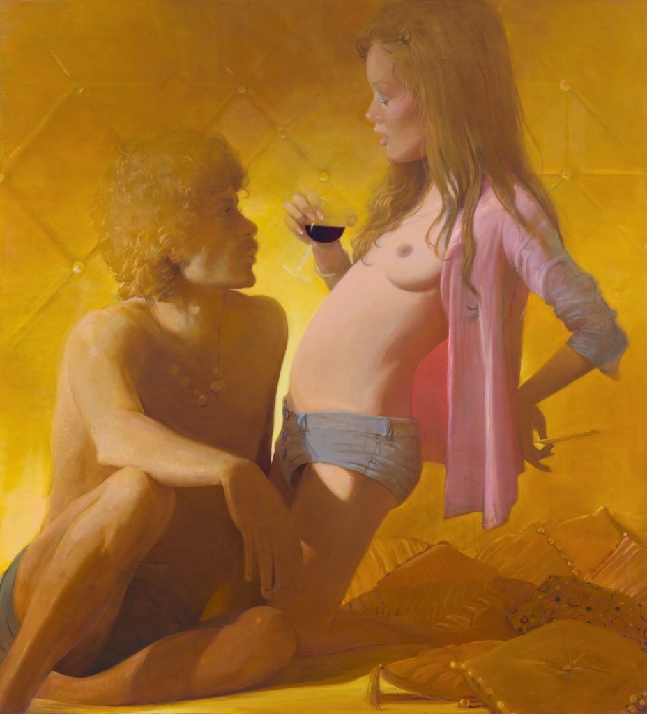
Lisa Yuskavage is a female conventional painter who enjoys painting nude female figures. Her painting style is best described as a combination of both realism and abstract. Yuskavage was born in Philadelphia, Pennsylvania where she graduated from Temple University with a BFA. She then moved to New York City where she now exhibits her paintings. Yuskavage’s paintings provocative paintings take inspiration from a blend of soft porn magazines such as “Penthouse” and artworks by Baroque artist Peter Paul Rubens.  

Lisa Yuskavage’s paintings are really amazing in my opinion. She is very good at capturing the mood she wants to convey in her paintings. I think what helps her with that is how she is able to include artificial lighting in each painted scene to make it look realistic. What is interesting about this technique is that the hues Yuskavage uses in her paintings feel fanciful, almost as if it were straight out of an “Avatar” movie. My favourite painting by Yuskavage is her “Self Portrait” (2017). At first when I saw this painting I thought she drew herself with three legs, but as I looked closer, I realized there is a man standing behind her, almost ghost- like grabbing her by the waist. It is a very different approach to a self portrait like the ones I’ve seen from different art periods. I admire Yuskavage’s careless attitude as she is not afraid to paint herself in such a revealing manner. She does not dwell on the critics opinions as she continues to draw women in a strong yet erotic way. I am glad that not all art history was dominated by the male gender painting nude women. I like how I get to see the shift in female erotica, how Yuskavage’s paintings feel more genuine knowing that it was painted by a female herself.

”Self Portrait” (2017). Oil on linen.
https://www.yuskavage.com/artwork/4543
”Golden Couple” (2018) depicts the strong connection between man and woman. The evidence of drugs and alcohol and afro and moustache suggest that this painting was meant to take place in the time of the disco era.
https://www.yuskavage.com/artwork/4565
“Scissor Sisters” (2019) depict two strong female figures surviving out in the wilderness. The way the women are dressed in their undergarments remind me of the Disney movie “Tarzan” and how the two ladies are only wearing and holding the bare necessities for survival.
https://www.yuskavage.com/artwork/4598

Sources:

https://brooklynrail.org/2009/03/art/in-conversation-lisa-yuskavage-with-phong-bui

https://en.wikipedia.org/wiki/Lisa_Yuskavage

https://www.theartstory.org/artist/yuskavage-lisa/

https://www.yuskavage.com/artwork/4565

Abstract Expressionism & Pop Art

ROY LICHTENSTEIN (1923-1997)

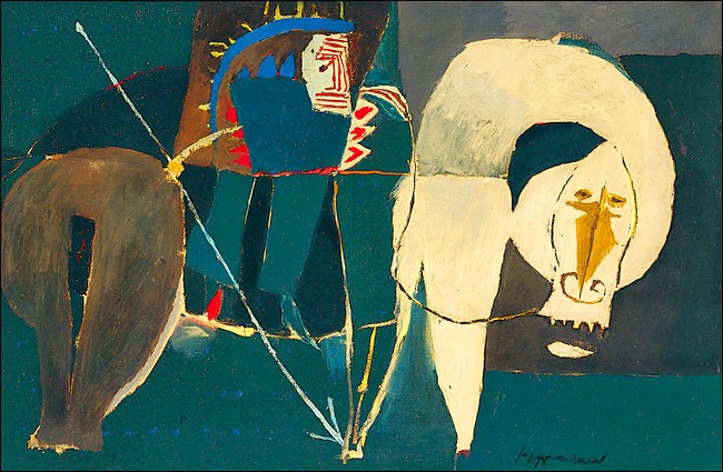
American pop artist Roy Lichtenstein was best known for his comic style parodies. Lichtenstein’s early life consisted of him going to the Apollo Theatre in Harlem, where he would draw life drawings of musicians playing their music. Lichtenstein continued his art studies at the Ohio State University where he graduated and became an art instructor. Lichtenstein also taught at Rutgers University where he was first introduced to pop imagery by his colleague Allan Karpov. 

End of the Trail” (1951) is one of Lichtenstein’s earlier works. You can see that his style was very much like cubism and expressionism at the time.
https://brendandonnet.wordpress.com/2012/11/25/roy-lichtenstein-vs-walter-benjamin/

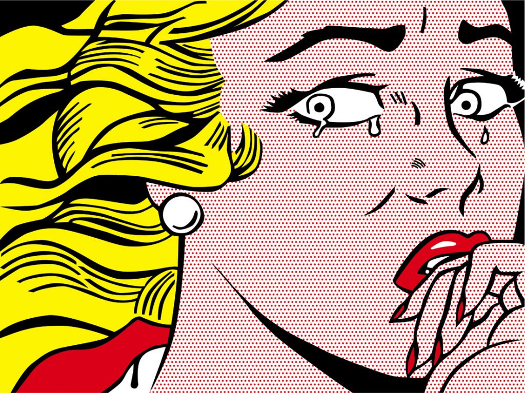
As a fan of comic books, I really enjoy Roy Lichtenstein’s work. I have been a fan of his work for some time as I dressed up as the “Crying Girl” for Halloween in grade nine. I think the reason why I wanted to dress up like one of Liechtenstein’s screen prints is for the way Lichtenstein is able to capture the beauty of women. Screenprints such as “Crying Girl” 1963 is a simple headshot of a girl crying. However, what I find so captivating about this piece is for the girl’s expression on her face. The girl is model like- similar to Marilyn Monroe and her red lipstick, yet she is expressing sadness. I think Lichtenstein was trying to convey a message of emotion, how even the most beautiful girls in the world can be sad too. Overall I enjoy his style of using flat colours with thick strokes. It helps exemplify the drama Lichtenstein likes to add to his work.

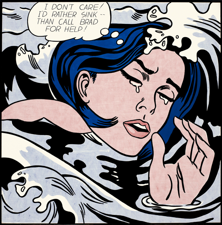
“Drowning Girl” (1963) depicts a girl in distress as she would “rather sink than call Brad for help”. I really enjoy the variety of strokes Lichtenstein uses in the water as well as her hair. The dark black stroke help make the subject matter pop out of the water.
https://brendandonnet.wordpress.com/2012/11/25/roy-lichtenstein-vs-walter-benjamin/
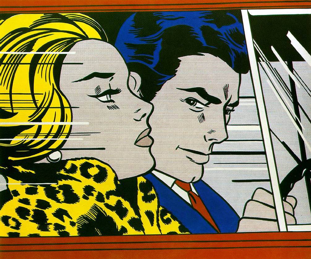
“In the Car” (1964) reminds me of Tamara de Lempicka’s “Tamara in the Green Bugatti”. However, in this image, it looks like the man next to her is controlling her life whereas Tamara looks like she is running her life according to how she wants to and does things her way.
https://brendandonnet.wordpress.com/2012/11/25/roy-lichtenstein-vs-walter-benjamin/
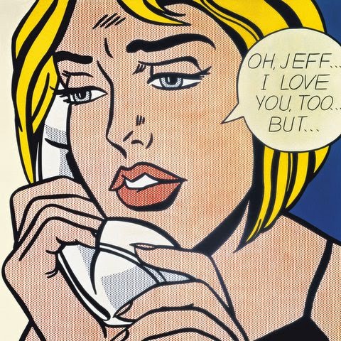
“Oh, Jeff… I Love You, Too… But…” (1964). This girl represents IDEA 23 at the end of the fall semester.
https://brendandonnet.wordpress.com/2012/11/25/roy-lichtenstein-vs-walter-benjamin/