Blog 5: Douglas Coupland

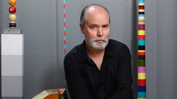
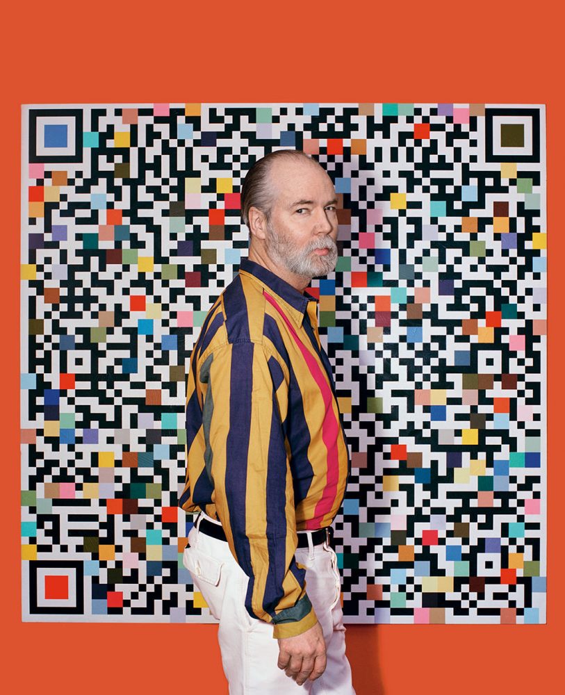
Born in Germany, but grew up in Vancouver, BC, Douglas Coupland has established himself as a Canadian author and artist. In 1984, Douglas attended Emily Carr University of Art and Design as a sculptor but then moved to Hawaii to study Japanese Business Science. In 2013, Douglas was given Officer of the Order Of Canada for his great accomplishments.

Douglas Coupland with Governor General David Johnston after Douglas was named Officer of the Order of Canada in 2013.

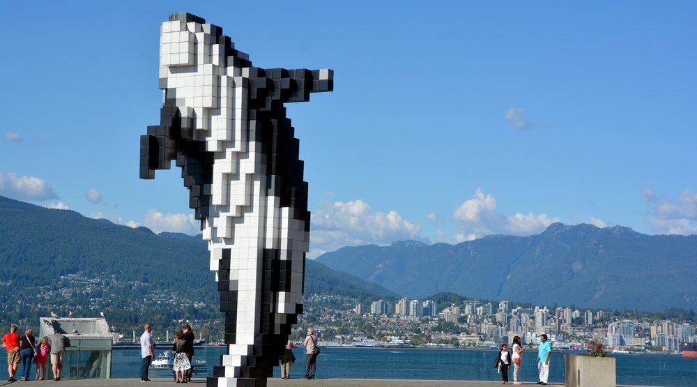
Some of Douglas’ greatest works include 2018 Vortex, an installation at the Vancouver Aquarium to bring awareness to plastic pollution in our oceans and his first solo exhibition 2014 “Everywhere is anywhere is anything is everything”. You can see from his great body of work that he is heavily influenced by the pop art era, artists such as Andy Warhol. The difference between pop art and Douglas Coupland’s art is that Douglas Coupland makes pop art that reflects the digital age that we are living in. For example, the “Digital Orca” is a sculpture he produced that showcases Vancouver’s past of harbour life with the future of the digital era.

Douglas Coupland’s “Everywhere is anywhere is anything is everything” exhibition showcased many pieces that were inspired by pixelations and patterns that represented the digital era.
Douglas Coupland’s “Digital Orca” is a popular sculpture that sits beside the Vancouver Convention Centre in Downtown Vancouver.

Sources:

https://www.britannica.com/biography/Douglas-Coupland

https://www.thecanadianencyclopedia.ca/en/article/douglas-coupland

Blog 4: April Greiman

April Greiman was one of the first graphic designers to push the limitations of the computer in the late 1970s.

Graduating with an undergraduate degree from Kansas City Art Institute, April found herself moving to Switzerland for additional learning, attending Basel School of Design, where she was mentored by Armin Hofmann and Wolfgang Weingart. Armin and Wolfgang exposed April to the International Style movement and later the “New Wave” which she associates her art style as. Things that seemed like a disadvantage such as pixelation and other digitization “errors”, April was able to integrate them as part of the design in her work.

A few key elements you can commonly find in most of April’s works is that she tends to make her subjects floating in mid air on different angles, while accompanied by different typefaces.

April has a way of bringing an element of surprise with all her pieces.

April’s body of work is overall enjoyable to look at. The use of colour, photography, font variation and perspective puts viewers through a new experience every time it is encountered with. What I have pulled out from April’s work is that putting thought and intention into your work does not have to be boring, thus why she is a quintessential member of the “New Wave” movement.

Distorting text is normally something a designer will not do, but it works well in this piece given that the photograph is quite plain. It gives this a level of interest and makes the viewers want to look more into the message of the poster.

Sources:

https://www.aiga.org/medalist-aprilgreiman

Blog 3: Paula Scher

Paula Scher reconfigured the design world with only knowing the essentials, knowing how to illustrate her concepts using typography. She is known to have given corporate identities to many big companies such as CNN, Citi Bank, and Tiffany & Co. Paula now sits as the first female Principal of Pentagram, since 1991. 

These are a few of Paula’s big corporate logos she has designed in her career.

Paula’s portfolio stretches into different design genres, from corporate logo design, packaging, and her album covers, which used to produce on average 150 album covers a year. Paula married her design “crush” Seymour Chwast who also is a partner at Pentagram. But their work history dates back to when Paula was first working at CBS and Atlantic Records, collaborating on Dan Hartman’s 1978 Instant Replay album cover. 

Dan Hartman’s Instant Replay album cover was designed by Paula Scher and illustrated by Seymour Chwast.

Although she said that she is not the best illustrator out there, it is not a doubt that Paula Scher’s 40-year career has been anything but mediocre. 

Paula’s success comes from her mastery of crafting an illustration only using typography. This was one out of the 39 other paintings she had done for New York City’s Queens Metropolitan Campus.

Sources:

http://paulastribute.weebly.com/1974-1983-cbsatlantic-records.html

https://www.pentagram.com/about/paula-scher

Blog 2: Stanley Mouse

Stanley Mouse is an American artist who is renowned for his psychedelic posters and album covers. Some of Stanley’s most credible pieces include his works done for the Grateful Dead and Journey which he and fellow artist Alton Kelley collaborated on together. Stanley grew up in an artistic household in Detroit, Michigan, where his father was one of the animators for Walt Disney’s Snow White. Living in the main hub of automotive manufacturing, Stanley found himself obsessing over motor cars. Combining his great talent with the airbrush, it is said that Stanley painted almost every hot rod in the city and participated in every car show painting custom t-shirts. Aside from his love of cars, Stanley saw art nouveau and other periods like art deco to be influential periods that shaped his art style to fit the aesthetic of commercial art.

What I admire most about Stanley is his collaborative efforts with other artists. By taking advantage of the sources he had around him, and learning new styles, Stanley’s experimentation with rock posters and album covers rewarded him as being one of the most iconic psychedelic artists of this era.

Sources:

https://en.wikipedia.org/wiki/Stanley_Mouse

http://www.mousestudios.com/section/biography

Blog 1: Otto Storch

Otto Storch is a well-recognized photographer and Art Director who has received well over 300 awards for his work in the advertising industry. Otto helped bring a modern flavour to American editorials. He first stepped foot into the design industry as a photo retoucher for Dell publishing House and soon after became Art Director.

A McCall’s spread by Otto Storch from 1961. The text is warped to look like a mattress where the woman is laying on.

Otto had such a successful career because of his exploration in design. He craved excitement for new projects and liked having the freedom to push his creative limits. At Dell, Otto felt as if his work was being forced out of quantity rather than quality. This was where he went back to learning, first by taking classes taught by Harper Bazaar’s Art Director Alexey Brodovitch and then eventually studying at the New School. 17 years later, Otto joined McCall’s magazine where he began to feel his spark of creativity come back while discovering his new love for photography.

Another McCall’s spread done by Otto Storch. At first glance, this spread looks average as all text is aligned justified, but as you look closer, the text is adjusted according to the shape of the makeup brushes that come close.

Otto’s experimentation with typography and photography broke the barriers of design. For me, Otto helped make reading interesting by changing the way type was used. Type was no longer looked at as a way of communicating information, but a way of visually evoking feeling as an image. Although Otto is no longer with us today, I feel that his body of works will continue to live on and inspire many other artists to work outside of their comfort zone.

Sources: