Cubism, Dadaism, & Surrealism

YVES TANGUY (1900-1955)

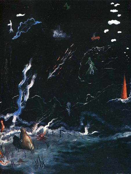
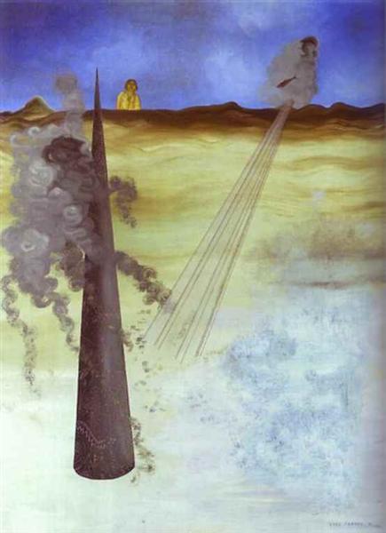
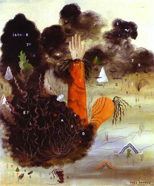
Raymond Georges Yves Tanguy was highly recognized for his surrealist paintings. Tanguy’s subject matter for his paintings include dreams, childhood memory, hallucinations, and psychotic episodes. Yves Tanguy did not only have a unique style of painting, he was a unique individual who enjoyed eating living spiders. 

Tanguy was a self-taught painter whose precision and skill disguised his lack of training. His lack of experience for being quite a young painter did not seem to affect people’s judgment of him. It rather surprised many to see how such a young artist could have such a mature sense of style to his painting. Tanguy was one of the first surrealist painters who was capable of capturing his unconscious thoughts into an atmosphere.

Early on in his career, Tanguy met Andre Breton. This was his lead way into meeting the group of surrealists at the time, including Pablo Picasso, Max Ernst, and Andre Masson. In 1928, Tanguy joined this group of painters to exhibited his work at Paris’ “Galerie au Sacre du Printemps”. Tanguy soon after would exhibit his pieces across the world, he had exhibits in New York, Brussels, Paris, and London.

“Storm” (Black Landscape, 1926). This painting reminds me of the ocean floor. The white strokes look like water waves but also look like clouds (the strokes up at the top). The brown rock on the left looks like a hermit crab shell but also looks like a bird’s head with the eye on the side.
https://www.wikiart.org/en/yves-tanguy/storm-black-landscape-1926

Looking at the work of Yves Tanguy, I can see that his paintings are a self-reflection of himself. As a person and painter, Tanguy has a strange personality that is somewhat admirable. I admire how he does not shy away from the unusual however I do not see myself gravitating towards his art. For me, I like to be able to recognize the subject matter of a painting. When I look at Yves Tanguy, I do not know what I’m looking at. The only thing I know is that this French painter was very good at conveying the depth of field and turning shapes into objects. His paintings almost look sculpture-like. 

“Tomorrow” (1938) is an oil on canvas piece that looks almost desert-like. The green twigs in the background look like cacti, while the shapes in the foreground look like animals and people trying to migrate to a new home.
https://www.wikiart.org/en/yves-tanguy/tomorrow-1938
“Through Birds Through Fire But Not Through Glass” (1943). A lot of Tanguy’s pieces are not supposed to represent anything other than his unconscious mind, however this piece, I am reminded of a circus scene, where the big object in the front looks like an elephant with its trunk out and the red and white balls in the background are the circus balls that the animals play with.
https://www.wikiart.org/en/yves-tanguy/through-birds-through-fire-but-not-through-glass-1943
“I Came Like I Promised” (1926) sounds like a piece that was inspired by World War 1. The diagonal lines that lead my eyes towards the smoke in the foreground and background remind me of some sort of bombing that is occurring. The woman in the background looks like she is standing still. She looks like she is in shock of what is happening before her eyes.
https://www.wikiart.org/en/yves-tanguy/i-came-like-i-promised-1926
“The Hand in the Clouds”(1927). This piece is refreshing to see from Tanguy because it looks like he used the anatomy of a human hand as the main subject of his painting rather than shapes. He also included scattered letters and numbers arising from the smoke which makes me feel like it was a calculated attack on someone.
https://www.wikiart.org/en/yves-tanguy/the-hand-in-the-clouds-1927

Sources:

https://en.wikipedia.org/wiki/Yves_Tanguy

https://www.guggenheim.org/artwork/artist/yves-tanguy

https://www.theartstory.org/artist/tanguy-yves/

Survey 6: Suffragette Sash Artifact

Fashion played a big part in the Suffragette Movement in the early 1900’s. This caused a great notion amongst society as women were rejecting the corsets and crinolines of the Victorian Era. Like men, women were seen wearing trousers and pantsuits, in preachment of the comfortable clothing movement. Unlike any other protest, the Suffragette Movement did not shy away from the public eye. Many women who supported the movement wore the colours green, purple, and white in solidarity of women having equal rights to men. These three colours were chosen by Christabel Pankhurt, who was the co-founder and leader of the Social and Political Union. The colour green represents hope, purple for royalty, and white for purity. The Suffragette Movement not only change the right for women to vote, but it made fashion for females more progressive and more diverse decades after. 

Women supporting the Suffragette Movement were expected to dress in either all white, or in the three colours, white, green, and purple. This is an example of one of the many types of suffragette sashes worn during this time.
https://blog.fitnyc.edu/volumesandissues/2017/01/20/textiles-speak/

Though controversial, fashion houses such as Peter Robinson, best known as Topshop today had well supported the Suffragette Movement.  Storefronts helped promote pieces of clothing such as scarves in the iconic green, purple, and white colours. With the whole dress according to the occasion movement, “Vote for Women”, a newspaper house argued to be conscious when buying white dresses for the movement and to only buy from companies who supported the Suffragettes. This comes to show how intense this protest was that no matter what one does, there will always be an afterthought of doing the right thing for women.

Example of a suffragette poster used to advertise the movement in 1910.
https://mymodernmet.com/womens-suffrage-poster-cambridge-university-library/

What I have learned from this time period was that in order to do justice to the Suffragette era, I would need to include the iconic colour trio into my fashion artifact. These colours back in the day were the main determinants to show whether you were a supporter of this cause or not.

My idea for this artifact is to recreate the sash that was worn by women during the Suffragette Movement. This was an important piece of clothing as it was a wearable piece of promotion for the Suffragette Movement. 

Sources:

https://americanhistory.si.edu/collections/search/object/nmah_509474

https://en.wikipedia.org/wiki/Black_suffrage

https://www.stylist.co.uk/fashion/suffragette-movement-fashion-clothes-what-did-the-suffragettes-wear/188043

https://www.womenshistory.org/resources/general/woman-suffrage-movement

Knowing I was being given a fashion artifact for Survey 6, I felt extremely excited and enthusiastic about the project ahead. I decided to dedicate this spread towards the Suffragette Movement because I had learned a bit about this topic in high school, yet I wanted to further my knowledge of an important event that improved lives for millions of women. When researching, I found the Suffragette sash to be one of the most well-recognized clothing pieces of this time. I like how the sash was a piece of clothing that signified unity amongst women. For this reason, I felt the need to shine light on this event and try to educate others on my learning.

I am much happier and satisfied with the turnout of my second spread compared with my first because I felt like the process ran much smoother, which allowed me to really comprehend how I was applying my knowledge into this project. I would give myself an 8.5/10 for this artifact because I was able to go out of my comfort zone and try something new, yet not allow this new thing to affect the execution of the final product like how it did for my first spread. My experience with sewing is very slim. I have not played around with sewing a lot, so I believe the turnout of my satin Suffragette sash was very successful. What I think I could have improved on with this project was photographing the sash. Initially, I wanted to iron on my text to the back of my sash using iron-on fabric paper, however, because I used satin, I was unsure if the material would work the same as if it were cotton fabric. That lead me to photograph the sash vertically so that later on I could paste the text on with glue. I wish I would have done a better job at incorporating my text because I felt like it was a bit lacklustre. Aside from the text, I was very happy with the background illustration because I felt like it was able to set a good mood for my time period yet not take away too much from the actual artifact itself. 

Expressionism, Fauvism, & Early 20th Century

RAOUL DUFY (1877-1953)

Raoul Dufy was a late 18th century french painter who explored different mediums such as woodcuts, ceramics, and tapestries. In 1912, Dufy became the founder of a textile company, where he made textiles out of cotton and silk. What motivated Dufy to pursue art was for his first job working as a junior clerk at a coffee importing firm. This was where Dufy witnessed many boats that he felt ignited to enroll himself at Le Havre’s Ecole des Beaux-Arts shortly after. Dufy’s work is defined as fauvism because Dufy tended to use plenty of bright colours in his paintings. Dufy’s subject matter of choice were horse races, regattas, parades, and concerts. 

“The Hunt” (1919) was one of the fabric patterns Dufy designed. This pattern reminds me of Hawaiian prints because of the rounded petals on the flowers and the variety of strokes on the diverse selection of plants.
https://www.wikiart.org/en/raoul-dufy/the-hunt-design-for-fabric

Dufy is an artist whose work I can picture on the cover of a magazine or poster. When I look at Dufy’s work, I gain a sense that Dufy was not afraid of taking risks. Not only does Dufy use a wide range of colour in majority of his pieces, the detail on Dufy’s work is quite minimal, yet has enough information that I can gain a sense of what the image is suppose to resemble. My first impression when I saw Dufy’s work was that Dufy was an artist not to be taken seriously. His works such as “The Kessler Family on Horseback” feel playful and lively. This might be because of the painting scenes of his choosing.

“The Kessler Family on Horseback” (1931) is a very minimal yet chaotic piece because Dufy uses many colours and has many subjects in a cluster, yet has the bare minimum of strokes for the people and horses on scene.
https://www.tate.org.uk/art/artworks/dufy-the-kessler-family-on-horseback-t03566
“La Réception à l’Amirauté” (1936) is one of my favourite pieces by Dufy because it reminds me of a collage due to the mismatch in colours each person is drawn in. The perspective of the painting is very interesting because the people in the foreground are almost equally as small as the people in the midground.
https://www.artsy.net/artwork/raoul-dufy-la-reception-a-lamiraute-reception-at-the-admiralty
“Open Window, Nice” (1926), oil on canvas.
https://www.artic.edu/artworks/23639/open-window-nice

Sources:

https://www.britannica.com/biography/Raoul-Dufy

https://en.wikipedia.org/wiki/Raoul_Dufy

Impressionism & Post Impressionism

CAMILLE PISSARRO (1830-1903)

Camille Pissarro was one of the few contributing artists who shaped the impressionist movement. Because Camille Pissarro was a french artist of Portuguese descent, he was often looked at as an outsider. In addition to his disliked origins, Pissarro’s art style was not idealized by the Paris salon. Like Monet and Cezanne, Pissarro’s approach to landscape paintings was much more experimental and modern at the time of realism, pre-impressionism, and pre-raphaelites. By not being able to showcase his artworks like his peers, Pissarro and other artists such as Cezanne, Edgar Degas, Edouard Manet, Pierre-Auguste Renoir began to create what was known as their own art exhibition. In 1873, Pissarro showcased five of his paintings, some including The Old Road to Ennery, Bourgeois House at L’Hermitage, Pontoise, and his own self-portrait.

The man in “The Old Road to Ennery” (1873) is shown to be doing his everyday tasks in the countryside.
https://commons.wikimedia.org/wiki/File:Camille_Pissarro_-_Gel%C3%A9e_blanche,_ancienne_route_d%C2%B4Ennery,_Pontoise_-_1873.jpg
“Bourgeois House at L’Hermitage, Pontoise” (1873)
http://www.camillepissarro.org/bourgeois-house-in-at-hermitage-pontoise.jsp
Camille Pissarro’s self-portrait (1873)
https://www.wikiart.org/en/camille-pissarro/self-portrait-1873

When I look at Camille Pissarro’s pieces, I see myself enjoying his earlier works such as Paisaje tropical con casas rurales y palmeras much more compared to his more recent pieces. What I like about Paisaje tropical con casas rurales y palmeras is Pissarro’s choice of a warmer colour palette. Even though it is clear that Pissarro is not painting in a realistic manner, his figures in this piece are well recognizable, which I find it a little more challenging when I look at his later pieces. For instance, Haymaking, Éragny is a painting that I dislike because I find it hard to concentrate on what the main subject is. There appears to be no real subject manner. The painting’s delivery lacks depth and the colours are not my ideal compared to when I look at Paisaje tropical con casas rurales y palmeras.

“Paisaje tropical con casas rurales y palmeras” (1867) was a piece Camille Pissarro worked on early in his career when he moved to Venezuela.
https://theculturetrip.com/europe/france/articles/10-artworks-by-pissarro-you-should-know/
“Two Women Chatting by the Sea, St.Thomas” (1856) is a painting that well displays Pissarro’s ability in capturing outdoor lighting with oil paint.
http://www.camillepissarro.org/camille-pissarro-painting-gallery6.jsp

Sources:

https://www.biography.com/artist/camille-pissarro

http://www.camille-pissarro.org/

https://www.theartstory.org/artist/pissarro-camille/

Survey 3: Design Infographic Rationale

My experience with having to do my first history spread on the Rococo period started off rocky. When I was assigned design for my infographic, I assumed I was given the broad topic of design and did not realize design meant graphic design. This lead me to believe that I had the freedom to do anything that was considered design. I had sketches of designs based on my admiration for interior design during this period. Thinking about furniture and interior decoration, I thought it would be really fun to recreate and do my interpretation on an “Ikea” catalogue. After realizing my mistake, I decided to not let this idea go to complete waste. I decided to base my spread on different types of typography developed during this period that was influenced by interior design at the time.

I would rate my spread an 8/10 because I thought my idea was really good but I was not satisfied with the completion of it. I ran into a bunch of artistic problems such as the type of medium to use. At the start, I used pencil crayon to colour in the hands and background. However, it did not look very vibrant as I wanted it to so I resorted to using acrylic paint. At the same time, I had planned to use gold leaf because the Rococo had a lot of gold as the interior. I found it to be a mistake because I had never had the proper experience using gold leaf that it left me with great difficulty placing the gold leaf onto my spread evenly. Other then the type of medium, I would have made the text of my spread look more interesting. Whether I incorporated the appropriate text for each blurb or added little statistics and diagrams, I wish I had made my infographic look more so like an infographic.