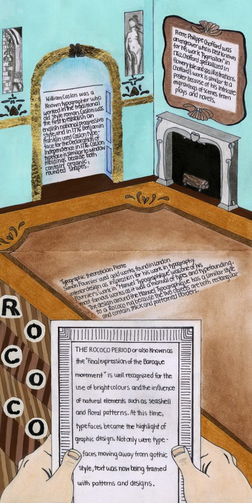
My experience with having to do my first history spread on the Rococo period started off rocky. When I was assigned design for my infographic, I assumed I was given the broad topic of design and did not realize design meant graphic design. This lead me to believe that I had the freedom to do anything that was considered design. I had sketches of designs based on my admiration for interior design during this period. Thinking about furniture and interior decoration, I thought it would be really fun to recreate and do my interpretation on an “Ikea” catalogue. After realizing my mistake, I decided to not let this idea go to complete waste. I decided to base my spread on different types of typography developed during this period that was influenced by interior design at the time.
I would rate my spread an 8/10 because I thought my idea was really good but I was not satisfied with the completion of it. I ran into a bunch of artistic problems such as the type of medium to use. At the start, I used pencil crayon to colour in the hands and background. However, it did not look very vibrant as I wanted it to so I resorted to using acrylic paint. At the same time, I had planned to use gold leaf because the Rococo had a lot of gold as the interior. I found it to be a mistake because I had never had the proper experience using gold leaf that it left me with great difficulty placing the gold leaf onto my spread evenly. Other then the type of medium, I would have made the text of my spread look more interesting. Whether I incorporated the appropriate text for each blurb or added little statistics and diagrams, I wish I had made my infographic look more so like an infographic.