Contemporary & Post Modernism

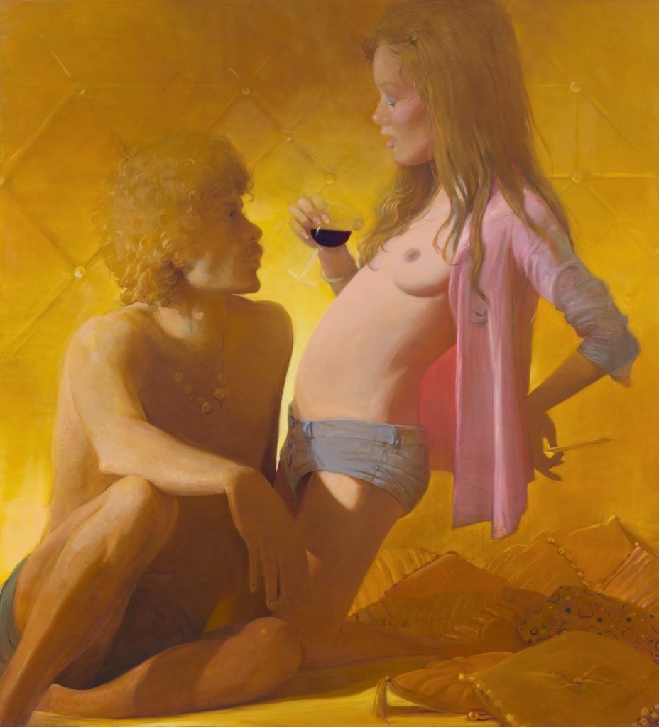
LISA YUSKAVAGE (1962-PRESENT)

Lisa Yuskavage is a female conventional painter who enjoys painting nude female figures. Her painting style is best described as a combination of both realism and abstract. Yuskavage was born in Philadelphia, Pennsylvania where she graduated from Temple University with a BFA. She then moved to New York City where she now exhibits her paintings. Yuskavage’s paintings provocative paintings take inspiration from a blend of soft porn magazines such as “Penthouse” and artworks by Baroque artist Peter Paul Rubens.  

Lisa Yuskavage’s paintings are really amazing in my opinion. She is very good at capturing the mood she wants to convey in her paintings. I think what helps her with that is how she is able to include artificial lighting in each painted scene to make it look realistic. What is interesting about this technique is that the hues Yuskavage uses in her paintings feel fanciful, almost as if it were straight out of an “Avatar” movie. My favourite painting by Yuskavage is her “Self Portrait” (2017). At first when I saw this painting I thought she drew herself with three legs, but as I looked closer, I realized there is a man standing behind her, almost ghost- like grabbing her by the waist. It is a very different approach to a self portrait like the ones I’ve seen from different art periods. I admire Yuskavage’s careless attitude as she is not afraid to paint herself in such a revealing manner. She does not dwell on the critics opinions as she continues to draw women in a strong yet erotic way. I am glad that not all art history was dominated by the male gender painting nude women. I like how I get to see the shift in female erotica, how Yuskavage’s paintings feel more genuine knowing that it was painted by a female herself.

”Self Portrait” (2017). Oil on linen.
https://www.yuskavage.com/artwork/4543
”Golden Couple” (2018) depicts the strong connection between man and woman. The evidence of drugs and alcohol and afro and moustache suggest that this painting was meant to take place in the time of the disco era.
https://www.yuskavage.com/artwork/4565
“Scissor Sisters” (2019) depict two strong female figures surviving out in the wilderness. The way the women are dressed in their undergarments remind me of the Disney movie “Tarzan” and how the two ladies are only wearing and holding the bare necessities for survival.
https://www.yuskavage.com/artwork/4598

Sources:

https://brooklynrail.org/2009/03/art/in-conversation-lisa-yuskavage-with-phong-bui

https://en.wikipedia.org/wiki/Lisa_Yuskavage

https://www.theartstory.org/artist/yuskavage-lisa/

https://www.yuskavage.com/artwork/4565

Abstract Expressionism & Pop Art

ROY LICHTENSTEIN (1923-1997)

American pop artist Roy Lichtenstein was best known for his comic style parodies. Lichtenstein’s early life consisted of him going to the Apollo Theatre in Harlem, where he would draw life drawings of musicians playing their music. Lichtenstein continued his art studies at the Ohio State University where he graduated and became an art instructor. Lichtenstein also taught at Rutgers University where he was first introduced to pop imagery by his colleague Allan Karpov. 

End of the Trail” (1951) is one of Lichtenstein’s earlier works. You can see that his style was very much like cubism and expressionism at the time.
https://brendandonnet.wordpress.com/2012/11/25/roy-lichtenstein-vs-walter-benjamin/

As a fan of comic books, I really enjoy Roy Lichtenstein’s work. I have been a fan of his work for some time as I dressed up as the “Crying Girl” for Halloween in grade nine. I think the reason why I wanted to dress up like one of Liechtenstein’s screen prints is for the way Lichtenstein is able to capture the beauty of women. Screenprints such as “Crying Girl” 1963 is a simple headshot of a girl crying. However, what I find so captivating about this piece is for the girl’s expression on her face. The girl is model like- similar to Marilyn Monroe and her red lipstick, yet she is expressing sadness. I think Lichtenstein was trying to convey a message of emotion, how even the most beautiful girls in the world can be sad too. Overall I enjoy his style of using flat colours with thick strokes. It helps exemplify the drama Lichtenstein likes to add to his work.

“Drowning Girl” (1963) depicts a girl in distress as she would “rather sink than call Brad for help”. I really enjoy the variety of strokes Lichtenstein uses in the water as well as her hair. The dark black stroke help make the subject matter pop out of the water.
https://brendandonnet.wordpress.com/2012/11/25/roy-lichtenstein-vs-walter-benjamin/
“In the Car” (1964) reminds me of Tamara de Lempicka’s “Tamara in the Green Bugatti”. However, in this image, it looks like the man next to her is controlling her life whereas Tamara looks like she is running her life according to how she wants to and does things her way.
https://brendandonnet.wordpress.com/2012/11/25/roy-lichtenstein-vs-walter-benjamin/
“Oh, Jeff… I Love You, Too… But…” (1964). This girl represents IDEA 23 at the end of the fall semester.
https://brendandonnet.wordpress.com/2012/11/25/roy-lichtenstein-vs-walter-benjamin/

Cubism, Dadaism, & Surrealism

YVES TANGUY (1900-1955)

Raymond Georges Yves Tanguy was highly recognized for his surrealist paintings. Tanguy’s subject matter for his paintings include dreams, childhood memory, hallucinations, and psychotic episodes. Yves Tanguy did not only have a unique style of painting, he was a unique individual who enjoyed eating living spiders. 

Tanguy was a self-taught painter whose precision and skill disguised his lack of training. His lack of experience for being quite a young painter did not seem to affect people’s judgment of him. It rather surprised many to see how such a young artist could have such a mature sense of style to his painting. Tanguy was one of the first surrealist painters who was capable of capturing his unconscious thoughts into an atmosphere.

Early on in his career, Tanguy met Andre Breton. This was his lead way into meeting the group of surrealists at the time, including Pablo Picasso, Max Ernst, and Andre Masson. In 1928, Tanguy joined this group of painters to exhibited his work at Paris’ “Galerie au Sacre du Printemps”. Tanguy soon after would exhibit his pieces across the world, he had exhibits in New York, Brussels, Paris, and London.

“Storm” (Black Landscape, 1926). This painting reminds me of the ocean floor. The white strokes look like water waves but also look like clouds (the strokes up at the top). The brown rock on the left looks like a hermit crab shell but also looks like a bird’s head with the eye on the side.
https://www.wikiart.org/en/yves-tanguy/storm-black-landscape-1926

Looking at the work of Yves Tanguy, I can see that his paintings are a self-reflection of himself. As a person and painter, Tanguy has a strange personality that is somewhat admirable. I admire how he does not shy away from the unusual however I do not see myself gravitating towards his art. For me, I like to be able to recognize the subject matter of a painting. When I look at Yves Tanguy, I do not know what I’m looking at. The only thing I know is that this French painter was very good at conveying the depth of field and turning shapes into objects. His paintings almost look sculpture-like. 

“Tomorrow” (1938) is an oil on canvas piece that looks almost desert-like. The green twigs in the background look like cacti, while the shapes in the foreground look like animals and people trying to migrate to a new home.
https://www.wikiart.org/en/yves-tanguy/tomorrow-1938
“Through Birds Through Fire But Not Through Glass” (1943). A lot of Tanguy’s pieces are not supposed to represent anything other than his unconscious mind, however this piece, I am reminded of a circus scene, where the big object in the front looks like an elephant with its trunk out and the red and white balls in the background are the circus balls that the animals play with.
https://www.wikiart.org/en/yves-tanguy/through-birds-through-fire-but-not-through-glass-1943
“I Came Like I Promised” (1926) sounds like a piece that was inspired by World War 1. The diagonal lines that lead my eyes towards the smoke in the foreground and background remind me of some sort of bombing that is occurring. The woman in the background looks like she is standing still. She looks like she is in shock of what is happening before her eyes.
https://www.wikiart.org/en/yves-tanguy/i-came-like-i-promised-1926
“The Hand in the Clouds”(1927). This piece is refreshing to see from Tanguy because it looks like he used the anatomy of a human hand as the main subject of his painting rather than shapes. He also included scattered letters and numbers arising from the smoke which makes me feel like it was a calculated attack on someone.
https://www.wikiart.org/en/yves-tanguy/the-hand-in-the-clouds-1927

Sources:

https://en.wikipedia.org/wiki/Yves_Tanguy

https://www.guggenheim.org/artwork/artist/yves-tanguy

https://www.theartstory.org/artist/tanguy-yves/

Expressionism, Fauvism, & Early 20th Century

RAOUL DUFY (1877-1953)

Raoul Dufy was a late 18th century french painter who explored different mediums such as woodcuts, ceramics, and tapestries. In 1912, Dufy became the founder of a textile company, where he made textiles out of cotton and silk. What motivated Dufy to pursue art was for his first job working as a junior clerk at a coffee importing firm. This was where Dufy witnessed many boats that he felt ignited to enroll himself at Le Havre’s Ecole des Beaux-Arts shortly after. Dufy’s work is defined as fauvism because Dufy tended to use plenty of bright colours in his paintings. Dufy’s subject matter of choice were horse races, regattas, parades, and concerts. 

“The Hunt” (1919) was one of the fabric patterns Dufy designed. This pattern reminds me of Hawaiian prints because of the rounded petals on the flowers and the variety of strokes on the diverse selection of plants.
https://www.wikiart.org/en/raoul-dufy/the-hunt-design-for-fabric

Dufy is an artist whose work I can picture on the cover of a magazine or poster. When I look at Dufy’s work, I gain a sense that Dufy was not afraid of taking risks. Not only does Dufy use a wide range of colour in majority of his pieces, the detail on Dufy’s work is quite minimal, yet has enough information that I can gain a sense of what the image is suppose to resemble. My first impression when I saw Dufy’s work was that Dufy was an artist not to be taken seriously. His works such as “The Kessler Family on Horseback” feel playful and lively. This might be because of the painting scenes of his choosing.

“The Kessler Family on Horseback” (1931) is a very minimal yet chaotic piece because Dufy uses many colours and has many subjects in a cluster, yet has the bare minimum of strokes for the people and horses on scene.
https://www.tate.org.uk/art/artworks/dufy-the-kessler-family-on-horseback-t03566
“La Réception à l’Amirauté” (1936) is one of my favourite pieces by Dufy because it reminds me of a collage due to the mismatch in colours each person is drawn in. The perspective of the painting is very interesting because the people in the foreground are almost equally as small as the people in the midground.
https://www.artsy.net/artwork/raoul-dufy-la-reception-a-lamiraute-reception-at-the-admiralty
“Open Window, Nice” (1926), oil on canvas.
https://www.artic.edu/artworks/23639/open-window-nice

Sources:

https://www.britannica.com/biography/Raoul-Dufy

https://en.wikipedia.org/wiki/Raoul_Dufy

Impressionism & Post Impressionism

CAMILLE PISSARRO (1830-1903)

Camille Pissarro was one of the few contributing artists who shaped the impressionist movement. Because Camille Pissarro was a french artist of Portuguese descent, he was often looked at as an outsider. In addition to his disliked origins, Pissarro’s art style was not idealized by the Paris salon. Like Monet and Cezanne, Pissarro’s approach to landscape paintings was much more experimental and modern at the time of realism, pre-impressionism, and pre-raphaelites. By not being able to showcase his artworks like his peers, Pissarro and other artists such as Cezanne, Edgar Degas, Edouard Manet, Pierre-Auguste Renoir began to create what was known as their own art exhibition. In 1873, Pissarro showcased five of his paintings, some including The Old Road to Ennery, Bourgeois House at L’Hermitage, Pontoise, and his own self-portrait.

The man in “The Old Road to Ennery” (1873) is shown to be doing his everyday tasks in the countryside.
https://commons.wikimedia.org/wiki/File:Camille_Pissarro_-_Gel%C3%A9e_blanche,_ancienne_route_d%C2%B4Ennery,_Pontoise_-_1873.jpg
“Bourgeois House at L’Hermitage, Pontoise” (1873)
http://www.camillepissarro.org/bourgeois-house-in-at-hermitage-pontoise.jsp
Camille Pissarro’s self-portrait (1873)
https://www.wikiart.org/en/camille-pissarro/self-portrait-1873

When I look at Camille Pissarro’s pieces, I see myself enjoying his earlier works such as Paisaje tropical con casas rurales y palmeras much more compared to his more recent pieces. What I like about Paisaje tropical con casas rurales y palmeras is Pissarro’s choice of a warmer colour palette. Even though it is clear that Pissarro is not painting in a realistic manner, his figures in this piece are well recognizable, which I find it a little more challenging when I look at his later pieces. For instance, Haymaking, Éragny is a painting that I dislike because I find it hard to concentrate on what the main subject is. There appears to be no real subject manner. The painting’s delivery lacks depth and the colours are not my ideal compared to when I look at Paisaje tropical con casas rurales y palmeras.

“Paisaje tropical con casas rurales y palmeras” (1867) was a piece Camille Pissarro worked on early in his career when he moved to Venezuela.
https://theculturetrip.com/europe/france/articles/10-artworks-by-pissarro-you-should-know/
“Two Women Chatting by the Sea, St.Thomas” (1856) is a painting that well displays Pissarro’s ability in capturing outdoor lighting with oil paint.
http://www.camillepissarro.org/camille-pissarro-painting-gallery6.jsp

Sources:

https://www.biography.com/artist/camille-pissarro

http://www.camille-pissarro.org/

https://www.theartstory.org/artist/pissarro-camille/

Realism, Pre-Impressionism, & Pre-Raphaelities

WINSLOW HOMER (1836-1910)

Winslow Homer is an artist I believe first year Idea Program students can resonate with. Homer was an all-american landscape painter and printmaker who started off as a commercial illustrator at the age of 19, as he apprenticed for J. H. Bufford. Afterwards Homer began to specialize in making sheet music covers during his first two years of his career, then eventually he branched into bigger jobs such as working for Harper’s Weekly. Before starting his career, Homer and his family were well off, his uncle had a mansion in Belmont that inspired Homer’s first few works. Attending school at the National Academy of Design in New York, Homer was sent by Harper’s to sketch and draw the Amercian Civil War in 1861-1865. This opportunity transitioned Homer’s illustrated style into the more traditional art form. It was after getting back from the war was when Homer explored more with paints. 

Homer’s “Great Russian Ball” for Harper’s Weekly (1863).
http://www.sonofthesouth.net/Winslow_Homer_Civil_War_1863.htm
“The Return, Tynemouth (recto) Study (verso)” (1881) was a watercolour painting painted during the American Civil War.
https://www.artic.edu/artworks/113064/the-return-tynemouth-recto-study-verso

Winslow Homer’s career is a career I aspire to have. It did not seem like it was a struggle for Homer to start his career as an artist due to his apprenticeship with J. H. Bufford. Even so, Homer’s family was well off and had the money to send Homer to study abroad if Harper’s did not send him off to war instead. As for Homer’s paintings, it makes sense as to why Homer was a well renowned landscape artist of his time. As one who has experience with watercolour, it takes a great deal of confidence to use. I say that because unlike oil paint, it is very hard to layer and fix mistakes. However, if used right, watercolour can create an illusion of airiness and movement, which is why I think watercolour suits Homer. What I can depict from Homer’s art style is that it is very free handed, his strokes are painted with assurance. For example, “Fishing Boats, Key West” is a painting of three men fishing on their fishing boats. Homer does not focus on making his painting look life like. Instead Homer focuses on giving off the illusion that the atmosphere is moving.

“Fishing Boats, Key West” (1903)
https://www.metmuseum.org/toah/works-of-art/10.228.1/
“After the Hurricane, Bahamas” (1899) is a piece that explores the idea of weather patterns and the dangers that it brings.
https://www.artic.edu/artworks/16776/after-the-hurricane-bahamas
“Prout’s Neck, Breakers” (1883). Homer focuses solely on the ocean and how with each wave contains the power to make it to shore.
https://www.artic.edu/artworks/16815/prout-s-neck-breakers

Sources:

https://www.artic.edu/artists/34988/winslow-homer

https://www.metmuseum.org/toah/hd/homr/hd_homr.htm

https://en.wikipedia.org/wiki/Winslow_Homer

Neoclassicism, Romanticism, & Rococo

JEAN-BAPTISTE CHARDIN (1699-1779)

Jean Baptiste Chardin, master of life drawings, was special as he did not fit into the period of paint style of his time. He did not fit in the category of the Rococo period because he did not use soft colours that displayed scenes of love and entertainment in his paintings. Rather he was a genre painter who painted everyday life. In spite of the fact that Chardin had produced 200 paintings during his 50 year career, Chardin was well admired for his activity amongst the Academy. Chardin had the role of treasurer, to manage finances in the Academy. Chardin by 1770 became ‘Premier peintre du roi’ and took the lead as the highest paid member in the Academy. 

Jean Baptiste Chardin’s “Self Portrait” (1771)
http://spokenvision.com/jean-chardin-the-great-18th-century-still-life-painter/

I respect Jean Baptiste Chardin as an artist because he did not feel the need to follow trends during his time period. He stuck with what he was good at and that was life drawings. Chardin reminds me of Baroque artist Jan Steen because one of Chardin’s pieces called Soap Bubbles looks like it was painted in the exact same setting as Steen’s “Rhetoricians at a Window”. Both paintings contain a subject leaned up against the edge of a windowsill. In the top left corners of Chardin and Steen’s paintings includes a vine of leaves of a similar sort. Other than the subject matter, the only difference between the two paintings is for Chardin’s use of muted dark colours, creating a soft hue, whereas Steen’s painting uses tiny pops of colour to emphasize his depicted object, producing the illusion of a more crisp and refined painting.

Jean Baptiste Chardin’s “Soap Bubbles” (1733-1734). Chardin possibly used Jan Steen’s “Rhetoricians at a Window” (below) as inspiration.
https://www.britannica.com/biography/Jean-Baptiste-Simeon-Chardin
Jan Steen’s “Rhetoricians at a Window” (1658-1665)
https://en.wikipedia.org/wiki/Jan_Steen

 Although life drawings are not meant to give off emotion, I find Chardin’s pieces to feel intimate and humble. His brush strokes are soft and somewhat abstract, which creates a nice glow to his pieces. I am not alone in giving my opinion. According to Britannica.com, after Chardin died in 1779, Charles-Nicolas Cochin wrote a letter to Haillet de Couronne about his interaction with Chardin. Cochin asked Chardin “But who told you that one paints with colours?” Chardin’s response was “One uses colours, but one paints with feeling”.

“Pears, Walnuts and Glass of Wine” (1768). Oil on canvas.
http://spokenvision.com/jean-chardin-the-great-18th-century-still-life-painter/
“The Ray” (1728) was the piece that gave Chardin a spot in the Academy. Out of all the life drawings created by Chardin, I understand why this one was one of his most famous pieces. The subject matter of the ray is an unusual choice for a painting and because it is somewhat graphic with the cat crawling on the dead fish around it, makes it shocking for its viewers.
https://en.wikipedia.org/wiki/The_Ray_(painting)

Sources:

https://www.britannica.com/biography/Jean-Baptiste-Simeon-Chardin

https://en.wikipedia.org/wiki/Jean-Baptiste-Sim%C3%A9on_Chardin

Baroque

JAN STEEN (1626-1679)

Jan Steen was a man who lived an unusual life in comparison to his colleagues. He grew up in Leiden, Holland in 1626, where his father was a brewer who owned a tavern named “The Red Halbert”. Steen was taught by german painter Nicolaes Knupfer who was well known for his “historical and figurative scenes in Utrecht”. As an observer, I can pinpoint characteristics such as composition and use of colour where Steen took influence from Knupfer’s teachings. Unlike other artists who only had one occupation- art, Jan Steen relied on his brewery background as a source of second income where in 1654 he ran a tavern named “De Slang” and opened another after the “Year of Disaster” in 1672. Jan Steen was not rich for most of his lifetime, thus had to compensate through his art, which Steen was able to produce approximately 800 paintings in his career.

“Feast of the Chamber of Rhetoricians near a Town-Gate”. As you can see, Steen’s brewery background influenced a lot of his paintings.
https://www.tripimprover.com/blog/rhetoricians-at-the-window-by-jan-steen

By looking at Steen’s work, I can very much tell that he was an artist during the Baroque period. Steen’s works are very good at showing movement, as each of his paintings were mainly influenced by the chaos of social gatherings like in “The Dancing Couple” where a group of people look to be having intoxicated fun at a local bar. “Rhetoricians at a Window” is one of my personal favourites because it shows a strong sense of Steen’s humorous style. It may be because of the man in the back poking his cheek and grinning, or the contrast between the man proudly reading out a story and the man to his right looking in complete boredom, but this painting radiates a fun and playful attitude. Despite the fact that Steen likes to paint more chaotic and fun settings, he has painted a couple serious paintings in his lifetime such as “The Lovesick Maiden”.

“Rhetoricians at a Window” (1658-1665)
https://en.wikipedia.org/wiki/Jan_Steen
“The Lovesick Maiden” (1660). Steen paints subtle hints that the woman is lovesick by adding Cupid in the doorway and an open bed to her right.
https://www.metmuseum.org/art/collection/search/437748
“The Dancing Couple” (1663). Oil on canvas.
https://www.britannica.com/biography/Jan-Havickszoon-Steen

Sources:

https://www.britannica.com/biography/Jan-Havickszoon-Steen

https://www.tripimprover.com/blog/rhetoricians-at-the-window-by-jan-steen

https://en.wikipedia.org/wiki/Jan_Steen

High Renaissance & Mannerism

RAPHAEL (1483-1520)

Though lived a short life, dying at the age of 37, Raphael was well recognized for his works as an italian painter and architect during the high renaissance. In the early years of Raphael’s career, it is said that he apprenticed for Perugino. The similarities between Raphael’s early pieces such as “The Marriage of the Virgin” to Perugino’s piece “Giving of the Keys to St. Peter” show that Perugino had a heavy influence on Raphael at the time. Small things such as the way the two painters painted their hands on their figures are almost identical. However the similarities started to wear off once Raphael furthered into his career. People were beginning to distinguish Raphael for his strong sense of form and composition he used in his pieces such as the “Vision of a Knight”, “Three Graces”, and “St. Michael”. It is undeniable that Raphael was talented. This high renaissance artist had great knowledge when it came to using composition and perspective in his paintings. I might be bias because the High Renaissance is one of my favourite eras in art history, but I have a great respect for Raphael. It is evident that Raphael’s paintings are much simpler than other artists during this period of time, however I think the simplicity works well for him because he is able to incorporate composition in all of his pieces, which gives his viewers a clear sense of focus. The simplicity in Raphael’s painted figures help give off a feeling of sweetness and innocence, which I find charming because it helps soften a topic. This can help if I am looking at one of Raphael’s more gruesome pieces.

Raphael’s “Marriage of the Virgin” (1504). Similarities such as the central building in the background was said to be inspired by Pietro Perugino’s “Delivery of the Keys”.
https://en.wikipedia.org/wiki/The_Marriage_of_the_Virgin_(Raphael)
Pietro Perugino’s “Delivery of the Keys” (1481-1482)
https://en.wikipedia.org/wiki/Delivery_of_the_Keys_(Perugino)
Raphael’s “Vision of the Knight” (1504-1505); egg tempera painting on poplar.
https://en.wikipedia.org/wiki/Vision_of_a_Knight_(Raphael)
Raphael’s “Three Graces” (1504-1505). This pieces represents the stages of a developing woman.
https://en.wikipedia.org/wiki/Three_Graces_(Raphael)
Raphael’s “St. Michael” (1504-1505). This oil painting shows St. Michael battling the “demons of Hell”.
https://en.wikipedia.org/wiki/St._Michael_(Raphael)

Sources:

https://www.britannica.com/biography/Raphael-Italian-painter-and-architect

https://en.m.wikipedia.org/wiki/Raphael

https://www.google.ca/amp/s/www.theartstory.org/amp/artist/raphael/

Late Gothic & Early Renaissance

Hugo Van Der Goes (1440-1482)

Considering that Hugo Van Der Goes is known to be one of the most influential artists in northern Belgium, most of his life remains unknown due to his short life span of 42 years. Yet, Goes’ career is still well established through pieces such as the “Adoration of the Kings” and “Portinari Altarpiece”.

“The Adoration of the Kings” (1470)
“Portinari Altarpiece” (1475)

Goes uses proportion to bring focus to Virgin looking down on baby Jesus, who is highlighted in a golden hue.

Hugo Van Der Goes is an early renaissance painter who specializes in flemish paintings. All of Goes’ pieces share one common theme of Christianity, as most of his pieces were commissioned by the Roman Catholic “City of Ghent”. What makes Goes’ style authentic is his limited colour choice in his paintings. In the transition between late gothic to early renaissance, viewers can see that most of Goes’ paintings are dark in colour. That is because Goes uses certain colours to highlight his symbolism. Blue would be used to show purity, red to show holy spirit and white to represent goodness. Goes does a good job at storytelling, allowing his viewers to gain a better understanding of the meaning of his paintings through hidden messages. 

“Portrait of a Man” (1475)

From his paintings, I can tell that Hugo Van Der Goes was a well educated artist with a good understanding of the Christian religion. Goes knew how to tell a story through his art. What made his style particularly interesting was although Goes was known to take a certain realistic approach to his figures, Goes also experimented with his work by diverting away from reality and seeking the immortal. In most of his well recognized pieces such as “The Fall” and “The death of the Virgin”, he includes drawings of angels, and animocaputs. 

“The Fall of Man and The Lamentation” (1479)
“The Death of the Virgin” (1470)

In the centre is a bed where the Virgin lies, dressed in pure colours. Surrounding her are twelve chief disciples, whose faces express sadness and despair. Yet, above the virgin is a yellow circle, representing light, and in the circle are Christ and angels waiting for Virgin’s soul to follow them up in heaven.

Sources:

https://www.wikiart.org/en/hugo-van-der-goes/the-adoration-of-the-kings-monforte-altar

https://www.italian-renaissance-art.com/Van-der-Goes.html

http://www.visual-arts-cork.com/old-masters/hugo-van-der-goes.htm

https://en.wikipedia.org/wiki/Hugo_van_der_Goes