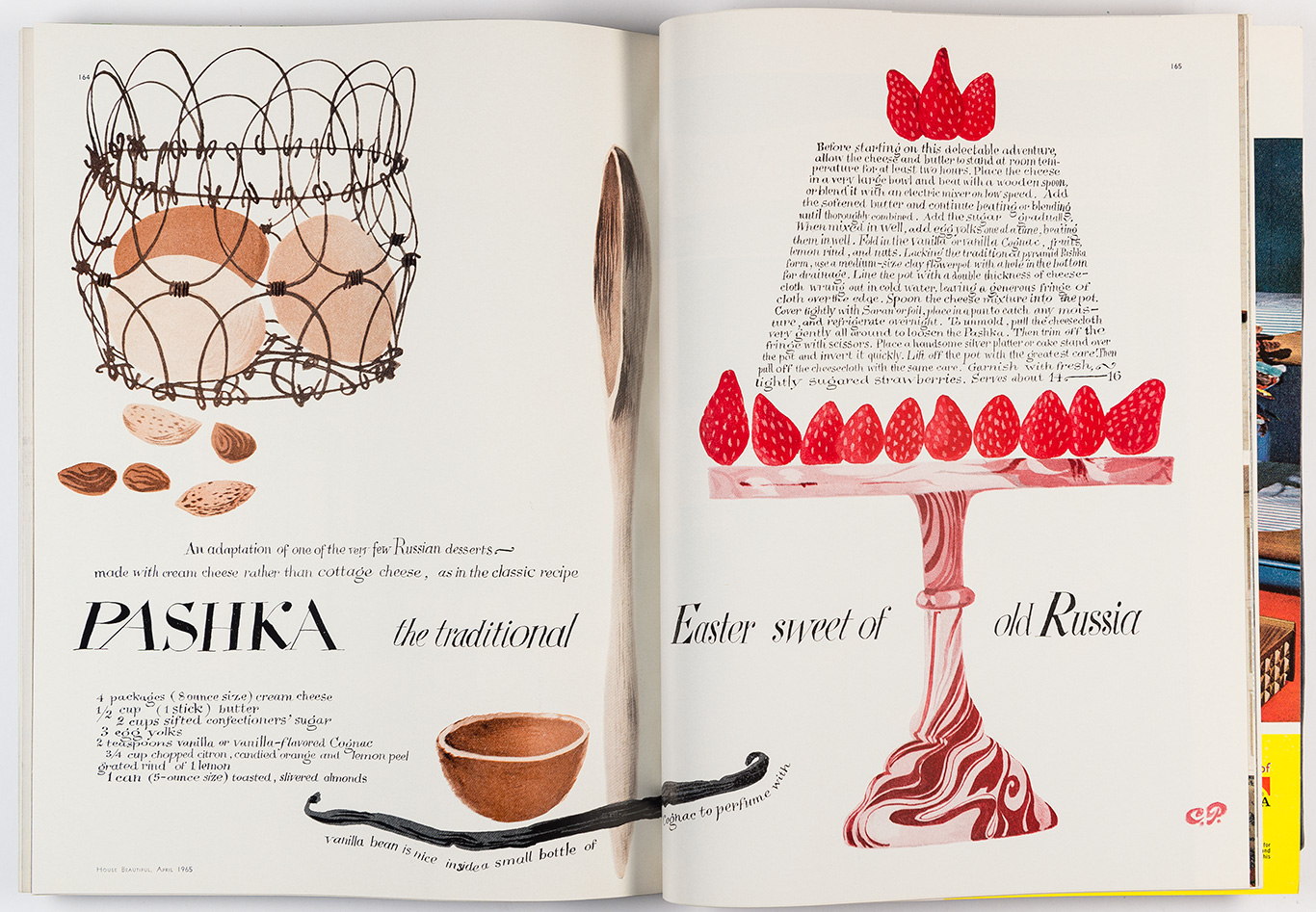
Cipe Pineles was an editorial designer that was most well known for her wok on Seventeen magazine, Vogue, Charm, and Vanity Fair. She was the first women to be asked into the all-male New York Art Directors Club. Pineles career lasted over 60 years and elevated the magazine industry through her innovative design work.
I really like her work and the muted, romantic colours that are used in her covers for Seventeen magazine and Charm magazine. I also really love her illustrations that she did in her cookbook. Her illustrations are charming and I enjoy the usage of texture in her organic forms. I also like how she’s treated the type, including it in her illustrations and integrating it into her designs.
I ended up being assigned the front cover for the history book. I wanted the cover to look like it covered various times throughout history but I also wanted the cover to hint at what was inside. I knew that when we made our spreads that only certain topics were included, so I decided to take classmates spreads and make a collage out of them.
Some of the successful things I did were making the cover look interesting without being too busy or messy. I also think the placement of the title works well as it grabs your attention. I also like the title I used because it sounds more interesting than just titling it “history book”. I also made sure to give the cover bleed room which is why the edges are white and red.
Some things I could improve on would be to format the spacing of the title better. I also wish I had waited longer for the ink to dry because some parts smudged a bit.
I would give myself a 9/10 for this cover. I think the finished product looks really good and it really captures your attention.
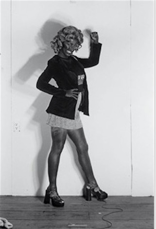
Cindy Sherman was born on January 19, 1954, in Glen Ridge, New Jersey. She is an American photographer and she is well known for her self portraits where she dresses up as stereotypical versions of other people, most often women. She attended the State University of New York in 1972 and majored in painting before switching to photography. One of her most well known works is Untitled Film Stills (1977 – 1980), where she dresses in wigs and outfits that fit the stereotypical depictions of women in media during the time. She says that the piece is meant to be “about the fakeness of role-playing as well as contempt for the domineering ‘male’ audience who would mistakenly read the images as sexy.” She continues to take photographs of her own self dressed up in costume and shares many of them online.
I understand her desire to explore the stereotyping and the generalization of women in media as well as attacking the normalcy of it all. I admire that aspect of her work, however I can’t say I am completely comfortable with viewing the photos, as they have very uncomfortable and unnerving looks to them, However, that’s the whole point of her work so I understand why her pieces need to shock and disturb. Acknowledging all of this, I have to say that I do not like her. Some of her work is nice, but I also think that some of her work is extremely distasteful. She has a series called Bus Riders (1976) where she takes multiple photos in blackface. I can’t agree with her work, and I haven’t seen any type of apology or explanation from her either that would help me understand her perspective on the issue. So while I can acknowledge some of her art, I can’t say that I support her.
Jim Dine is an American Pop Artist born on June 16th, 1935 in Cincinnati, Ohio. Dine studied at the Boston Museum of Fine Arts School and at Ohio University where he received his Bachelor of Fine Arts in 1957. Later on in 1958 Dine moved to New York and began working with other artists such as Allan Kaprow, Robert Whitman, and Claes Oldenburg to create performance art that they called “Happenings”. He has been a guest lecturer at Yale University and was an artist-in-residence at Cornell University. His first solo exhibit was at the Ruben Gallery, New York, in 1960.
Dine’s work includes painting, sculpture, poetry, and photography. Common motifs in his pieces are hearts, Pinocchio, bathrobes, and tools. Common themes of his works are personal identity, memory, and the body. His work uses bright colours and many scratchy, textural qualities. It is interesting to me that Dine seems to be able to take one subject and create so many variations of the piece. I like some of his more graphic works, but I find the constant use of hearts and bathrobes to be too repetitive for my tastes. I think the process of making his pieces is more interesting than the end result. I do like his sculptures though.
David Hockney was born July 9th, 1937 in Bradford, West Yorkshire, in Britain. He attended the Bradford School of Art from 1953 – 1957 and the Royal College of Art from 1959 – 1962 in London, England. He later moved to the U.S. to teach at universities in Iowa, Colorado, and California from 1964 – 1967. After his experience teaching, he moved to Los Angeles in 1978. His work ranges from paintings of landscapes and portraits to costume and stage design in opera and theatre productions. Hockney is currently one of the most influential artist because his work’s popularity continues to spread, with one of his most well-known pieces selling for $90 million USD at an auction. He was also appointed an Order of Merit by Queen Elizabeth II.
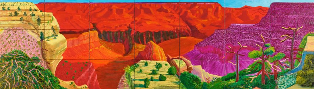
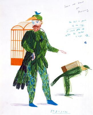
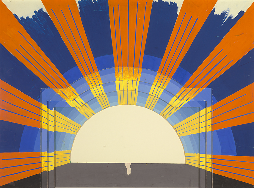
I find his work especially appealing, I love the bright colours, interesting use of space and perspective, as well as his Dog Days (1998) series. I saw one of his Dog Days paintings for the first time recently and have been obsessed with it ever since. It is an extremely simple painting, with the subject of his dog sitting upright on a pillow. However, something about the way he uses colour and the way he handles the paint in his brushstrokes give the dog a charming character that I cannot get enough of. While his other works, especially his large landscapes such as A Bigger Grand Canyon (1998), are beautiful to look at, I find his smaller and more personal pieces to be more interesting. I also really enjoy seeing his costume design and stage design sketches.
A Bigger Grand Canyon, 1998.
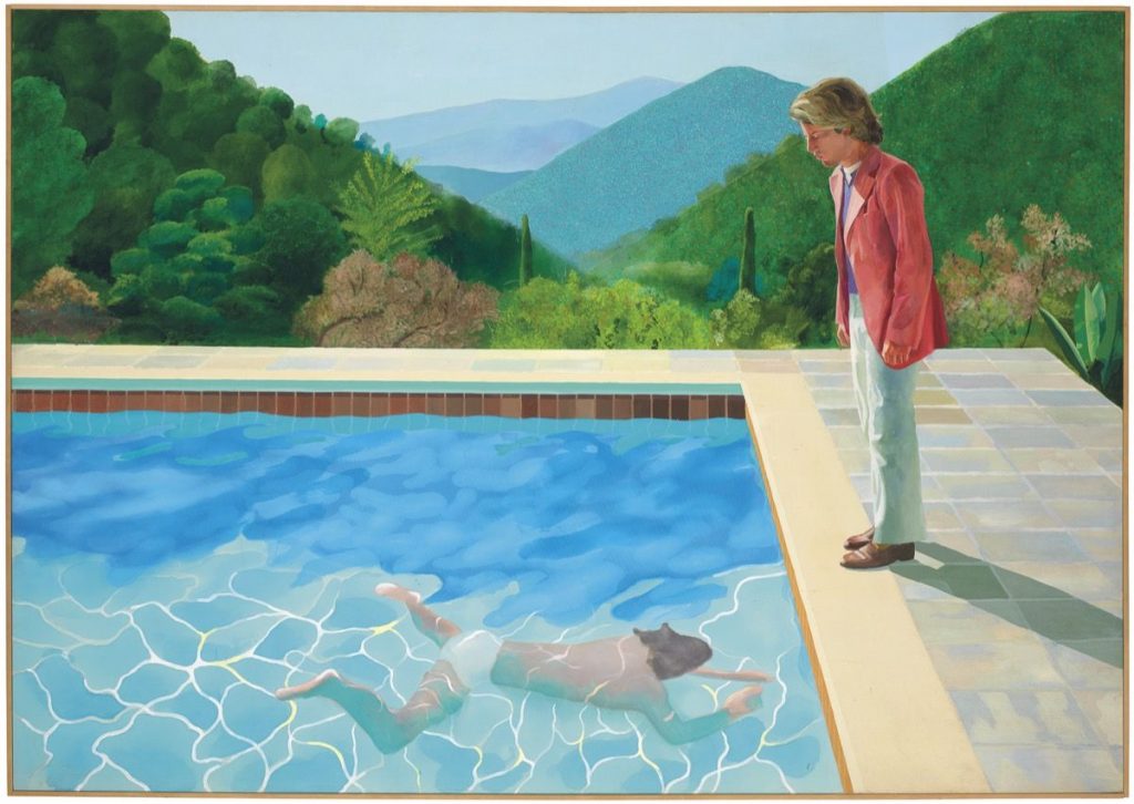
Portrait of an Artist (Pool with Two Figures), 1972.
“Papageno” from “The Magic Flute”, 1977.
David Hockney “Act II, Scene VIII. The Triumph of Light” from “The Magic Flute” 1977