Survey 8: Project Rationale – Artifact (1895 – 1905)

I was made the designer for a geopolitical artifact from 1895 – 1905. I debated making something for WWI, but ultimately decided that the Chinese Immigration act of 1885 was more interesting to me. I chose this topic because I thought it was an important topic to cover, and I knew what kind of artifact I wanted to make with it. I covered both the initial head tax in 1885 as well as the immigration act in 1923 because I felt that they are crucial to one another and help people understand the depth of the issue.

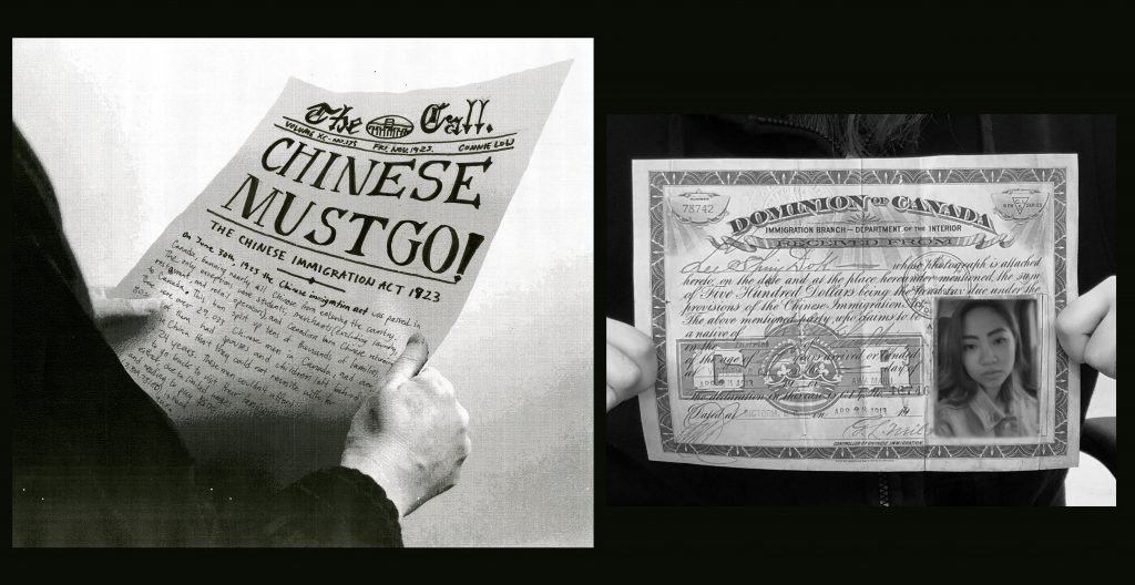
I made a newspaper mimicking the font and design of the time. I think my title is very easy to see, and I think I did well in putting together the newspaper itself. I also think the black and white composition of the spread helps set the serious tone of the topic. I also think that the addition of hands holding the objects adds to the spread, because they feel less like random history events but they feel more personal and connected with people’s lives.

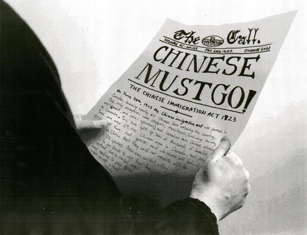
I think I could have incorporated the body text better, as it gets difficult to read because of the dark shadow and the small size. I couldn’t get the spacing right, so the bleed lines and the centerfold spacing is not correct, but I know I can correct that later on if this spread ends up in the history book.

I would give myself a 7/10 because I think the spread works really well for the topic and I had good research but I also think that the spread itself could be easier to read.

Survey 8: Cubism, Dadaism, and Surrealism – Paul Klee (1879 – 1940)

Three Houses, 1922.

Paul Klee was born on December 18, 1879, in Münchenbuchsee, Switzerland. He was a painter and draftsman best known for his use of colour and hue in simple and abstract shapes. He was influenced by Renaissance prints, Impressionist artists, and especially by the North African landscape which was the reason for his unrestricted use of colour. He produced many child-like pieces that appealed to the public and depicted different landscapes and emotions he experienced during WWI. From 1920 – 1931 Klee was hired at the Bauhaus school of modern design to lecture about the mechanics of art. After 1931, Klee resigned to the Dusseldorf Academy until 1933 when Hitler came into power.

While I don’t usually enjoy cubism or abstract art, I find that Klee has a unique art style that combines a number of movements that makes his work unique and appealing. I enjoy his use of colour and the shapes he creates in his pieces. Some of his pieces portray clearer subjects, such as in Three Houses and One Who Understands. I love the abstraction of fruit in his piece Suspended Fruit and the colour scheme of dark green and dull grey-red. His use of shades in Three Houses and the way he creates distance and a horizon just by using colour. The blue shades in the background look like they are fading into mountains and they whole piece has a very calm albeit melancholic feeling.

One Who Understands, 1934.
Suspended Fruit, 1921.
Tower in Orange and Green, 1922.
Hilterfingen, July 19, 1895.
Rough-Cut Head, 1935.
Sources

Survey 7: Expressionism, Fauvism, and Early 20th Century – George Grosz (1893 – 1959)

The Eclipse of the Sun, 1926.

George Grosz was a German New Objectivity and Dadaist artist born in Berlin on July 26th, 1893. He is best known for his criticism of society through caricatures and art with themes from his experiences during WWII. Grosz’s work depicted the greed of war by capitalists and the bourgeoisie through warped caricatures of military figures and other benefactors of war. 

The way Grosz uses light and colour in his work gives each piece a dramatic and drastic feeling that exemplifies the grotesque and evil depictions of military and bourgeoisie in Grosz’s work. In Bonhams he depicts a man of the bourgeoisie who is maniacal in his facial expression and is seen chopping up meat for himself to eat while surrounded by skeletons of those who worked hard to give him the food he is greedily consuming. His work is poignant and represents the feelings of the proletariat during the German Depression. I think his work is important for understanding how the terrible conditions people lived in and how unfair the workers were treated and his work is an important part of history. I admire how he did not shy away from his subjects or themes, and he used different visual elements such as skewed perspective and caricature to get his message across.

Fairy Tale, 1942.
Remembering, 1937.
Explosion, 1917.
The Agitator, 1928.
Source

Degenerate Art: The Silencing of Expressionism (1905 – 1915)

Refugees and First Snow, Lee Jung Seob. 1916/1952.

Before WWI the Expressionist movement was beginning to spread throughout the arts. However, because of Hitler’s distaste and renouncing of modern art, the Expressionist movement was quickly snuffed out in Europe and the derogatory term “Degenerate Art” was placed onto these artworks.

WHAT IS EXPRESSIONISM?

Expressionism began in 1905 because of four architect students in Germany by the names of Ernst Ludwig Kirchner, Fritz Bleyl, Erich Heckel, and Karl Schmidt Rottluff. The four of them wanted a new style of art to express themselves, including their dissatisfaction with the bourgeoisie and their desire for individuality. Expressionism reflected the artists inner feelings through abstract and exaggerated imagery with unrealistic colours and distortion. It was heavily inspired by the works of Vincent van Gogh, Edvard Munch, and James Ensor.

Mountains at Saint-Rémy, Vincent Van Gogh. 1853.
EXPRESSIONIST ARTISTS

The Expressionist movement was filled with artists who explored their abstract emotions through art. They expressed their anxiety and their desires through distorted and unrealistic imagery, often using distorted human figures.

Egon Schiele was an Austrian artist who painted nude self portraits with elongated proportions. His work was often intense and sexual.

Reclining Male Nude, Egon Schiele. 1910.

Edvard Munch was a Norwegian painter who painted anxious and fearful portraits depicting his own worries.

The Scream, Edvard Munch. 1893.

Wassily Kandinsky was a Russian painter who focused on expressing music through colourful and abstract landscapes.

Blue Rider, Wassily Kandinsky. 1909.

HOW DID IT BECOME DEGENERATE ART?

As Hitler rose to power, he began to eliminate and condemn anything opposing his Nazi ideas. This included controlling the art that was accepted by the general public of Germany. He and his party organized an art exhibit in 1937 called “Degenerate Art” which showed many examples of expressionist art. This alienated and demonized the artists who created these images, causing many of them to flee Europe in fear. This caused the end of the main era of the Expressionist movement.

Adolf Hitler and Adolf Ziegler visit the Degenerate Art Exhibition, 1937.
Sources:

Survey 5: Typography Zine Rationale (1850 – 1895)

I made my typography zine about William Morris and his contribution of different typefaces during the Arts and Crafts movement and Jules Cheret’s illustrative use of typography. I also showed examples of some o the most popular typefaces created in the time period. I chose this information because Morris had a big influence on typography and design in general and Cheret created the important method of 3 stone lithography which allowed for more artistic uses of typography in posters.

I believe that my execution of the designs and information was well done as it is visually pleasing and easy to read. I also think that the pages showing popular fonts was a good idea because it shows a good overview of fonts used at the time.

However, the hierarchy of type could be improved by making the sizes or spacing different. I could also increase the saturation of the white pencil crayon I used for most of the zine could also be bolder, the white turned out to be more gray and dull once it was scanned.

I would give myself a 9/10, as I put a lot of effort into the zine and I think it turned out really well.