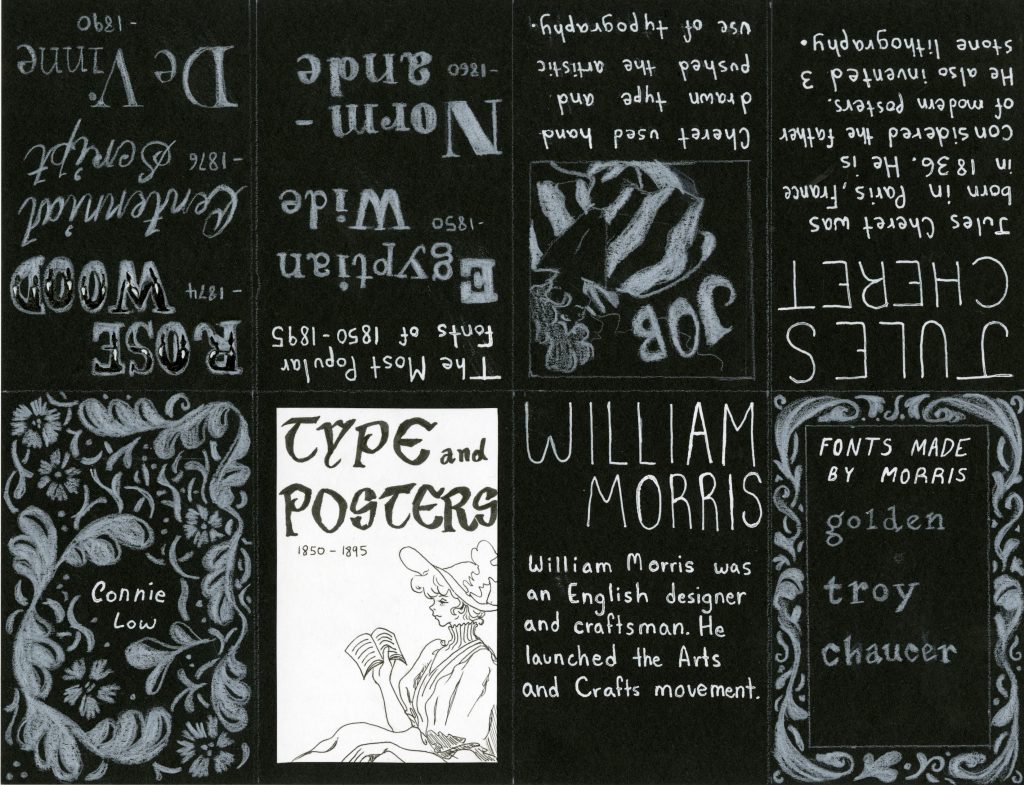
I made my typography zine about William Morris and his contribution of different typefaces during the Arts and Crafts movement and Jules Cheret’s illustrative use of typography. I also showed examples of some o the most popular typefaces created in the time period. I chose this information because Morris had a big influence on typography and design in general and Cheret created the important method of 3 stone lithography which allowed for more artistic uses of typography in posters.

I believe that my execution of the designs and information was well done as it is visually pleasing and easy to read. I also think that the pages showing popular fonts was a good idea because it shows a good overview of fonts used at the time.
However, the hierarchy of type could be improved by making the sizes or spacing different. I could also increase the saturation of the white pencil crayon I used for most of the zine could also be bolder, the white turned out to be more gray and dull once it was scanned.
I would give myself a 9/10, as I put a lot of effort into the zine and I think it turned out really well.
