History Book Front Cover – Rationale

I ended up being assigned the front cover for the history book. I wanted the cover to look like it covered various times throughout history but I also wanted the cover to hint at what was inside. I knew that when we made our spreads that only certain topics were included, so I decided to take classmates spreads and make a collage out of them.
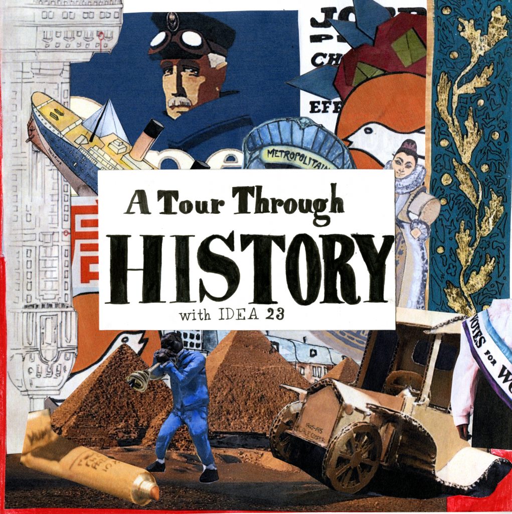
Some of the successful things I did were making the cover look interesting without being too busy or messy. I also think the placement of the title works well as it grabs your attention. I also like the title I used because it sounds more interesting than just titling it “history book”. I also made sure to give the cover bleed room which is why the edges are white and red.

Some things I could improve on would be to format the spacing of the title better. I also wish I had waited longer for the ink to dry because some parts smudged a bit.

I would give myself a 9/10 for this cover. I think the finished product looks really good and it really captures your attention.

Survey 2: Science and Discovery (0-1450) Rationale

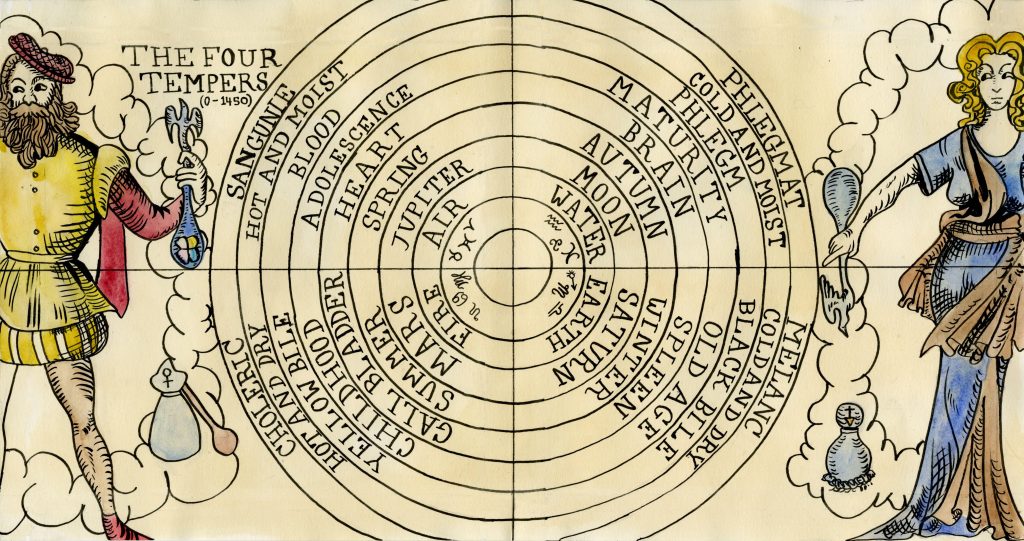
The spread that I made for survey 2 is about the four temperaments, which is the first attempt at giving reasons to why a person becomes sick. I copied an illustration from a book about the four tempers. I used the round formatting found in some books written about the four humors as well. I expanded on the two figures towards the edges to make sure that the bleed would not ruin the illustrations at the edges. I also kept the writing away from the center to prevent it getting lost in the centerfold.

Some things that I could improve on would be the size and colour of the title and the headings. It is not clear that the inner parts of the circle fall under the categories of the four tempers. The title is also very small, and I could have made it more distinct so that it wouldn’t get lost within the other elements of the spread.

Overall, I think I made a very interesting spread and I am happy with the result. I would give myself an 7/10 for the strong composition and overall look of the piece, but I could have put more information about what the temperaments were and give more context to the reader.

Yearbook Rationale

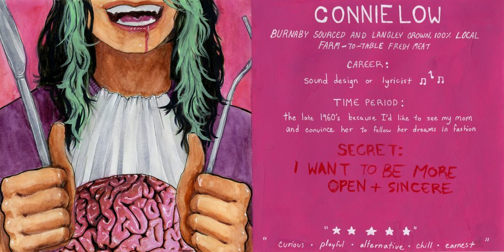
The first thought that came into my mind when we were assigned the yearbook project was a fork and knife cutting into my brain. I wanted the image to seem like people were taking pieces of my brain so they could find out what I think, and so they could get to know me. I made multiple thumbnails before settling on the final two page spread. In previous versions my face was in the center as the focal point, but I wanted to draw more attention to the brain and the act of eating. I included the mouth to show more emotion in the image. The fork and knife framed the photo and guided the viewers eyes toward the center where the brain is. I used the green to imitate the streaks in my hair, which made the faceless figure recognizable as myself rather than a random person. The pink and green contrast well, and don’t feel imbalanced as they are both fairly light colours. I cut the image in half because I wanted the yearbook page to be easily viewed after it was made into a book. I added white highlights to the brain to make it look like it was wet and as if it was just taken out of my head.

I used a restaurant theme on the text side, including the five descriptors as fake reviews. I wrote my “secret” in red because I wanted it to be harder to see from afar because it was supposed to be a secret. I wrote my introductory statement like a restaurant would describe their overpriced meat dish which made light of the morbid scene to the left, which I feel describes me fairly well.

I would give myself an 8/10. I think I did really well on the visual part of the yearbook, but I think I could have put more information onto it. I also think I could have switched the positions of the secret and the five descriptive words at the bottom of the page.