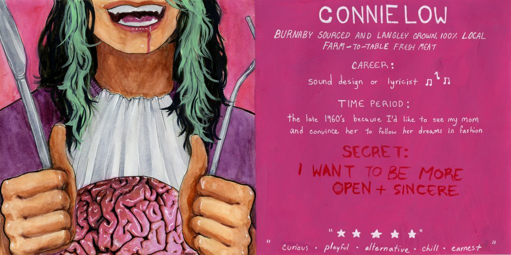
The first thought that came into my mind when we were assigned the yearbook project was a fork and knife cutting into my brain. I wanted the image to seem like people were taking pieces of my brain so they could find out what I think, and so they could get to know me. I made multiple thumbnails before settling on the final two page spread. In previous versions my face was in the center as the focal point, but I wanted to draw more attention to the brain and the act of eating. I included the mouth to show more emotion in the image. The fork and knife framed the photo and guided the viewers eyes toward the center where the brain is. I used the green to imitate the streaks in my hair, which made the faceless figure recognizable as myself rather than a random person. The pink and green contrast well, and don’t feel imbalanced as they are both fairly light colours. I cut the image in half because I wanted the yearbook page to be easily viewed after it was made into a book. I added white highlights to the brain to make it look like it was wet and as if it was just taken out of my head.
I used a restaurant theme on the text side, including the five descriptors as fake reviews. I wrote my “secret” in red because I wanted it to be harder to see from afar because it was supposed to be a secret. I wrote my introductory statement like a restaurant would describe their overpriced meat dish which made light of the morbid scene to the left, which I feel describes me fairly well.
I would give myself an 8/10. I think I did really well on the visual part of the yearbook, but I think I could have put more information onto it. I also think I could have switched the positions of the secret and the five descriptive words at the bottom of the page.