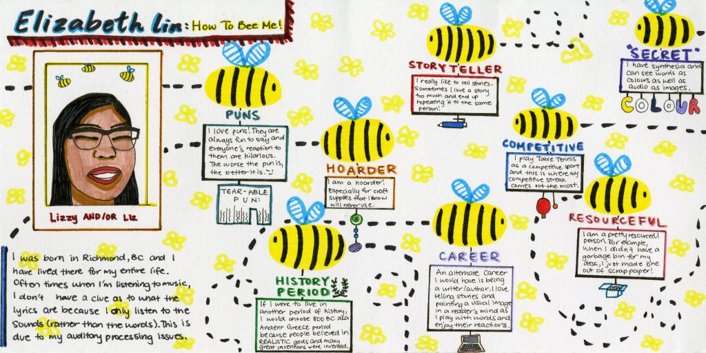
I created this yearbook spread in order to display my person through visual means.
First, I combined all of my 5 keywords: puns, hoarder, storyteller, competitive, and resourceful, and tried to connect them to find a common topic and bring all my different personality quirks together. Thus, the theme of “Bees” was created. Bees are hoarders, storytellers (or rather they can communicate well to tell a story of where to find resources), competitive, and resourceful. While they may not tell puns, they are an excellent subject to create bee-autiful puns from.
After the theme was established, everything else fell into place. I decided that instead of using a honeycomb design, as I originally planned, I would draw bees buzzing around as they carried signs of the blurbs I had for each required element. Then hanging from these signs would be related imagery. For example, with the “historical period we would like to be born in” section, I chose the Ancient Greek period and drew a laurel, a prominent symbol of that age. This allowed me to group information together and keep them separate from one another. I also added pale yellow flowers in the background to minimize the amount of white space and add to the theme.
On the left side of the spread, I decided to keep all the information directly about me (name, nicknames, photo, introductory statement) there. Since we usually read from left to right, I wanted the viewer’s eye to first find all these information about myself before delving into further details about my personality and preferences.
Through this spread, I hope to show that I am a simple person who loves using colour and cute bees to describe myself: a competitive and resourceful storyteller who likes to hoard and tell awful puns.
On a scale of 1-10, I give myself a 9.5 out of ten. I have created a fun and simple layout that accurately matches and describes who I am as a person by including all the required elements. The only thing I am unsatisfied with is with the colouring of my portrait.
