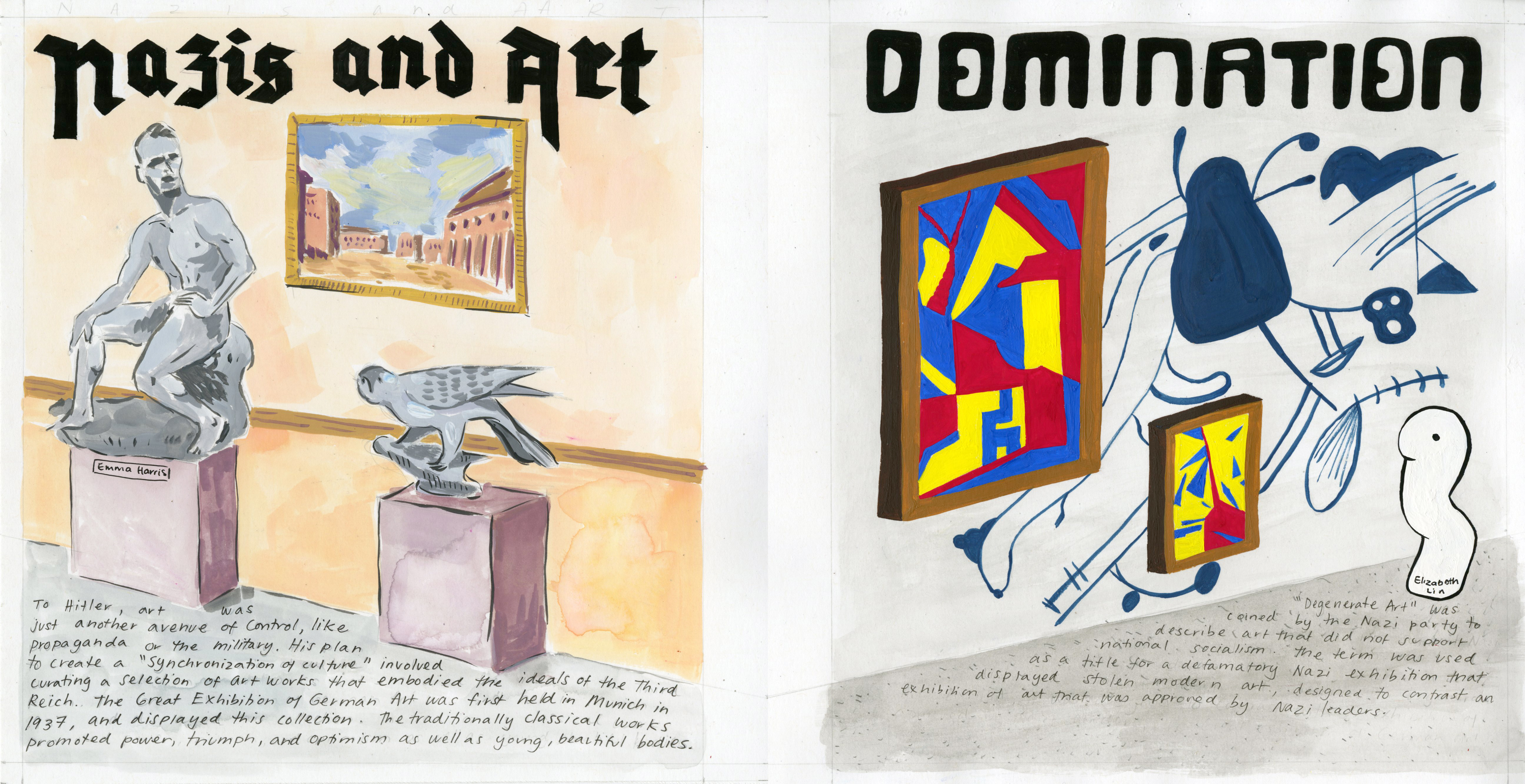
For this history spread, I was partnered with Emma and we were assigned to create a spread for the final survey on “art/culture”. As this time period was during World War 2, We chose to focus on Degenerate Art and Third Reich Art- the two arts connected to the Nazis.
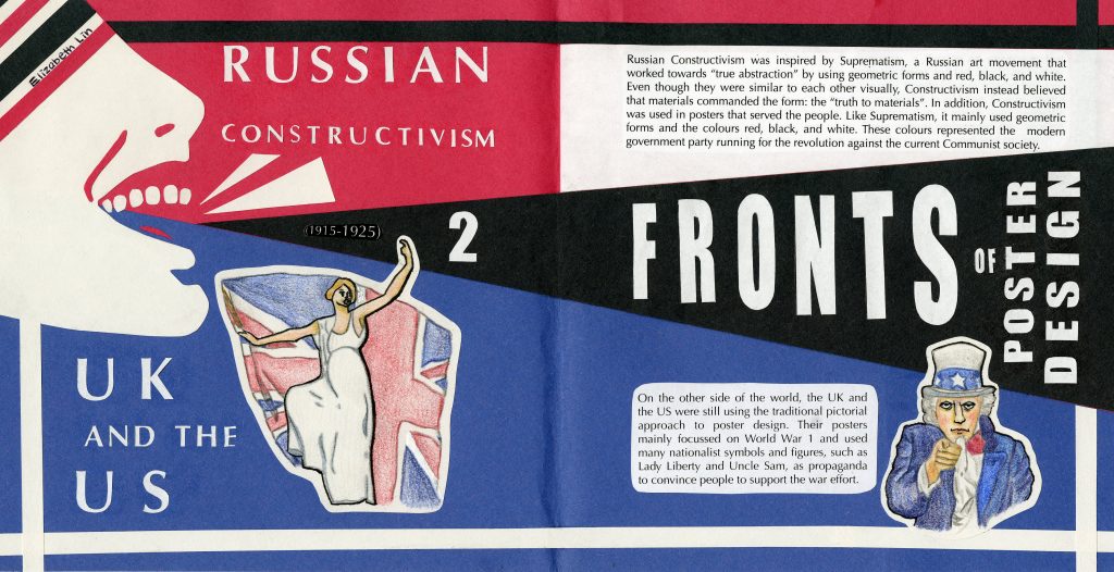
For this history book spread, I was assigned to create a comparative spread for the time period 1915-1925 on the subject of “design/type”. Thus, I decided to create a spread comparing the traditional pictorial approach that the UK and the UK continued to use versus the Constructivist style that the Russians used in their posters.
While both styles were drastically different, they did have one thing in common. Both design styles were used as a call for action: the Russians and their revolution against Communism, and the UK/US and their demand for support in World War 1. By using the shouting figure on the left side of the spread, I have emulated this call for action and created movement in relation to the intense events that happened during this time period.
One of the major decisions I made was the use of papercraft to create the spread. Since Russian Constructivist posters used bold colours and shapes, I decided to use construction paper for the entire spread to keep in sync with the style. However, since the UK/US’ pictorial approach mainly used drawing mediums such as watercolour, I decided to draw the images for the UK/US side with pencil crayon to keep with that style while adding a border around each image so that it could fit with the construction paper approach.
The use of the shouting figure in Constructivism was one of the most popular motifs and so I used this image to represent Constructivism. I used Lady Liberty and Uncle Sam to represent the UK/US as they are also popular and important figures in their poster designs. In terms of colour, I only used red, black, and white for Constructivism just as the Constructivists did. For the Western powers, I used the colours of red, blue, and white- both the colours of the US and the UK. In addition, I wanted to contrast the difference between the two sides so by using the red vs blue concept I have created more emphasis on the idea of opposing sides. This is also present in the black and white borders around the differing sides.
Overall, I think I did a good job with this spread. I had a lot of fun with making this spread (such as cutting out every letter and shape) and by only using papercraft, I have kept consistent throughout the spread. I am especially pleased with the use of the figure and connecting it to the borders. I would have liked to add more motifs around the text but at the same time, I also think that that would have made the spread too busy when the poster design back then only used a few important figures/motifs. I give myself a 9/10 for this spread.
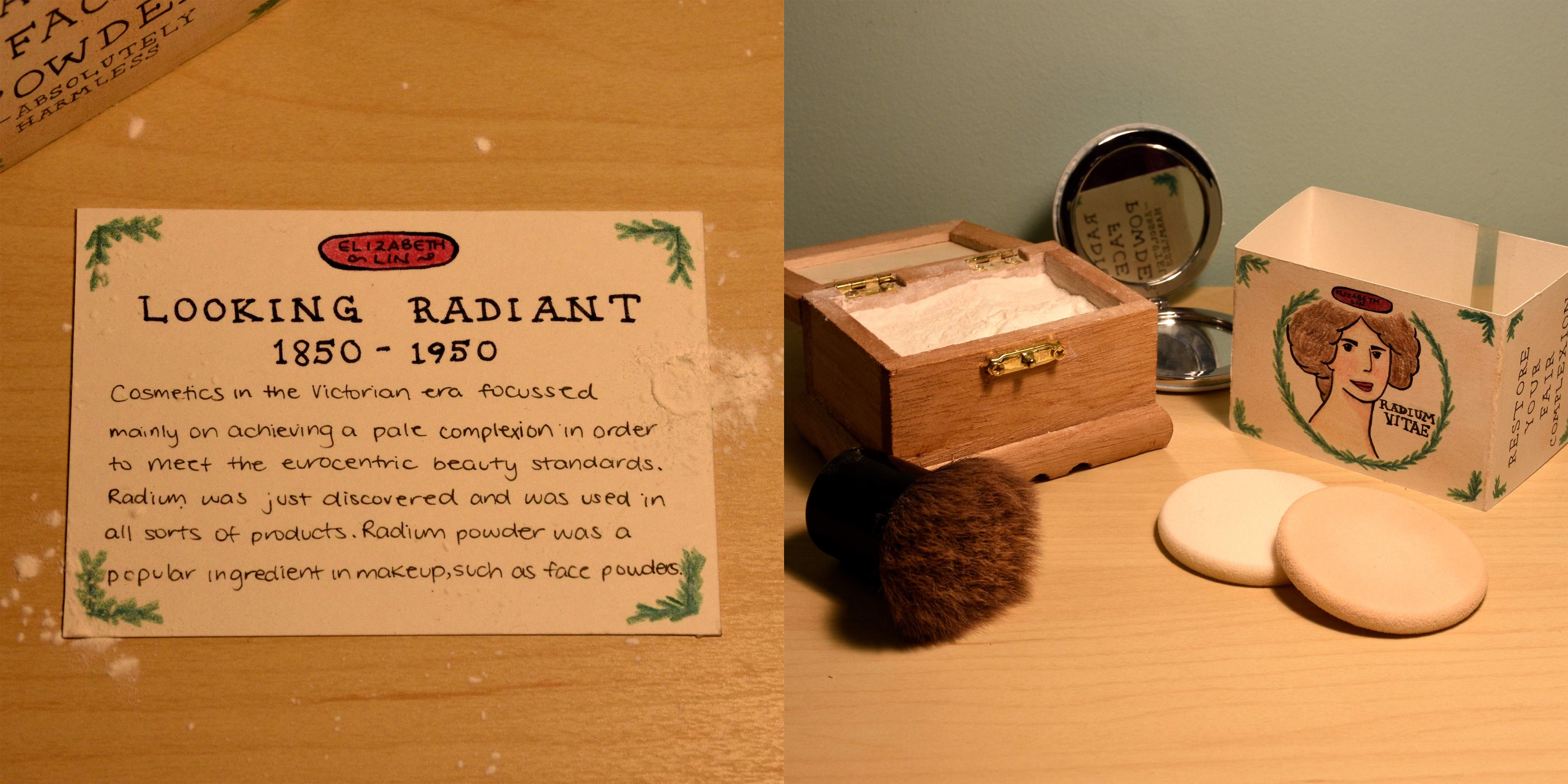
For this history book spread, I was assigned to create an artifact for the time period 1850-1950 with “fashion” as the focus. Thus, I decided to create packaging for Victorian makeup products as my artifact.
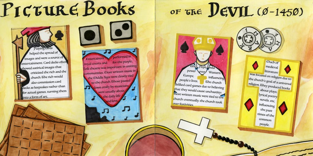
This history book spread for my topic (culture) combined with the time period (0- 1450) was certainly a challenge. Due to the large range of time, a single culture was hard to pinpoint. Nevertheless, my group decided to focus on the entertainment of the period as well as the influences of the Church. Continue reading “Picture Books of the Devil (0- 1450) (History Book Spread: Blue)”