
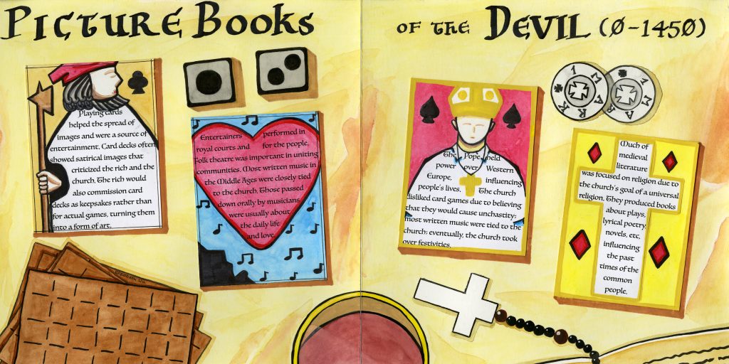
This history book spread for my topic (culture) combined with the time period (0- 1450) was certainly a challenge. Due to the large range of time, a single culture was hard to pinpoint. Nevertheless, my group decided to focus on the entertainment of the period as well as the influences of the Church.
For the spread, I decided to focus mainly on the entertainment. Thus, I decided to create playing cards to present my information. Each playing card used the silhouette of the illustration to present the writing and each illustration complemented the content. For example, I decided to use the heart suit in combination with the topic of performing arts as music at the time was usually about daily life and love. I also used the suits to add further meaning to the design and text of the cards. With the Jack of Clubs card, the clubs suit means “peasantry”, which suited the content of playing cards mainly used in games by the common folk.
The two cards on the left page are in the format of cards used by the common people- they have a simple border and present pictures related to entertainment- the Jack for playing cards and the musician singing for performing arts. On the other side, the cards are fancier. These cards are about the Church and the influence they possessed during the time period. They are decorated in gold paint- gold-leaf would be used at the time- and have religious pictures on them.
I chose to use a more Gothic typeface for the headline and text to better represent the lettering of that period. The background is made to be a plain tablecloth in order to focus attention to the foreground and around the playing cards, I have decorated the background with a few objects. The pile of playing cards, dice, currency and the glass of wine all relate to the main subject of entertainment while the rosary inside the Bible is a nod towards the Church’s influence during the period.
Overall, I think that I did a decent job. I am pleased with the design choices I made for the typeface of the text, the playing cards, and objects in the background- particularly the coins. However, I think that if I added more elaborate designs in the playing cards about the Church, it would improve the distinction between the common folk and rich people’s cards. On a scale of 1- 10, I rate myself 8/10.