
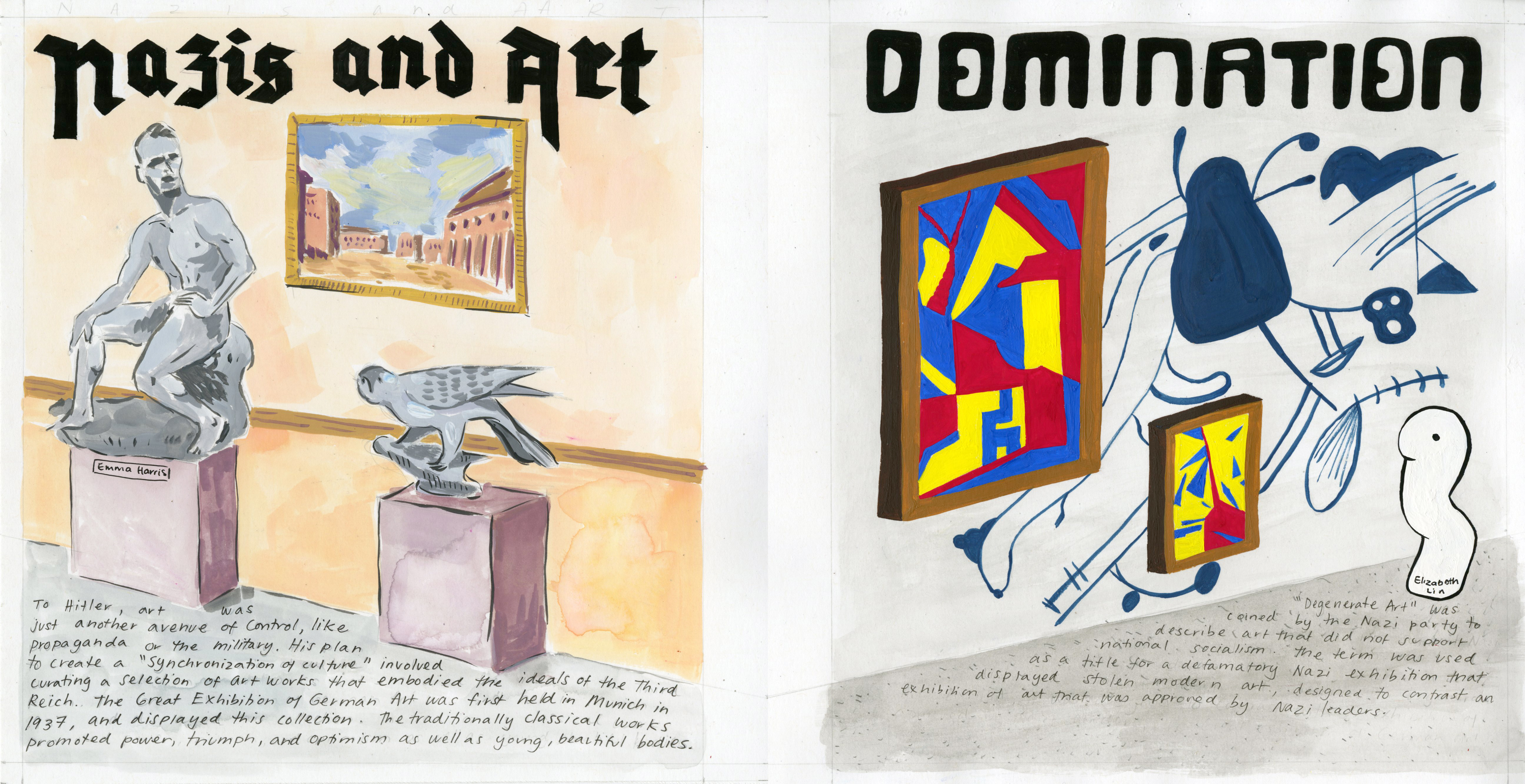
For this history spread, I was partnered with Emma and we were assigned to create a spread for the final survey on “art/culture”. As this time period was during World War 2, We chose to focus on Degenerate Art and Third Reich Art- the two arts connected to the Nazis.
In addition to being connected to the Nazis, the Nazis put on exhibitions for both of these arts, one to glorify Third Reich art and one to defame Degenerate Art. Since the two arts were very contrasting, we ultimately decided to create a spread that used the corner of a gallery to separate and compare the two.
I chose to do the Degenerate art wall while Emma concentrated on the Third Reich wall. For my part, since the Nazis did not like modern art and claimed modern art was culture documents of the Bolsheviks and the Jewish, the Nazis placed the Degenerate in a disorderly manner. As shown in my part of the spread, the floor is dirty and the walls are shabby. All the art were cramped together and some works were just straight up painted on the walls. I painted with gouache to create strong, bold, and colourful modern art paintings that are displayed on the wall, basically art that the Nazis would’ve abhorred. I also emanated the disorderly and overwhelming style by filling as much of the wall with paint but also not in certain places to give it a lopsided composition and imbalance. The sculpture is also added in to represent another form of modern art that the Nazis did not appreciate.
Emma’s side would be neat and orderly, much in the style that we can see in today’s museum exhibitions. Her side has white space to bring attention to each Third Reich art and since Third Reich art favoured the traditional academic art, she also uses clean walls and a welcoming palette.
For the title, we came up with “Nazis and Art Domination” as it could mean art that dominated during the Nazi’s reign and art that got dominated. It is also another reference to how the Nazis kept a tight control on everything, including art to get more people to support their ideals. On Emma’s side, she used a more Fraktur style typeface as that was the style the Nazis favoured while I used a sans-serif/expressionist style of typeface- which they hated as it is similar to modern art.
Overall, I think that we did a good job in contrasting the different art movements. The aura changes from the left side (Third Reich art) of an approachable/encouraging look to the right (Degenerate art) of a dirty and inferior mood. This is exactly as the two art exhibitions were portrayed by the Nazis. I give our spread a 9/10.