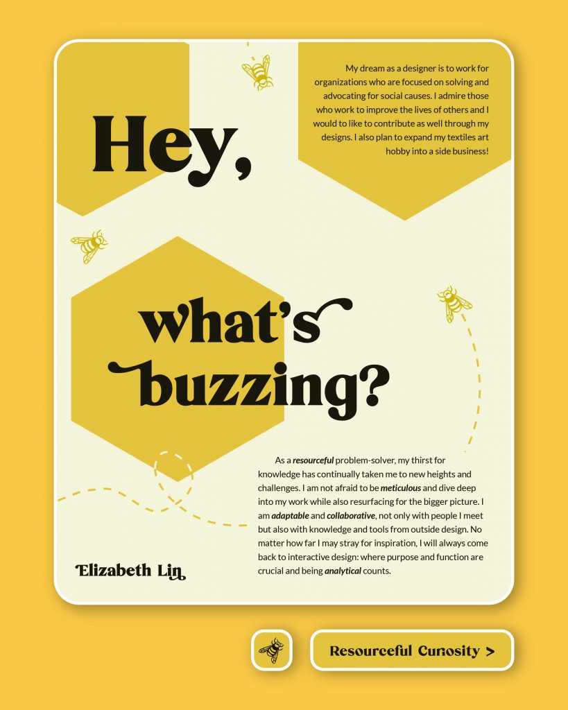
My personal ad really forced me to think about what I like in terms of design and how I approach this field. I wanted to show an aspect of me that highlighted my attributes (resourceful, meticulous, adaptable, collaborative, and analytical) while also inserting a part of my personality unrelated to design. Many options were considered but in the end, I chose bees and puns to be the highlight of my ad – obsessions that I’ve been nurturing throughout the years.
Since the target audience of this ad was digital design studios, I wanted to show the flexibility of my skills and how I’m able to integrate graphic design skills into a digital “setting”. I chose to present my info in a “tech-savvy” manner not unlike how many eye-catching apps and digital products are presented today in case studies and studio websites. Elements such as grid, white space, and legibility were all considered to combine both my graphic design and interactive design interests. In addition, I really played around with the copywriting and message I wanted to send out, signifying my ability to capture interest with a few words and then elaborate with longer text. These skills are all applicable and considered valuable in the digital design world as it’s not only about the thinking behind the product but also getting people to use it in the first place.
Overall, I would give myself a 9/10 for this assignment. There are a few tweaks I would like to fix, such as text alignment and adding more UI elements, but I think my message as a whole has done it’s job well in both representing me and grabbing attention/interest.
