This week, I took my digital mid-fi wireframes and began designing the UI elements of the app. I took my mentor’s advice of creating moodboards for different parts of the UI elements, such as the button styles, menu style, and card styles. This process helped me out a lot as I usually have trouble deciding colours and dictating which elements should have colour and what they should look like while also keeping up with the UI trends.
After creating numerous boards for UI elements I liked, I then narrowed down the choices and picked which ones suited my project. Through this process, I created my style guide, including a system of how elements/text should be spaced, and applied it to the home screen of my app. I tried many iterations before I presented my work to the class.
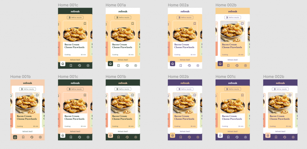
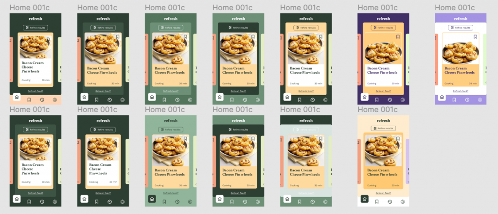
After meeting with Judy and the class, it was agreed that the second set of UI elements would fit better with the target audience. However, while I preferred the green colour palette, I got feedback that the colours were not very “Refreshing” and did not match with the name of the app. For next week, I will have to work on the colours before I applied the style guide to the rest of the screens.
Overall, I would rate myself 9/10 this week. I think that I have discovered a good process to tackling UI (my weaker skill) that works for me and while I forgot to consider the name of my app, that could be easily fixed. My challenge was mainly to design a modern-looking app which involved researching UI trends as well but I found it largely rewarding to familiarize myself with popular designs today. I am eager to finalize the rest of my design.