A quote that stood out most to me was from the Chinese philosopher Gongsun Long discussed in Gleick’s “Persistence of The Word”. The quote poses a question: “Can it be that a white horse is not a horse?” Long elaborates on his question, “Horse is that by means of which one names the shape. “White is that by means of which one names the colour. What names the colour is not what names the shape. Hence, I say that a white horse is not a horse.” Gleick used this argument in his paper about how written language has stolen the connection and intimacy between us and the world. The fact that we are made to think and sort our world into arbitrary categories has interesting connotations and possible consequences. I think this quote stood out to me because I heard the white horse paradox when I was younger and as a kid, I thought it was hilarious. I think Gleick’s contextualization of this classic question is super interesting I would have never thought to question the system of written language.
Reflection
I found ENGL 100 probably the toughest course out of my first term in university. The readings assigned were far beyond the reading and comprehension level I’ve experienced before. I found the online format a little bit disappointing, for a class like English I definitely prefer in class discussions where I can discuss with my peers and teacher more directly about the concepts being introduced. Although I still enjoyed the thought-provoking ideas the readings provided, I just wanted more communication and connection to engage my comprehension of the subjects. I think I improved on structuring essays this term, before I generally would just write straight and wordy. My writing style was more like a transcript of my ramblings. This term I tried to be more conscious of having a clear structure in my essays. My favourite part of this course was talking about the final essay topics with my peer review partner. It was very beneficial and uplifting to talk to someone about the topics we were passionate about!
About Me
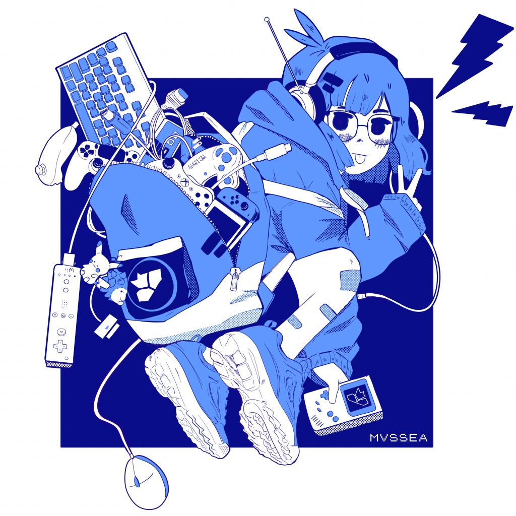
Emma Do is a Vietnamese Canadian Artist and designer who loves warm colours and soft lines. She loves expressing fantastical concepts and warm nostalgia through digital art. Born in Vancouver British Colombia and then spent her childhood in Winnipeg. Her family later moved back to BC. She is currently pursuing a Bachelor of Design in Visual Communication at Capilano University. When Emma isn’t drawing, she enjoys playing video games and sleeping in.

Survey #8 – The Sticky History of Band-Aids
Loved to the Point of Invention
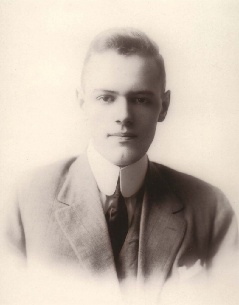
The origin story of Band-Aids is a surprisingly rather sweet love story! Bandaids were first invented by Earle Dickinson in 1921, solely for his wife Josephine Dickinson. She was clumsy by her own admission and would often cut herself while preparing food. Bandages before Earle’s invention were just separated pieces of gauze and adhesive tape people would combine. Earle noticed that the bandage would always fall off her fingers rather easily. Earle fixed this by attaching the piece of gauze to the centre of the tape beforehand and covered everything in a fine material called crinoline to keep it clean. This easy-to-use bandage helped Josephine dress her wounds easily and quickly. It also stayed on a lot better and kept wounds more sterile. This invention was later noticed by James Johnson, Earle’s boss at Johnson & Johnson. Johnson decided to manufacture Band-Aids for the public and made Earle vice president.
From Scouts to Soldiers
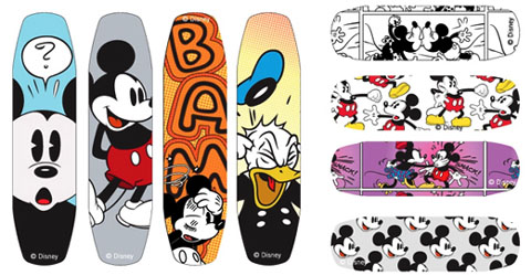
It took a while for this small household invention to become a household staple everywhere. Sales were very slow until Johnson & Johnson hatched a publicity stunt and donated Band-aids to boy scouts! Johnson & Johnson continued their trend of healthcare volunteering and supplied Soldiers who were heading out to World War 2 with Band-aids in their kits. The concept and heart of Band-aids have remained the same all these years, though Band-aids have gone through some revisions. Machine made Band-Aids were the new norm in 1924 and sterilized Band-aids hit the shelves in 1939. Further down the line Band-Aids used vinyl tape as its base instead of regular tape. Decorative Band-Aids featuring popular cartoon characters first appeared in 1951 where they printed Mickey Mouse on the bandages to cater to children.
“Flesh Coloured”
Band-Aids were often marketed as “Flesh coloured” and “invisible” and this irony was not lost to the POC community. While there are clear Band-Aids, It’s offensive and ignorant that out of all the tons of designs from peach to the dozens of cartoon characters none of the bandages are designed with black or brown skin in mind. In 2005 the company unveiled a line of band-aids that were designed with multiracial skin tones, but it was discontinued due to lack of interest. Fast forward to 2020 Johnson & Johnson released a line of Band-Aids that hues matched the skin tone of African Americans in solidarity with the BLM movement. Although, it is a good step in the right direction it’s a wonder as to why it has taken this long to be designed and released.

References
Alcorn, C. (2020, June 12). Band-aid will make black and brown flesh-toned bandages. CNN. Retrieved December 15, 2021, from https://www.cnn.com/2020/06/12/business/black-band-aids/index.html
Bellis, Mary. (2020, August 26). The History of the Band-Aid. Retrieved from https://www.thoughtco.com/history-of-the-band-aid-1991345
Bisset, C. (2018, January 22). A brief history of the band-aid, from boy scouts to Bob Geldof. ABC News. Retrieved December 15, 2021, from https://www.abc.net.au/news/2018-01-03/a-brief-history-of-the-band-aid/9271754
Vanessa Stockard
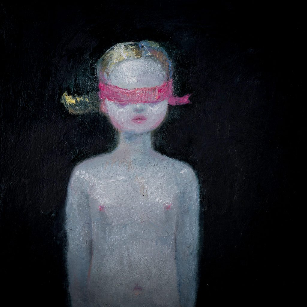
Vanessa Stockard is a renowned contemporary Australian painter. She is known for whimsical and weird atmospheres paired with a mischievous levity in her work. Stockard was born in 1975 in a small town in Australia. She spent most of her childhood engaged in creative past times such as drawing and playing the piano. Both her mother and grandmother were painters and she commonly frequented art galleries. She graduated from the College of Fine Arts in Sydney in 1998 with a BFA. She then kicked off her career by exhibiting both locally and internationally. She has been described by her contemporaries and critics as one of the most dangerous artists in the Australian and international scene.
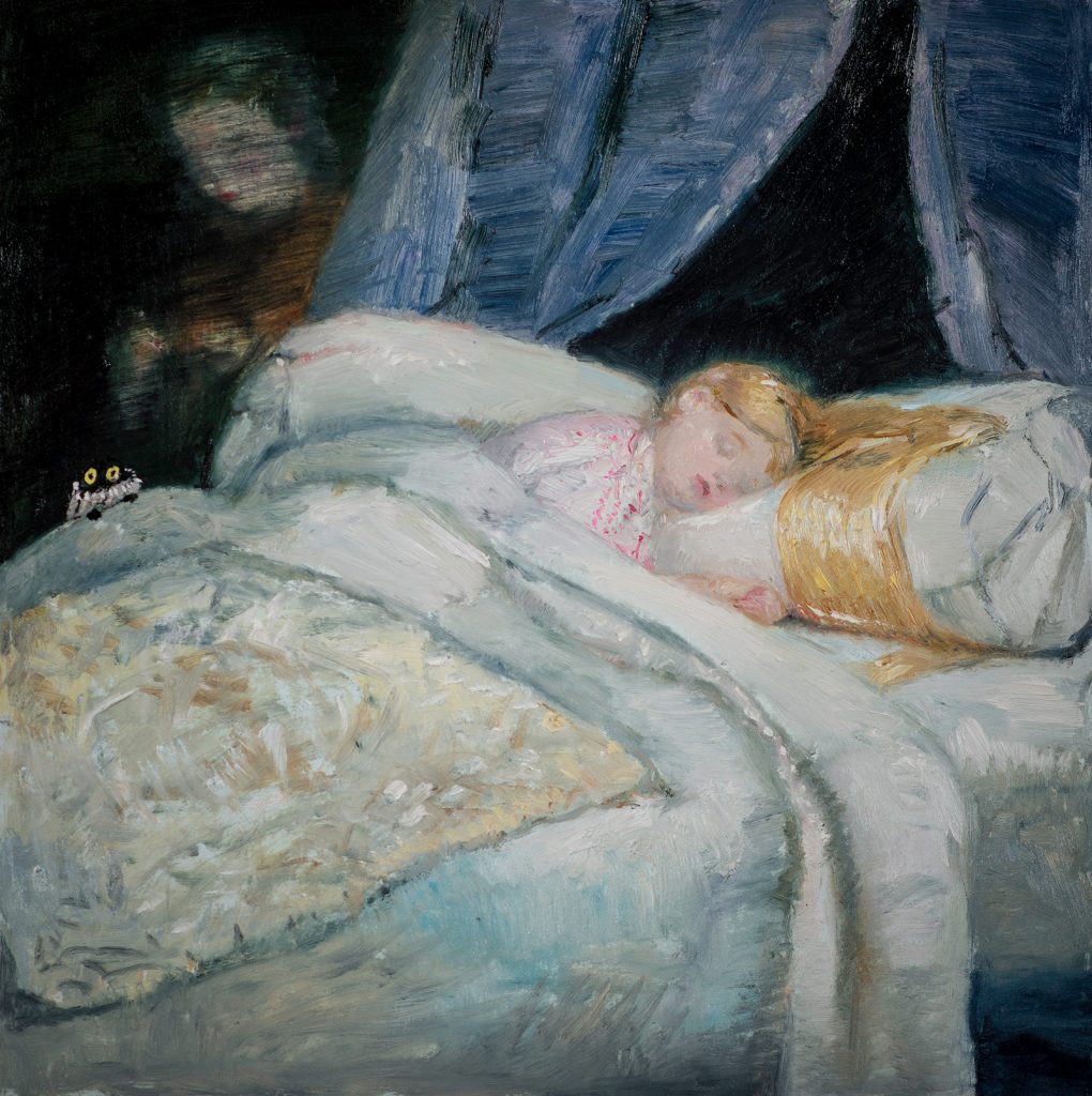
Stockard’s art is rife with colour and texture. Her paintings have a unique way of eliciting people’s emotions may they be unsettled or swooning from the cuteness. Stockard has been noted to say her art is mainly inspired by her slow country life. She really strikes a chord with her audience, drawing them into her weird but quiet world.
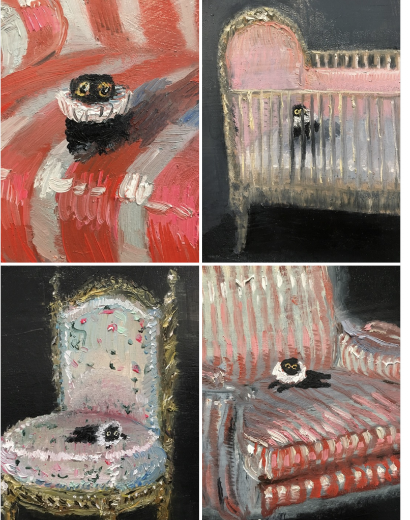
Stockard is most known for her reoccurring character she sneaks into her art, the cat Kevin! She grew up with a black cat and finds that cats are endlessly amusing. Kevin isn’t based on a real cat but instead one day she mistook a sock as a cat from a distance and that was the illogical inspiration for Kevin.

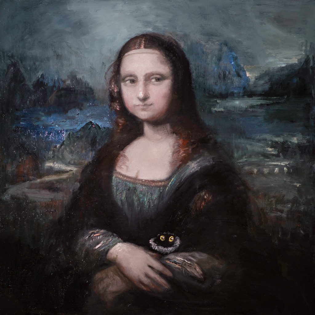
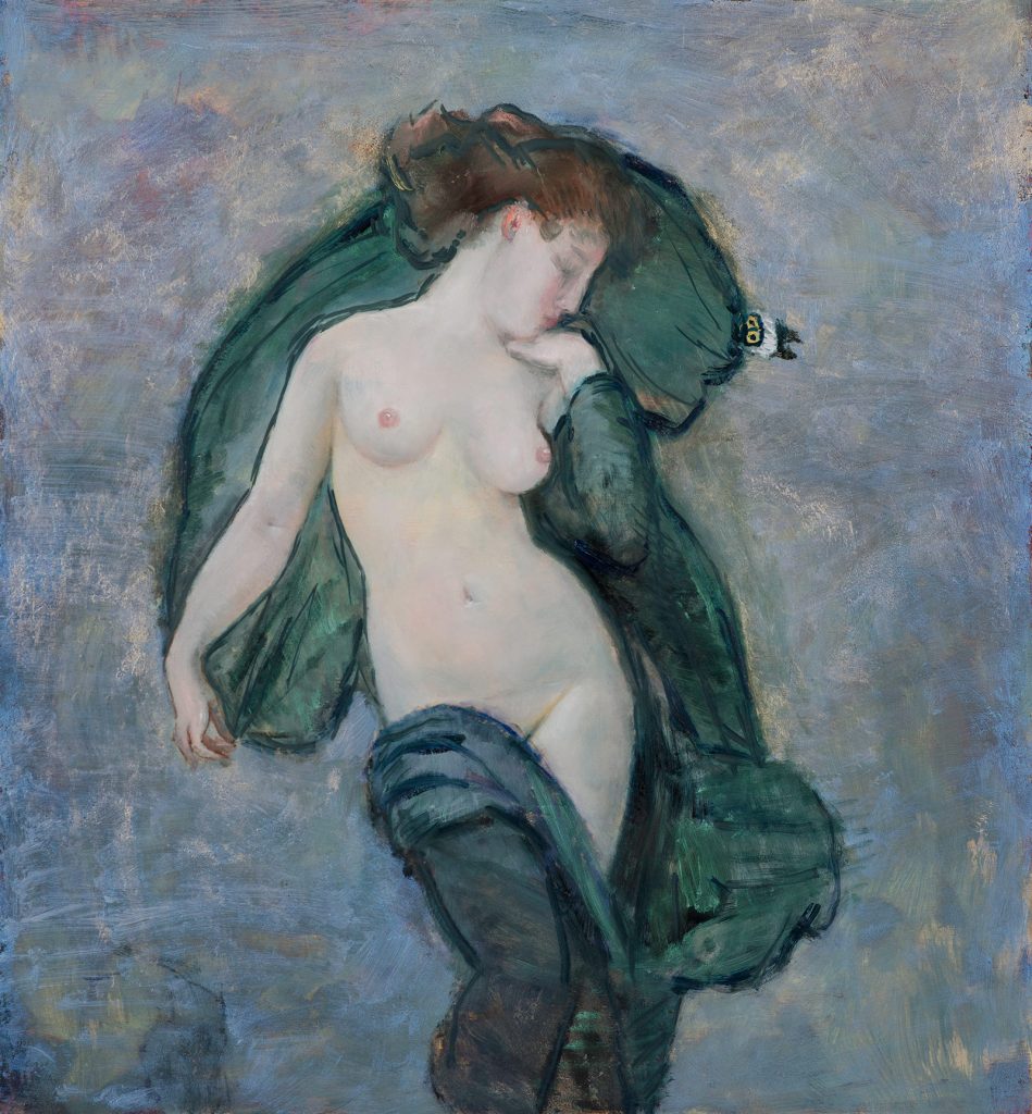
I personally really love Stockard’s entire line of work. My favourite works of hers is the Kevin series! I think Kevin captures the ethos of cats perfectly and his round, expressive eyes remind me of my cat. I think the fact that I saw her art passing by one day years ago and her work sticking with me this whole time is a testament to how charming and memorable her paintings are.
References
Kalvelytė, J. (2021, December 12). Vanessa Stockard: Metal magazine. English. Retrieved December 12, 2021, from https://www.metalmagazine.eu/en/post/interview/vanessa-stockard.
Vanessa Stockard. JEFA Gallery. (n.d.). Retrieved December 12, 2021, from https://www.jefagallery.com/artists/vanessa-stockard/.
A Font of Knowledge
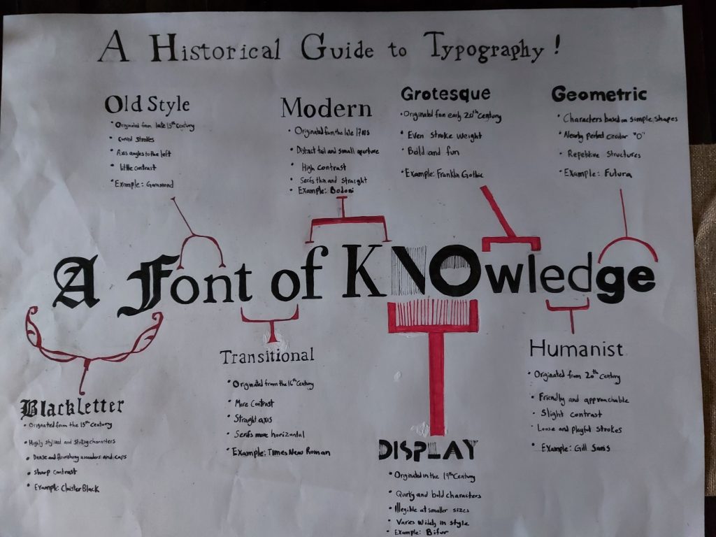
For this last project my concept was to merge my timeline with my title. I thought that a good way to convey type evolving was to see the gradual shift literally! I chose my title “A Font of Knowledge” because of the obvious pun and it had coincidentally sixteen letters so I could dedicate two letters to each type. I really liked my concept this time around! Although, I think my execution was a bit lacking in some places My hands started cramping up when I was writing my notes so I elected to just write in my normal hand writing, which is truthfully atrocious. I think I should have budgeted my time better and paced myself so my hand would be able to deliver better handwriting. I also probably could’ve chose a smaller size of paper, but I was really enthusiastic to make my title giant. I probably should’ve made the top title smaller to not compete with my main title. Another possibility could’ve been to frame my notes in themed frames that match the type! I spent 7 hours on this project and I’d give myself an 8/10.