John Alcorn

John Alcorn is an American commercial artist, designer, and illustrator who was born on February 10, 1935, in Corona, Queens, New York. When he was 5 years old, his family moved to Great Neck, Long Island. He was educated in local schools but he later studied graphic arts at Cooper Union where he studied drawing, calligraphy, typography, architecture, and design. In his last years at Cooper Union, he studied illustration and advertising design. After he graduated, he married a woman named Phyllis in 1962 and moved to Ossining, New York. He and his family would later move to Italy and different parts of the United States such as Connecticut. During the early years of his career, he spent time working for the famous PushPin Studios founded by Milton Glaser. Alcorn would work on numerous book and paperback covers during his time in PushPin and he was known for being one of the youngest workers at the studio at age 21. His work at PushPin would dominate advertisements in throughout the 60s and 70s. Throughout his career, Alcorn exhibited his work at museums and has had his work published in a book called “John Alcorn: Evolution by Design”. John Alcorn suddenly died from a heart attack in 1992 at age 57.
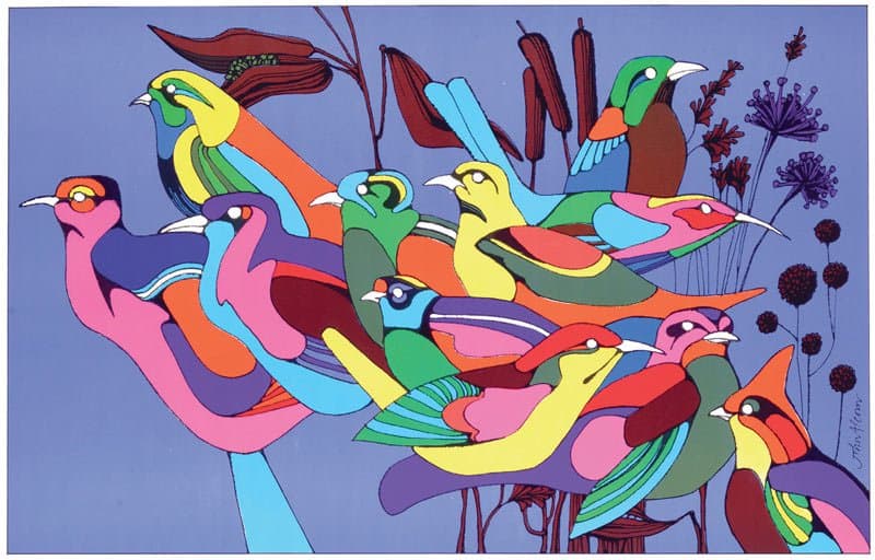
Alcorn’s art style is known for his elegant, flowing, and linear approach which fit perfectly for PushPin’s proto-postmodern aesthetic. This style was inspired by Glaser’s psychedelic style which would become a popular design trend throughout the 60s and 70s. Alcorn is also known for his use of crazy colours, sinuous shapes, and natural forms and has been considered as one of the most versatile and gifted illustrators and designers. I really like looking at Alcorn’s work. His psychedelic work is very unique in its own way because they pop out and are simplistic in terms of design unlike most other psychedelic artworks which were very overly done. His style is much more natural which makes his work pleasant to look at but still retain that psychedelic look. When it comes to his work outside of the psychedelic style, he is still able to create natural designs with good detail and wonderful patterns which shows his talent. If I had to describe his style, it would be a combination of pop art, surrealism, and simplistic beauty. The colours stand out and the way he composites objects makes his works feel like a dream, while all being done in a simplistic style that doesn’t require detail.
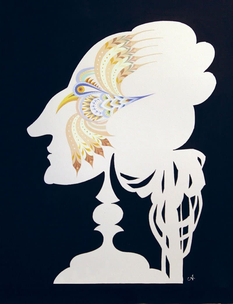
Unpublished poster for Fellini’s Il Casanova, 1976
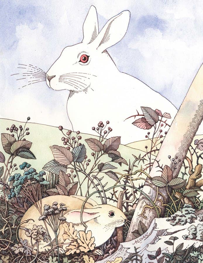
Book cover illustration for Italian version of Watership Down by Richard Adams, 1974

Sources
https://visualmelt.com/John-Alcorn
http://www.historygraphicdesign.com/the-age-of-information/the-new-york-school/249-john-alcorn
February 24, 2019 at 9:38 pm
Joseph,
Nice work on Francois and John Alcorn. Francois is a popular choice for posts by the class for this era which is no surprise to me. Alcorn was also a good choice as he was a perfect fit for PushPin and the esthetic that they created at the time. Well researched and good insights.
Jeff