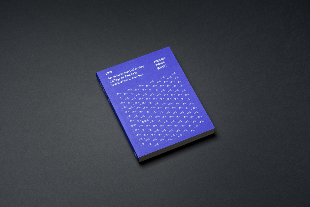
Seoul National University College of Fine Arts Graduation Catelogue
Chuigraf, 2018
Created by design company Chuigraf, this graduation catalogue clearly exhibits the use of repetition on its cover. When zoomed in more closely, you can see that this pattern is actually multiple small lines of staggering text. The words forming this pattern are actually the names of the 2018 graduates written in both Korean and English. Though usually executed with shapes, [artist] took another approach in this design, giving the pattern slight variations despite its repetitive nature, creating more visual interest as opposed to if the names were aligned in a more traditional format.
“Ordinary Work” Exhibition Poster
Kim Bo Huy, 2018
This poster, designed by Kim Bo Huy, features a blue man with a circle head in front of a bright red background with text. The contrast in colour stands out the most, but there is also a large contrast between the small text on the top and bottom of the poster compared to the bold blue text spelling out “Ordinary Work.” Together, all the elements of the poster guide the eye and gives a sense of hierarchy.
Deer Eagle Logo
Jenggot Merah, 2021
This logo plays with the idea of positive and negative space, where the designer manipulates the figure/ground of the logo. At first glance, the most prominent symbol is the deer in blue, but upon taking a closer look, the red detail below its antlers acts as the eye of an eagle that fills the white space. These two animals quite literally represent the name of the apparel brand, which creates an effective and memorable logo.
Thor Movie Poster
Olly Moss
This remade poster for the movie Thor employs the Gestalt principle of proximity. Various scenes from the movie are depicted within the multiple irregular shapes, which collectively make Thor’s famous hammer, Mjolnir. The colours and proximity of the shapes help us decipher the relation of these elements, allowing us to see the bigger picture.
This series of designs were made for the album covers of kpop group BTS. The albums include Love Yourself ‘Her’, Love Yourself ‘Tear’, and Love Yourself ‘Answer’, combining together to tell a story of hope and self-love. These covers rely solely on line and colour to communicate their central message, but the overall effect is extremely impactful in my opinion. The lines depict the life of a flower, from its full bloom in Love Yourself ‘Her’ to its petals falling in Love Yourself ‘Tear’ and ‘Answer’. The simplicity and abstractness of these designs give a sense of grace and softness, highlighting the storyline of the series, which is one of the biggest reasons why the music of BTS remains so iconic and relatable.
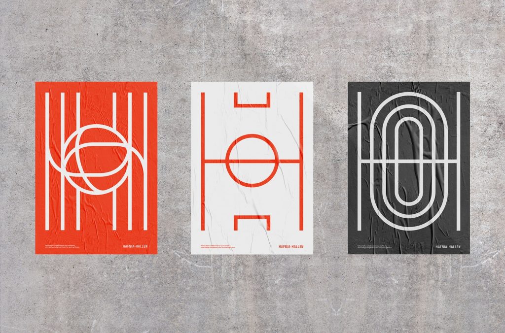
Hafnia-Hallen Logo
Re-public, 2018
The logo of Hafnia-Hallen (left), the reconstructed public sports facility in Copenhagen, features lines that join to make a ball at the centre. The clean design combined with the bright colours conveys a friendly and welcoming image, inviting the public to visit and use its facilities. The logo’s lines represent the floor markings on different sports courts, which is also illustrated by other designs made for the sports facility (centre and right), while collectively forming the capital letter H for Hafnia.
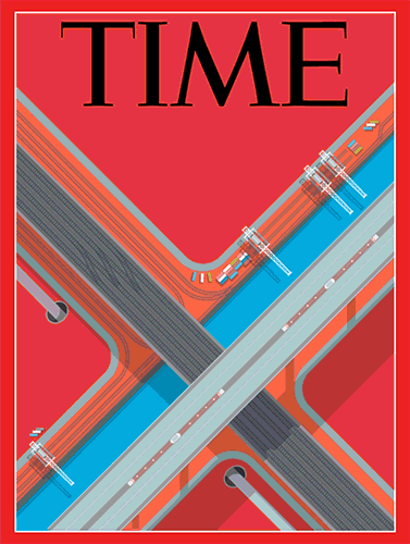
Time Magazine Cover
Peter Greenwood, 2017
This Time magazine cover displays an intersection of highways and roadways along with modes of transportation presented in a birds-eye view. The cars, trains, construction cranes, and roads themselves form large and small lines that are parallel and perpendicular to each other, giving the entirety of the piece a sense of structure and rigidity. In addition to the lines, the fact that the roads are tilted at an angle adds direction and motion to the cover.
Space
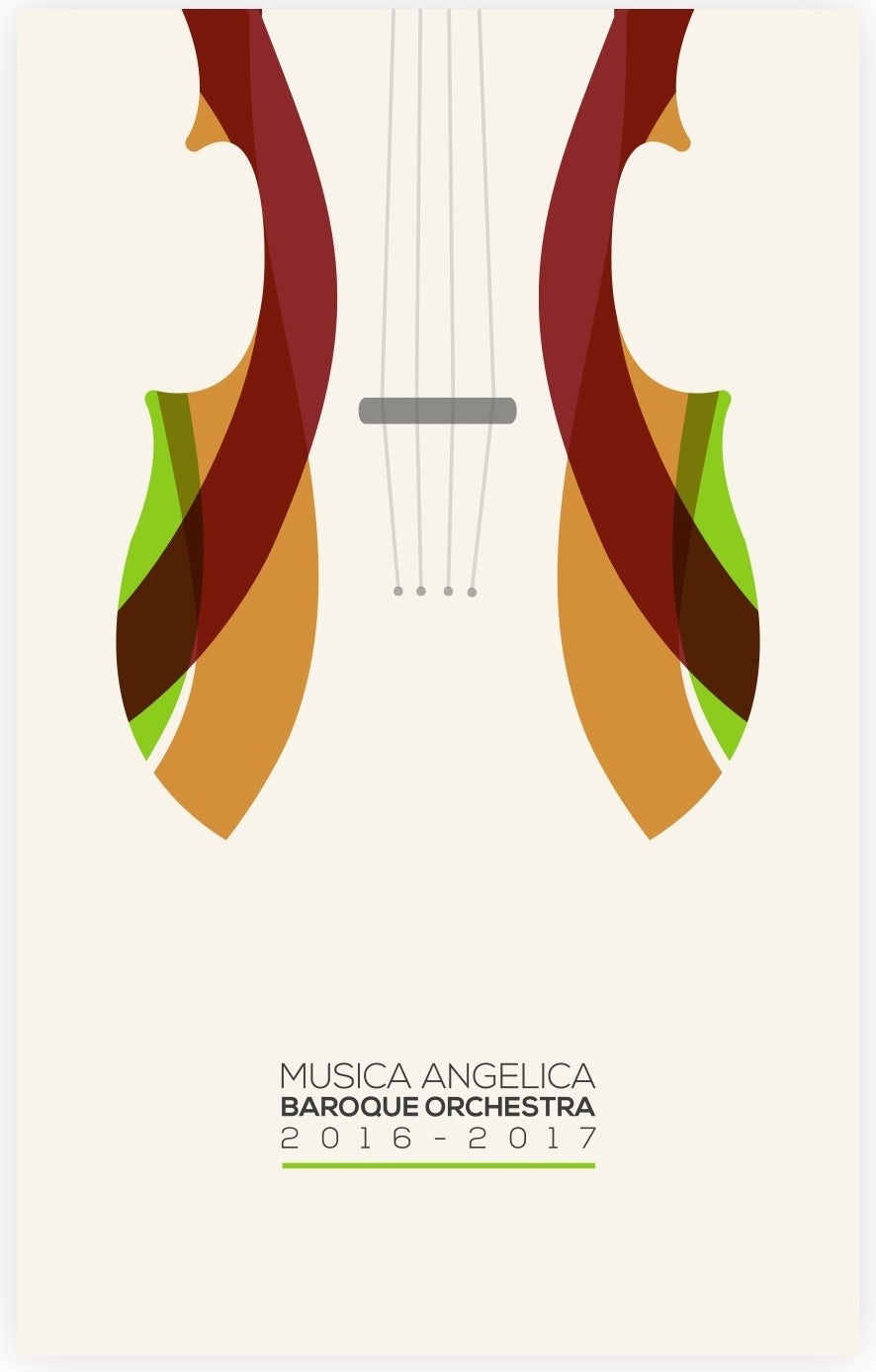
Musica Angelica Poster
2017
This poster design for a baroque orchestra is a prime example of using space productively. The violin and the background of the poster are the same colour, with only the brown and green curves distinguishing the edges of the instrument, leaving the rest of the blanks to be filled in with our own imagination. The small details of the instrument and text at the bottom together tie the overall minimalistic composition together nicely.
The Works of Geoffrey Chaucer Now Newly Imprinted
William Morris, 1896
This page is one of many in the book “The Works of Geoffrey Chaucer Now Newly Imprinted.” Each spread is filled to the brim with detailed designs and illustrations to go along with the text. The rectangles bordering the art and typography give structure, while the vines loosely swirl around the title and along the edges of the text. Though it was created over a century ago with traditional printing techniques, this book surely is a masterpiece!
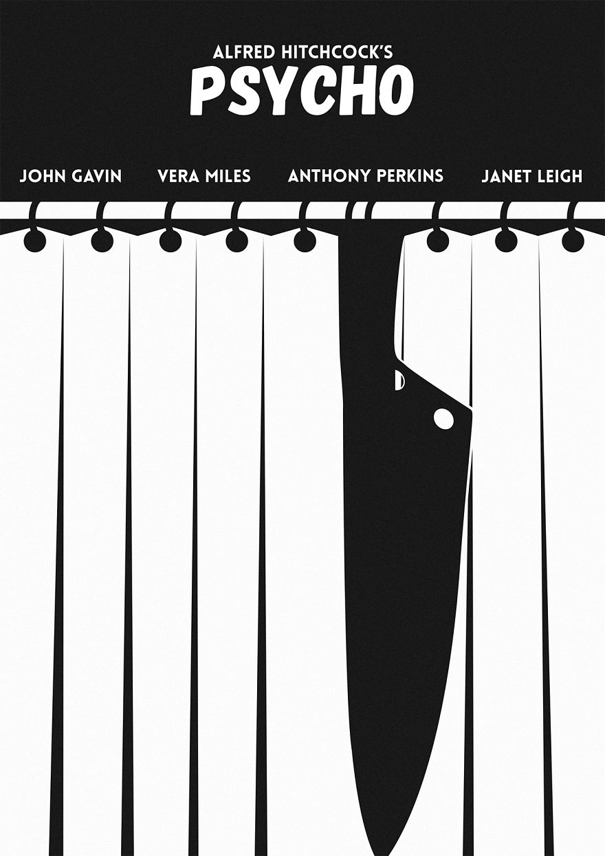
Psycho Movie Poster
Eduard Cirstea, 2017
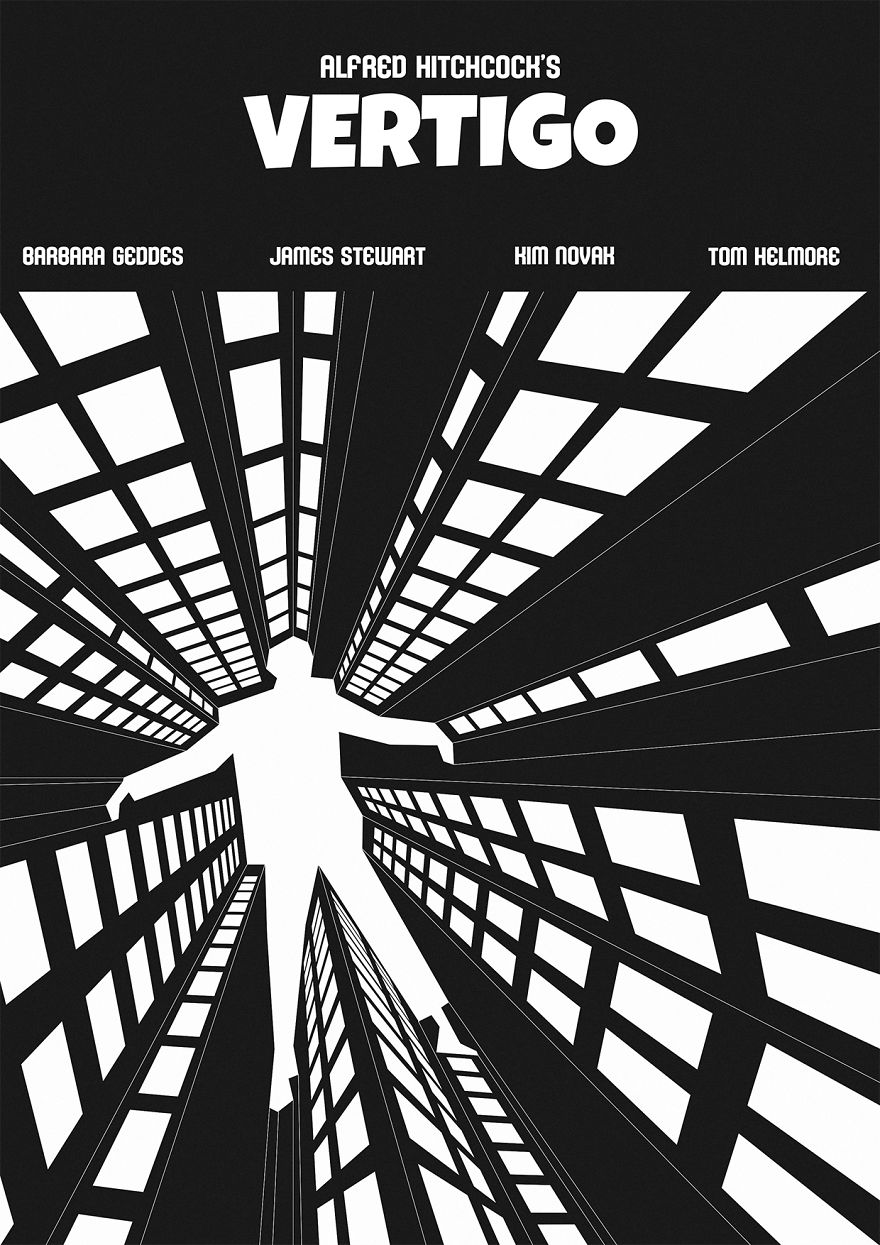
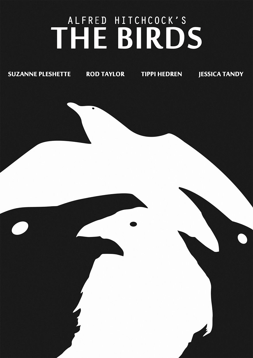
The use of negative space is prominently shown in this poster design for Alfred Hitchcock’s movie Psycho. The curtains are illustrated with the white panels while the knife and hooks are in black, making the knife seem to blend in with the panels, which is very reminiscent of the famous shower murder scene that happens in the movie. There are an additional two posters also for Hitchcock’s movies done by the same artist shown below.
Shape
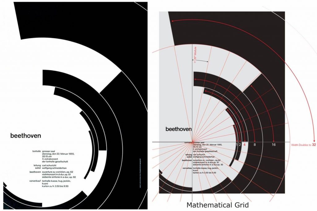
Beethoven Poster
Josef Müller-Brockmann, 1955
This Beethoven Poster is designed by Josef Müller-Brockmann, a Swiss graphic designer know for using calculated geometric shapes that result in his simple yet eye-catching designs. All of the curved rectangular shapes seem so effortlessly scattered yet lay perfectly to frame the text. The rigidity and contrast of the colours are balanced out by the roundness or the curves and gives a sense of rhythm and harmony, much like Beethoven’s music. The photo on the right shows a more detailed analysis of the placement of each element of this poster, done by Kimberly Elam on Behance.
Beat the Whites with the Red Wedge
El Lissitzky, 1919
The element of shape can also be seen used effectively to deliver messages of propaganda, like the poster above. Titled “Beat the Whites with the Red Wedge,” El Lissitzky uses both colour and shape to symbolize the Bolsheviks and Mensheviks during the Russian Revolution. The red triangle, representing the “Reds” or communists, shatters the borders of the white circle, representing the “Whites” or monarchists, delivering a clear message of the Bolsheviks’ power and intentions. Shapes played an important role in this poster to communicate its core idea in the simplest form, allowing the audience to quickly grasp what the design is trying to say.
Hub-Tones Album Cover
Reid Miles, 1962
Freddie Hubbard’s Hub Tones is known to be a staple in a jazz collector’s set, not only because of Hubbard’s undeniable talent on the trumpet but also for the iconic cover, designed by Blue Note Records art director Reid Miles. Though simplistic, the photography, text, and composition of the nine black bars were enough to captivate the audience’s attention. Our eyes are immediately drawn to the offset rectangle above the smart placement of text, creatively juxtaposing the repetitiveness and predictability of the rest of the cover. As analyzed in this blog post, the offset rectangle can also be seen as a symbol of the tonal weight of Hubbard’s tunes, “expressively signalling the authority of the tones emanating.” With all these careful decisions taken into consideration, it is no wonder why Reid Miles’ works are some of the most iconic in both design and jazz history.