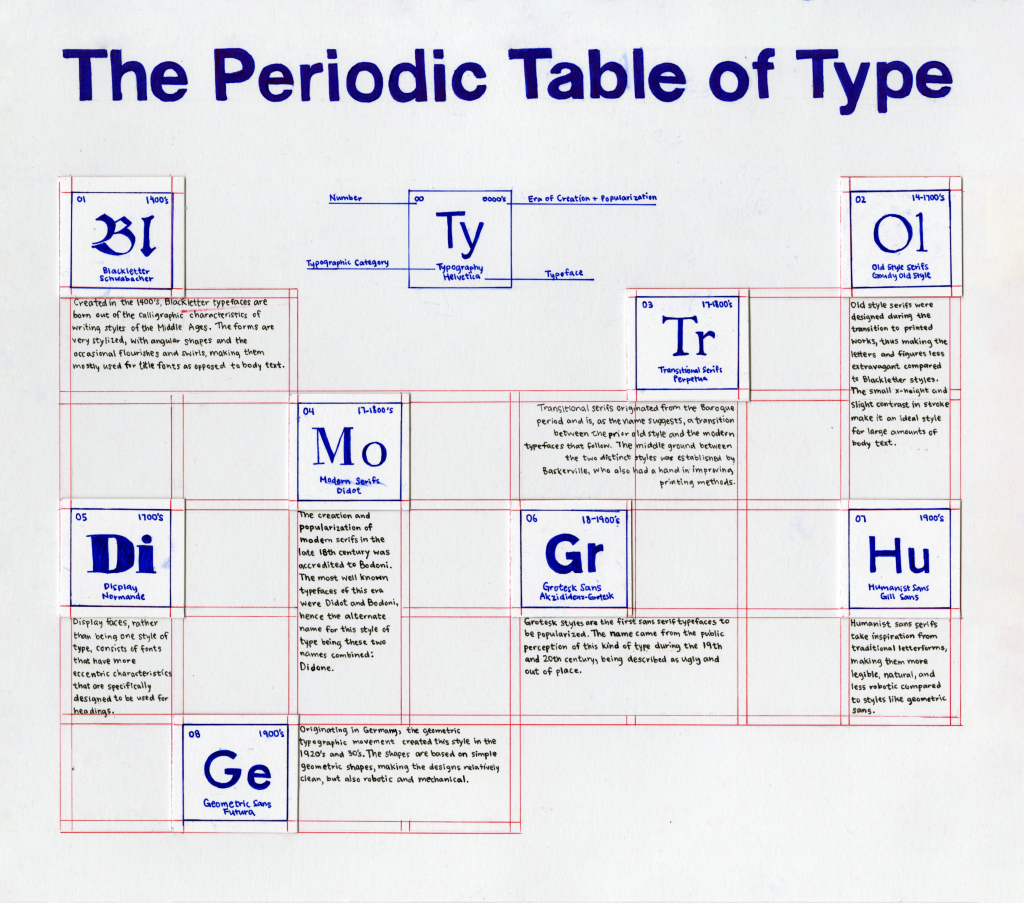
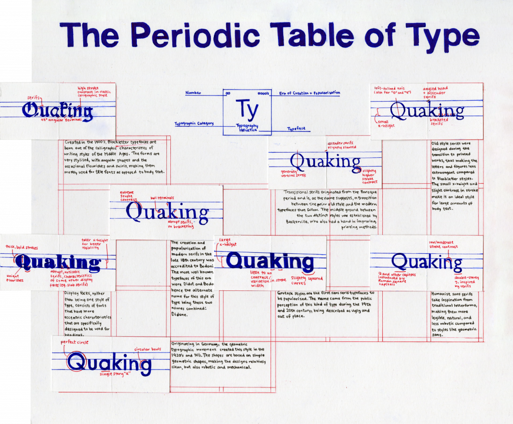
The Genius Storytelling of Hayao Miyazaki

Birth of a Legend

Hayao Miyazaki was born in Tokyo in 1941. Because of Japan’s state during the war at the time of his birth and early childhood, much of his first memories were of evacuations and “bombed-out cities.” Though his father [name] enjoyed purchasing and displaying art, he didn’t have much knowledge about painting, so Miyazaki’s early interest in animation is quite interesting. It was possible that came from his mother who he was closest with, though she passed away from spinal tuberculosis later in Miyazaki’s life.

Early Career

Miyazaki graduated from Gakushuin University with a political science and economics degree, but he eventually found a job at Toei Animation. He stayed there for most of his early career, taking part in animating feature anime movies and slowly moving up the ranks. After leaving the company, his individual style began to develop shine through in manga strips he wrote for magazines.

Nausicaa of the Valley of the Wind A page from his manga translated in English that led to the creation of Studio Ghibli. The characters are drawn in a very simplistic style and would carry over to his coming feature films.

Studio Ghibli

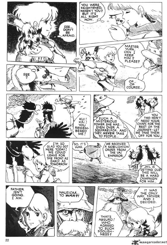
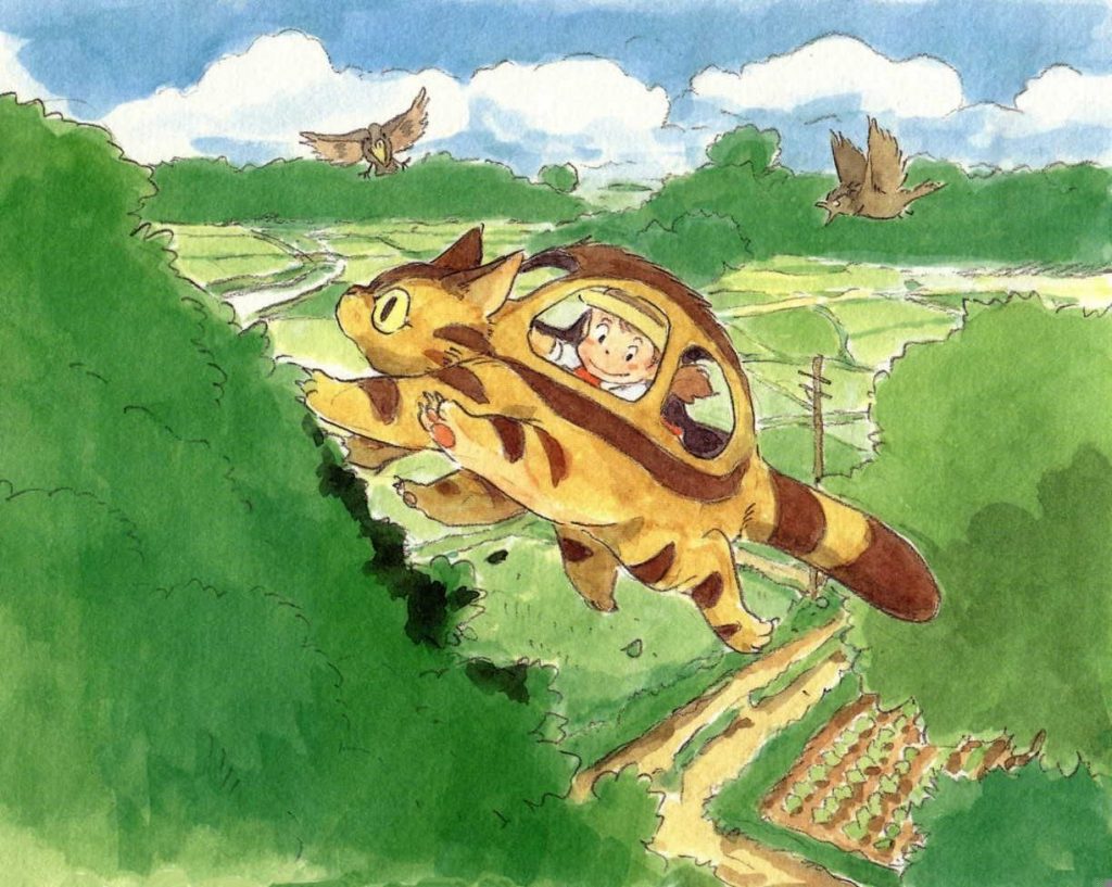
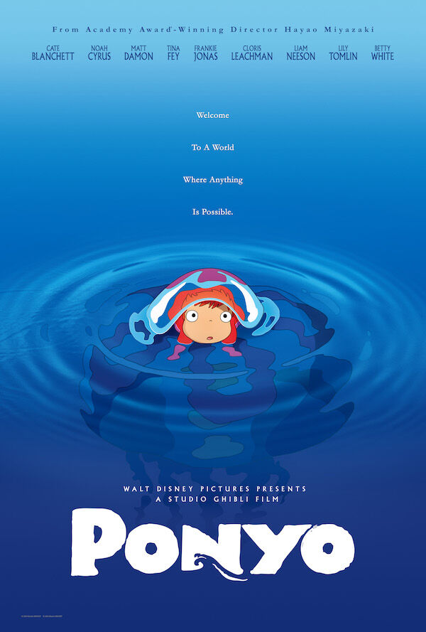
While he is a great illustrator and manga artist, Miyazaki is most known for his phenomenal and unique storytelling that he finally got to showcase through Studio Ghibli. The success of Nausicaa of the Valley inspired the creation of the infamous studio in 1985 and was later animated into a film produced by the company. Today, he has animated films include My Neighbour Totoro, Castle in the Sky, and Ponyo, and are all internationally recognized for their unique perspectives and mesmerizing music score. 

Miyazaki’s voice shines brightly through his work. While all of his films have an absolutely captivating storyline, they all have underlying themes of environmental consciousness and conservation. As someone who has grown up with his films, they give me a nostalgic feeling of childhood innocence that I don’t seem to get with anything else. The serene qualities and accompanying music add a very nice touch and complete his works.
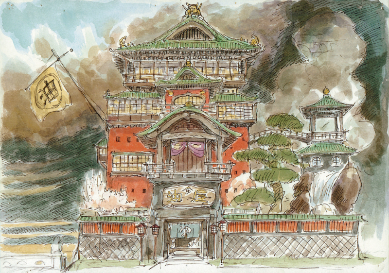
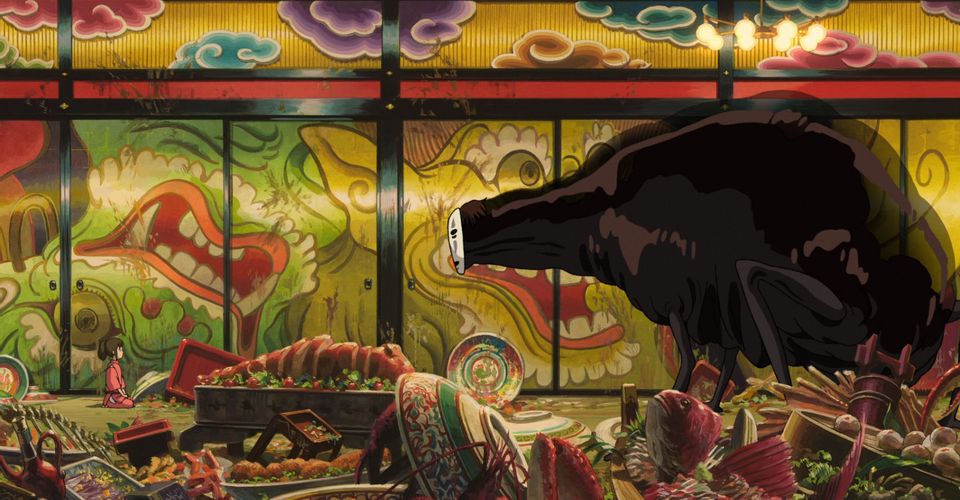
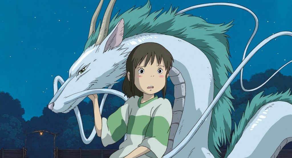
My Neighbour Totoro Sketch This is a sketch of the character Mei riding the Cat Bus in one of his signature movies titled My Neighbour Totoro. I have not looked into Miyazaki’s sketches until doing research for the blog, but I find it very interesting how little changes he made from these sketches to the final movie in terms of character design, atmosphere, etc. Fun fact: Totoro, the main character of the film (not shown) became the so-called mascot or logo for Studio Ghibli and can be seen in the opening credits of all of their movies!
Ponyo Poster This whimsical film features the adventures and discoveries of Ponyo, a fish princess, when she was discovered by a boy named Sosuke. She learns about the human world and provides such an innocent and child-like perspective, making me appreciate the little things in life just a bit more.

Spirited Away

Spirited Away is possibly my favourite movie of all time. I remember watching it as a child and being confused and rather scared, as there was a specific scene where the main character’s parents turned into pigs. Though obviously, I grew very fond of the film as I learned to appreciate the beauty of not only the animation, but also all other aspects of the movie. His mystical concepts are truly out of this world and balance just the right amount of fantasy and reality.

Spirited Away Sketch Pictured is the iconic bathouse that most of the movie Spirited Away takes place in. You can see how much Miyazaki pulls from his cultural influences to drive the stories he tells, and I love the meaning that he puts behind every decision he makes.
Spirited Away Movie Still This shot came from a scene in the movie featuring the main character, Chihiro, on the left and No Face on the right. No Face is a character that can produce gold from his hands to lure and eat creatures tempted by it. Maybe you can see how it can be quite haunting for children to watch some scenes in this move despite it being animated.
Chihiro and Haku Haku, the dragon and river God, is a friend in the film that helps Chihiro navigate this new and fantastical world that she gets herself into. Haku helps Chihiro to reunite with her parents and Chihiro aided Haku in remembering his lost memories in return.

I recognize that this blog post is mostly commentary on his life and films rather than specific illustration works. Despite that, I think that Miyazaki’s art was the perfect vehicle for him to grace us with his incredible talents, which, in a way, is precisely what being an artist is all about.

Happy holidays and happy almost retirement Jeff!

Sources

https://www.britannica.com/biography/Miyazaki-Hayao
https://en.wikipedia.org/wiki/Hayao_Miyazaki#Early_career
https://wherecreativityworks.com/illustrator-study-hayao-miyazaki/

Historical Type Identification Poster Rationale

Poster Concept

For our final project of this course, we were instructed to create a poster that illustrates and defines the different categories of type through the centuries in a creative and informative way. I was struggling for a while with coming up with interesting ideas, though I wanted to experiment with the idea of gridding because it seems to be very useful in different fields of design. Eventually, I came up with the concept of a “Periodic Table of Type.” I thought that this was very suitable for showing the most basic and recognizable categories of type, as the periodic table of elements represents similar information but in the context of science and chemical elements. I looked at many standard periodic tables for inspiration on how to lay out shorter pieces of information (like the year it was created and the order the type categories were created and popularized) and plan out the number of squares of the table. To incorporate the gridding aspect, the borders of each square look like design grids and is done in a different colour to imitate how it would look on computer software, as I think that it fits well with the theme and also makes the poster more visually appealing without being distracting. In the middle under the title, there is a square that acts as the key for what the numbers and words represent on each element square to help the viewer navigate the information. As for incorporating an example typeface for each of the type categories, I came up with the solution of a flap under the square so that it flips out to a longer rectangle, making for an interactive experience and more space to show and analyze each of the typefaces.

Execution

I wanted to keep the overall poster simple with a fair amount of white space, so I thought that coloured pens would be the best and fastest method for executing this design, especially for the finer lines. The title and informational squares are done slightly thicker and in dark blue to pull the hierarchy forward over the lighter lines of red that are mainly there to provide structure and context for the concept of the poster. I decided to insert red in the analyses of the typefaces so that it stands out from the blue and acts better as an accent colour. As the text is much smaller than I anticipated it to be, it was important that it would still be legible in a small point size, so I decided to slightly break the colour palette and use black Micron fine liners to minimize the risk of smudging. Though I was more careful with moving my hands over ink that has yet to dry, some words and designs in the coloured ink inevitably smudged.

Evaluation

I would give myself a 9 out of 10 for this assignment. I was proud of myself for coming up with an original and innovative idea and was excited about the planning process, but it was very time-consuming and slightly pressuring to execute in the amount of time I allotted for myself. I also wish I had a bigger piece of paper so the body text could be bigger, more legible, and less labour intensive to write. From research to final execution, I spent roughly 20-25 hours.

Edward Hopper: The Artist of Empty Spaces

Self-Portrait Edward Hopper, like many other notable artists, was quite a loner especially at a young age. It was mostly due to his height, as he had an early growth spurt and was taller than six feet by the time he was in his early teens.

Born in 1882, Hopper was the youngest in a family of four and lived a comfortable life in Nyack, New York. He would often sketch boats while sitting by the Hudson River as a child, leading him to build a boat himself and seriously consider a career in naval architecture for a short time. He initially went to the New York School of Illustration for his education as his parents encouraged him to pursue a more commercial route in the industry, but he eventually left to attend the current Parsons School of Design instead. While he got into the field working as an illustrator at the New York Advertising Agency in 1905, Hopper was not satisfied, as his true passion lies in the world of painting.

The Cat Boat The type of boat Hopper ended up building during his teenage years was a cat boat. Later on, the first ever painting he sold for $250 would also be a piece related to boats, titled Sailing.

Reoccuring Expressions and Motifs


Emptiness is a common theme in Hopper’s paintings. Many of his works show couples in an unhealthy relationship, possibly due to his personal marriage issues, where the two would be occupying the same space while their minds wander elsewhere. The themes of isolation are particularly easy to resonate with today, as it echos the sudden shut-downs that COVID-19 has forced upon us.

Train and Bathers Hopper took a few trips to Europe that would go on to shape his painterly influences after he went back to New York City and start to gain recognition. He was mainly inspired by Impressionist painters like Degas and Manet as well as the trend of painting en plein-air.
Office in a Small City Department This painting is a great example of many aspects of Hopper’s style: angled buildings with usually one to two people as subjects, with the windows that seemingly dissapear to blend the existence of the interior and exterior environments.
House on the Railroad Another notable aspect of Hopper’s works is that he was constantly inspired by film and theatre. His creative takes, in turn, influenced future film directors as well as other writers and musicians. House on the Railroad is a prime example, as this was the original inspiration for the classic Alfred Hitchcock move Psycho.

Nighthawks

Painted in 1942, Nighthawks is Edward Hopper’s most famous work. Featuring four distant and absentminded figures, this painting brings the feeling of void and loneliness to the forefront. The diner lights are the only thing illuminating the scene, while the absence of a door into the building connotates an isolated atmosphere. The streets are gloomy and empty, pointing to the frequent blackout drills that occur throughout the city during a time of war. Personally, I was fascinated by the way Hopper’s paintings could encapsulate a sense of hollowness while still feeling wholly complete, especially in a bustling place like New York City (though apparently when people were searching for this diner in the city, they found that Nighthawk was not a real place at all!).

Nighthawk The name of this piece was thought up by Hopper’s wife, Josaphine, who was inspired by the hawk-like nose of the man facing the audience in this painting. Even as an introvert who likes to be alone for extended amounts of time, I can still feel the stillness and slight tension in the air of this painting, where all of the subjects seem to be in the same space but mentally adrift.

After Hopper’s death, it was thanks to his many sketches and his wife’s journals that we get to see the laborious process he went through for each of his works. Though abstract expressionists like Pollock and Rothko took centre stage nearing the middle of the century, Edward Hopper’s naturalistic style of painting never wavered and remained universally appealing. With his massive influence on society then and now, it is safe to say that Hopper is one of the most iconic figures of art in the 20th century.

Sources

https://www.youtube.com/watch?v=lKIbT-4UFaE
https://www.wikiart.org/en/edward-hopper
https://www.youtube.com/watch?v=mdi4XXl2kUg
https://en.wikipedia.org/wiki/Edward_Hopper
https://www.theartstory.org/artist/hopper-edward/life-and-legacy/

Exhibit Artifact Rationale: Chinese Seals

In this assignment, I decided to research and recreate an artifact that connects me to my roots and ethnic background: ancient Chinese seals. My dad makes seal engravings for friends and family as a hobby and I have always been intrigued by the art form, so I thought this was a perfect opportunity for me to explore its history and culture as well as learn some stone-carving skills.

I decided to make a carving of my last name, 楊 (Yeung), in traditional seal script, as name engravings were the most common kinds of seals. With my dad’s guidance, I spent roughly five to six hours from designing to carving and finalizing. The process was quite tedious and I had to be very cautious to stay within the white space when engraving to prevent cutting off any strokes of the Chinese character, but patience is a major aspect of this art form and I slowly grew to enjoy it more and more.

Photography approach

For photographing my artifact and description, I had many ideas and inspiration photos from my research. Initially, I thought of writing my description on the brown piece of paper that ended up being the background of the photo, but the paper was very thin and ink would easily leak through. In the end, I opted for a simple piece of thick white paper, which I propped onto a small piece of stone to create a sense of depth and hierarchy in the photo. I was fortunate to have many extra seals and tools that I could use as props, but since the other seals were slightly larger than the one I chose to engrave, I had a hard time making my artifact the centre of attention when I arranged them side by side. Thus, I went with a composition that makes the focal point stand out through the use of the red ink and also by making both the seal and description closer to the camera. I also wanted to display what the seal would look like as a stamp, so I stamped it on the paper and cropped the photo so that it would appear at the bottom right corner, which is where they would have been placed as signatures when they were first created and used. From experimenting with different angles and layouts to capturing the final image, the process took around two to three hours.

Reference Images

Self-Evaluation

Overall, I enjoyed the majority of this assignment, from the creation of the artifact to taking the final image. I am also quite proud of the final photo as I like that I was able to show the seal and the design when it is stamped on paper in an effective and creative way. Though I would give myself a 9.5/10, as I had a little trouble creating the museum description in terms of its size in relation to the artifact and ink smudging, and it could have been better executed and more legible. Combining the estimated amount of time I spent on the different parts of the project, I used a total of 8-10 hours from the initial research stage to the final execution.

Sources

https://www.inkston.com/stories/guides/chinese-seals/
chinahighlights.com/travelguide/culture/chinese-seals.htm
http://www.chinaonlinemuseum.com/carving-seals.php
https://en.wikipedia.org/wiki/Seal_(East_Asia)

Elgar’s Unsolved Mystery: The Enigma Variations

Last summer, I completed my grade 12 year and finally graduated from high school. Though it was a virtual ceremony because of the pandemic, Pomp and Circumstance was, of course, on repeat as the graduates crossed the stage one by one. I was surprised to find out that Pomp and Circumstance was written by the English composer Edward Elgar, but even more caught off guard by one of his other well-known works and the mysteries it holds: the Enigma Variations.

The Beginning of a Classic Conspiracy

Edward Elgar was a composer famous for many of today’s most classic British pieces, including the Pomp and Circumstance Marches and Land of Hope and Glory, though Variations on an Original Theme was the beginning of the development of his international reputation. (Image Source)

Originally called Variations on an Original Theme, Edward Elgar finished this orchestral piece in 1899. Complete with 14 variations, he dedicated each to one of his close friends and titled them after codenames he made up for them. It became known as the Enigma Variations after Elgar decided to add the word at the top of his score after its completion. This addition, he briefly explained, represents a hidden melody in addition to the main theme that sparked much conversation after it was first performed in London that year. There were a few conditions that Elgar says the Enigma theme fulfills, including rules stating that the Enigma is a counterpoint to the main theme and that it comprises of the first 19 measures. Furthermore, in the premiere, Elgar writes: 

The Enigma I will not explain — its “dark saying” must be left unguessed. I warn you that the apparent connection between the variations and the theme is often of the slightest texture; further, through and over the whole set another and larger theme “goes” but is not played.

Since then, many musicians have been stumped by this underlying melody, and no one has been able to come to a conclusive, yet convincing answer.

Nimrod’s Story

Aside from this mysterious puzzle, the main theme also had many easter eggs representing memories, habits, or specific events Elgar has had with his friends in each variation. The most famous example of this is in the ninth variation titled “Nimrod.” This codename is for Augustus Jaeger, music editor of Novello & Co and one of Elgar’s dearest friends. His variation captures a conversation the two had when Elgar consulted Jaeger as he was losing motivation to continue with music entirely. Jaeger successfully convinces Elgar to keep going as he compares his struggles to Beethoven’s, and then goes on to softly hum the second movement of his Piano Sonata No. 8 Pathétique. In the opening bars of this variation, Elgar nods to this event with a suggestion of a small excerpt of that sonata.

A video excerpt on his most famous variation of the piece titled Nimrod. If you are familiar with Beethoven’s Piano Sonata No. 8, you may be able to hear hints of it, especially in the opening measures. (Video Source)

The Never-Ending Search

A recent analysis of a Texas musician still tirelessly attempting to solve this near-impossible riddle. (Image Source)

Many musicians thought the Engima to be a famous anthem, like God Save the Queen, Auld Lang Syne, or even Twinkle Twinkle Little Star. Though some of the explanations to these solutions sound absurd and a little bit of a stretch, Elgar was a man obsessed with codes and anagrams, so it makes sense to approach his music in a similar mindset. Despite the countless attempts, Elgar took the answer of the Enigma to the grave, denying wrong solutions, but never revealing the correct one. 

As a music nerd who loves puzzles and regrets quitting piano lessons after passing level eight, I was genuinely excited and intrigued when looking into this conspiracy. Though as much as I loved the deep analyses going into the construction of hidden codes and complex melodies, the music as a standalone piece is completely mesmerising and not in the slightest underwhelming if one did not know about the stories behind it. Dissecting the Enigma in search of Elgar’s true intentions is certainly a way to approach this piece, but perhaps just listening to the music is enough of an experience of its own.

Sources

https://en.wikipedia.org/wiki/Enigma_Variations
https://www.classicfm.com/composers/elgar/guides/story-behind-elgars-enigma-variations/
https://www.youtube.com/watch?v=M08vJ0i6hyc
https://www.youtube.com/watch?v=ZatQm8ASsmI&t=78s
https://www.youtube.com/watch?v=panxnMhHtuo

Camille Pissarro: The Underdog of Impressionism

Impressionism is a movement synonymous with names like Monet, Manet, and Cezanne for their daring approaches to this new and evolving generation. Camille Pissarro rarely comes up as one of the first names you think of, but his contribution to this era was essential nonetheless and quickly became a pivotal figure in the world of art.

Jalais Hill, Pontoise This may be one of my personal favourite paintings by Pissarro! The flatness of the colours remind me of gouache, which I currently have a love-hate relationship with, and the overall tone is calming and comfortable. Though I am a big fan of the city, this painting makes me want to visit the outskirts of Europe and bathe in the warmth of the afternoon sun.

Early Life

Jacob-Abraham-Camille Pissarro was a Danish-French impressionist born in Charlotte Amalie, St. Thomas. He would continue to live in his hometown until travelling to Paris for boarding school, where he spent his free time drawing and observing the life around him.

The Hermitage at Pontoise Pissarro slowly developed a focus on landscape paintings, which he often puts his signature on by adding at least one person in the midst of the buildings and nature.

Growing up, and even when he made a name for himself in the art world, Pissarro was considered an outsider, usually for reasons relating to his family and ethnic background. Perhaps this unfortunate aspect of his life led him to empathize with new and upcoming artists, as he was kind, respectful, and welcomed many with open arms. He committed to becoming a full-time artist at 21, but when returning home after fleeing from the Franco-Prussian War, he discovered that his house, along with many of his early works, were destroyed.

Hoarfrost Pissarro befriended Monet, Renoir, and other contemporaries, who eventually organized a society that would host exhibitions outside of the Paris salon. They would later on be appropriately named the Impressionists. This was one of Pissarro’s paintings shown in the first Impressionist Exhibit.

Boulevarde Montmartre

During his later life, Pissarro suffered from an eye condition that restricted him from working outdoors for long periods. His creative solution was to start painting outdoor scenes through the windows of hotels, which occupied the majority of his time in Paris and London. He went on to create a series of 14 paintings of the same view of Boulevarde Montmartre from the window of the Grand Hôtel de Russie during different times of the day. Collections like these remind me of other artists who have done the same, like Hokusai and his 36 Mount Fuji prints, and make me wonder about the reason behind artists’ fascination with series paintings.

Boulevard Montmartre: Afternoon, Sunshine There is a large variety of times of day and weather conditions in his many paintings of Boulevard Montmartre. In this specific painting, his rapid and loose brushwork accurately captures the bustling of the city streets during the peak hours of the day.
Boulevard Montmartre, Spring Pissarro was quite proud of this series of paintings: “I am delighted to be able to paint these Paris streets that people have come to call ugly, but which are so silvery, so luminous and vital.”

Pissarro was not only a notable leader in the development of the Impressionistic style, but he also became an important character for future generations that came after him and was an influence on Neo-Impressionism. It is truly a little disappointing to see Pissarro as such an underrated figure of his time, but his dignified life, stunning works, and remarkable impacts on the world of art will never be forgotten.

Sources

https://www.youtube.com/watch?v=XoEX16Stct0
https://www.youtube.com/watch?v=TIE7FME6F8M
https://www.youtube.com/watch?v=CW8Bwt2ZJwo
https://www.youtube.com/watch?v=ES5_kkOxKvM&list=PLnqgKdfiHvurTl2sC-8KECu53gYjLHBYs&index=13
https://en.wikipedia.org/wiki/Camille_Pissarro
https://www.camille-pissarro.org/biography.html
https://impressionistarts.com/first-impressionist-exhibition

Good Design or Out of Convenience? The Rise of the QWERTY Keyboard

Would you be able to live without a keyboard for a day?

This is not a question I would normally ask myself, but I only came to realize its significance in my life after researching for this assignment. Whether it is attached to our laptops or on the screens of our phones, keyboards are a crucial part of our everyday communication in the online world, but have you ever wondered why they are arranged in the way they are now?

The Typewriter

Though the concept of typewriters has existed a while before, its more relevant history began in the summer of 1868, when Christopher Latham Sholes, Carlos Glidden, and Samuel Soule put a patent on the first typewriter. Though it did not receive much attention in the beginning, typewriters slowly made their way into the world of business communication, becoming the most prominent invention in the industry until the computer. Unlike our keyboards today, the letters were in a completely different order and it can only type in capital letters. When typing, the keys strike upward, meaning that the person typing could never see what was being typed.

Figure 1: The first typewriter keyboard. Though Christopher Latham Sholes, Carlos Gidden, and Samuel Soule were all mentioned, Sholes was mainly credited to the invention of the typewriter and specifically the QWERTY keyboard. (Image Source)

QWERTY!

There were many improvements of the keyboard composition by Sholes and other inventors that came shortly after. The common theme between all of them was the goal to place the most common letters as far away from each other as possible. This was crucial especially in the age of typewriters, as it was done to prevent the machine from jamming when typing quickly. The QWERTY keyboard, also accredited to Sholes, rose above the rest and became the standard until this day. Of course, there are valid reasons for the public to adopt the QWERTY keyboard so quickly, but there were also many people that believed it could still be improved.

Figure 2: Can you believe that the version of the keyboard we use today was invented in the 1860s? There was also a very similar version right before QWERTY with the slight change of positions of the T and the period. (Image Source)

The Dvorak Simplified Keyboard

One of these people was August Dvorak, who, in the 1930s, came up with a layout comparable to the QWERTY keyboard in its efficiency: the Dvorak Simplified Keyboard. This keyboard was productive as he put the most used letters in the middle row where our fingers naturally lay, making for less reaching and tangled fingers. Dvorak expected his rendition to be an immediate hit, but the reaction was quite the opposite. People were hesitant to try out his new invention, but according to a limited amount of studies, this alternative was actually proved to be slightly better than the QWERTY keyboard. So why are we still using the QWERTY keyboard?

Figure 3: Dvorak’s take on a more efficient keyboard layout. Notice how the commonly used letters, including all the vowels, are on the middle row. I wonder how much work it would take to switch my habits and type naturally on a completely different keyboard layout… (Image Source)

Sholes’ Inventions Prevail

Though Dvorak’s unsuccessful promotion of his new invention was also to blame, the main reason for the failure of his keyboard was the unfortunate timing. Despite the potential people may have seen in Dvorak, the QWERTY keyboard was already so widespread and standardized by the 1900s that switching to a new format would have required a significant amount of time dedicated to relearning and adjusting. The industry ultimately decided that the cost of switching was not worth it, especially because the Dvorak keyboard was only marginally better than the one they were currently using.

Do you think we should have given the new keyboard a shot? Would it have spread like Sholes’ invention if it was invented just a little earlier? Most importantly, was the QWERTY keyboard truly the result of good design, or was it popularized out of convenience?

Sources

https://search.credoreference.com/content/entry/fofbusiness/typewriter/0?institutionId=6884.
http://www.smithsonianeducation.org/scitech/carbons/typewriters.html
https://www.youtube.com/watch?v=iQb1GRQxXdA
https://www.youtube.com/watch?v=tIJNusYZXMA
https://www.youtube.com/watch?v=ZnUBl90tayI

Typography Zine: Cooper Black

I chose to research the font Cooper Black for my typography essay assignment. I wanted my colour choices to feature the font’s playful and approachable style along with its impact on the trends of the 60s and 70s. The use of limited colours and layout style gives the entire zine more consistency. My favourite part of the process was designing each spread to be visually appealing and following the rules of hierarchy. It was fun to experiment with different compositions and ways I could present my information. I also enjoyed learning about terminology for typography, like counter, base-line, and the difference between a single and double-storey g.

I would give myself a 9 out of 10, as I am satisfied with my layout, though there was a lot of ink smudging and squished writing in the execution process. I spent around 10-15 hours on this assignment, with the most time spent on research and layout.

Theodore Gericault: The Man Who Came to Define the Dramatic Era of Romaticism

Theodore Gericault, the pioneer and embodiment of the romantic movement, had humble beginnings in the city of Rouen, France. Learning from French painter Carle Vernet, Gericault first studied the style of English sporting art, which is the painting of animals in the setting of popular sports of the century. He also gained influences from Peter Paul Rubens and even Michelangelo later on during his time in Florence and Rome. 

Horsewoman Through Carle Vernet’s teachings, Gericault predominantly focused on painting horses. I admire his loose, yet calculated brushwork on the ground and mountains while giving the horse such detail and structure, clearly exhibiting his plethora of knowledge on the subject.
The Charging Chasseur The colourful influences of the Baroque master Peter Paul Rubens are prominent in Gericault’s earlier works. This was also shown in the Paris salon of 1812, being one of his first major paintings.

The Epitome of Romanticism

Gericault’s most defining work, The Raft of Medusa, captures a shameful and dark history of the French in the 19th century. This painting depicts the aftermath of an unqualified sailor who ran the Méduse, a French naval ship, aground. Escaping on lifeboats, the captain and the upper class left 147 people abandoned on a makeshift raft to drift in the open sea for 13 days. The desperate fight for survival resulted in violence, murder, and even cannibalism, with only 15 people remaining when the raft was found and rescued.

This image has an empty alt attribute; its file name is JEAN_LOUIS_THÉODORE_GÉRICAULT_-_La_Balsa_de_la_Medusa_Museo_del_Louvre_1818-19-1024x699.jpeg
The Raft of Medusa The countless studies, sketches, and interviews Gericault conducted explain the striking authenticity and realness of this painting. Gericault observed dead and rotting body parts in morgues, hospitals, and lunatic asylums to emote the atmosphere of the painting through the accuracy of the lifeless survivors.

There are so many fascinating things to point out about this painting, but what stood out to me the most was the portrayal of the only black survivor, Jean Charles, as the saviour of the raft. This message of the unseen and overlooked becoming the hero was an extremely brave choice, as the French would not abolish slavery for another 30 years.

Head of a Guillotined Man An example of one of Gericault’s many studies of corpses, rotting flesh, and in this case, a severed head.
Inspiration and Comparison Although he may not have seen it, Gericault’s influences in the coming era were evident. Liberty Leading the People by Eugene Delacroix was directly inspired by The Raft of Medusa, most significantly in its pyramidical composition and heavy underlying message.

Later Life and Legacy

Despite the current success of the painting, The Raft of Medusa was heavily criticized and did not sell during its display at the Paris salon of 1819. His confusing love life, reoccurring mental illness, and dissatisfaction with his achievements led to an unfortunate death at the early age of 32. One can only wonder if Gericault would finally be content with his accomplishments if he had only seen his painting bought and displayed by the Louvre, eventually becoming the painting only second in popularity to the Mona Lisa.

Sources

https://www.britannica.com/biography/Theodore-Gericault
https://en.wikipedia.org/wiki/Théodore_Géricault
https://en.wikipedia.org/wiki/The_Charging_Chasseur
https://www.youtube.com/watch?v=yUq9qMm9NtI&t=251s
https://www.metmuseum.org/art/collection/search/438113
https://eclecticlight.co/2016/03/14/the-story-in-paintings-gericaults-raft-of-the-medusa/