Below is a revised paragraph about Amy Fleming’s “The Importance of Urban Forests” that uses academic writing techniques like effective summary, MLA citation techniques, and quotation integrations.
Amy Fleming’s “The Importance of Urban Forests” highlights the immense benefits trees have on our communities and the significant efforts initiated to incorporate them into our urban environments. Contrary to the preconceived notion of being “expensive ornaments,” Fleming notes the many economic advantages of trees near our buildings, including their ability to “absorb . . . carbon dioxide,” “muffle the roar of a main road,” and “cool cities by between 2C and 8C”(Jones qtd in Fleming 2, 2). In addition, Fleming consults public health expert William Bird, who claims that greenery lights up the parts of our brain “where empathy and altruism happen” (qtd in Fleming 4). Given our brains’ tendency to be more alert to dangers in cities, Bird explains that trees can create a more relaxed and calm mental state, ultimately improving the quality of our everyday lives (4). Despite these advantages, Jones writes, “disease, development and shrinking municipal budgets” have rid many trees of their urban habitats (Jones qtd in Fleming 1). As a result, advocacy groups like the Big Trees Project have been formed all around the world in an attempt to restore and provide everyone with “greener, happier, [and] healthier cities” (qtd in Fleming 5).
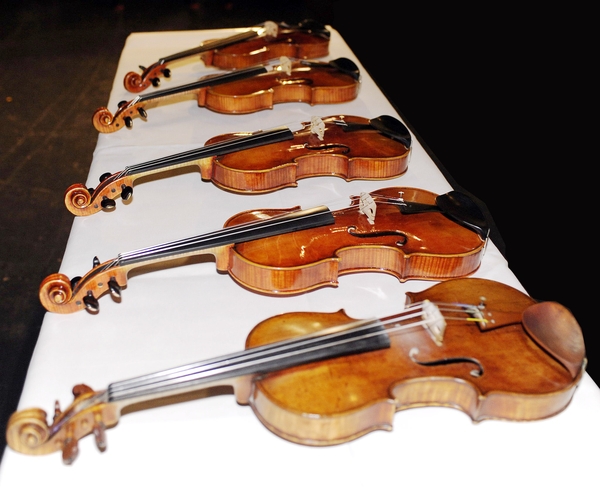
In 2011, a violin nicknamed “Lady Blunt’ was sold for a whopping 15.9 million in London to aid the Japanese earthquake and tsunami appeal. Though made in 1721, “Lady Blunt” was kept in excellent condition and has rarely been played at all, as it was a very sought out and treasured item by collectors and admirers. But still, I ask, why, and how can an instrument be so incredibly expensive?
This complex and loaded question can be answered with just one simple explanation:
It’s a Stradivarius!
After around 300 years of the “Lady Blunt” having never been played, Yehudi Menuhin became the first to play the instrument. Some say it is unfortunate that the violin is no longer in its peak condition, but surely Stradivari made his violins for the purpose of playing! (Video source)
The Creator
Whether you are an expert or have only dabbled in the world of classical music, the name Stradivari is certainly not unknown. Antonio Stradivari was a luthier — a craftsman of violins, cellos, and other string instruments alike. He was most famous for the craftsmanship of his violins, also known as Strads. They are said to have such a quality that it is almost like the violins have their own personalities. Strads produce the highest quality of sound on a violin and are often said to have a “silvery” tone, giving the violinist an incredible range without sacrificing the quality and colour of each note. Many great musicians have grown to love this distinct characteristic in Strads, but what was it about Stradivari’s craftsmanship and practices that made his instruments so special?
Stradivari has made an estimate of 1,100 instruments during his lifetime, including but not limited to violins, violas, and cellos. Unfortunately, only around 650 of his violins exist today, which are mostly owned by private collectors. (Image source)
Was it the Wood?
Since Stradivari didn’t write down his methods during his lifetime, experts can only observe and test their theories on his secret recipe. The most common one I have seen floating around is one about the wood of his violins. String instruments require specific types of wood with different densities for the vibrations to resonate well through the body. A combination of Spruce, Maple, and Ebony are typically used because of this. Stradivari used Spruce for the tops of his violins as well, but his wood was slightly different. The Little Ice Age, lasting from the 14th to mid 19th century, caused the alpine Spruce in Europe to grow slower than usual, making the trees even denser and consistent.
Attempts have been made to reproduce the sound of a Strad, like using fungi to control the growth of its surrounding trees. Some say that the quality of these violin copies match up to their original quite well! (Image source)
And So It Remains a Mystery…
Could this be the reason why Strads are superior amongst other violins? How much of Stradivari’s reputation is built truly on his craftsmanship? How do psychological and social influences play a part in a musician’s perspective on these instruments? Certainly, the truth behind such an extraordinary violin cannot be explained by just one definitive element. There is so much more to a Stradivarius than we will ever know, but if we are sure about anything, it is that these secrets have become one of its greatest charms of all, so maybe it is best for it to remain a mystery.
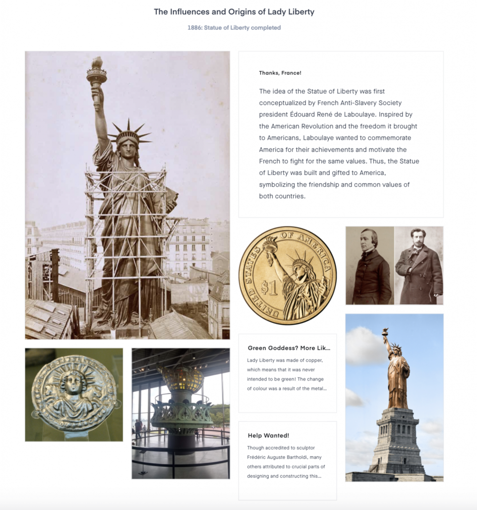
Upon researching for this project and looking through the many historical events, I was fascinated by the many events that combined the knowledge of a variety of disciplines like art and science, which typically are not subjects that you would think associate with each other. Having some interest in the sciences myself, I decided to base my mood board on this main theme. I wanted to choose some unconventional yet remarkable events that related to arts and sciences or applied sciences and eventually settled on the painting of The Last Supper, the construction of the Statue of Liberty, and the discovery of penicillin. The most surprising thing that I found out about was the microbial art of Alexander Fleming. I was intrigued by Fleming’s dedication to science and his casual interest in painting and how he decided to combine the two together.
The history and influences of the Statue of Liberty were very interesting to research!
I would give myself a 9 out of 10 on this project because though I liked my overarching theme for all three events of the mood board, the connection between them was not as clear as I had hoped. I spent roughly 3-4 hours, though I would have liked to a little more time diving deeper into each event before constructing the mood board.
Hieronymus Bosch was a Dutch painter in the Renaissance era who made quite an impression despite not having much of his works or personal life recorded. Little information about him is confirmed, including his exact age and birth year, but it is generally agreed upon that he came from a family of relatively established painters and spent the bulk of his life living comfortably in the town of ‘s-Hertogenbosch.
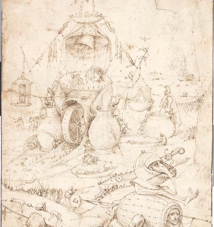
Infernal Landscape This drawing was part of a private collection that was only recently attributed to Bosch. His limitless imagination shines through, featuring a dystopian narrative filled with his famous beasts and fearful creatures, possibly with the purpose to warn the public about the consequences of sin.
Influences and Style
Often taking inspiration from the Bible, Bosch displays rather disturbing visuals of hell and the forces of evil in his paintings, something he became well known for. He put his own spin on these well-known stories and disregarded the general trend of the time.
The Adoration of the Magi The Adoration of the Magi is a triptych commissioned by Peeter Scheyfve and Agnes de Gramme for the El Escorial monastery. The central panel depicts three Magis presenting their various gifts to Christ and Virgin Mary. Upon closer examination, many symbols represent some of Bosch’s underlying messages, like the toads and the magi’s crown in the foreground.
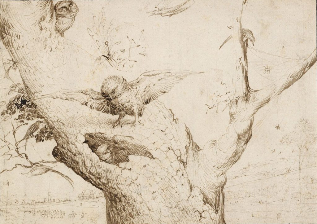
The exact number of paintings attributed to him is also heavily debated, as Bosch did not sign nor date his paintings. Though, in the works that are confirmed to be his, the repeated appearance of owls serves as his unique seal of identity, which can be argued to symbolize wisdom, ignorance, or sin.
The Owl’s Nest This drawing is perhaps a nod to Bosch’s interest in owls, which he scatters across his many attributed paintings. Now located in Museum Boijmans Van Beuningen, The Owl’s Nest sits with a few of his other drawings, the only location in the Netherlands with a collection of his works.
His works were already being collected by many during his lifetime and his style was often imitated, even by Peter Bruegel the Elder, who was particularly influenced by his landscapes.
The Table of the Seven Deadly Sins The Table of the Seven Deadly Sins depicts a central wheel with the seven deadly sins, with four smaller wheels surrounding it that represent Death, Judgement, Heaven, and Hell. It is still speculated whether or not this painting is an authentic work of Bosch; it has been thought to be the work of one of his close followers multiple times. In the centre of the large wheel lies Jesus rising from his tomb, with the placement of this image being significant, as it symbolizes the pupil of an eye, saying that God sees all.
The Garden of Earthly Delights
I appreciate the intricacy of his larger works, with my favourite being TheGarden of Earthly Delights. I stumbled on a very extensive video analysis of this painting and thoroughly enjoyed the journey of hunting for the easter eggs and explanations for almost every aspect of the painting.
The Garden of Earthly DelightsThis elaborate triptych narrates a Biblical story from left to right and, in my opinion, cautions the audience of the horrid place that is Hell. The left panel illustrates God introducing Eve to Adam in the garden of Eden, where many plants and trees bloom and strange creatures lurk in the waters as a foreshadow of what’s to come. The largest centre panel is seen to be the moments when humans fail to resist the temptation of sin, disregarding any laws of nature and freelyfrolicking about. Lastly, the right panel portrays the scene of the Last Judgement, where humans become the victims of many demons, monsters, and other morbid creatures. The man’s face featured in the right panel is rumoured to be a self-portrait of Bosch himself; perhaps another way to make a mark on his works.
Bosch intrigues me because of the mystery and ambiguity around his works and him as an artist. He leaves many things up to our imaginations and never fails to leave me admiring with curiosity and awe. It is no wonder why he was such a notable character of the Northern Renaissance.
The end of your life marks the beginning of the long and treacherous journey of the dead. Though if you show yourself worthy, an eternity in the afterlife welcomes you with open arms. Most importantly, prove yourself innocent against the test of purity, and you will be rewarded. You will now be transported to the underworld. Be careful, and best of luck.
Entering the duat in 5…4…3…2…1…
If I was a nobleman living in the time of Ancient Egypt, that is what I would like to imagine would happen after I die. The underworld sure sounds unpleasant, but fortunately, I came prepared.
The Origin Story
Egyptian hieroglyphics was undoubtedly one of the most prominent and notable inventions of its time. Writing revolutionized the way people communicated in their everyday lives in such a massive civilization, but who knew it would be so useful to the dead? According to Egyptian belief, a dead man needs to pass through the duat, or the underworld, to reach the peaceful and perfect afterlife. Thus, the Book of the Dead, also known as the Book of Coming Forth by Day, was created to help Egyptian kings and nobles overcome the obstacles to safety.
Figure 1: Coffin texts (shown above) and pyramid texts were precursors to the Book of the Dead. These targeted the common people of Egypt who could afford coffins as the Egyptians started to believe that people other than the Pharaoh could also go to the afterlife. (source)
But What Are They Really?
Rather than being pages of paper bound together, these “books” were actually long scrolls of papyrus written and drawn by multiple scribes customizable to each buyer. The book is said to be filled with spells and chants written in hieroglyphs or hieratic script to help with all sorts of things, from ones to scare away snakes and crocodiles to ones that help open your mouth to eat. The writing is accompanied by drawings of the gods and the owner of the book traversing through the obstacles.
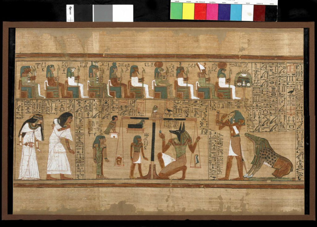
Figure 2: Located in the British Museum, the Papyrus of Ani is the most famous and well preserved Book of the Dead we have today. This frame depicts Ani and his wife in white on the left, the scale with his heart and a feather, and the Egyptian gods above watching over the scene. (source)
The Final Test
Though all obstacles of the underworld are dangerous, the weighing of the man’s heart is said to be the part that determines the man’s fate. At the end of the underworld lies a scale, with a feather on one end and the man’s heart on the other. It is said that if the heart weighs more than the feather, the heart is bearing too much weight from the man’s sins on earth. Thus, it will be eaten by Ammit, a creature with the head of a crocodile, the body of a lion, and the rear of a hippopotamus (shown in Figure 2, bottom right). But if the man proves to have lived a good life, he would have passed the final stage and will be transported to the long-awaited paradise of the afterlife.
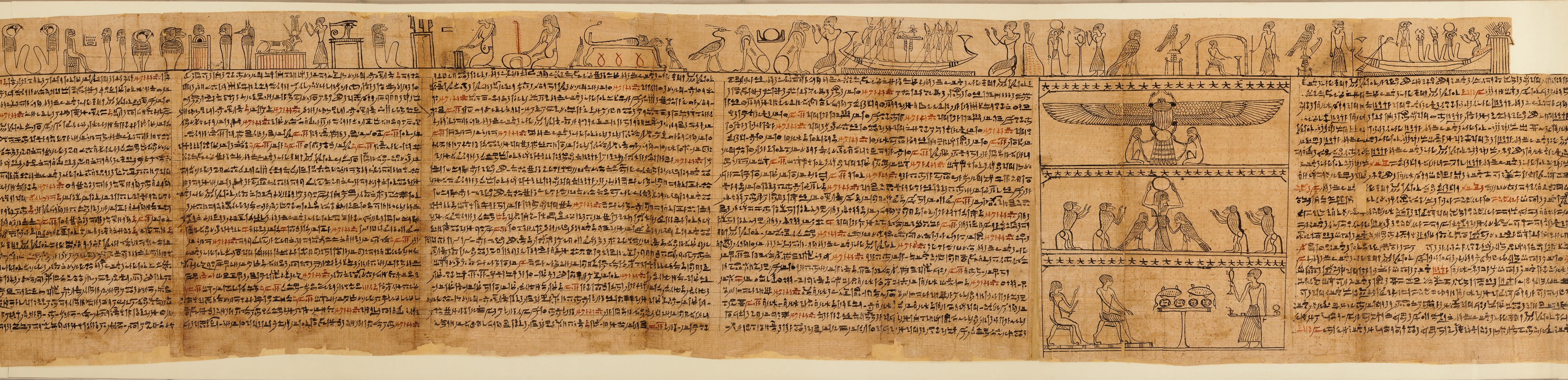
Figure 3: This is the full papyrus for Imhotep, the priest of the god Horus, which is now located in the MET. This papyrus is significantly longer than Ani’s, stretching to over 70 feet long! See source for larger image. (source)
Have you lived a good life? What would your papyrus look like? Do you have what it takes to survive?
Congratulations, you have succeeded in the final level of the duat. You have lived a pure and perfect life and are now eligible to collect your rewards.
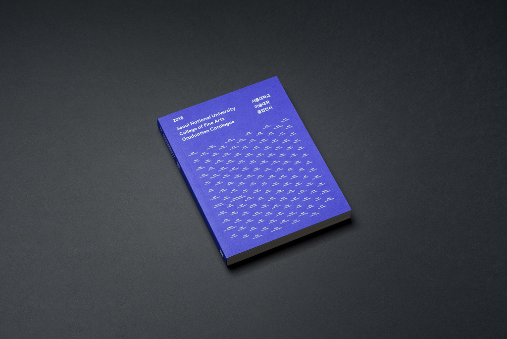
Seoul National University College of Fine Arts Graduation Catelogue
Chuigraf, 2018
Created by design company Chuigraf, this graduation catalogue clearly exhibits the use of repetition on its cover. When zoomed in more closely, you can see that this pattern is actually multiple small lines of staggering text. The words forming this pattern are actually the names of the 2018 graduates written in both Korean and English. Though usually executed with shapes, [artist] took another approach in this design, giving the pattern slight variations despite its repetitive nature, creating more visual interest as opposed to if the names were aligned in a more traditional format.
“Ordinary Work” Exhibition Poster
Kim Bo Huy, 2018
This poster, designed by Kim Bo Huy, features a blue man with a circle head in front of a bright red background with text. The contrast in colour stands out the most, but there is also a large contrast between the small text on the top and bottom of the poster compared to the bold blue text spelling out “Ordinary Work.” Together, all the elements of the poster guide the eye and gives a sense of hierarchy.
Deer Eagle Logo
Jenggot Merah, 2021
This logo plays with the idea of positive and negative space, where the designer manipulates the figure/ground of the logo. At first glance, the most prominent symbol is the deer in blue, but upon taking a closer look, the red detail below its antlers acts as the eye of an eagle that fills the white space. These two animals quite literally represent the name of the apparel brand, which creates an effective and memorable logo.
Thor Movie Poster
Olly Moss
This remade poster for the movie Thor employs the Gestalt principle of proximity. Various scenes from the movie are depicted within the multiple irregular shapes, which collectively make Thor’s famous hammer, Mjolnir. The colours and proximity of the shapes help us decipher the relation of these elements, allowing us to see the bigger picture.
This series of designs were made for the album covers of kpop group BTS. The albums include Love Yourself ‘Her’, Love Yourself ‘Tear’, and Love Yourself ‘Answer’, combining together to tell a story of hope and self-love. These covers rely solely on line and colour to communicate their central message, but the overall effect is extremely impactful in my opinion. The lines depict the life of a flower, from its full bloom in Love Yourself ‘Her’ to its petals falling in Love Yourself ‘Tear’ and ‘Answer’. The simplicity and abstractness of these designs give a sense of grace and softness, highlighting the storyline of the series, which is one of the biggest reasons why the music of BTS remains so iconic and relatable.
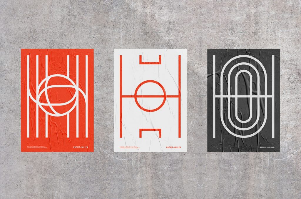
Hafnia-Hallen Logo
Re-public, 2018
The logo of Hafnia-Hallen (left), the reconstructed public sports facility in Copenhagen, features lines that join to make a ball at the centre. The clean design combined with the bright colours conveys a friendly and welcoming image, inviting the public to visit and use its facilities. The logo’s lines represent the floor markings on different sports courts, which is also illustrated by other designs made for the sports facility (centre and right), while collectively forming the capital letter H for Hafnia.
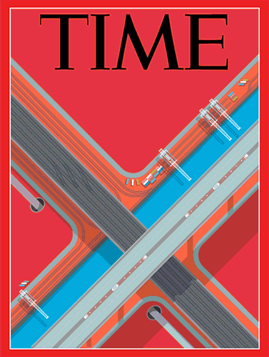
Time Magazine Cover
Peter Greenwood, 2017
This Time magazine cover displays an intersection of highways and roadways along with modes of transportation presented in a birds-eye view. The cars, trains, construction cranes, and roads themselves form large and small lines that are parallel and perpendicular to each other, giving the entirety of the piece a sense of structure and rigidity. In addition to the lines, the fact that the roads are tilted at an angle adds direction and motion to the cover.
Space
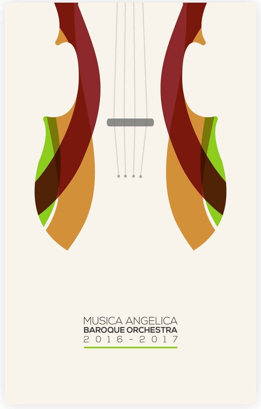
Musica Angelica Poster
2017
This poster design for a baroque orchestra is a prime example of using space productively. The violin and the background of the poster are the same colour, with only the brown and green curves distinguishing the edges of the instrument, leaving the rest of the blanks to be filled in with our own imagination. The small details of the instrument and text at the bottom together tie the overall minimalistic composition together nicely.
The Works of Geoffrey Chaucer Now Newly Imprinted
William Morris, 1896
This page is one of many in the book “The Works of Geoffrey Chaucer Now Newly Imprinted.” Each spread is filled to the brim with detailed designs and illustrations to go along with the text. The rectangles bordering the art and typography give structure, while the vines loosely swirl around the title and along the edges of the text. Though it was created over a century ago with traditional printing techniques, this book surely is a masterpiece!
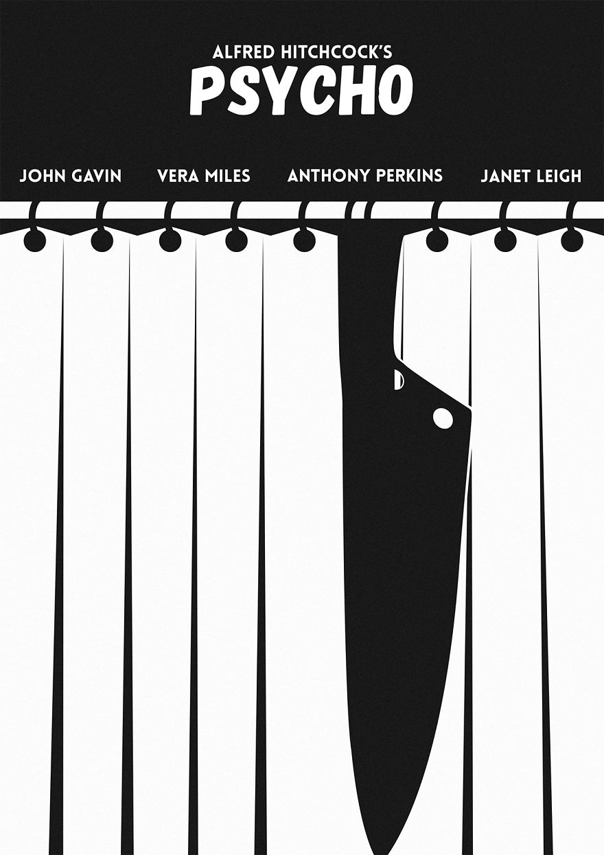
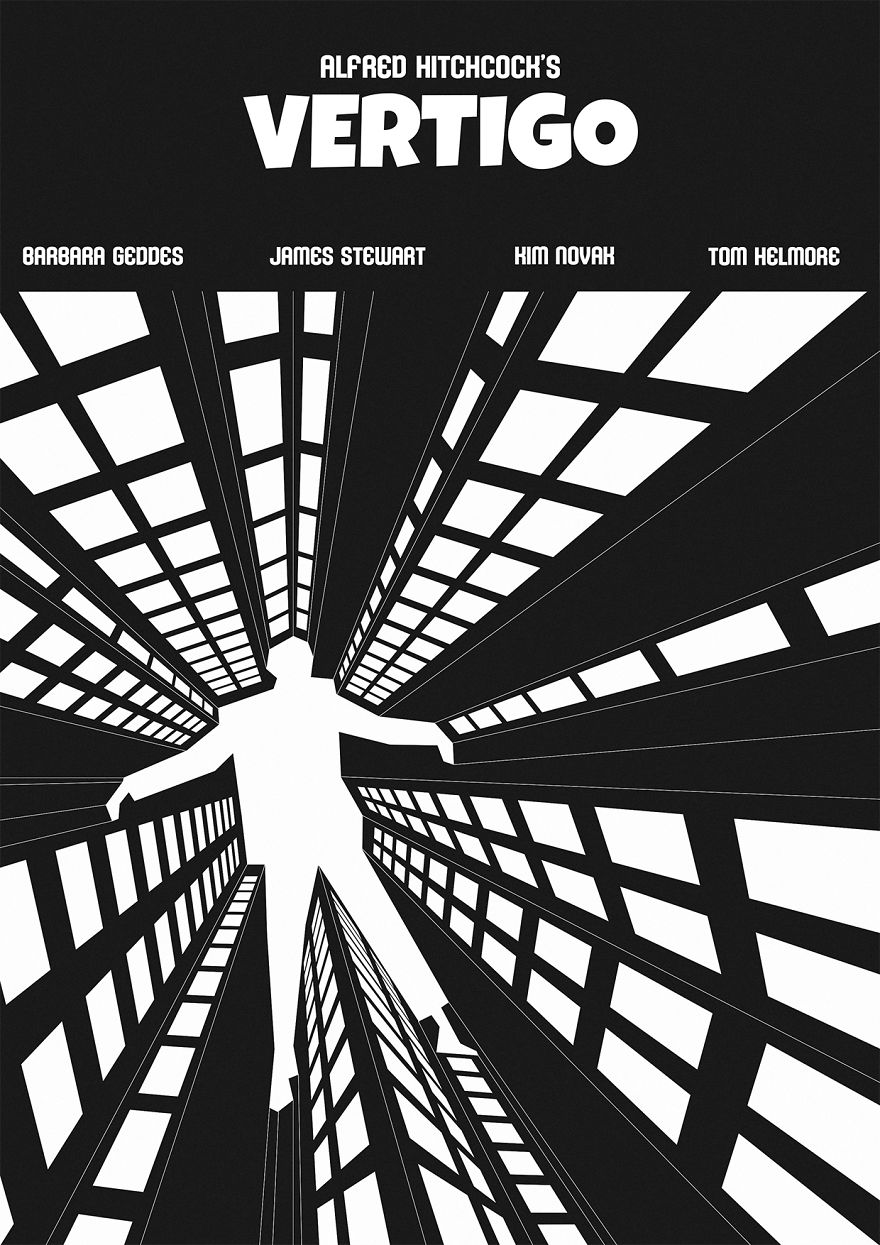
Psycho Movie Poster
Eduard Cirstea, 2017
The use of negative space is prominently shown in this poster design for Alfred Hitchcock’s movie Psycho. The curtains are illustrated with the white panels while the knife and hooks are in black, making the knife seem to blend in with the panels, which is very reminiscent of the famous shower murder scene that happens in the movie. There are an additional two posters also for Hitchcock’s movies done by the same artist shown below.
Shape
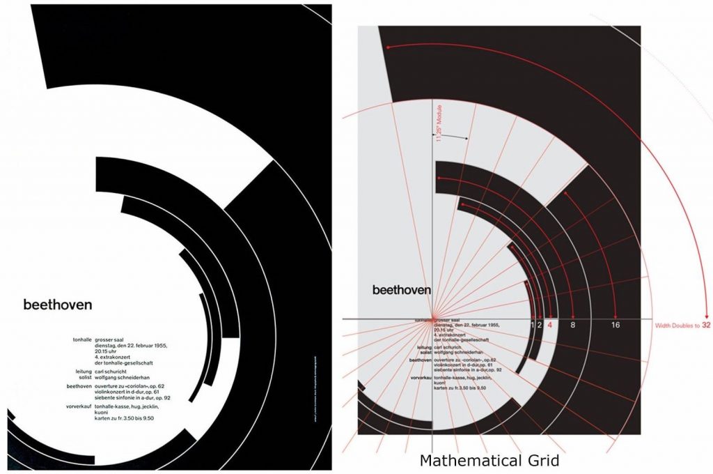
Beethoven Poster
Josef Müller-Brockmann, 1955
This Beethoven Poster is designed by Josef Müller-Brockmann, a Swiss graphic designer know for using calculated geometric shapes that result in his simple yet eye-catching designs. All of the curved rectangular shapes seem so effortlessly scattered yet lay perfectly to frame the text. The rigidity and contrast of the colours are balanced out by the roundness or the curves and gives a sense of rhythm and harmony, much like Beethoven’s music. The photo on the right shows a more detailed analysis of the placement of each element of this poster, done by Kimberly Elam on Behance.
Beat the Whites with the Red Wedge
El Lissitzky, 1919
The element of shape can also be seen used effectively to deliver messages of propaganda, like the poster above. Titled “Beat the Whites with the Red Wedge,” El Lissitzky uses both colour and shape to symbolize the Bolsheviks and Mensheviks during the Russian Revolution. The red triangle, representing the “Reds” or communists, shatters the borders of the white circle, representing the “Whites” or monarchists, delivering a clear message of the Bolsheviks’ power and intentions. Shapes played an important role in this poster to communicate its core idea in the simplest form, allowing the audience to quickly grasp what the design is trying to say.
Hub-Tones Album Cover
Reid Miles, 1962
Freddie Hubbard’s Hub Tones is known to be a staple in a jazz collector’s set, not only because of Hubbard’s undeniable talent on the trumpet but also for the iconic cover, designed by Blue Note Records art director Reid Miles. Though simplistic, the photography, text, and composition of the nine black bars were enough to captivate the audience’s attention. Our eyes are immediately drawn to the offset rectangle above the smart placement of text, creatively juxtaposing the repetitiveness and predictability of the rest of the cover. As analyzed in this blog post, the offset rectangle can also be seen as a symbol of the tonal weight of Hubbard’s tunes, “expressively signalling the authority of the tones emanating.” With all these careful decisions taken into consideration, it is no wonder why Reid Miles’ works are some of the most iconic in both design and jazz history.
For my yearbook spread, I used printed photos, highlighters, and ink on white and grid paper. I spent little time planning the layout as I wanted the process of making my spread to be natural and organic, though the initial inspiration were collages and bullet journal spreads that I often browse online. I decided to use the photo of myself on the left page to be the main photo as you will always find me holding up a peace sign and smiling with my eyes half-closed if I was ever asked to have my photo taken. On the left page, the grid of photos show some of my favourite people, things, and memories, most of which were from this past summer. Another purpose of the photos is to showcase my interest in photography, as most of the photos were taken by me. Ultimately, I would give myself an 8/10 on this assignment. Although the two different types of paper were intentional, I wish the pages were a little more cohesive, as the only things tying the two pages together are the highlighter doodles and printed photos.