Category: 141
Historical Type Identification Poster Rationale
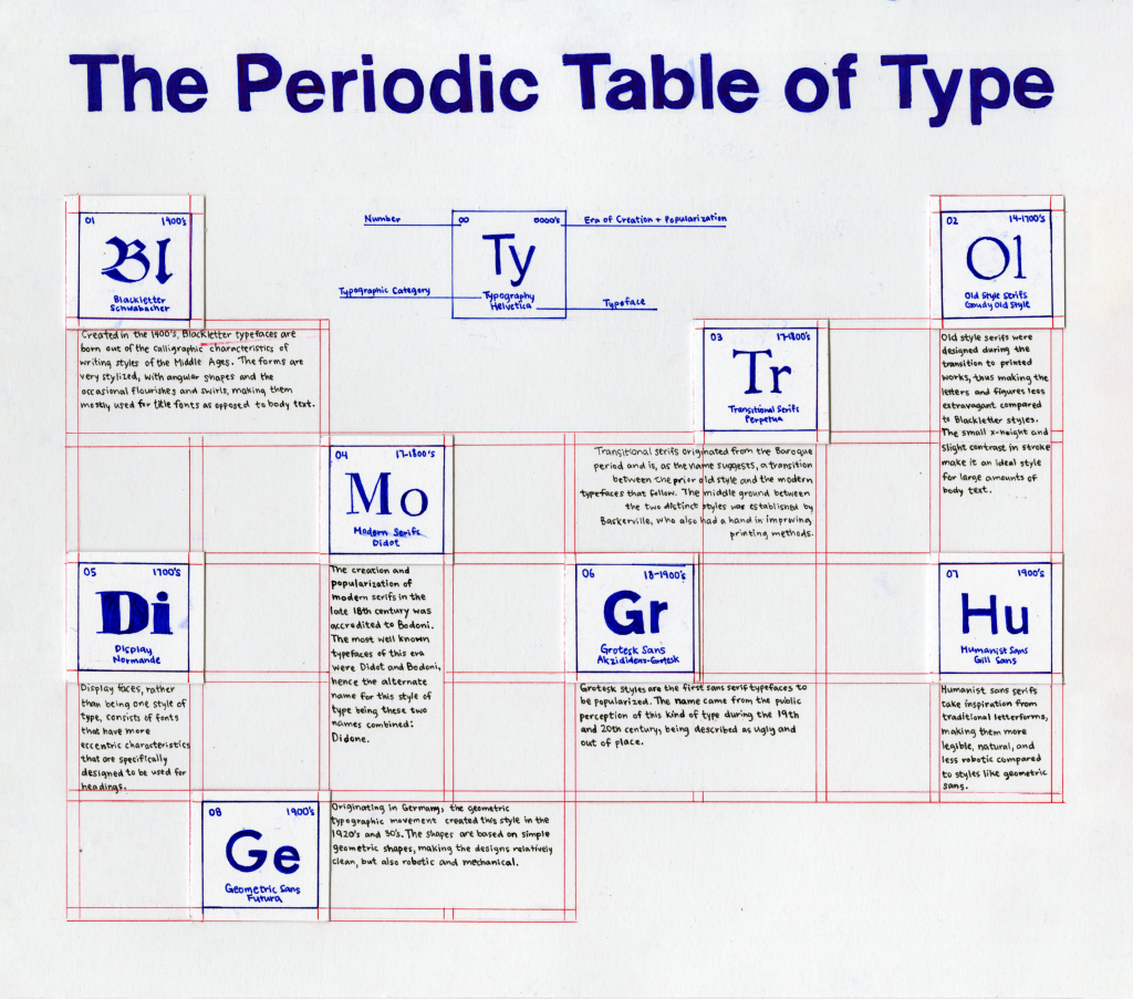
Poster Concept
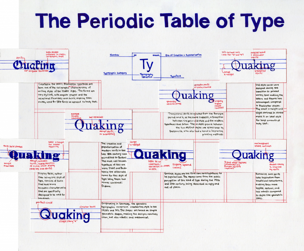
For our final project of this course, we were instructed to create a poster that illustrates and defines the different categories of type through the centuries in a creative and informative way. I was struggling for a while with coming up with interesting ideas, though I wanted to experiment with the idea of gridding because it seems to be very useful in different fields of design. Eventually, I came up with the concept of a “Periodic Table of Type.” I thought that this was very suitable for showing the most basic and recognizable categories of type, as the periodic table of elements represents similar information but in the context of science and chemical elements. I looked at many standard periodic tables for inspiration on how to lay out shorter pieces of information (like the year it was created and the order the type categories were created and popularized) and plan out the number of squares of the table. To incorporate the gridding aspect, the borders of each square look like design grids and is done in a different colour to imitate how it would look on computer software, as I think that it fits well with the theme and also makes the poster more visually appealing without being distracting. In the middle under the title, there is a square that acts as the key for what the numbers and words represent on each element square to help the viewer navigate the information. As for incorporating an example typeface for each of the type categories, I came up with the solution of a flap under the square so that it flips out to a longer rectangle, making for an interactive experience and more space to show and analyze each of the typefaces.
Execution
I wanted to keep the overall poster simple with a fair amount of white space, so I thought that coloured pens would be the best and fastest method for executing this design, especially for the finer lines. The title and informational squares are done slightly thicker and in dark blue to pull the hierarchy forward over the lighter lines of red that are mainly there to provide structure and context for the concept of the poster. I decided to insert red in the analyses of the typefaces so that it stands out from the blue and acts better as an accent colour. As the text is much smaller than I anticipated it to be, it was important that it would still be legible in a small point size, so I decided to slightly break the colour palette and use black Micron fine liners to minimize the risk of smudging. Though I was more careful with moving my hands over ink that has yet to dry, some words and designs in the coloured ink inevitably smudged.
Evaluation
I would give myself a 9 out of 10 for this assignment. I was proud of myself for coming up with an original and innovative idea and was excited about the planning process, but it was very time-consuming and slightly pressuring to execute in the amount of time I allotted for myself. I also wish I had a bigger piece of paper so the body text could be bigger, more legible, and less labour intensive to write. From research to final execution, I spent roughly 20-25 hours.
Exhibit Artifact Rationale: Chinese Seals
In this assignment, I decided to research and recreate an artifact that connects me to my roots and ethnic background: ancient Chinese seals. My dad makes seal engravings for friends and family as a hobby and I have always been intrigued by the art form, so I thought this was a perfect opportunity for me to explore its history and culture as well as learn some stone-carving skills.
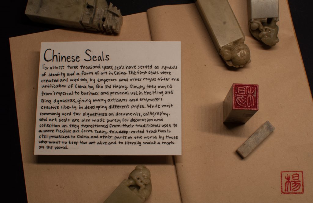
I decided to make a carving of my last name, 楊 (Yeung), in traditional seal script, as name engravings were the most common kinds of seals. With my dad’s guidance, I spent roughly five to six hours from designing to carving and finalizing. The process was quite tedious and I had to be very cautious to stay within the white space when engraving to prevent cutting off any strokes of the Chinese character, but patience is a major aspect of this art form and I slowly grew to enjoy it more and more.
Photography approach
For photographing my artifact and description, I had many ideas and inspiration photos from my research. Initially, I thought of writing my description on the brown piece of paper that ended up being the background of the photo, but the paper was very thin and ink would easily leak through. In the end, I opted for a simple piece of thick white paper, which I propped onto a small piece of stone to create a sense of depth and hierarchy in the photo. I was fortunate to have many extra seals and tools that I could use as props, but since the other seals were slightly larger than the one I chose to engrave, I had a hard time making my artifact the centre of attention when I arranged them side by side. Thus, I went with a composition that makes the focal point stand out through the use of the red ink and also by making both the seal and description closer to the camera. I also wanted to display what the seal would look like as a stamp, so I stamped it on the paper and cropped the photo so that it would appear at the bottom right corner, which is where they would have been placed as signatures when they were first created and used. From experimenting with different angles and layouts to capturing the final image, the process took around two to three hours.
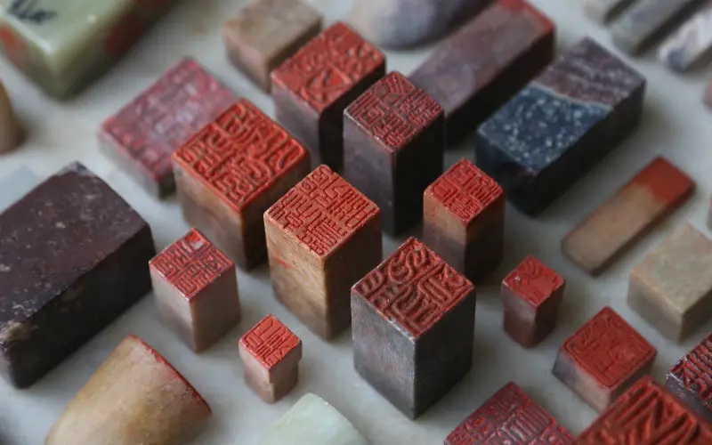
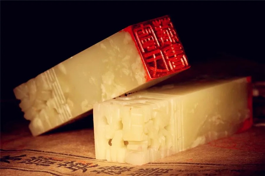
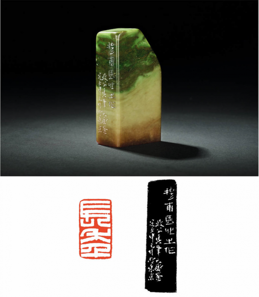
Reference Images
Self-Evaluation
Overall, I enjoyed the majority of this assignment, from the creation of the artifact to taking the final image. I am also quite proud of the final photo as I like that I was able to show the seal and the design when it is stamped on paper in an effective and creative way. Though I would give myself a 9.5/10, as I had a little trouble creating the museum description in terms of its size in relation to the artifact and ink smudging, and it could have been better executed and more legible. Combining the estimated amount of time I spent on the different parts of the project, I used a total of 8-10 hours from the initial research stage to the final execution.
Sources
https://www.inkston.com/stories/guides/chinese-seals/
chinahighlights.com/travelguide/culture/chinese-seals.htm
http://www.chinaonlinemuseum.com/carving-seals.php
https://en.wikipedia.org/wiki/Seal_(East_Asia)
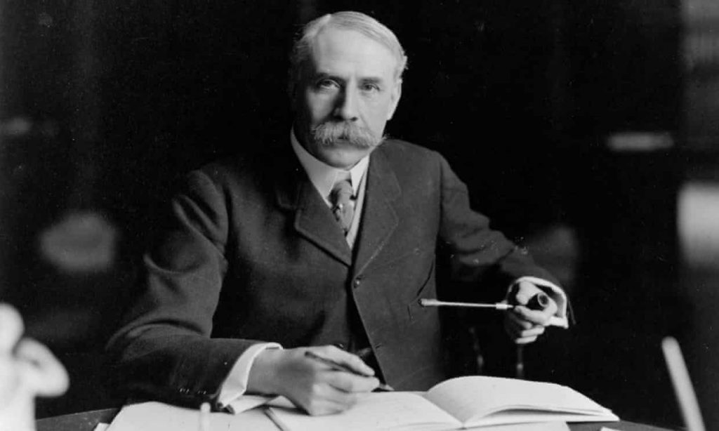
Elgar’s Unsolved Mystery: The Enigma Variations
Last summer, I completed my grade 12 year and finally graduated from high school. Though it was a virtual ceremony because of the pandemic, Pomp and Circumstance was, of course, on repeat as the graduates crossed the stage one by one. I was surprised to find out that Pomp and Circumstance was written by the English composer Edward Elgar, but even more caught off guard by one of his other well-known works and the mysteries it holds: the Enigma Variations.
The Beginning of a Classic Conspiracy
Originally called Variations on an Original Theme, Edward Elgar finished this orchestral piece in 1899. Complete with 14 variations, he dedicated each to one of his close friends and titled them after codenames he made up for them. It became known as the Enigma Variations after Elgar decided to add the word at the top of his score after its completion. This addition, he briefly explained, represents a hidden melody in addition to the main theme that sparked much conversation after it was first performed in London that year. There were a few conditions that Elgar says the Enigma theme fulfills, including rules stating that the Enigma is a counterpoint to the main theme and that it comprises of the first 19 measures. Furthermore, in the premiere, Elgar writes:
The Enigma I will not explain — its “dark saying” must be left unguessed. I warn you that the apparent connection between the variations and the theme is often of the slightest texture; further, through and over the whole set another and larger theme “goes” but is not played.
Since then, many musicians have been stumped by this underlying melody, and no one has been able to come to a conclusive, yet convincing answer.
Nimrod’s Story
Aside from this mysterious puzzle, the main theme also had many easter eggs representing memories, habits, or specific events Elgar has had with his friends in each variation. The most famous example of this is in the ninth variation titled “Nimrod.” This codename is for Augustus Jaeger, music editor of Novello & Co and one of Elgar’s dearest friends. His variation captures a conversation the two had when Elgar consulted Jaeger as he was losing motivation to continue with music entirely. Jaeger successfully convinces Elgar to keep going as he compares his struggles to Beethoven’s, and then goes on to softly hum the second movement of his Piano Sonata No. 8 Pathétique. In the opening bars of this variation, Elgar nods to this event with a suggestion of a small excerpt of that sonata.
The Never-Ending Search
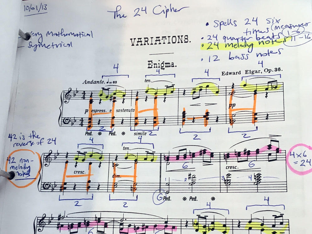
Many musicians thought the Engima to be a famous anthem, like God Save the Queen, Auld Lang Syne, or even Twinkle Twinkle Little Star. Though some of the explanations to these solutions sound absurd and a little bit of a stretch, Elgar was a man obsessed with codes and anagrams, so it makes sense to approach his music in a similar mindset. Despite the countless attempts, Elgar took the answer of the Enigma to the grave, denying wrong solutions, but never revealing the correct one.
As a music nerd who loves puzzles and regrets quitting piano lessons after passing level eight, I was genuinely excited and intrigued when looking into this conspiracy. Though as much as I loved the deep analyses going into the construction of hidden codes and complex melodies, the music as a standalone piece is completely mesmerising and not in the slightest underwhelming if one did not know about the stories behind it. Dissecting the Enigma in search of Elgar’s true intentions is certainly a way to approach this piece, but perhaps just listening to the music is enough of an experience of its own.
Sources
https://en.wikipedia.org/wiki/Enigma_Variations
https://www.classicfm.com/composers/elgar/guides/story-behind-elgars-enigma-variations/
https://www.youtube.com/watch?v=M08vJ0i6hyc
https://www.youtube.com/watch?v=ZatQm8ASsmI&t=78s
https://www.youtube.com/watch?v=panxnMhHtuo
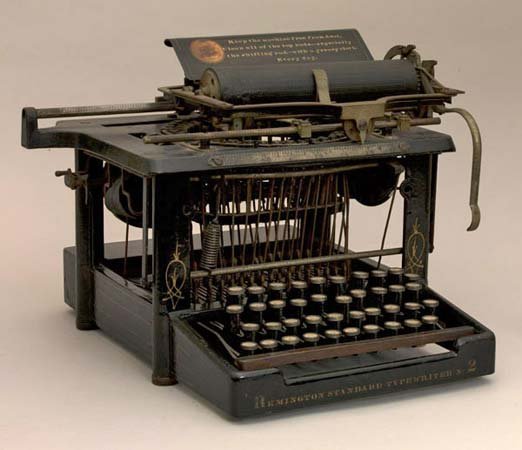
Good Design or Out of Convenience? The Rise of the QWERTY Keyboard
Would you be able to live without a keyboard for a day?
This is not a question I would normally ask myself, but I only came to realize its significance in my life after researching for this assignment. Whether it is attached to our laptops or on the screens of our phones, keyboards are a crucial part of our everyday communication in the online world, but have you ever wondered why they are arranged in the way they are now?
The Typewriter
Though the concept of typewriters has existed a while before, its more relevant history began in the summer of 1868, when Christopher Latham Sholes, Carlos Glidden, and Samuel Soule put a patent on the first typewriter. Though it did not receive much attention in the beginning, typewriters slowly made their way into the world of business communication, becoming the most prominent invention in the industry until the computer. Unlike our keyboards today, the letters were in a completely different order and it can only type in capital letters. When typing, the keys strike upward, meaning that the person typing could never see what was being typed.
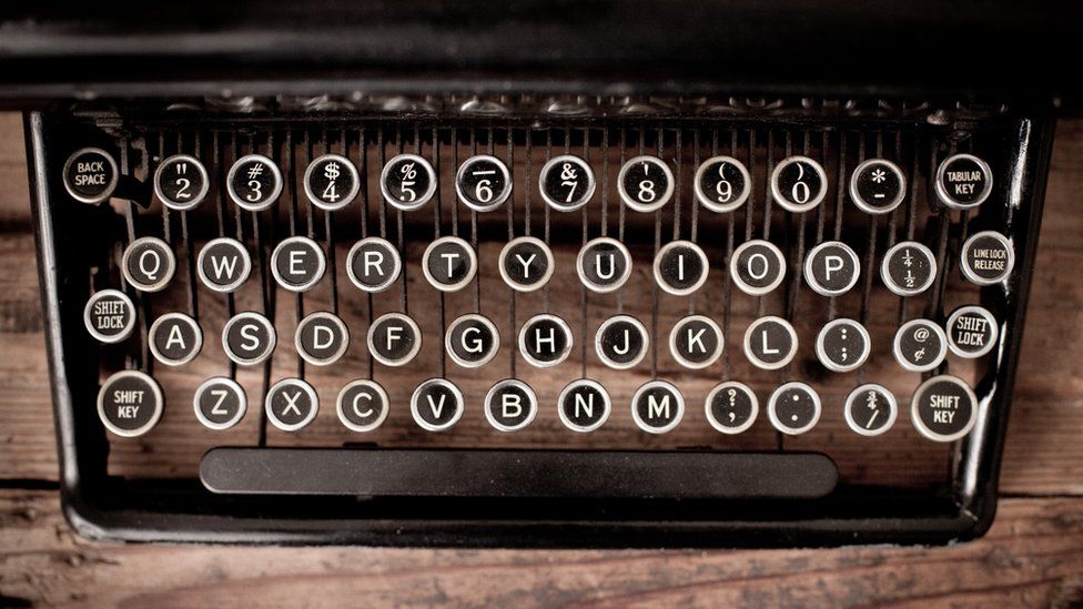
QWERTY!
There were many improvements of the keyboard composition by Sholes and other inventors that came shortly after. The common theme between all of them was the goal to place the most common letters as far away from each other as possible. This was crucial especially in the age of typewriters, as it was done to prevent the machine from jamming when typing quickly. The QWERTY keyboard, also accredited to Sholes, rose above the rest and became the standard until this day. Of course, there are valid reasons for the public to adopt the QWERTY keyboard so quickly, but there were also many people that believed it could still be improved.
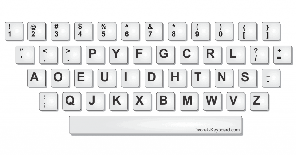
The Dvorak Simplified Keyboard
One of these people was August Dvorak, who, in the 1930s, came up with a layout comparable to the QWERTY keyboard in its efficiency: the Dvorak Simplified Keyboard. This keyboard was productive as he put the most used letters in the middle row where our fingers naturally lay, making for less reaching and tangled fingers. Dvorak expected his rendition to be an immediate hit, but the reaction was quite the opposite. People were hesitant to try out his new invention, but according to a limited amount of studies, this alternative was actually proved to be slightly better than the QWERTY keyboard. So why are we still using the QWERTY keyboard?
Sholes’ Inventions Prevail
Though Dvorak’s unsuccessful promotion of his new invention was also to blame, the main reason for the failure of his keyboard was the unfortunate timing. Despite the potential people may have seen in Dvorak, the QWERTY keyboard was already so widespread and standardized by the 1900s that switching to a new format would have required a significant amount of time dedicated to relearning and adjusting. The industry ultimately decided that the cost of switching was not worth it, especially because the Dvorak keyboard was only marginally better than the one they were currently using.
Do you think we should have given the new keyboard a shot? Would it have spread like Sholes’ invention if it was invented just a little earlier? Most importantly, was the QWERTY keyboard truly the result of good design, or was it popularized out of convenience?
Sources
https://search.credoreference.com/content/entry/fofbusiness/typewriter/0?institutionId=6884.
http://www.smithsonianeducation.org/scitech/carbons/typewriters.html
https://www.youtube.com/watch?v=iQb1GRQxXdA
https://www.youtube.com/watch?v=tIJNusYZXMA
https://www.youtube.com/watch?v=ZnUBl90tayI
Typography Zine: Cooper Black
I chose to research the font Cooper Black for my typography essay assignment. I wanted my colour choices to feature the font’s playful and approachable style along with its impact on the trends of the 60s and 70s. The use of limited colours and layout style gives the entire zine more consistency. My favourite part of the process was designing each spread to be visually appealing and following the rules of hierarchy. It was fun to experiment with different compositions and ways I could present my information. I also enjoyed learning about terminology for typography, like counter, base-line, and the difference between a single and double-storey g.
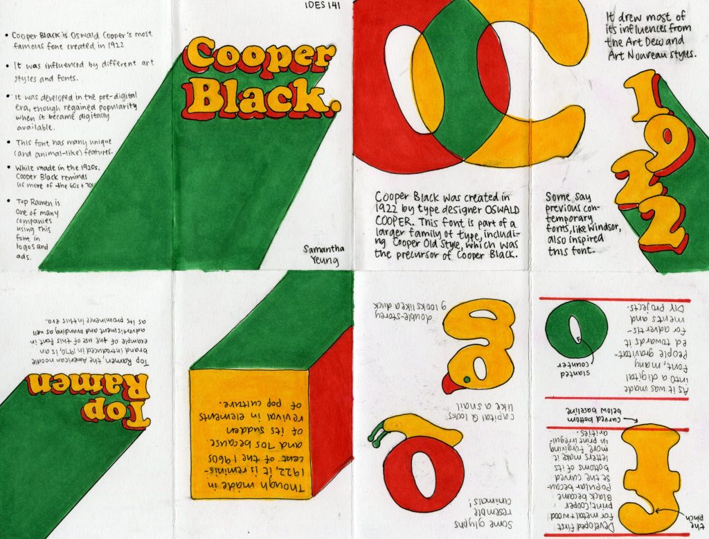
I would give myself a 9 out of 10, as I am satisfied with my layout, though there was a lot of ink smudging and squished writing in the execution process. I spent around 10-15 hours on this assignment, with the most time spent on research and layout.
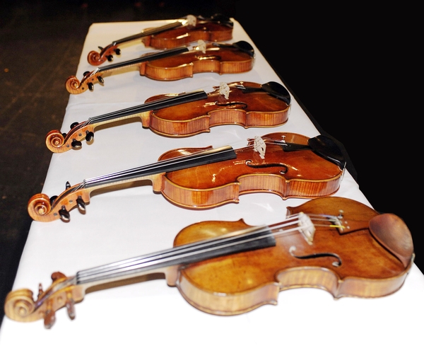
Stradivari’s Secrets Finally Exposed? The Truth Behind A Stradivarius
In 2011, a violin nicknamed “Lady Blunt’ was sold for a whopping 15.9 million in London to aid the Japanese earthquake and tsunami appeal. Though made in 1721, “Lady Blunt” was kept in excellent condition and has rarely been played at all, as it was a very sought out and treasured item by collectors and admirers. But still, I ask, why, and how can an instrument be so incredibly expensive?
This complex and loaded question can be answered with just one simple explanation:
It’s a Stradivarius!
The Creator
Whether you are an expert or have only dabbled in the world of classical music, the name Stradivari is certainly not unknown. Antonio Stradivari was a luthier — a craftsman of violins, cellos, and other string instruments alike. He was most famous for the craftsmanship of his violins, also known as Strads. They are said to have such a quality that it is almost like the violins have their own personalities. Strads produce the highest quality of sound on a violin and are often said to have a “silvery” tone, giving the violinist an incredible range without sacrificing the quality and colour of each note. Many great musicians have grown to love this distinct characteristic in Strads, but what was it about Stradivari’s craftsmanship and practices that made his instruments so special?

Was it the Wood?
Since Stradivari didn’t write down his methods during his lifetime, experts can only observe and test their theories on his secret recipe. The most common one I have seen floating around is one about the wood of his violins. String instruments require specific types of wood with different densities for the vibrations to resonate well through the body. A combination of Spruce, Maple, and Ebony are typically used because of this. Stradivari used Spruce for the tops of his violins as well, but his wood was slightly different. The Little Ice Age, lasting from the 14th to mid 19th century, caused the alpine Spruce in Europe to grow slower than usual, making the trees even denser and consistent.
And So It Remains a Mystery…
Could this be the reason why Strads are superior amongst other violins? How much of Stradivari’s reputation is built truly on his craftsmanship? How do psychological and social influences play a part in a musician’s perspective on these instruments? Certainly, the truth behind such an extraordinary violin cannot be explained by just one definitive element. There is so much more to a Stradivarius than we will ever know, but if we are sure about anything, it is that these secrets have become one of its greatest charms of all, so maybe it is best for it to remain a mystery.
Sources
https://www.francemusique.fr/en/top-ten-most-expensive-violins-world-15600
https://en.wikipedia.org/wiki/Stradivarius
https://en.wikipedia.org/wiki/Antonio_Stradivari
https://www.si.edu/spotlight/violins/stradivarius
https://www.youtube.com/watch?v=E21NATEP9QI
https://www.youtube.com/watch?v=zOtQQRf0Fzc
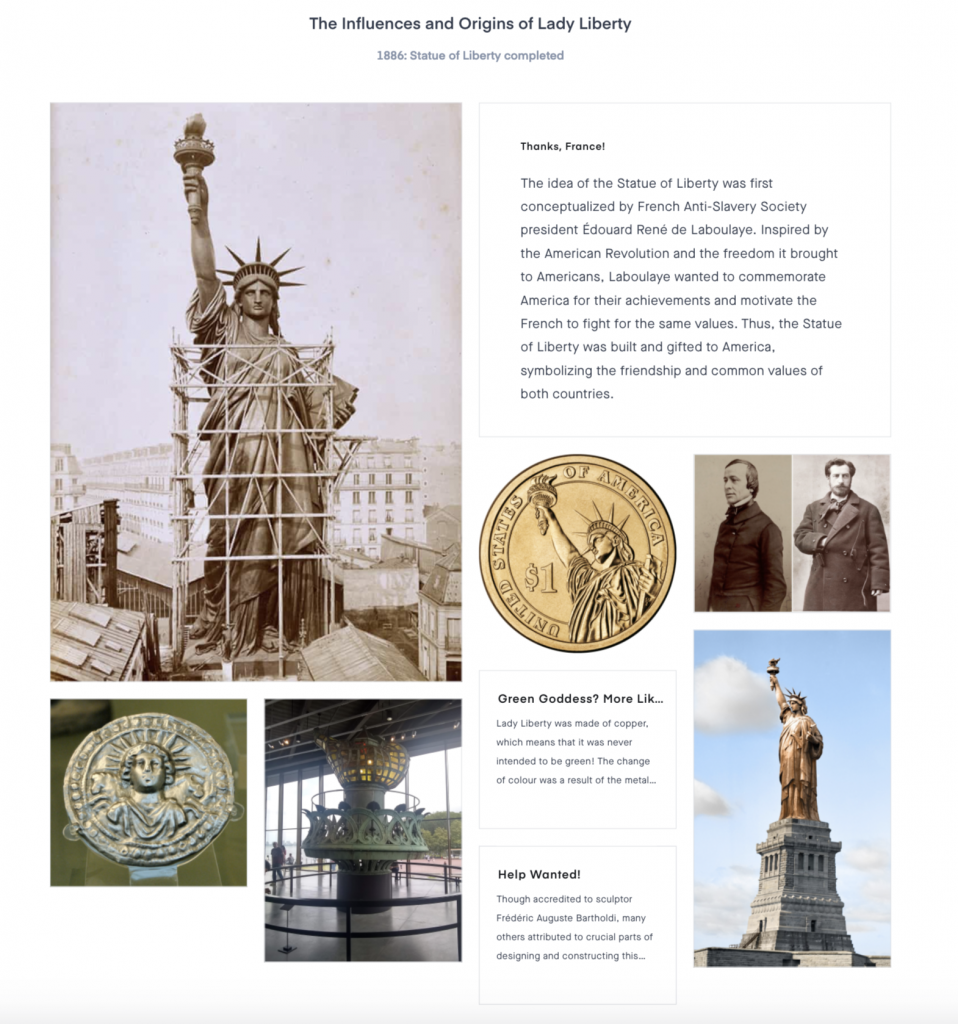
Mood Board: The Best of Both Worlds
Upon researching for this project and looking through the many historical events, I was fascinated by the many events that combined the knowledge of a variety of disciplines like art and science, which typically are not subjects that you would think associate with each other. Having some interest in the sciences myself, I decided to base my mood board on this main theme. I wanted to choose some unconventional yet remarkable events that related to arts and sciences or applied sciences and eventually settled on the painting of The Last Supper, the construction of the Statue of Liberty, and the discovery of penicillin. The most surprising thing that I found out about was the microbial art of Alexander Fleming. I was intrigued by Fleming’s dedication to science and his casual interest in painting and how he decided to combine the two together.
I would give myself a 9 out of 10 on this project because though I liked my overarching theme for all three events of the mood board, the connection between them was not as clear as I had hoped. I spent roughly 3-4 hours, though I would have liked to a little more time diving deeper into each event before constructing the mood board.
Final Level Unlocked! The Ultimate Guide to Surviving the Egyptian Underworld
Welcome, reader. You are now officially dead.
The end of your life marks the beginning of the long and treacherous journey of the dead. Though if you show yourself worthy, an eternity in the afterlife welcomes you with open arms. Most importantly, prove yourself innocent against the test of purity, and you will be rewarded. You will now be transported to the underworld. Be careful, and best of luck.
Entering the duat in 5…4…3…2…1…
If I was a nobleman living in the time of Ancient Egypt, that is what I would like to imagine would happen after I die. The underworld sure sounds unpleasant, but fortunately, I came prepared.
The Origin Story
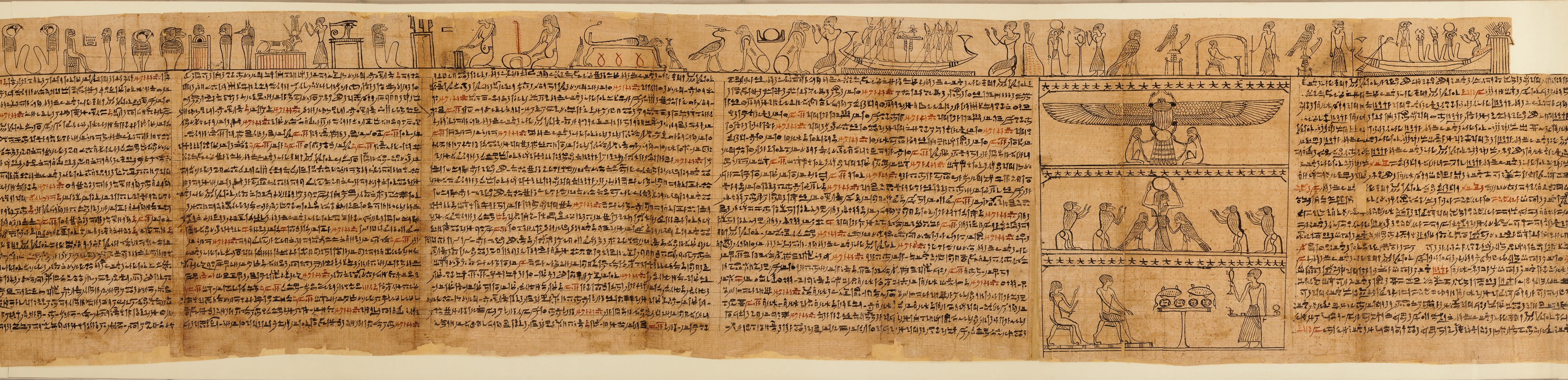
Egyptian hieroglyphics was undoubtedly one of the most prominent and notable inventions of its time. Writing revolutionized the way people communicated in their everyday lives in such a massive civilization, but who knew it would be so useful to the dead? According to Egyptian belief, a dead man needs to pass through the duat, or the underworld, to reach the peaceful and perfect afterlife. Thus, the Book of the Dead, also known as the Book of Coming Forth by Day, was created to help Egyptian kings and nobles overcome the obstacles to safety.

But What Are They Really?
Rather than being pages of paper bound together, these “books” were actually long scrolls of papyrus written and drawn by multiple scribes customizable to each buyer. The book is said to be filled with spells and chants written in hieroglyphs or hieratic script to help with all sorts of things, from ones to scare away snakes and crocodiles to ones that help open your mouth to eat. The writing is accompanied by drawings of the gods and the owner of the book traversing through the obstacles.
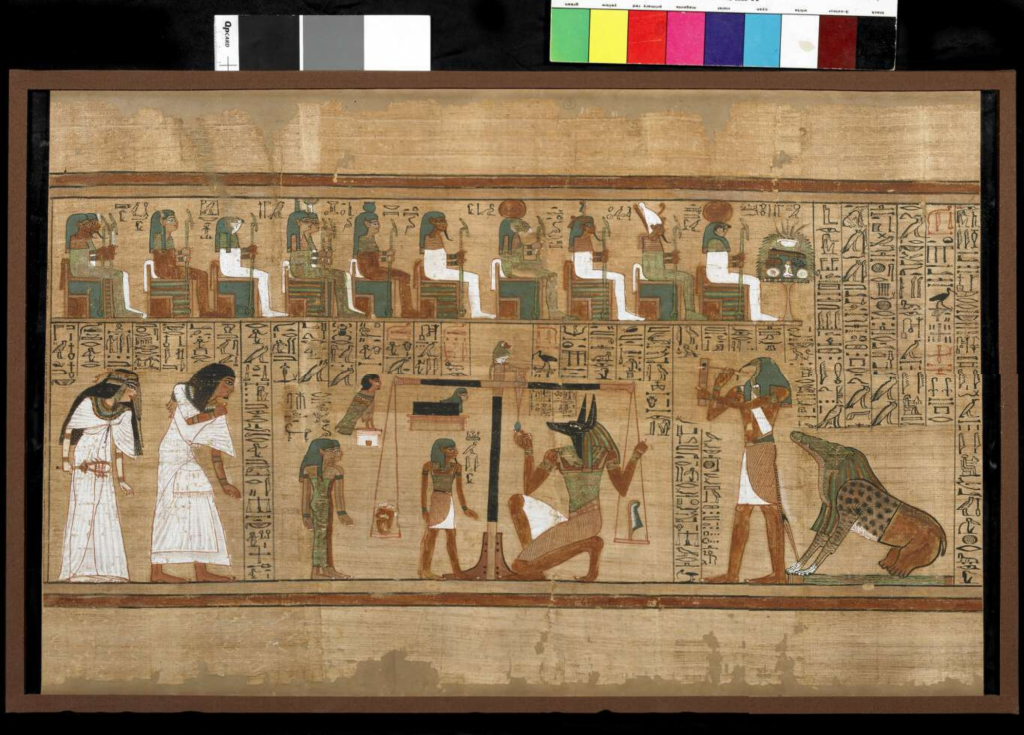
The Final Test
Though all obstacles of the underworld are dangerous, the weighing of the man’s heart is said to be the part that determines the man’s fate. At the end of the underworld lies a scale, with a feather on one end and the man’s heart on the other. It is said that if the heart weighs more than the feather, the heart is bearing too much weight from the man’s sins on earth. Thus, it will be eaten by Ammit, a creature with the head of a crocodile, the body of a lion, and the rear of a hippopotamus (shown in Figure 2, bottom right). But if the man proves to have lived a good life, he would have passed the final stage and will be transported to the long-awaited paradise of the afterlife.
Have you lived a good life? What would your papyrus look like? Do you have what it takes to survive?
Congratulations, you have succeeded in the final level of the duat. You have lived a pure and perfect life and are now eligible to collect your rewards.
Entering the afterlife in 5…4…3…2…1…
Sources
https://search.credoreference.com/content/entry/fofworld/book_of_the_dead/0?institutionId=6884. https://en.wikipedia.org/wiki/Ancient_Egyptian_afterlife_beliefs#Journey_to_the_afterlife. https://www.youtube.com/watch?v=1yv_MXNYbAo
https://www.youtube.com/watch?v=iWr0QmN0Ocg
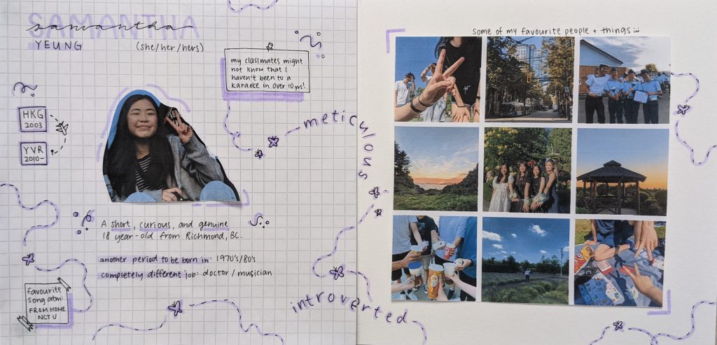
Project Yearbook Spread