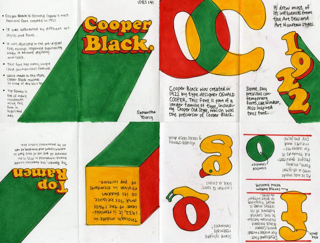
I chose to research the font Cooper Black for my typography essay assignment. I wanted my colour choices to feature the font’s playful and approachable style along with its impact on the trends of the 60s and 70s. The use of limited colours and layout style gives the entire zine more consistency. My favourite part of the process was designing each spread to be visually appealing and following the rules of hierarchy. It was fun to experiment with different compositions and ways I could present my information. I also enjoyed learning about terminology for typography, like counter, base-line, and the difference between a single and double-storey g.

I would give myself a 9 out of 10, as I am satisfied with my layout, though there was a lot of ink smudging and squished writing in the execution process. I spent around 10-15 hours on this assignment, with the most time spent on research and layout.
