Poster Concept
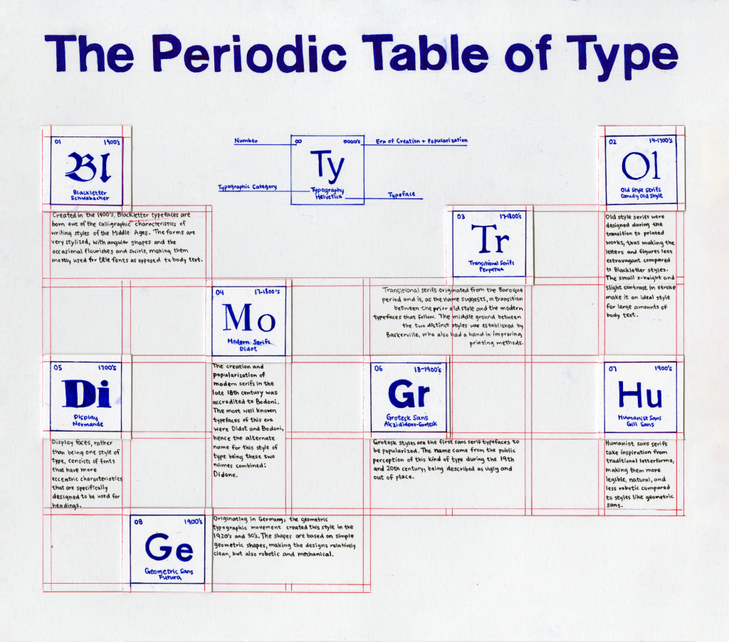
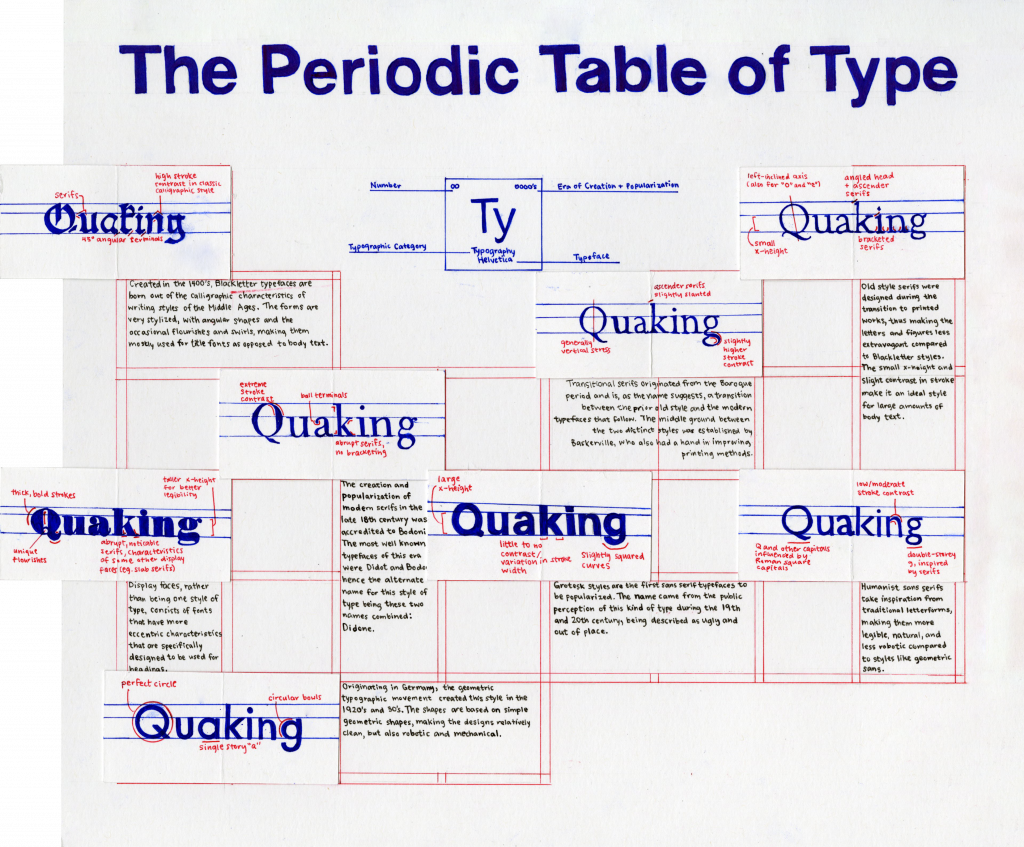
For our final project of this course, we were instructed to create a poster that illustrates and defines the different categories of type through the centuries in a creative and informative way. I was struggling for a while with coming up with interesting ideas, though I wanted to experiment with the idea of gridding because it seems to be very useful in different fields of design. Eventually, I came up with the concept of a “Periodic Table of Type.” I thought that this was very suitable for showing the most basic and recognizable categories of type, as the periodic table of elements represents similar information but in the context of science and chemical elements. I looked at many standard periodic tables for inspiration on how to lay out shorter pieces of information (like the year it was created and the order the type categories were created and popularized) and plan out the number of squares of the table. To incorporate the gridding aspect, the borders of each square look like design grids and is done in a different colour to imitate how it would look on computer software, as I think that it fits well with the theme and also makes the poster more visually appealing without being distracting. In the middle under the title, there is a square that acts as the key for what the numbers and words represent on each element square to help the viewer navigate the information. As for incorporating an example typeface for each of the type categories, I came up with the solution of a flap under the square so that it flips out to a longer rectangle, making for an interactive experience and more space to show and analyze each of the typefaces.
Execution
I wanted to keep the overall poster simple with a fair amount of white space, so I thought that coloured pens would be the best and fastest method for executing this design, especially for the finer lines. The title and informational squares are done slightly thicker and in dark blue to pull the hierarchy forward over the lighter lines of red that are mainly there to provide structure and context for the concept of the poster. I decided to insert red in the analyses of the typefaces so that it stands out from the blue and acts better as an accent colour. As the text is much smaller than I anticipated it to be, it was important that it would still be legible in a small point size, so I decided to slightly break the colour palette and use black Micron fine liners to minimize the risk of smudging. Though I was more careful with moving my hands over ink that has yet to dry, some words and designs in the coloured ink inevitably smudged.
Evaluation
I would give myself a 9 out of 10 for this assignment. I was proud of myself for coming up with an original and innovative idea and was excited about the planning process, but it was very time-consuming and slightly pressuring to execute in the amount of time I allotted for myself. I also wish I had a bigger piece of paper so the body text could be bigger, more legible, and less labour intensive to write. From research to final execution, I spent roughly 20-25 hours.