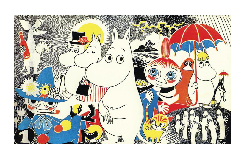
Tove Jansson was a figure who’s work I was aware of growing up, but faded out of my consciousness as an illustrator until this year. Early on I grew up with a lot of European children’s books, and collections such as The Moomins, Barbapapa and Tintin were in regular withdrawal rotation as soon as I had my first library card.
A good number of friends equate most of my drawing sensibilities to macabre and darker subject matter and themes, but the truth is that I’ve deeply admired the thought and craft that has to go into illustrating children’s books and truthfully I’m a little envious and wish I could draw the same way sometimes.

However, Tove Jansson is one of those artists that helps me see a way to bridge the gap in my own work and illustration process. I think that a lot of contemporary children’s illustration that I’ve seen is almost strictly colour and medium-driven texture (soft chalks, pastels, cut paper), which leaves more of the classic ink-based work out in the cold. It made me wonder if there was still a place for that kind of thing, or if it had fallen out of fashion, but I’d still like to try and give it a go at some point. There’s a reason Tove Jansson, Edward Gorey and Dr Seuss’ pen and ink driven work still holds up, even if I don’t see too much of that around these days in contemporary work. Perhaps it’s still there, and I just haven’t been looking hard enough!

This image of the Hobbit cover up above has an interesting story behind it that I quite like, and it’s something I can identify with as I’m working through the handful of assignments we’re currently juggling this term. In regards to this project, Jansson was quoted as saying, “I have tried to free myself from my “Moomin style” with its careful line-drawing and painstakingly filled surfaces. To achieve this I was to use ‘poor quality paper’ (i.e. paper I did not respect) and to draw each figure freely again and again, 20, 40, 60 times… then I glued the result together.”

She made another shift like this with some of her work for Alice in Wonderland. One illustration in particular that I’ll show below moves right out into the realm of body-horror in depicting Alice’s transformations throughout the story. There’s so much white space in this, it’s a lovely illustration but from what I read, the publisher may have vetoed this as “too weird”. Can’t help but roll my eyes a little bit at that, but I do appreciate the finished work, even if they didn’t.

Sourcing and Bibliography:

Leave a Reply