
The Idea, Strategy, Process (and most importantly, self-evaluation) of the No Token reconciliation and storytelling exhibition format.
Boy howdy, was this an adventure.
Starting out with this project, I was enormously wary when trying to pick an avenue to pursue. As part of my background, I’d been adjacent to indigenous activism and actively witnessed overt racism, marginalization and a distinct lack of validation of First Nations peoples and the ongoing and generational trauma they have endured. I was extremely concerned of falling into the ‘white saviour’ trap while going into this, particularly since many of the issues we were working with (MMIWG, ongoing colonial violence) required an extreme amount of tact to approach and would involve a lot of folks from a settler background having to put themselves in very unfamiliar, deliberately uncomfortable places.
I think there’s an incredible amount of good to be had in that, but the desire to actually do something helpful instead of inadvertently doing something that amounted to nothing (or worse, harm!) was sitting with me like a leaden weight.
So, approaching the idea of decolonization from this standpoint left me juggling some tricky baggage as I started thinking about what I wanted to actually try and contribute.
In the end, I decided that I wanted to tackle reconciliation itself as something of a meta-issue. How do you bring reconciliation forward as a concept and have a public who may not understand it buy in (and in good faith)?
At the root, misconceptions around what truth and reconciliation actually are can keep settlers from engaging and forming a relationship based in allyship, when the reality is reconciliation is not something to be feared and avoided.
Keeping this in mind, my mission statement became thus: reconciliation is reconnection. It is support. Understanding. Most of all, it is radical empathy at its very core. To build empathy, a concept needs to have a human touchpoint that could be related to. It needs faces, people and stories.
So naturally I casually proposed an entire traveling multimedia arts exhibition.
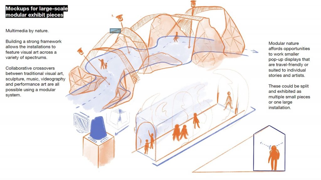
The intent was to have something modular that could work more like a format or frame; if you can provide a storytelling vector, the artists can use those parameters to tell their stories across as many art forms as possible.
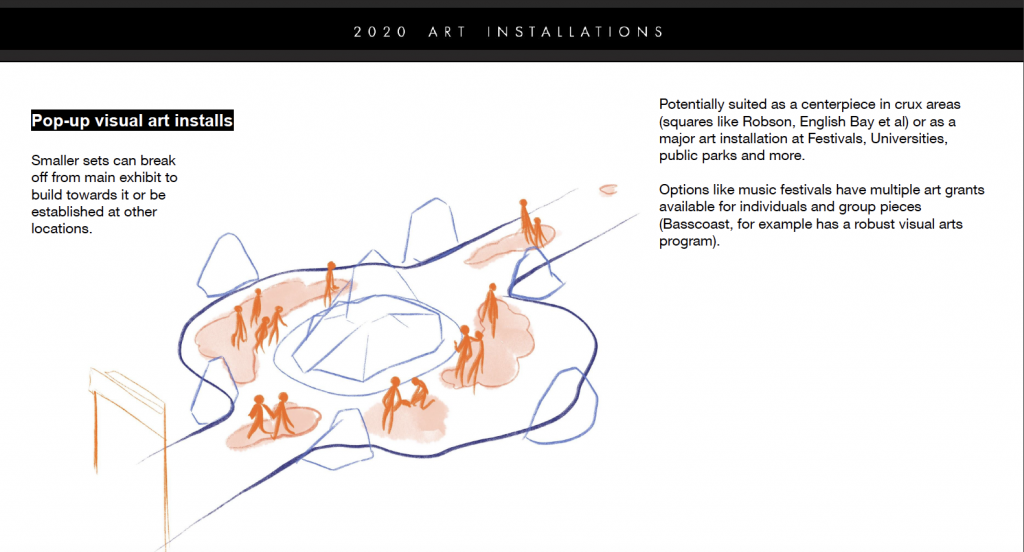
I wanted to have a platform that would provide an opportunity to actually experience indigenous stories and points of view in public locations, particularly ones that may already be giving land acknowledgements. It felt like the obvious next step, and actually provides some kind of tangible action, as a land acknowledgement seems to feel more and more like glib lip service if there is no follow-through.
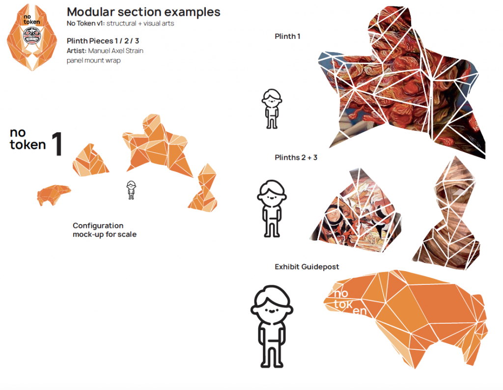
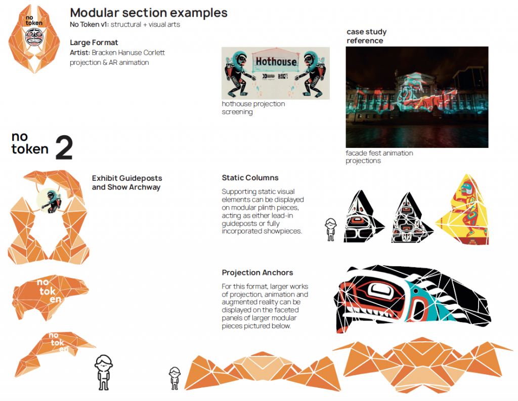
After talking to Bracken, he and I both spoke about the difficulties faced by up-and-coming artists. Making it in visual arts can be difficult enough as is, but coming at it as an indigenous artist, it can be doubly challenging in other areas. With this in mind, I wanted to explore bringing in an inaugural mock-up focused on visual arts for a first run.
The idea was to have something that could work as a very small pop-up showcase, or a large and bombastic installation featuring advanced visual techniques like projection animation and AR/VR. It could travel and pop-up with work from a single artist, or be brought together for a large storytelling event or group showcase.
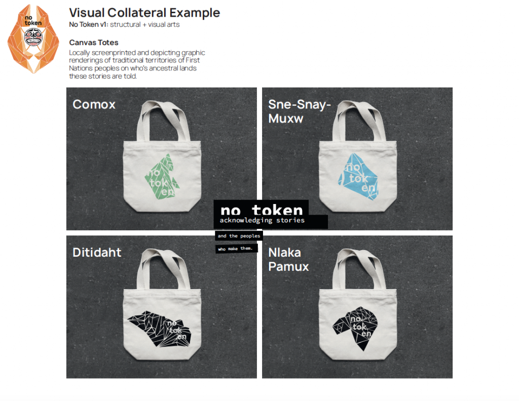
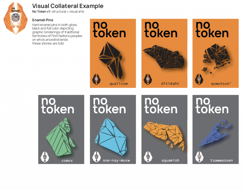
I also created some on-site collateral to support the show and provide additional audience touchpoints in the form of hard enamel pins and silkscreened totes. They depict the traditional territories of West Coast First Nations peoples that we’re acknowledging, but also acknowledging that we have to go beyond just merely mentioning their ancestral lands.
I think near the end, I was still worried I’d under-delivered on pitching the format, but the scope was so large that I was struggling to create enough mocked-up assets within the time allotted and had to step it back. I wanted to do something that wasn’t focused on layout and design, but on community through arts, connection, and a foundation of practical but strong conceptual thinking. More art direction, less graphic design I suppose. In that regard, I feel really good about where this went, and it’s ignited a real desire to work on functional exhibit design and group shows with other illustrators and fine artists.
In closing, I’d also like to acknowledge the artists who’s work I used for the purpose of demonstrating this format.
– Cole Pauls, the fantastic comic artist who I featured in my land acknowledgement. https://www.instagram.com/tundrawizard/
– Manuel Axel Strain, who was the artist featured on the first plinths: https://www.instagram.com/manuelaxelstrain/
– Ocean Hyland, who’s piece “Cedar Woman” made the basis for the collateral poster: https://www.instagram.com/dropletfromthesalishsea/
– And finally, Bracken Hanuse Corlett, who was an invaluable resource not only in this project, but in firmly cementing my resolve to uplift other artists through collective endeavor. https://www.instagram.com/wuulhu/
These are just a handful of the folks telling stories on the unceded territories of the xʷməθkʷəy̓əm (Musqueam), Səl̓ílwətaʔ (Tsleil-Watuth), Stó:lō, Shíshálh (Sechelt) and Skwxwú7mesh (Squamish) Nations of the Coast Salish peoples, and I hope to know many more in future through the lens of allyship.
Self-evaluation:
Ooh boy you know how much I hate these. I have a hard time grading this one, because on one hand I think I really pushed myself hard on this project and it shows in a lot of ways. In others, I have a secret anxiety that I didn’t deliver enough volume of polished visuals, especially because so much of my project was showing a firm though process and conceptual approach over a hard deliverable like a website or brochure. I wanted to work on solid thinking and art direction over mocking up print materials, and in that this was successful.
That being said, I think I did a lot of work for having tackled the project solo, and I would peg the project somewhere in the range of an 8 – 9.5/10. Which makes me squirm, but I think there’s a case for it. Please tell me if you disagree, I hate self grading and giving good marks (it always feels conceited!)
Thanks for providing such an interesting format for us to tackle over the term, this was an honest joy to work on and partaking in the blanket exercise in particular was an enormously powerful experience. This got me excited to design work of this nature in the future, and I think planted an important primer for thought in the class as a whole.
Look forward to learning with you again next year, Judy and thanks for another fantastic term!
Leave a Reply