Well, I guess first we should define what makes up our whole curriculum! COMICS!
We look at a number of ways of defining a narrative medium as tricky as comics in our first chapter, but after much exploration we fall on the definition as defined by Will Eisner: “Juxtaposed pictorial and other images in deliberate sequence intended to convey information and or to produce an aesthetic response in the viewer.” Yikes. I’m still happy with sequential art, and I hope you are too.
Terms of Layout
These should be dead easy to retain, as they’re fundamental parts of design as well!
Gutter: The gutter is the space that separates panels from each other (including the center of the book!) In comics, they can be used to control the pacing of storytelling by manipulating their properties of distance between frames.
Panels: a panel is some manner of picture contained within a border. These can also be used to set pacing through repetition or lingering. Panels don’t necessarily have to be square and rectangular, in fact using non-standard shapes or breaking the panels entirely can be a wonderful storytelling opportunity to set the scene.
Closure: this is when you pick up on what is implied between panels, in McCloud’s words “observing the parts but perceiving the whole.” Providing connection through closure is a great method for not needing to “tell” everything!

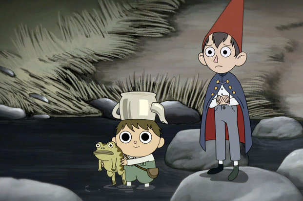
Amplification through Simplification: This is the act of distillation, using cartoons to strengthen the impact of our content by simplifying it to a form that the viewer can relate to more easily. They can now project themselves and their ideas on the simplified rendering in question! McCloud’s example took us from a complex ink rendering of a man’s face and distilled it down to perhaps one of the most universal symbols: the happy face. Speaking of symbols…

ICONS: A fundamental building block of comics. Some manner of image that represents something greater, a person, a thing, and idea etc! Typically icons are universally recognizeable.

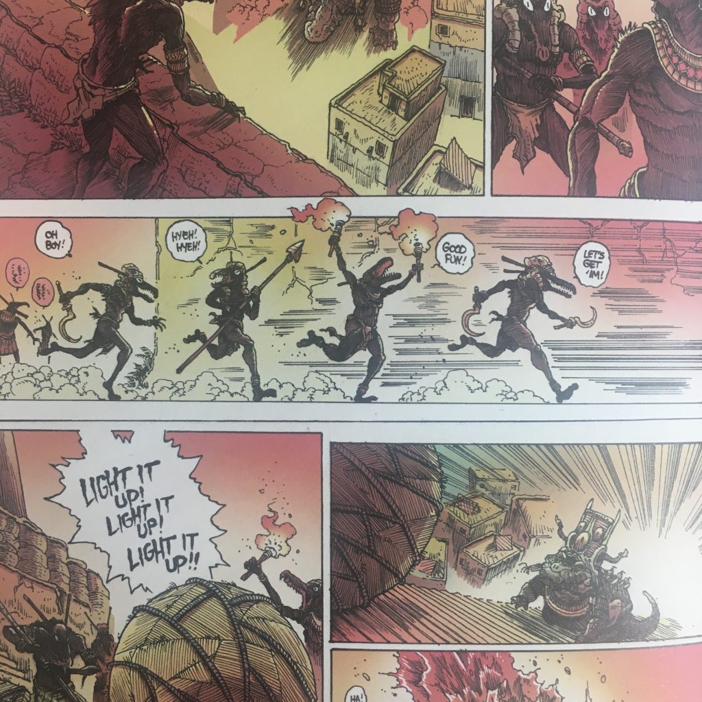
Zip Lines/Motion Lines: Lines meant to communicate action, speed and motion. This could be as simple as a trio of lines behind a runner to more complex renderings of blurring and ghosting!
Non-sequitur: A transition that juxtaposes between two unrelated images. By putting them together, the viewer will now search for some kind of meaning or connection between the two.
Scene to Scene: transitions between panels that cross large distances or make leaps in time span.
Moment to Moment: transitions that (you guessed it) occur within a very short amount of time. Typically measured in seconds to minutes.

Leave a Reply