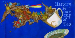
After looking through other people spread for the book me and my group deiced that we want to make a more dynamic and interesting design rather than an an academic cover. We deiced that we want to add bit and pieces of information on our cover some how to attract the reader and we finally came up with a design of a tea cup with spread from the back to the front cover. More over, we also felt that history is kind of a mess so we go with a more messy approach with an explosion of object we think is important in history such as the pyramid, the first camera, printing press and the teddy bear which is more like a funny factor that we just want to throw in. Since we want to emphasize this is a tea cup we went with a dark brown color which I think should be lighter but overall I happy with the final product. I would mark myself 8.5
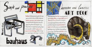
I chose to make a spread comparing the style between Bauhaus and Art Decor. When I did my research, I found that Bauhaus and Art have two completely different style and beside producing furniture they also make art and others object so I corporate them to my spread to emphasize the differences between the two movement. I also attempted to suggest the differences by using two type of typography, while ” Bauhaus” is bold lettering with heavy outline, ” Art Deco” is more decorative. Also, the two-chair image which I used are two great examples of Bauhaus and Art decor product. While the Wassily chair is quite modern looking, the Dragon chair is more complicate with dragon heads carve to the chair handle and the one common point about the two chair is their design are both influenced by something else. Finally, I highlight key works to compare and contrast between the two movement.
I quite satisfy with the final product since I think that I had convey all the important information so I would give myself 8.5.
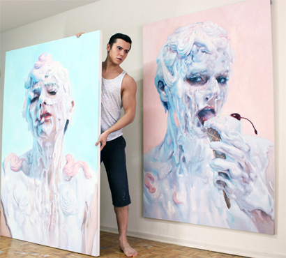
Ivan Alifan Jdanov was born in 1989 in Russia. He graduated from the OCAD University in Toronto, Canada with a Bachelor in Fine Arts in Drawing and Painting. Recently he participates in the LA International art pair. He is famous for his process of hardening paint with wax and using cake icing tools to pipe paint onto his canvas.
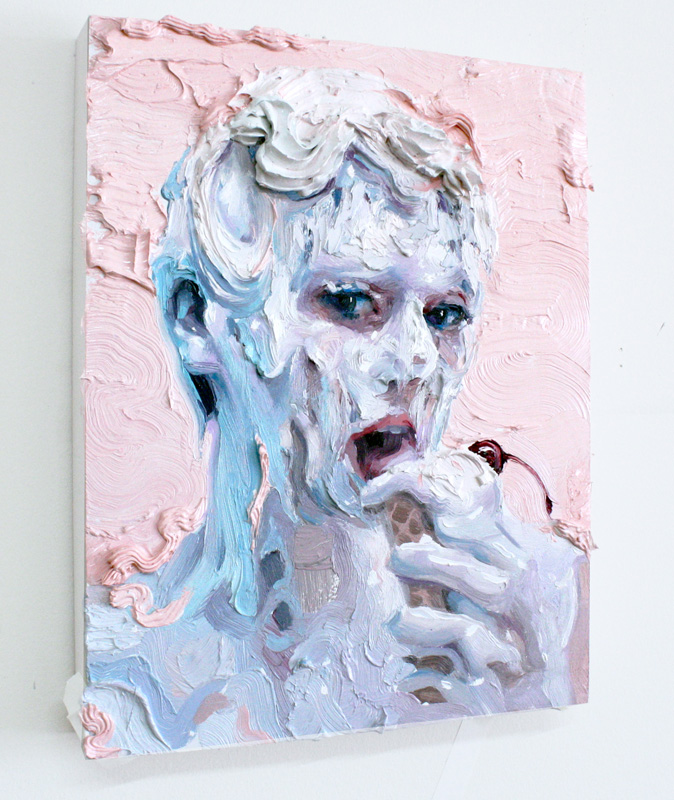
Ice cream sketch – I love his technique with the cake pipping tools and in some of his painting he made paint flower with the tools and sticked it to the canvas.
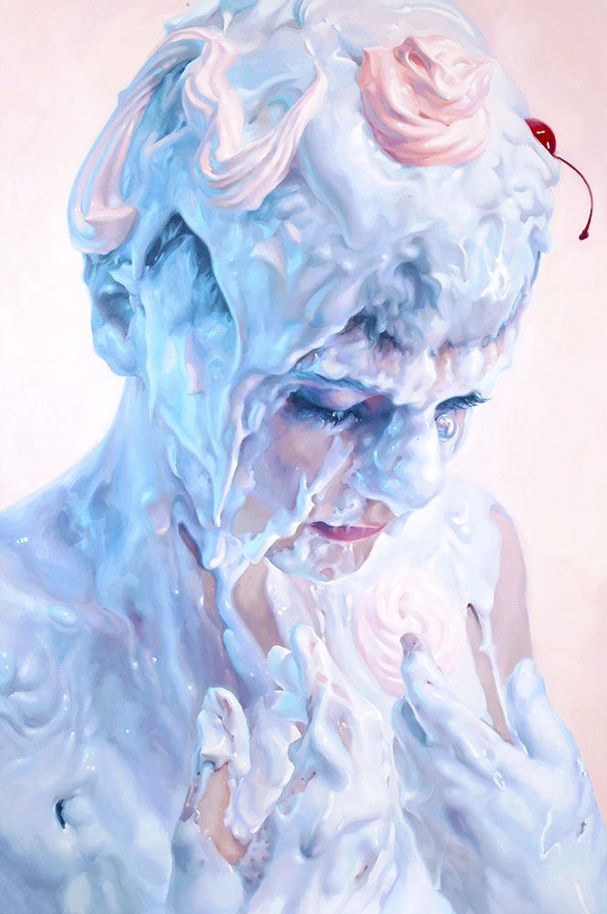
Ivan Alifan’s work often depicts human body to portrait the meanings of consumption about sexual taboos. He uses shocks tactics and provocative topic, where the erotic subtext is used to stroke the viewer and force them to examine their relationship to sexuality, questioning their prejudices about sex. To be more specific, he would paint male of female heads, busts or bodies which are covered with dripping white- pastel liquid. He intentionally forms an exotic, explicit and even strange composition. Ivan’s palette consists of mostly turquoise and picks which resemble the baroque lavishness and decadent delight.
Meringue
Ivan said that:
” Art is beyond an image of perception and creativity. Art is part of the past present, future, where one can interpret their own view. Painting allows me as an artist to express my strengths or my vulnerability. Each brushstroke builds up a story, a life and, a passion.”
Ivan had always fascinated with the glossy surface of porcelain figures and marble statues. His current art style form during one time when he asked his friend to participate in a photo shoot where he would pour a bucket full of gesso over her. Ivan does not want to stick with the traditional brown painting method; he wants to represent the human flesh realistically to create images filled with sexual ambiguity. Later on, he started to experiment with slime, milk-based creams and non-toxic paint.
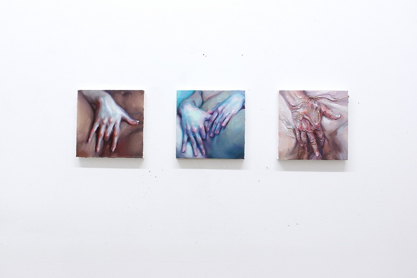
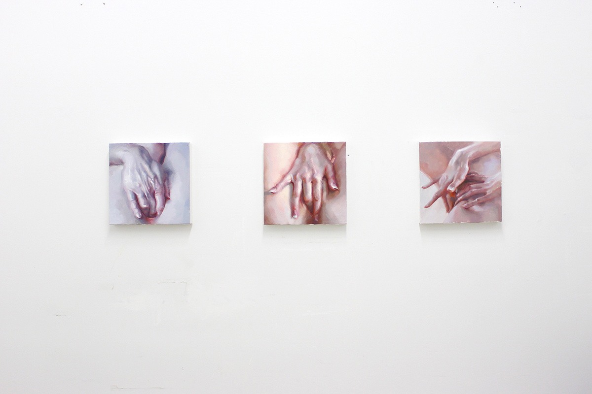
The hand study
One of Ivan famous series is ” The hand study” series which he aimed to portrait female intimacy. He did not portrait it as a sexual act but more like a moment of enlightenment, a pure bliss. Ivan wanted to accentuate the profundity of the female pleasure and self-awareness regardless of the omnipresent male gaze. This series of beautiful art hit you when you see it with fantastic work of illustrating delicate woman hand realistically. It might be the best hand paintings I have ever seen.
2D Love – I think this painting is an accurate depiction of people with anime obsession, having an unhealthy life style . The way he handling paint looks phenomenal.
Source : I believe art is sex and sex is art’: Step into the dripping pastel world of Ivan Alifan.
Roy Lichtenstein pulled off his idea of irony comic illustration with one of his first popular art piece of Mickey Mouse and Donald Duck on a wooden jetty. Donald Duck raises his fishing rod and shouts out: ” Look Mickey, I’ve hooked a big one”. This painting somehow challenged the Abstract Expressionism artists which was dominated American art during that time.
Look Mickey, I’ve hooked a big one
Lichtenstein was born in New York City, he showed his artistic really early. Lichtenstein drew, painted and sculpted as a teenager, and he also spent lots of his time in the American Museum of Natural History and the Museum of Modern Art. Later on, he spent sometimes in Europe but then returned home due to his father illness.
Wonder Woman Comic Art
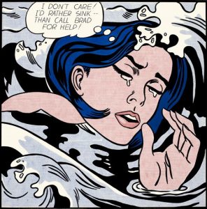
Lichtenstein was identified with Pop art, he interested in industrial processes and mass consumerism. He form his career on creating simple works that appropriated from comic books, advertisements and pulp fiction, isolating, cropping and enlarging selected elements to form power-full composition. More over, he also imitate the crude printing processes of newspaper reproduction as you can see with the dots on his art works. Lichtenstein creates about more than 5000 painting, prints, drawings, sculptures, murals and other objects.
Drowning Girl (1963). On display at the Museum of Modern Art, New York
To be more specific, Lichtenstein’s works based on enlarged panels from comic books. Lichtenstein himself said ” I am nominally copying, but I am really restating the copied thing in other term. In doing that, the original acquires a totally different texture. It isn’t thick or thin brushstrokes, it’s dots and flat colours and unyielding lines”. He would took a tiny picture, smaller than the palm of the hand, printed in four colour inks on newsprint and blew it up to the conventional size and finished it by painting on canvas. He elevated comic art to something you would see in a gallery.
Ohhh…Alright…
His popularity reached it peak during the 1960s with Pop painting, he gravitated toward what he would refer as ” dumbest” or ” worst” visual item he could fins and then he would attempt to improve it. Paraphrasing, particularly the paraphrasing of despised images had become a unique trait ofLichtenstein art. People love his convention or permeated art, they called his works ” a purely American mythological subject matter”.
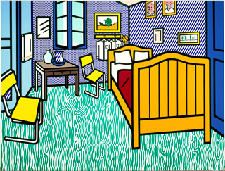
Lichtenstein’s Bedroom at Arles (1992)
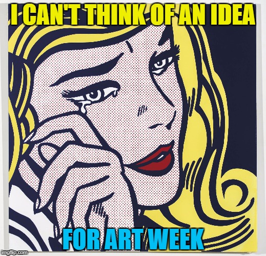
My comment on Liechtenstein’s art: His art really catch my eyes with the vibrant palette and interesting texture. Unlike the other, his creativity is about seeing a poetical image and elevate it. When I first look at his art, I immediately think about all those meme picture since his art tend to be zoom in to a girl face with emotional face expression.