Blog post#6: Departures and Rumblings -Renato Fratini

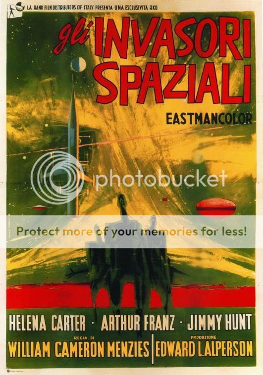
Renato Fratini was born in Civitavecchia, Italy in 1932. During his career, he worked at a couple different studio, he was the one turned Favalli brothers studio into one of the worlds’ most prolific producers of film posters. Fratini produced iconic American and Italian movie posters such as Invaders from Mars ( 1953), La Donna Piu Bella Del Mondo ( 1995) and The Sweet Smell of Success( 1957).
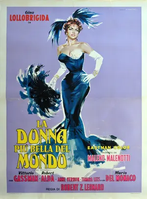
Donna più bella del mondo, La


Fratini worked as a magazine illustrator for journals such as Homes and Garden, Woman’s Journal and Woman. He also worked for a number of London publishers, such as Coronet, Hodder, Corgi and Pan. He was commissioned by the legendary art director, Germano Facetti at Penguin to create new covers for the best selling romance novels. He also had a long- term cooperation with Eric Fulford on several film posters commissions. Pulford would specify the design, layout and graphics with Fratini distinctive illustrations style. There is a bold, graphic quality to his work that is very characteristic of Sixties art. Fratini’s illustrations would capture the essence of the film or book and in the process create unique artwork. Before artists like Fratini, film posters would often simply depict a scene from the film and be fairly formulaic. After Fratini, film poster illustration attempted to capture the essence of the film, establishing a visual style definitively associated with each film.

Renato Fratini, South by Java Head, 1969

The narrative element of his work is also a reflection in his success as a comic strip artist, which continued throughout his career. In the late 1950s, he was commissioned work on a number of covers for the Sexton Blake comic and novel series. In 1965, he was also asked to work on Modesty Blaise, for King magazine, over four issues. Modesty Blaise, a long running British newspaper cartoon, followed the adventures of a fictional action heroine in her spoof spy-fi adventures.

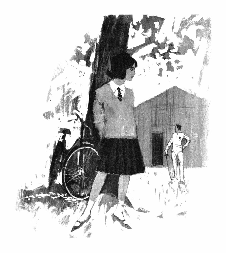
Renato Fratini, The Sour Lemon Score, 1969


Kết quả hình ảnh cho Renato Fratini

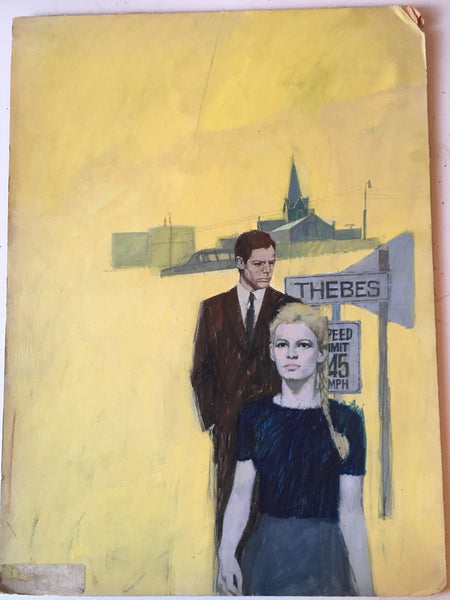
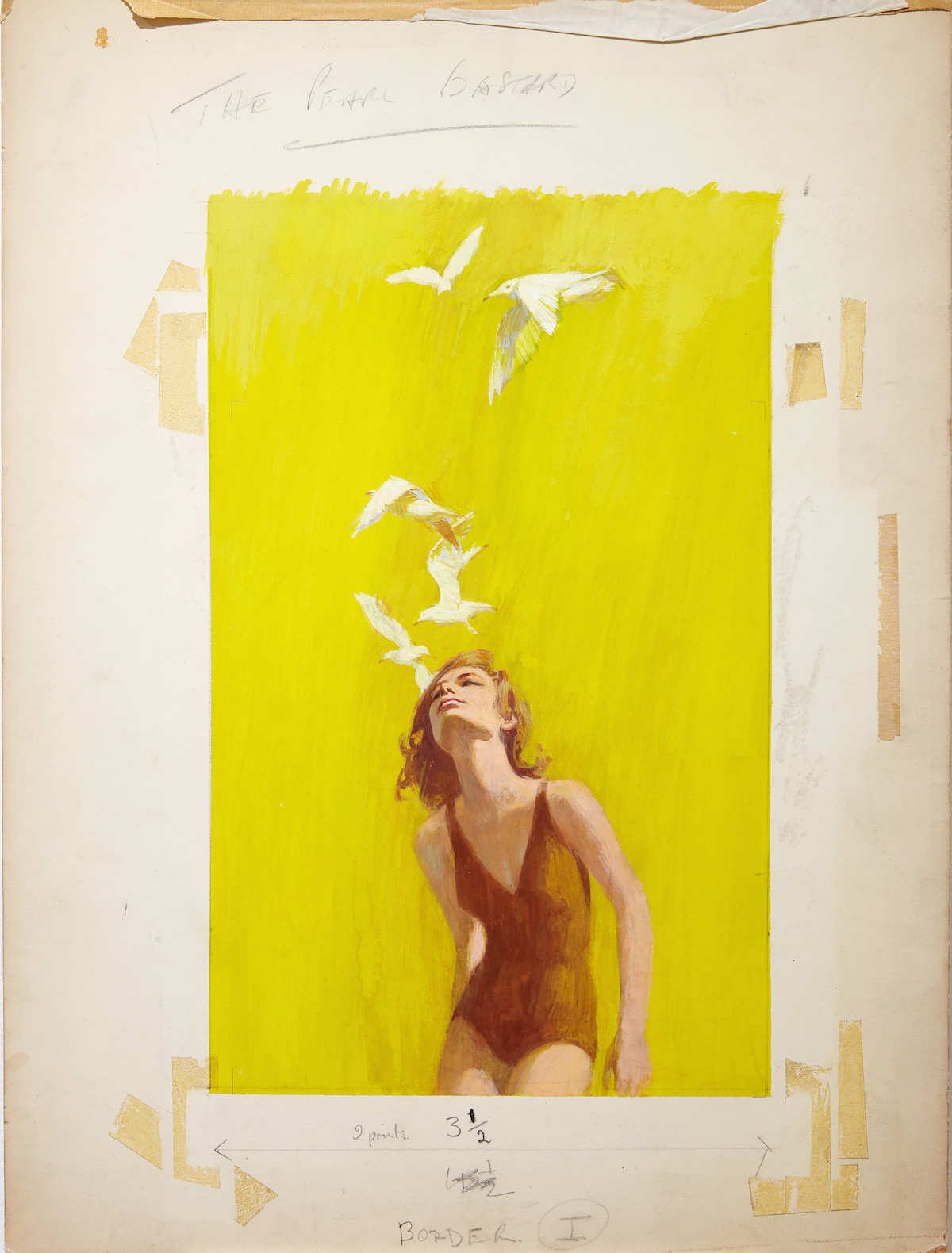
In addition to the strong narrative elements, Fratini artwork has an almost tangible sense of atmosphere, which helps explain his popular appeal.  Fratini also experimented with mixed media to create contrast and texture which adds depth and. He would often create the background in acrylic and then use mixed acrylic inks over the top and finish with gouache.
Kết quả hình ảnh cho renato fratini
Renato Fratini_The Pearl Bastard_c1960s_ gouache on board_copyright Lever Gallery_AW


Blogpost#1 Cipe Pineles

Cipe Pineles was born in 1908 in Vienna. She came to the US when she was 13 and she attended Bay Ridge High School in Bay Ridge High School in Brooklyn and later on she got a Tiffany Foundation Scholarship to Pratt Institute.

Kết quả hình ảnh cho Cipe Pineles


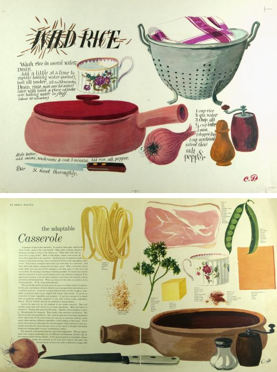
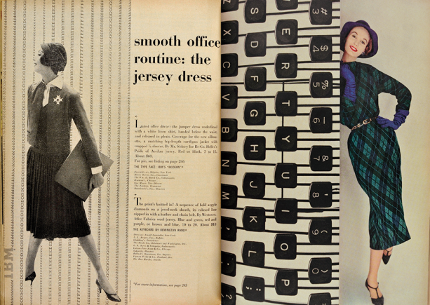
Pineles had a nearly 60-year-long career in design despite the sexism in the industry during her time. She worked for Contempora for two years then became an assistant to M.F.A Agha, the art director of Conde Nast Publications. From that one assistant job, she gained her experiences and soon became the art director for Glamour, a publication with mainly targets young women which allowed Pineles to develop her own unique style through various uses of image and type. Later on, she became the Art Director at Seventeen and Charm. In 1961 to 1972, she worked as a graphic design consultant for the Lincoln Center for Performing Arts in New York, supervising the creation of branding and marketing materials for the institutions. In 1943, Pineles became the first female member of the Art Directors Club. She was later inducted into the Art Directors Club Hall of Fame in 1975 and she also the only female member of the Alliance Graphique Internationale. In 1984, she was honoured by the Society of Publication Designers with Herb Lubalin Award. She also received the AIGA Medal in 1996.

Out of Pineles’s contributions, she was considered as the first person to bring fine art into mainstream, mass-produced media. She commissioned fine artist such as Ad Reinhardt and Andy Warhol to illustrate articles during her time at Seventeen. Bringing different things to the attention and interest of the young public like food, household items, furniture, etc. She also brought more playful typography and visual puns to her designs.

Her work contributed to the effort to redefine the style of women’s magazines. Her efforts also contributed to the feminist movement by helping to continue to change women’s roles in society. Pineles repeatedly broke the glass ceiling in the design field.

Kết quả hình ảnh cho Cipe Pineles

As for Pineles personal life, she was married to two notable designers. She and William Golden were married from 1939 until his death in 1959. Then in 1961, she married Will Burtin until his death in 1972.

Blogpost#5: Postwar Prospertie​​s-Bernard D’Andrea

Bernard “Bernie” D’Andrea

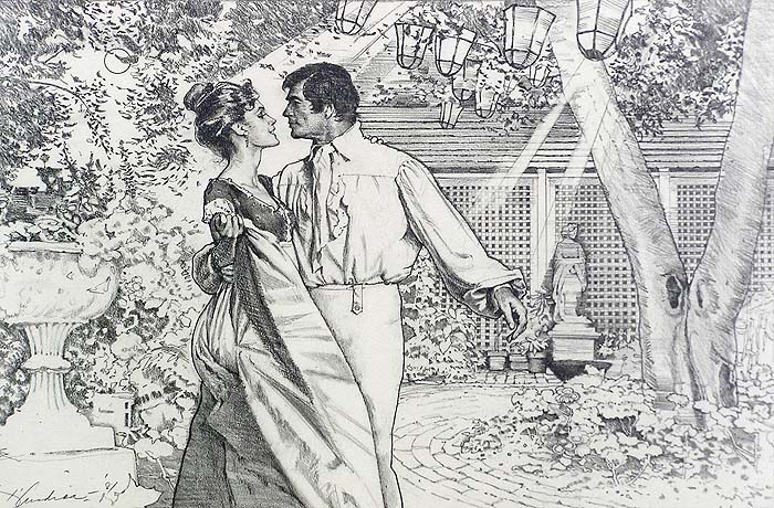
Bernard D’ Andrea was born in a supportive family that allowed him to go pursuit art, he studied under Will Burtin in Pratt Institute and later on became an illustrator for mainly women’s magazine.

McCall’s, “My Friend Lucinda” (1952) D’andrea – 002

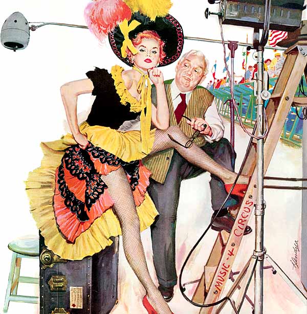
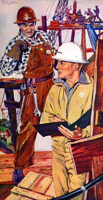
Like many other artists during WWII, D’ Andrea spent four years as an artist for the U.S Army and he met Art Cooper, Charles Cooper brother, who ran the Charles E. Cooper studio in New York City. This studio was known to work with many popular magazines that full with talented illustrators such as Coby Whitmore, Joe DeMers, Jow Bowler, and Lorraine Fox, D’ Andrea’s wife whom he married in 1951. When D’Andrea came to the studio, it was at its peak which helped him launched a successful career as an illustrator. He worked with The Saturday Evening Post for 15 years and Good Housekeeping for over 40 years. His works also appeared in Boy’s Life, Redbook, Cosmopolitan, Woman’s Home Companion, McCall’s and Seventeen.

Woman’s Home Companion, “A Woman Named Storm” (1955) D’andrea – 004


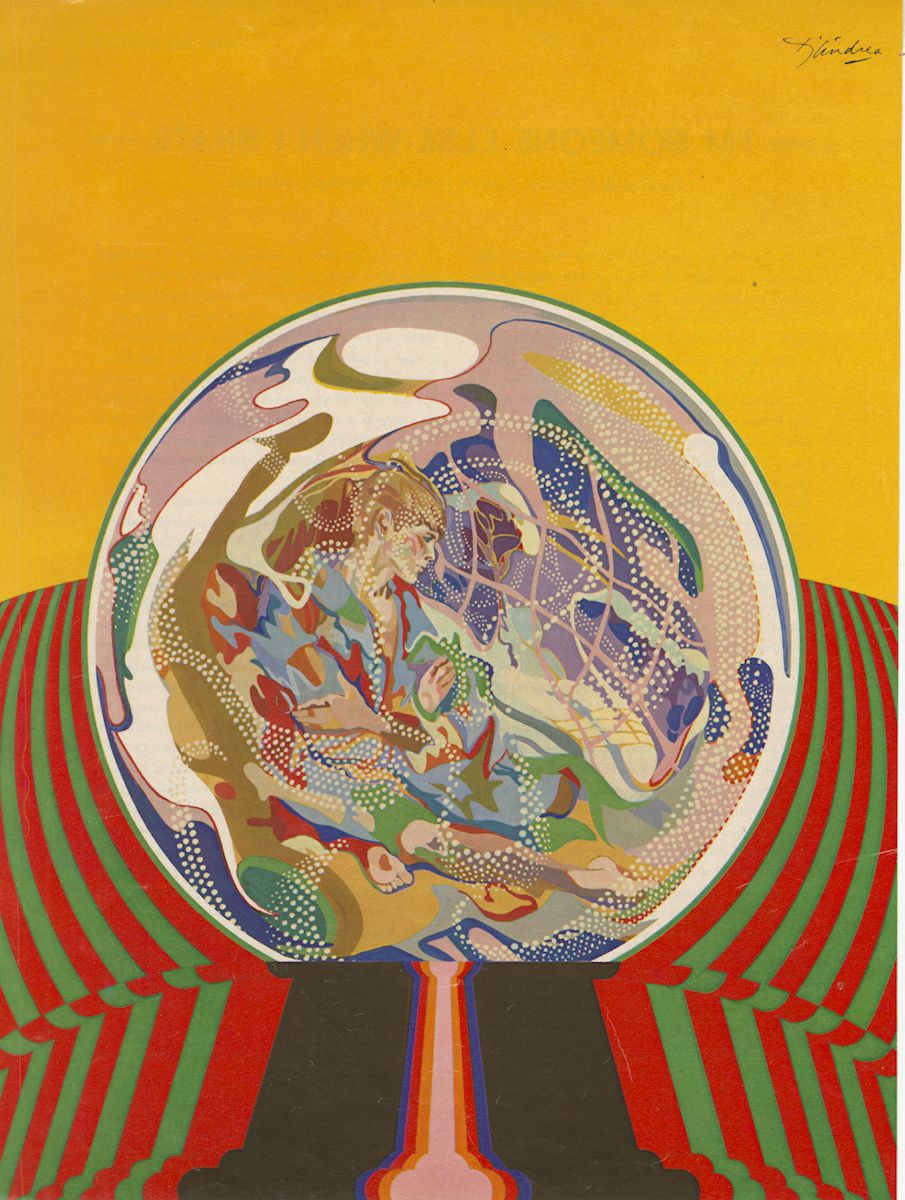
Crystal Ball

After years of working as a commercial illustrator, D’ Andrea decided to broaden his artistic horizon and pursuing painting. After receiving training from Reuben Tam, a prominent landscape abstract expressionist who taught at the Brooklyn Museum Art School, D’ Andrea altered his views about illustrative concepts and reach out for a new direction. In 1983, D’Andrea first exhibit in Hilton Head Island was a huge success which leaded to he exhibited in the Hammer Galleries in New York City and was offered a major landscape show at the Hunter Museum of Contemporary Art in Chattanooga, Tennessee. His extensively exhibited work was also becoming part of numerous collections.

Kết quả hình ảnh cho Bernard D'Andrea


Mainstream Illustration, BERNARD D'ANDREA (American, b. 1923). The Conversation, originalmovie poster artwork, 1974. Mixed media and appliqués o...

Bernard D’Andrea’s work has been produced for national and international recipients. In 2015, he was inducted into the Society of Illustrators’ Hall of Fame.His work is in the collections of the Brooklyn Museum, Hunter Museum, the U.S. Coast Guard Naval Museum in Washington, D.C., and the Telfair Museum of Arts & Sciences in Savannah, Georgia. His work has been shown in Allan Stone Galleries and Hammer Galleries of New York City, among many others.

Kết quả hình ảnh cho bernard d andrea
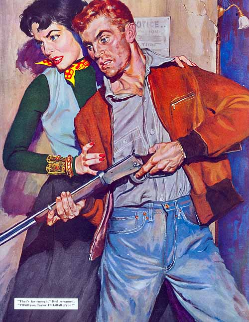
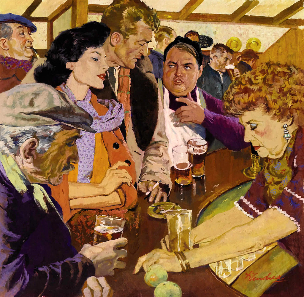
Murder On My Street, Part 1
Kết quả hình ảnh cho Bernard D'Andrea
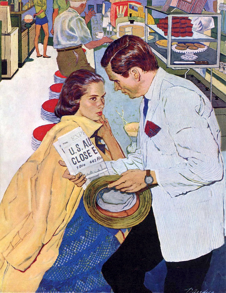
Shopping 1958
Kết quả hình ảnh cho Bernard D'Andrea
Murder On My Street, Part 1″ in the Saturday Evening Post

I can’t find Bernard D’ Andrea later on paintings but I really like his commercial illustration. Figures in his painting are not just the idealize version but they look quite natural like real people. I love his colour palette and his brush stroke in every piece. Like in the piece shopping, his colour choice isn’t common during that time and the way he adds texture on everyone face except for the girl in the front is really interesting. ”Murder on the street ” painting is packed with people and I love how busy looking it is, he paid attention to every detail in the piece, even the old lady earing.

Blogpost#4 The Golden Age Part II – Gil Elvgren

Kết quả hình ảnh cho gil elvgren portrait
Gil Elvgren portrait

Gil Elvgren was born in St. Paul, Minnesota. He went to the Minneapolis Institute of Arts for the short period of time and then changed to the American Academy of Art. After graduating, he joined the stable of artists at Stevens and Gross, Chicago’s most prestigious advertising agency. During this time he got the chance to learn from the famous illustrator Haddon Sundblom, who gained his popularity from his Coca Cola Santas. Working in Sundblom’s shop, Elvgren contributed to various Coca-Cola ads himself.

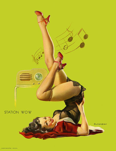
Station WOW

In 1937, Gil began painting calendar pinups girl for Louis F. Dow, one of America’s leading publishing companies, during which time he created about 60 works. These pinups girls illustrations art easily to recognize because they are printed version with Elvgren’s signature. In 1944, he was approached by Brown and & Bigelow to work for them as a staff artist which meant his work would be in more or less direct competition with other big names in the field. The firm offered him $1,000 per piece, which was more than what Dow was paying him. Elvegren signed a contrast with Brown & Bigelow in which he has to produce twenty calendar girls each year, ranging from cowgirls of the golden west to sultry sirens of the Riviera.

Image result for Louis F. Dow Gil Elvgren
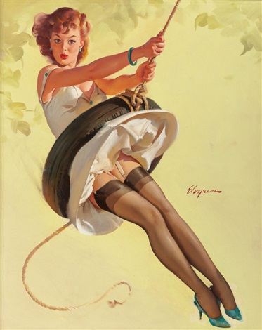
Louis f. dow calendar illustration by Gil Elvgren
Related image

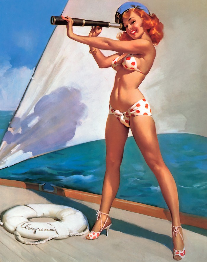
Swingin Sweetie, Brown & Bigelow calendar illustration by Gil Evgren

In 1951, Evgren salary arrangements with Brown & Bigelow changed, instead of $ 1,000 per piece, they paid him $ 2,500 per piece. With the amount of money he got from his magazine illustration and numerous national advertising accounts, he and his family moved from Chicago to the suburb of Winnetka. He started to hire a full-time assistant to help with photographing the models, forming sets with various props to portray different subjects and preparing his art tools. Having his own studio at home help Evgren work more efficiently. Eventually, after 30 years working with Brown & Bigelow Evgren retired and moved to Florida.

Image result for Gil Elvgren
Splendid View

In order to create these pin-up girl pieces, Elvgren had to plan each of them carefully. Beginning with an idea, he would develop the visual situation and then select a suitable model for the specific setting. Then he would choose the outfit, the background, the props and the liting and finally, he would take some pictures as the reference for his piece.

My opinion :

To be honest, in my opinion, pin-up girl illustrators kind of have really similar styles. He did have a successful career and he had a really solid skill set to make these girls look as lively as possible. His colour palette is always warm, vibrant to look at but other than that his art doesn’t leave a strong impression for me.