The cover rationale


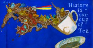
     After looking through other people spread for the book me and my group deiced that we want to make a more dynamic and interesting design rather than an an academic cover. We deiced that we want to add bit and pieces of information on our cover some how to attract the reader and we finally came up with  a design of a tea cup with spread from the back to the front cover. More over, we also felt that history is kind of a mess so we go with a more messy approach with an explosion of object we think is important in history such as the pyramid, the first camera, printing press and the teddy bear which is more like a funny factor that we just want to throw in. Since we want to emphasize this is a tea cup we went with a dark brown color which I think should be lighter but overall I happy with the final product. I would mark myself 8.5

.


History spread #3 rationale

Rationale:

          I chose to make a spread comparing the style between Bauhaus and Art Decor. When I did my research, I found that Bauhaus and Art have two completely different style and beside producing furniture they also make art and others object so I corporate them to my spread to emphasize the differences between the two movement. I also attempted to suggest the differences by using two type of typography, while ” Bauhaus” is bold lettering with heavy outline, ” Art Deco” is more decorative. Also, the two-chair image which I used are two great examples of Bauhaus and Art decor product. While the Wassily chair is quite modern looking, the Dragon chair is more complicate with dragon heads carve to the chair handle and the one common point about the two chair is their design are both influenced by something else. Finally, I highlight key works to compare and contrast between the two movement.

             I quite satisfy with the final product since I think that I had convey all the important information so I would give myself 8.5.


History speard#2 rationale architecture 1895-1905

Rationale:

I chose to make a spread about two famous architects in this particular period: Antoni Gaudi and Louis Tiffany. When I did my research, I found that these two architects both had some unique design of their own. Antoni Gaudi designed the famous Casa Batlló building which has some interesting characters,  this building facade and balcony reassemble the human skeleton. Louis Tiffany, on the other hand, was famous for his glass work and some of his church design. The Art Nouveau movement influenced both of them, so I did indicate the Art Nouveau style to my spread. Overalls, I think I did a good job, and I would mark myself 8.5.


Survey#3 Artifact rationale

History book artifact
The artifact description.

Rationale:

I chose to make a missing poster for my artifact assignment. To make the poster believable, I indicated some information that I think is suitable for this period. To be more specific, The reward I gave this Chinese a considerable amount of money during this time which shows how valuable Chinese pottery was. As for the description part, I tried to replicate the old fashion handwriting to go along with the theme of my artifact, and I also chose some information from members of my group’s blog post that I think would create a logical flow. Overall, I quite satisfied with what I come up with but I do believe I can do better if I chose a different background for my artifact’s picture.


Yearbook spread

 For my yearbook spread I had used my illustration skills to create a piece that can help people to understand about my personality. Because typography is not my strong point, I had used several images to complement my text.
I drew the spirit of my dog watched myself over the vintage TV because I would like to think that he is always looking after me. I also drew a small wooden tree to imply about me want to be a farmer. In addition, I used a color palette which combines the 70s and 80s style to emphasize my fondness for the two time period. Furthermore ,through the assignment  I want to show others my drawing style (cartoons , bright) and somewhat of my personality. Overall, my first assignment is not that perfect. There are several things I wish I can change but I love the design ,so I would give myself 7 .