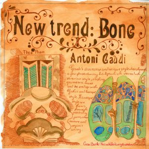
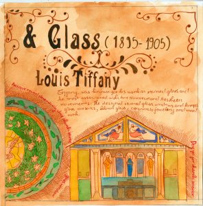
I chose to make a spread about two famous architects in this particular period: Antoni Gaudi and Louis Tiffany. When I did my research, I found that these two architects both had some unique design of their own. Antoni Gaudi designed the famous Casa Batlló building which has some interesting characters, this building facade and balcony reassemble the human skeleton. Louis Tiffany, on the other hand, was famous for his glass work and some of his church design. The Art Nouveau movement influenced both of them, so I did indicate the Art Nouveau style to my spread. Overalls, I think I did a good job, and I would mark myself 8.5.
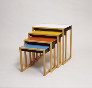
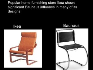
Bauhaus is the house to some of the most iconic furniture pieces in the world . Their furniture designs are modern, minimum and practical which were loved by many people during their time and its still has a strong influence on 21st century furniture design as we can see the similarity between Bauhaus and IKEA appliance.
Bauhaus furniture are simple, light and it do not have any additional decoration. All designs was often made with practical material such as wood, metal, plastics and glass. Moreover, Bauhaus designers focus on what their costumer can benefit from their product, they avoid bulky and over decoration design and they also restrict their color palette to three primary colour: red, blue, yellow. Bauhaus aim to create beautiful object but they also want it to be availible to the mass public.
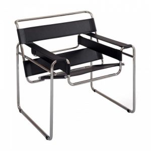
The Wassily Chair
The famous Wassily Chair by Marcel Breuer is a great example of a design that was able to deliver advances in material and technology. It was first created in 1926 which also opened the beginning of a new era in modern furniture that we are still familiar with nowadays. The chair design was inspired from the bicycle handlebar which explain its complex appearance but simple in construction.
1922: Peter Keler, Cradle.
Another good example would be the Cradle by Peter Keler. The design has an angled form supported by large circles instead of rockers and it is painted with red, yellow and blue accents.
Lecture summary: German gradually recovered from WWI. Weimar Arts & Craft school and Weimar Art Academy merged and became the Das Staatliche Bauhaus which last from 1919 to 1933. The student in Bauhaus learn a fusion of art and crafts and together they form their own distinct Bauhaus style. I am really into the Bauhaus movement how they were able to produce products that we can still use in the modern day, their typography is also interesting especially the Futura typeface . Their design are quite practical and way different from other movement in this current time.
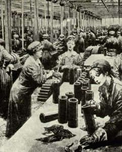
Before the war, a woman role is to stay home taking care of the kid and do the cooking. However, when the men go to war, with not enough people working, the woman began to go to work in offices, factories, shops, transport and on the farm. The young teenager in the city was forced to assist with harvesting in the countryside. There were more jobs than it used to such as working for munitions factories to sever the high demand for weapons. Even Though there was a variety of different opinion about the idea of women do man job, the introduction of conscription in 1916 made the need for women worker urgent.
As a result, Women in that time was able to be a railway guard, ticket collector, poster worker or they can take part in the challenging job such as police, firefighter and back employee. The figure of woman’s employment rates increased significantly, from 23.6% in 1914 to 46.6% in 1918. Also, the employment of married woman also increased up to nearly 40% of all woman workers. However, they received lower wages compared to the man who started the movement of demanding for equal pay among female.
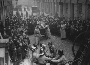
Women firefighters in action, 1916
By the year 1917, the majority of the worker in multiple factories was women, and they produced approximately 80% of weapons and shells for the British Army. Unfortunately, women had to work without any protective clothing which leads them exposed to many chemical substances such as trinitrotoluene, and it made theirs since turn yellow. Not only these chemicals affect their appearance, but it also had a negative impact on their health, around 400 women died from overexposure to trinitrotoluene during the great war.
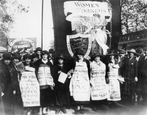
Women campaigning against the Unemployment Insurance Act in 1920
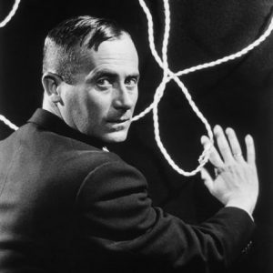
Lecture summary: During this particular period after the war ,we get to know about many art movements such as the Dada movement, Surrealist movement, and De Stijl. The Dada movement was lead by Tristan Tzara, a Romanian poet, and performance artist. The horror and cruelty of the were affect people actively, and some of them decided to go crazy with their art to mock society. The Data movement used their craziness in the art to help people heal from what they had gone through during the WW1. Besides the Data movement, people were introduced to readymade art by Marcel Duchamp which means writing your name on something and call it art. The Germany Data movement developed a technique of photomontage. The surrealist movement founded by Andre Breton aiming to tap into the ” superior reality” of the subconscious mind:” More real than the real world beyond the real”. Lastly, the De Stijl movement also aims to heal people from their trauma from the war like Data movement, but it approached a completely different method of rebuilding, creating harmonic order with the geometric shape and mathematical structure.
Joan Miro Ferra was a Spanish painter, sculptor, and ceramicist born in Barcelona. The Fundacio Joan Miro, a museum in Barcelona was built dedicated to his work and another named the Fundacio Pilar i Joan Miro was built with the same purpose in the city Palma de Mallorca .
Miro was born in a family of a goldsmith and watchmaker. He started to draw since he was seven at a private school at Carrer del Regomir, a medieval mansion. He then continued to pursuit art at a fine art academy at La Llotja and had his first solo art show in 1918 at the Galeries Dalmau.During the year 1918 he began to focus more on line, form and structure and his composition became more direct, clear and often has little fine details. .He was inspired by Fauve and Cubist exhibitions in Barcelona. Moreover Miro was also attracted to the Montparnasse arts community, he moved to Paris in 1920 for that reason, but later on he continued to spend his time in Catalonia. His early art style can be described as vivid and brushy.
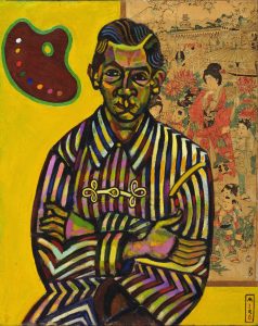
Joan Miró Portrait of Enric Cristòfol Ricart
Winter or early spring 1917 I like what he did in the painting, the two object and the man looked seem to be painted with the different style but come together very nicely thanks to the green colour. I also like the heavy outline in the portrait, and the warm lighting on the shirt contrasts the dark colour on the man face.
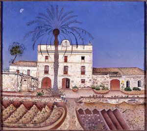
From the year 1920, Miro developed a very precise style, picking out different elements in isolation and arrange them in purposeful composition. This style can be seen in some of his works including House with Palm Tree, Nude with a Mirror and Horse. His work during this time are strongly influenced by Cubism in a restrained way.
Joan Miró 1918 La casa de la palmera House with Palm Tree oil on canvas
Miro developed a distinctly symbolic language of simplified, biomorphic, or lifelike, forms. He was one of the artists contributed to give a visual definition to the young movement which influences the younger artist generation. He created over 250 illustrated book which is known as Livres d’ Artiste. He was among some of the first artists to develop automatic drawing which aiming to undo the earlier technique in painting and form new techniques. He and Andre Masson was the two major artist started the Surrealism art movement, but he chose not to become an official member of the Surrealist to avoid being forced to work with only one style. He wants to experiment with another style such as expressionism, lyrical abstraction and colour field painting as he, please.
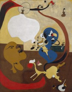
Some of Miro works:
Jean Miro Dutch Interior II I strangely into the composition in this painting and I also like the flat painting style .
Caress of a Bird (La Caresse d’un oiseau), 1967 Overall I find this painting is really funny looking. It can be a kid toy and I would buy it.Women and Bird in the Moonlight (Femmes, oiseau au clair de lune), 1949. To be honest this look like something 5 year old me would draw with a bunch of smiley faces and cliche star symbol.
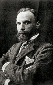
John William Waterhouse was an English painter of the Victorian era. His gain his popularity from series of large-scale Classical mythological subjects paintings. In 1970, He studied sculpture at the Royal Academy in London and then, later on, switched to painting. He was known for glowing colour, texture brush stroke, and visible surface. Like all other Pre Raphaelite artist, he had a strong passion for illustrating beautiful women portraits in a stunning outfit in the middle of some natural English countryside scenes.
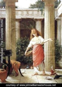
In The Peristyle 1874 – I really enjoy looking at this painting. The scene look natural, believable and it is a really interesting way to capture a ordinary scene. How he chose to pose the little girl feeds the bird makes the painting look somewhat like a photograph. More over, think that this painting has a really lovely color palette which many warm tones
Early in Waterhouse career, he was more like a Neo classical painter who would create painting of Greek and Roman scenes, as a result these painting would have the same subject, in some case it even have similar composition.
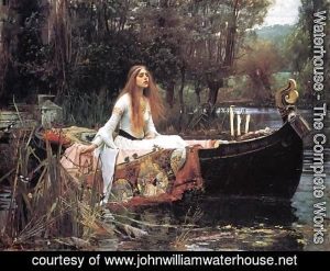
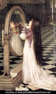
The Lady Of Shalott 1888
Between 1890s and 1990s Waterhouse produced many works of the mythological and daily life scenes which was exhibited regularly at the Royal Academy. As a result, the academy made him as their associate member in 1885 and then a full Royal Acedemician in 1895.
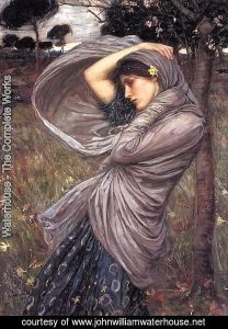
Mariana In The South 1897Boreas-1903– I like this woman expression and the way waterhouses illustrated her scarf. There are lots of texture in this painting which makes my eyes move around to really acknowledge all details. Because he painted this piece with mainly cool tone so the pink color on the girl cheek really pop out.
Waterhouse was really famous with his painting of ” The Lady Of Shalott”, he was inspired by the 1832 poem by Alfred about the the mysterious death of a beautiful woman death after looking directly at the Lancelot. He painted three different version of this poem. His series of painting about Ophelia before her death also gain its popularity but unfortunately Waterhouse did not get a chance to finish the series due to his cancer by 1915.
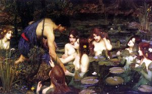
Waterhouse Hylas and the Nymph 1896 – the first thing I notice about this painting this the lavender highlight on the leaf which is really neat details. He put lots of effort to all these nymphs figure and they all look like fragile porcelain doll.
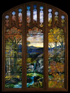
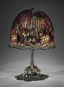
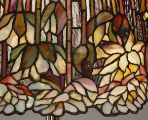
Louis Comfort Tiffany, the man we think of whenever we see those colorful glass lamp in the white spot or our grandparent house. Tiffany is an iconic architecture figure during the Art Nouveau movement. His works included many things from stained glass to windows, lamps, glass mosaics, blown glass, ceramics, jewelry, enamels, and metalwork. He was the first Design Director at his family company, Tiffany&Co.
Autumn Landscape -Leaded Favrile glass
In 1885, Tiffany form his firm, he continued to take customer commission, and he also tried to develop his method of glass manufacture. After four years, he came up and registered a patent for opalescent window glass, a new formula of combining and manipulate colours to construct a unique range of hues and three- dimensional effects.
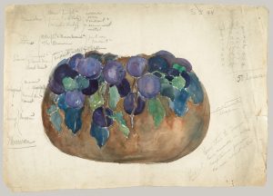
Louis’s design drawing
One of Tiffany biggest inspiration is natural and luminous colour. He used colour that often associates with flowers and plants on his glass works. His passion with nature and glass making technique led to his invention of the second method of construct glass vases and bowls. In 1893, Tiffany introduced his first blown- glass vases and bowls which called ”Favrile” which quickly gained its international recognition due to its surface iridescence and fabulous colour.
Lamp Designed by Louis Comfort Tiffany (American, New York 1848–1933 New York)
This week we get to know more about the Art Nouveau Movement which happened in several places in the world. Art Nouveau was all about using of pattern and decoration, adding details from nature such as plants, flower, exotic animals and bird. During this time Mucha, a Czech illustrator who was influenced by Art Nouveau, he created a number of famous painting, illustrations, advertisement, postcards, and designs. We can also see Art Nouveau style in architecture, wallpaper and so on. Aubrey Beardsley in England was also famous for his Art Nouveau works and he was strongly influenced by the Japanese woodcuts. Moreover, we got to see some vital artist during this period such as Gustav Klimt ( Secessionist movement) and Egon Schiele. Finally, my favorite part in the lecture is the iconic sci-fi movie Journey to the moon which is a huge step forward in the movie industry.
Gustav Klimt was an Austrian painter, and he was considered as one of the most outstanding members of the Vienna Secession movement. The female body is one of the most common subjects in his painting, and he also had some landscape piece. The Japanese art strongly influenced him, and it obviously showed through his artwork.
Gustav Klimt early year portrait
Gustav came from a low-income family of seven children which his father, a gold engraver can barely afford their living expense. Later on, at the age of 14, Klimt went to the Vienna Kunstgewerbeschule, a school of applied arts and craft, where he studied architectural painting from 1876 to 1883. Klimt started his art career with painting interior murals and ceiling in the large public building including a successful series of ” Allegories and Emblems”. His talent quickly noticed, and in 1879 he forms an artist company with his brother and another student.
Klimt was known for his use of colour and pattern which strongly influenced by Japanese art, ancient Egypt and Byzantine Ravenna. His art is flat and stylized, often about woman figure or reigns supreme. His art is considered to be beautiful, luxurious and above all erotic. He created his version of a beautiful world through his art.
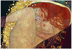
Danae – I saw this piece when I was in grade 8 and I immediately fall in love with the beauty of this piece. The woman in this painting look like she is sleeping peacefully in her own safety bubble which is a complete new way to approach the symbol Danae.
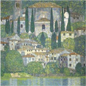
Bestand:Klimt – Kirche in Cassone – 1913
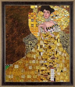
Portrait of Adele Bloch Bauer I (Luxury Line)
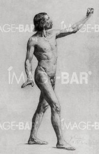
One of Klimt’s earliest drawing ” male nude waling facing right” show his skill as a painter with many great potential in his career.
Male Nude Walking Facing Right ( 1877-1879)
In Klimt studio, he kept girls available to him at all times by requesting them to wait for him in a room next door in case he decided to paint them. He would stand in silently in front of his easel, capturing the girl’s movement that appealed to his sense of beauty. To finalize his idea, Klimt would sketch the figure over and over. Sometimes there were over a hundred drawing for one painting, each showing different details. For the last ten years of Klimt life, he chose to use pattern, textile, and ornament to high light the erotic effect, emphasizing the nakedness of the body rather than cover it up. In my opinion, woman figure in his painting often look unreal, head and torsos are disintegrate, detach to their body. It looks like they might be trapped in a block which is decorated with textiles and ornaments. ( The Kiss and The Three Ages Of Woman)
Klimt himself made a statement about himself and his art: “I am certain that there is nothing exceptional about me as a person. I am simply a painter who paints every day from morning till night. … I’m not much good at speaking and writing,especially when I have to discuss myself or my work. Just the idea of having to write a simple letter fills me with anguish. I am very much afraid that you will have to do without a portrait of me, either painted or in words, but that is no great loss. Whoever seeks to know me better, that is to say as an artist – and that’s the only thing worth knowing – should study my paintings and try to glean from them who I am and what I want.”
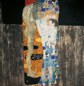
the three ages of Woman Gustav klimt 1905
Love Gustav Klimt- I like his approach for this painting with the background of gold paint and some with rose. To me the two figures look really peaceful and the blue color make it seem like they are sinking under the ocean.
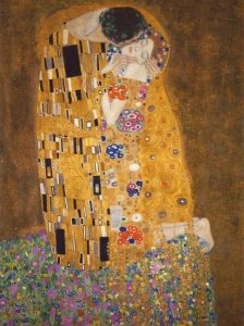
The kiss 1907-1908 – This is one of my favorite piece from Gustav Klimt work. These two female and male figure looks so intimate as they had became one individual not two. The bright color of gold and the purple flower create a lovely atmosphere to this painting.
The kiss becomes one of Klimt best-known artwork. The art piece suggests a couple locked intimate space against gold, flat background. The pattern in the painting indicates the style of Art Nouveau and the form of the Art and Craft movement. The use of gold leaf is similar to medieval ” gold ground” painting, illuminated manuscript, earlier mosaics, the clothing pattern similar to the Bronze Age art and how he crop the art piece just right above the man head reflects the influence of Japanese print.
Source: Gustav Klimt by Jane Rogoyska published 2005 Parkstone International
Peter Behrens was a German architect and designer who have a significant role in his field from the 19th century to 20th century when it changed from decorative design to simple and functional design. He was known for some of his exclusive design for AEG including logo, poster and typeface. Further more, He taught three of the most influential modern designers: Ludwig Miles van der Rohe, Walter Gropius and Le Corbusier.
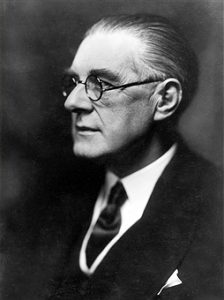
Peter Behrens portrait
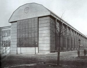
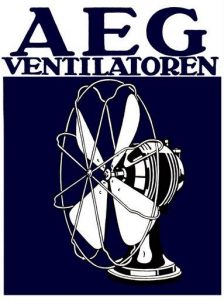
Peter Behrens was a principal designer of factories and office buildings in brick, steel and glass. In 1907, he and ten other people plus twelve companies created German Werkbund, an organization of artist, architects, designers, and industrialists which had a crucial role in the development of modern architecture. Moreover, in that same year, he was commissioned to design the entire visual identity of AEG.
The AEG building
Peter Behrens, Poster for Allgemeine Elektricitäts Gesellschaft (AEG), 1912
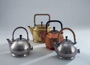
Before we were introduced to Peter Behrens’s tea kettle design, the 1890s version was not widely used due to its potential of electric hazardous and impractical. When his design appeared on the market, it had shown an outstanding improvement. He designed three version of the tea kettle ( oval, bulb-shaped, and octagonal). Each of them was available in three different surface finishes with the heating elements hidden inside and ebonised wood handle. However, the kettle was quite expensive and slow burner comparing to the routine kettle on a gas or wood burner, but it still dominates of the market because of the successful marketing. AEG used materials that were in high caliber and present-day styling created by the Germany modern architect which attract people interested.
Lecture summary: In this week survey, we get to know two important architecture of the century, Frank Lloyd Wright and Peter Behrens, the Munich Glaspalast exhibition, the development of advertising poster, the first contemporary automobile company in German and how the first colour photograph was introduced. In details, while Frank Lloyd Wright became a pioneering architecture in the US and opened his printer, Petter Baehrens designed the AEG factory in Berlin, and he also went one to create several logos exclusive for AEG. Further more, Like Lloyd Wright, Behrens was interested in book design and typeface design. During this time, the Munich Glaspalast Exhibition became famous for wildly colourful cabaret and theatre posters which shock all audience. Artists in the 20th century began to experience with lack of perspective, lack of realism and more abstract art. In America, the Armory show had changed how people think about modern art and was seen as one of the most important exhibitions in the US
Nowadays, various kind of posters can be seen anywhere, from indoor promo graphics to large-sized billboard. Originally served as a method of governmental public notification, America’s poster from the past were so different from what we know in contemporary time.
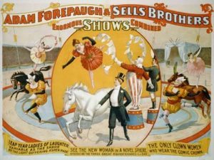
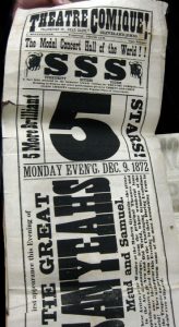
The earliest type of “artistic” posters in America were those used by travelling circuses to tell the people of their upcoming performance. A circus agent would come ahead to each town or village, spreading them around a few days before arrival of the circus. Those in the 1850s were made from wood veneer by hand drill and router, in the way of panto graph, usually portrayed the circus crow in bright colors with exaggerated wording. These posters worked extremely well to attract customers, but often ridiculed by critics of the same period.
Circus Posters & Performers 1890-1900 courtesy
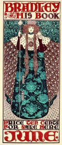
From the 1880s onward, when lithographic became available for commercial use, poster from this method bloomed all over Europe, even boosted itself into the level of fine arts. The trend quickly catched up in America after a few years, with big contributions from Edward Penfield and William Bradley, whose style blended features of the British Arts and Crafts Movement, the Japanese block printing and the popular Art Nouveau. As the poster was produced by drawing with greasy color crayons onto a fine “mold” surface, the offsetting it to the paper, this method open opportunity for more beautiful typing detailed graphic.
Will Bradley poster for His Book
On the other hand, traditional posters with pure-text contents continued to grow with the help of typographic. Designed to be viewed from distance, broadsides-as their name at that time- had a few different type sizes, and type styles from one single piece. Headlines or key details would have bigger typing and looked more attractive.
Lecture summary: During this period, there are many interesting event happens. The lecture introduced us to the beginning of the great exhibition and its effect on people, the origin of Morris, Marshall, Faulkner and co, art and craft movement, poster ( specifically the French’s poster), part of the photography evolution and the father of the Eiffel towel . World fair opened people eyes to the future with technology and culture around the world. The art and craft movement developed in short amount of time with a significant improvement in creating exquisite items. I am especially interested with illustrated poster and I can see it had came a long way comparing to the previous poster. Artist still indicate lots of detains but they organized it to please the audience eyes.More over, they also tried to be more creative with typography which make poster looks way more interesting.
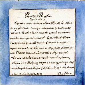
I chose to make a missing poster for my artifact assignment. To make the poster believable, I indicated some information that I think is suitable for this period. To be more specific, The reward I gave this Chinese a considerable amount of money during this time which shows how valuable Chinese pottery was. As for the description part, I tried to replicate the old fashion handwriting to go along with the theme of my artifact, and I also chose some information from members of my group’s blog post that I think would create a logical flow. Overall, I quite satisfied with what I come up with but I do believe I can do better if I chose a different background for my artifact’s picture.