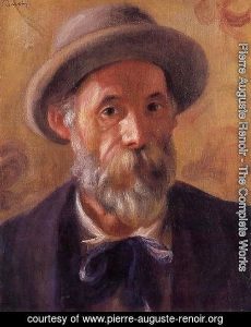
Pierre Auguste Renoir or Auguste Renoir, in short, was leading French artist during the development of the Impressionist style . He was known with vibrant light and saturated colour in his paintings, and he often worked with the theme of female nude. Based on the characteristic of impressionist style, Renoir used brushwork and soft colours to blend his figures with other details. In addition, He also was able to have the freedom to experience with his style which allow him to create some marvelous and unique painting.
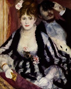
The Theater Box, 1874, Courtauld Institute Galleries, London – I love his brush work and how he blur out the gentlemen’s face behind this lady. More over human expression in this piece looks really natural and the light source also looks believable.
From 1881 to 1882, Renoir made several trips to Algeria, Italy, and Provence which created some significant influence on both his art and his life. He started to believe that all the previous Impressionistic technique was no longer suitable for him because using small brushstrokes with contrasting colours placed side by side did not allow him to paint the skin colour to his satisfaction. Moreover, he found out that the colour black prevents him from create a certain effect to his art works because it drowns other color and gives a intense mood to his art. He noticed that the color of shadows is not brown or black, it is the reflected color of the objects surrounding them.He began to use clear line to define a form, the expressive force of smooth painting when used to enhance the suppleness and modeling of a body.
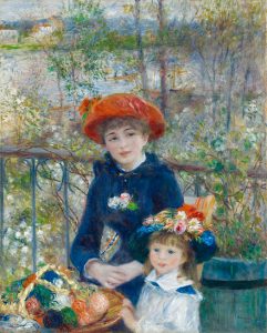
The two sisters on the terrace, 1881 Dance at Le Moulin de la Galette’,1876 – I am amazed with the amount of details Renoir putted in to this piece of art. the entire scene looks natural and believable. It have this warm and positive atmosphere which I really enjoy to look at.
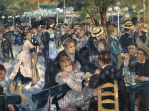
One of his best known early works is the ” Dance at Le Moulin de la Galette” piece which is also an excellent example of his method to depict the shadow. To be more specific, Renoir illustrated an open-air scene which packed with people at the Butte Montmartre, a famous dance garden near his house. We can see the Impressionist style with a real-life view, full of sparkling colours and light.
Young girls at the piano, 1892
Later year, under some influences Renoir change his art style again.To be more specific, He returned to using thinly brushed in some of his other art works and he also stared to paint more female nude.
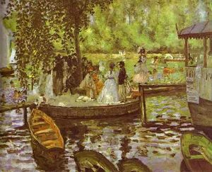
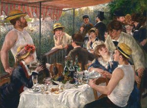
Example of Auguste Renoir works:
Nude in the Sun, 1875
La Grenouillère, 1868 – I really like his early art work especially this piece. He has this unique art style that can be mistaken with anyone else. I love the bright color and loose brush strok in this painting.
This week we get to learn about how the design develops during the industrial revolution. The appearance of the modern front like Bodoni and Didot which commonly used in the fashion magazine ( Bazaar magazine). The increasing need for cheaper printing which leading to the jobbing printer and also the downfall of craftsmen. Wooden type was invented and became popular since it is cheaper and lighter to use. Moreover, we also see the first comic book which created as a newspaper supplement. I was interested in the Ukoyo-e woodblock print of Japan since it is so different compared to the Europe illustration style. The Japanese have their interpretation of using perspective, colours which make their artwork look fascinating. Moreover, I love how they simplify everything down to please the eye. To my knowledge, The Japanese art style strongly influenced European artists as we began to see some western artwork with Japanese’s clothing pattern and abstract details.
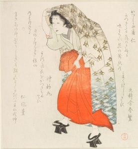
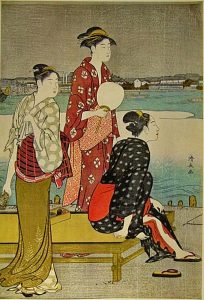
Woman fashion during the Edo period
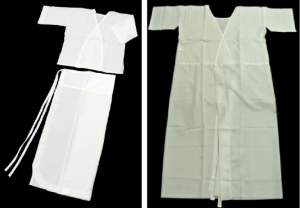
*When we think about a costume we have to consider the undergarment first.
Many undergarments and accessories are required to wear kimono and in Japan the undergarment called hadajuban and it also known as ” asetori” (soak up sweat). There are two type of hadajuban, the first one is one- piece type and the second one is separate to two pieces. People tend to like the second type more but the first type also really popular among kimono beginner.
In order to feel more comfortable while wearing kimono, Japanese also have different hadajuban’s fabric for the four season. In the summer, people would likely to wear more breezy, breathable hadajuban and a warmer, heat-retaining material during the winter
The two types of hadajuban
.* Accessories
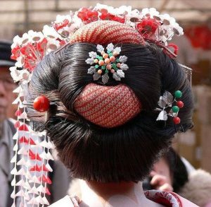
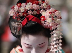
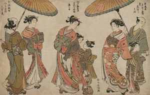
During the Edo period (1603-1868), fashion was significant for both women and men in Japan. Kimonos made from silk and brocade and to add more details to the entire outfit they would also wear Kanzashi ( woman hair ornament). Also, the creation of Kanzashi started from The Jomon period, but the real development of Kanzashi began during the Edo period with an enormous variety of styles and designs.
Kanzashi ( the back)Women Ornament ( Kanzashi – the front )
Geta or Japanese footwear gained its popularity during the Edo period as people started to wear it for fashion. As the result,the skill of making Geta improved and more stores started selling them in high number. We now have many types of Geta to choose from such as Ippon Geta, Tengu Geta, Okobo Geta, and the list goes on.
Kubo Shunman: Shrine girl( miko ) wearing high Geta and holding robe over her
Kimono evolution rose significantly during the Edo period, and it reached its maturity that we can see in the modern day kimono’s design . The Kosode or kimono with smaller sleeves got popular during this period even though it was considered as a form of undergarment. However, city people began to wear it as a form of outwear. Kosode then created a trend within the society which adapted by all ages, genders, and classes.
.
Brocades of Fashion of the East, print, Edo Period, Japan
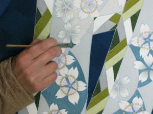
Different types of Kosode with a variety of colours and designs on the fabric were adopted in this period and citizen’s kosode style was based on their class. Notably, the design on the fabric of kosode was dramatically altered in the middle of the Edo period since the dyeing technique called ”Yûzen dyeing” was invented during the Edo period. People suddenly able to use as many colours as they wanted on the fabric. As a result, designers started to produced more Kosobe with a vast range of patterns.
Yuzen dyeing
Edo native began to feel a need to create their own style, having a real aesthetics of a real city person . Japanese in this period prefer wearing solid colour, small pattern prints and vertical stripe designs as their regular day clothing. Colours such as browns, grays and indigo blues were famous. However, they would also spend a massive amount of money on clothing with lining fabric, vivid colors and textiles. Since the then government banned people from using expensive fabrics for clothing, the Japanese felt the need to be more rebellious, so they did the exact opposite and found a way to get away with it. Japanese would wear the modest clothing outside and have all the refined details in their inner garment which no one else can see.
The Japanese during the Edo periodWomen of the middle Edo Period wearing stylish wide obi. Print by Kiyonaga
Kosode with butterfly and a twisted flower, 17th century, Tie-dyeing (kanoko-shibori, nui-shime) and stenciled gold leaves (surihaku) on black figured silk satin (rinzu) ground.
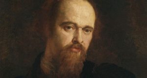
Gabriel Charles Dante Rossetti or Dante Gabriel Rossetti was known as a British poet, illustrator, painter and translator. He was considered the most successful member of his family, the Rossetti family. Moreover, he was one of the founders of the Pre-Raphaelite Brotherhood, and he then became the main inspiration for the second generation of artists and writer influenced by the movement.
Dante Gabriel Rossetti self portrait
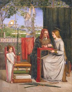
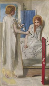
In the beginning, Rossetti gained his popularity from his two portrait pieces of Maria as a young girl. These two art pieces were named ”Girlhood of Mary Virgin(1849)” and” Ecce Ancilla Domini( 1950)”. He highly inspired by the work of early Renaissance artists such as Botticelli and Fra Angelico, so he deiced to work with the Annunciation theme with his unique interpretation. As Gombrich said in ” the story of art”, in the piece ” Ecce Ancilla Domini ” Rossetti want the audience to see the ancient story with a fresh mind. The piece illustrates the scene when Gabriel came to the Virgin and gave her a white lily. Rossetti successful painted the expression on the Virgin and her pose. The Virgin here look surprises and awkward since she was waking up from her sleep by an angel. Also, he also chose to paint this piece almost white and the three primary colours. Blue represents for heaven and it often associated with the Virgin. Red symbolized the blood of Christ.
The girlhood of Mary Virgin- I love how he took all the details in to consideration. It might looks not at natural at it should be but this piece have a really warm and peaceful atmosphere.However, the child here looks quite awkward so I would like it more if he change the child’s pose. Ecce Ancilla Domini! (The Annunciation) 1849-50- This piece looks amazing, He did a wonderful job at illustrate the angel by indicate the aura on his head and the yellow light under his feet which makes it look like he is floating.I think it would be better if Rossetti paid more attention in drawing their eyes which I think is a crucial part of most art piece.
Rossetti’s relationships with his models and muses including Elizabeth Siddal, Fanny Cornforth and Jane Morris had a significant effect on his works.
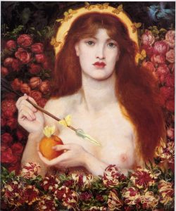
In 1850,he met Elizabeth, she became his muse, his pupil and his passion and they then married in 1860. We got to see a handful of Elizabeth portrait and one of the most well known portrait piece of her is the ‘‘ Venus Verticordia ”.
Venus Verticordia – I love the colour palette in this piece. He depicts her as the Venus Goddess which look tremendously breathtaking. The colour of the skin look really realistic and I love her face expression.
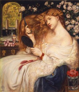
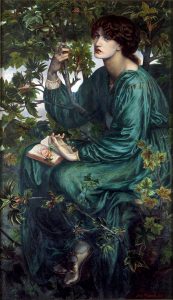
During 1860, he got influence on the development of the European Symbolic movement. He started to stylize women in his artworks. He would portray his new lover Fanny Cornforth as the epitome of physical eroticism, and he would also illustrate Jane Burden, the wife of William Morris as glamorous as an ethereal goddess.
Lady Lilith based on Fanny Cornforth.The Day Dream based on Jane Morris
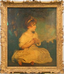
Sir Joshua Reynolds was an English painter specializing in portrait in the 18th century, and the first president of the Royal Academy of Art.Beside creating large scale full body portrait, Reynolds also painted a large number of smaller works. During the late 1750s, in an average day he did about five to six portrait piece each for an hour. Moreover, he also did some other genre of drawing such as landscape and children portrait. To be more specific, his piece named the age of innocence was well known for emphasizing the child’s impression and her grace.
the age of innocence -I love the use of colours in this piece of art which emphasize the innocent, and the adorable characteristic of the child.
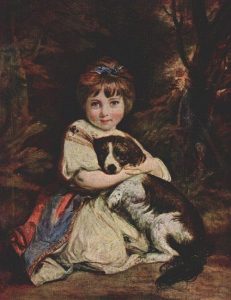
Reynolds’s belief in art maybe somewhat boring to us, the modern people; but it had stood firmly in the neoclassicism period. He considered that an artist should carefully study and imitate the dignity of classic Italian masters; and the pieces that were worthy of the name of Art are only those that were grand and impressive, like those landscape painting that had even the smallest detail. However, his actual works were mainly portraits, the kind of painting that was always in high demand in England. Even though, with great elegance and gracefulness, his portraits still established a standard for its kind, that even painters of later generation wanted to reach. In one of his notable work, “Miss Bowles with her dog”, Reynolds brought out the impression of a sweet child and the affection between her and her little pet. Later, this way of setting up became a common concept among photographers, but it was quite original at his time, and cannot make light of due to imitation from the later time.
Miss Bowles with her dog-I love the child expression and how she hug the dog look so natural. However, I would love a brighter background which in this piece she look like she is sitting in the middle of nowhere in the wood at night.
For me personally, I can understand why he is so famous for his portrait pieces they all look so lively and the viewer can almost sense somewhat of the model’s personality. He putted lots of effort to illustrate human’s expression and love how he painted eyes in all of his art work.
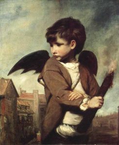
Cupid – I am especially adore this one art piece. Reynolds drew link boy as the cupid simply for his own pleasure. Cupid is a high god with somewhat powerful power but he had humanize this character to a poor boy that people would meet on the street. I love how he indicate small details to show this is a link boy: the background of London street, the boy cloth and the torch on his hand.
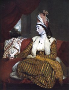
mrs Baldwin in eastern dress- I like the way he chose the colour palette for this piece and how he painted the woman face complete white which reminds me of the woman in Japanese art.
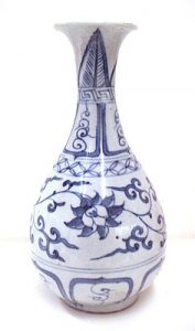
Blue and white glazed pottery (14th century – early 17th century )
Getting to know pottery:
Blue and white pottery are often decorated with blue pigment (cobalt oxide), and then the maker would glaze it to protect the blue colour from fading. Pottery would typically be painted by hand with brush painting, but people also develop some other alternative methods such as stenciling or transfer printing to push the production. The reason why cobalt pigment is so comment pottery decoration is that it can resist high temperatures during the firing process. For other colours, pottery would need over glaze decoration and a second firing at low temperature to preserve its pigment.
A Ming vase from the Yongle dynasty when the porcelain reached its most refined form.]
Blue glazed pottery was originated in Iraq from the 14th century to replicate the colour of Lapis Lazuli (a type of deep blue expensive rock) after they learned how to make pottery from Chinese people. Decorating with cobalt blue became well known during the Yuan Dynasty and remained famous until now. Furthermore, blue and white pottery became the mainstream pottery during the Ming area and reached its peak during the time of Kangxi emperor of the Qing Dynasty. Also, during the 15th century, Europe start to became interested in the beauty of pottery, and it then became the symbol of wealth to western people.
So, what type of decorate style was developed from the 14th century to 17th century?
The evolution of blue and white pottery began during the beginning of the 14th century, and it gradually replaced the blush white ware pottery (Qingbai). The European came to China then got interested in these blue and white pottery and brought it into the international trade market. From the 14th to 15th century, pottery would be decorated with flower or pattern; some would also add the dragon image ( representing power and wealth).
Early blue and white pottery from the first half of 14th century
Blue and white pottery made in Jiangxi Province during the first half of the 14th century
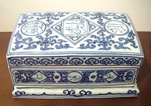
Going to the 16th century, we get to see the character of the Persian and Arabic script on pottery as decoration which was influenced by the Islamic and Muslim
Blue and white pottery with Arabic and Persian script from the beginning of 15th century
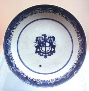
During the 17th century, the Chinese began to produce pottery to export the European market. We start to see English, and Latin letter on blue and white pottery and the decorating style also got highly inspired by Europe. People began to illustrate western scene or symbol on the pottery.
Blue and white export plate
Lecture summary :
In this week lecture, we get to know more about the evolution of typography with Roman style with show a great progress comparing to want we learn last week. Roman style typography using thick line but still quite humanist. This time we also see the first book ever printed in English William Caxton and later on we also see the ” On the Revolutions of the Heavenly Spheres” which marking the beginning of the scientific revolution. In art, we see the Baroque art style with dramatic lighting and composition. One thing that I really like about this lecture is Baskerville typeface and punch cuter who pull of some impressive work.
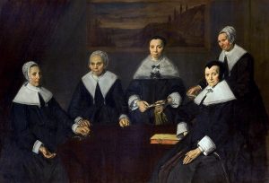
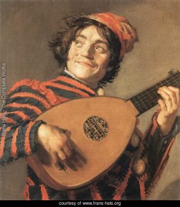
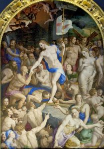
Franz Hals was a notable artist of the Baroque style in Holland during the seventeenth century. However, unlike some other, he had a financial unstable life. Franz started his career as a restorer of religious arts, then changed to portraiture when the market for religious theme started declining. Compare to the painting from previous decades, or even some of the same time, which felt like that the model had stayed for hours in a same neutral pose patiently; the portraits of Hals ware like camera snapshots that captured people “at a characteristic moment”, bringing emotional feeling into the canvas. This can be observed easily in many of his work, like “The Lute Player” in 1624, or “The Banquet of the Officers of the St George Militia Company in 1616”, a group portrait featuring a militia company at their diner hall. In addition, Hals’s portraits did not seem to be symmetrical as earlier ones often were. On the first glance, it could be perceived as a quick and easy-going approach; but actually, this impression could only be achieved through a very careful and calculated effort, to be able to keep the balance staying without following any visible rule. I personally love his new art style of simplify all the details, and using soft brush stroke. All these elements had made his work look natural and we can clearly distinguished between a low class citizen and high class people in his works.
Firstly, I can see that he was able to replicate the dress texture in this piece. Moreover, by taking loose brush strokes he had made the human figures look soft and elegant which is what i really love about this art work.I like the simple background of this piece, it has enough detail to create a natural scene and make the human figures look more outstanding. Furthermore, I love the white details on these man’s clothes which made them even look really powerful.I love the colour palette in this piece. The way he used red in this piece made it look natural and lively. The way. However I feel like the gesture of the man here is a little bit inflexible and the hand is also a a little bit shot compare to normal human’ proportion.
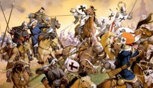
Genghis Khan, the leader of the Mongol empire leaved his throne to one of his son Ogeide Khan. Since then, Ogedei Khan decided to follow his father footstep, finishing his work of establish a world of empire. He then conquered the rest of Persia, Korea and witnessing the destruction of the Jinn dynasty. In the year 1235, he began to build a plan to invade Europe (Battle of Mohi). The entire conquest lasted for two decade long.
Shubuta was the one who in charge for the Mongol invasion. In order to secure his victory, Shubuta sent several spies around the central of Europe area. After having a clear vision of Europe and their army, he divided his soldiers in to three army which head to Poland, crossed the Carpathian Mountains and the Danube. The three armies then eliminate the opponent in a short amount of times, regroup and defeat Hungary at the Battle of Mohi in 1241.
The invasion of Hungary
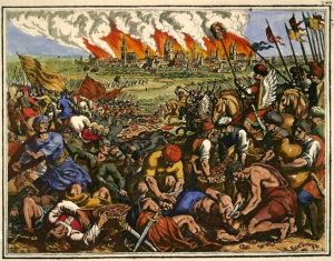
In the beginning, the Hungary made their first mistake of defy the Mongol army since they did not acknowledge how serious the situation is, some even expected that the royal army would handle everything. On top of that, Mongol army was a real risk while Hungary was unprepared for the invasion after such a long time living in peace.
The Mongol army used a strategy of attacking during the night time when the Hungary left their guard of. While the king was able to escaped with the help of his bodyguard, his army was brutally killed.
As a result, Mongol army killed up to half of the population and burn down most of the settles. Furthermore, they even destroyed all record of cultural and economic.
Mongols defeat Christian knights at the battle of LiegnitzBattle of LegnicaThe invasion movement
Lecture summary : This Wednesday lecture was a descriptive summary about printing and typography. We got to know the evolution of typography and a little bit about illustration in bibles from a long period of time. Furthermore, the lecture also included more information about the paper making process and how people know about it all over the world. I am personally really interested in all the example of old bibles especially ” the Book of hour ” which the designer had put a huge amount of detail to finish the entire book. I love the way they organized all the information in the book and making it interesting to the reader.
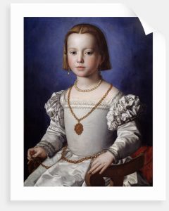
Agnolo di Cosimo was an Italian painter who was create many breathtaking portraits during the High Renaissance period. Many people called him Bronzino due to his art style of adding dark complexion to the person in his portrait. Beside portrait painting, Agnolo also created several series of religious works such as The Resurrection of the Virgin Mary and The Martyrdom of San Lorenzo. For me personally, I think that Agnolo di Cosimo is a talented artist. For example, in the piece portrait of Bia de’ Medici he drew all the detail on the little girl’s dress so precisely, which gives the piece a three-dimension felling. However, he did not do a great job in capture the face expression because she looks sad and more mature than her real age. Moreover, I am not fond of the way he paints the eyes in some of his portraits, those figures in his piece look lifeless and dull. Overall, I can understand why Agnolo is so famous due to all his remain art works. It may have some errors in my opinion but he was able to achieve few things that others did not.
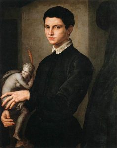
I love all the details he putted in to this piece. All the human figures look quite nature with their gestures and proportion`.Again as I said, he got those details on her dress correctly but I do not like her face expressionI love how he drew the pose of this young boy and also how he drew the sculpture behind the boy
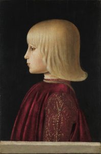
Piero Della Francesca was known as one of the most important artist during the Renaissance period in Italy. Piero was an artist but also a well-known mathematical theorist which explain how he was able to deliver such precise proportion to his art. The audiences can see all the elements of geometric form, perspective that Piero had put into his art which is difficult for artist in his time area to achieve. To me personally, I am amazed with his ability to record the human face and how he was able to get the human figure in the right proportion to fit with the background in his art. Unlike other artist in his period, the face expression in his art was quite lively even though people in Piero’s painting tend to look moody which I do not know if it is his intention to draw so or not. Lastly, I love how Piero chose the colour palette for his arts which is a lovely combination of all warm color with the touch of red that bring those pieces to live. Overall, Piero is truly a talented person who was able co-operate both his art skill and his mathematics knowledge to create such amazing arts that we still admire until now.
The golden background behind the piece really makes the human figure look more outstanding. Piero was able to capture the human expression, the woman in this piece look really elegant and beautiful.I am not fond of this piece too much but I do want to leave some comment for this piece. The child face is really stiff and I do not think that he was able to get the right proportion for this piece .I love how Piero chose his color palette in this art piece. It have the right amount of warm and cool tones to balance the entire piece. However he did not done a good job in drawing the background because it look really flat to me.
Early temples aka everything are giantic and it is all about worshiping god.
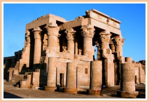
Architecture of the ancient Egypt. Kom ombo Temple
History background of temples
The Egyptian built temples with the purpose to honor their pharaohs and worship their god by holding festivals and rituals during the ancient time. It is also a link to communicate between Egyptian and their god. The pharaoh also built temples( mortuary temples) which linked to their tomb in order to maintain their spiritual after they pass away.
The temple exact location usually chose base on religious reason such as mythical birthplace or to be use as monument for their god.
In order to separate the noble house of god and pharaohs with the mortal’s shelter, Egyptian used stone as the main material to build their temple. They used limestone or sandstone which was easier to carve compare to others type of stone.
The Valley of the Kings
Design and decoration
The Egyptian temple design during this specific time period tend to be symmetry and monumentality since it is such a spiritual place.
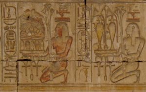
Relief and free-standing sculpture were the two main decorations in all temple. They covered walls, ceilings, columns, and beams with reliefs (bas relief or sunken relief) using fundamental colours to illustrate information such as festival calendars, myths and rituals depiction. It could be symbol or texts to tell others about all the rituals held in the temple.
Sunk relief
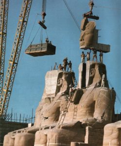
Sculptures often created in a large size of pharaoh’s figure and gods figured as figurative guardian of the place. The most common type of sculptured would be monumental sculpture which often made in pair to place in front of the pylons. A great example of these spectacular sculptures would be the status of Ramses the Great at the Great Temple of Abu Simbel which is 20-meter height.
The status of Ramses the Great at the Great Temple of Abu Simbel
Summary of week 3 lecture
The lecture includes lots of information about how the ancient people developed their own way to communicate through times. At first, people from different parts of the world used a range of symbols(pictograph and ideograph ) to note important messages then gradually they created their own alphabet which we are now using in the modern world. I am especially interested in Egyptian’s symbol, how they were able to combine several symbols to note someone name. Moreover, I also amazed by how they organized all those symbols for the others to read.


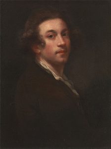 Beside creating large scale full body portrait, Reynolds also painted a large number of smaller works. During the late 1750s, in an average day he did about five to six portrait piece each for an hour. Moreover, he also did some other genre of drawing such as landscape and children portrait. To be more specific, his piece named the age of innocence was well known for emphasizing the child’s impression and her grace.