I was very excited to take this class because character development is something that I enjoy doing and would love to someday do as a profession, whether that be with an animation studio or through my own independent endeavours. My goal for this class was to push my character to look unique and compelling while also taking the opportunity to strengthen my illustration and colouring skills.
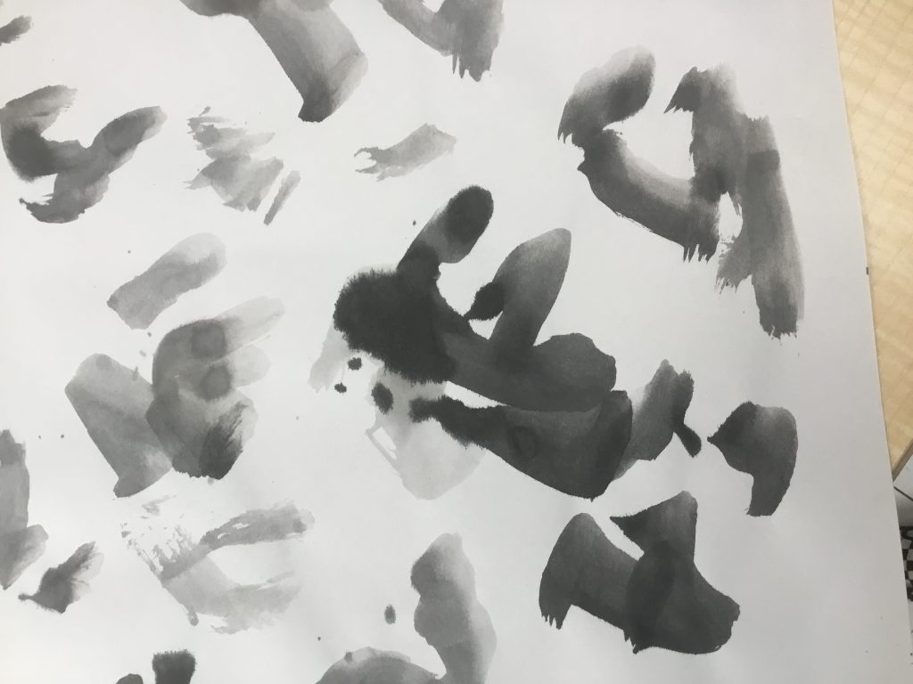
In our first class, we did a fun exercise where we used diluted ink to create tons of blobs on sheets of Newsprint. We worked quickly and loose and didn’t think too hard about what we were creating.
Next, we looked through our ink blots and tried to find “characters” within the shapes. I had a difficult time with this, because I tend to start my drawings with more structure, but this challenged me to explore new ideas and push my skills and style. If we found a character within a shape that we liked, we had the option to pursue it further with our final illustration. Unfortunately, a lot of mine ended up looking like grouchy old men or downright ugly characters, so I chose to take another approach.
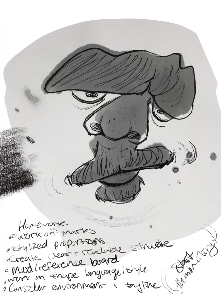
Instead of working with the ink blots, I chose to base my character off a set of shapes to give her a strong and unique silhouette, which was the intended goal. In my exploration, I landed on a silhouette that reminded me of a character that I had worked on for a previous assignment in Jeff’s class; She was a Gorgon lady, like Medusa, who collected the statues of the people she had turned to stone. While I overall enjoyed that past assignment, looking back on it now, the illustration seems very stiff and generic compared to what I’m capable of now (it’s crazy how much you can improve in only a year). So I decided to take the opportunity to tackle a similar character, but put her in a more unique setting. Enter: Gorgon Business Mogul. She’s strong, contemporary and unafraid.
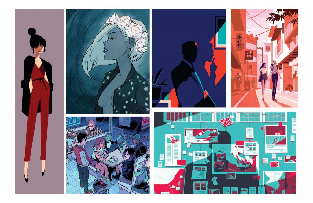
I sketched some thumbnails of her in various settings, like in a boardroom, walking down a hall with an intern trailing behind, and other work-based settings that suited her intimidating aura. But then I sketched a scene of her at home, sitting at a vanity, and was attracted to the intimate setting of a character who wouldn’t often reveal her private life to others. I settled on this concept, especially because the lighting would be far more dynamic than some of the other concepts.
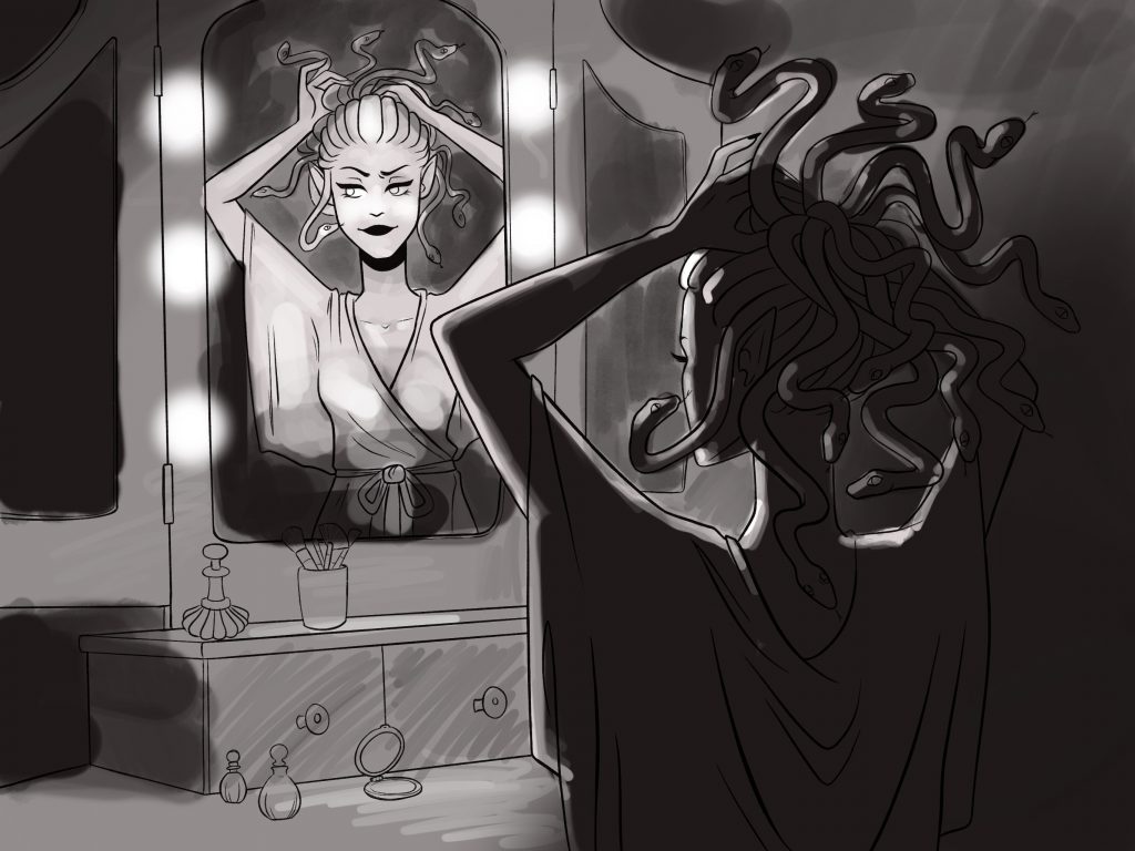
My first attempt at colouring her… failed miserably. I was sick for that week and when I looked back on the work I had done, it was a mess of different colouring styles and a not-so-cohesive colour pallette.
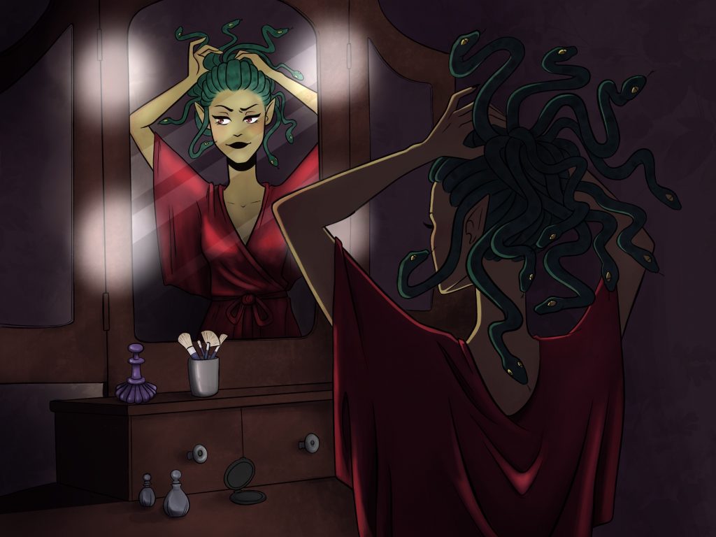
SO… I decided to redo the colouring entirely and sharpen the lines as well, and I was much happier with the result. I chose a more uniform colour palette and decided to go for a more graphic colouring style rather than… whatever the hell I was doing before.
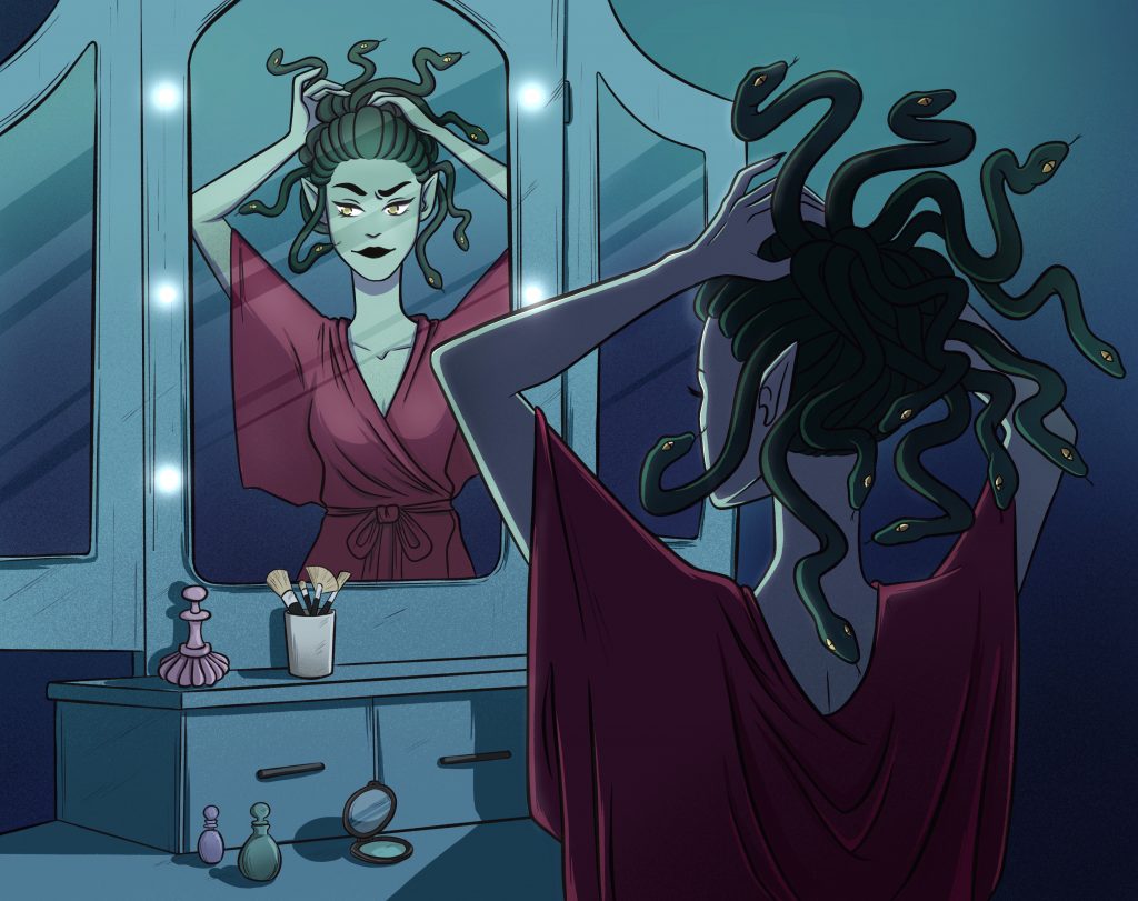
I’m… much happier with this version. There’s still room for improvement, but I hope to explore more with this character in the future.
Thanks for the class, Zoe!